Stop Starting From Flat: How Camera Profile Presets Fix Your Raw Import Workflow in Lightroom

Stop Starting From Flat: How Camera Profile Presets Fix Your Raw Import Workflow in Lightroom

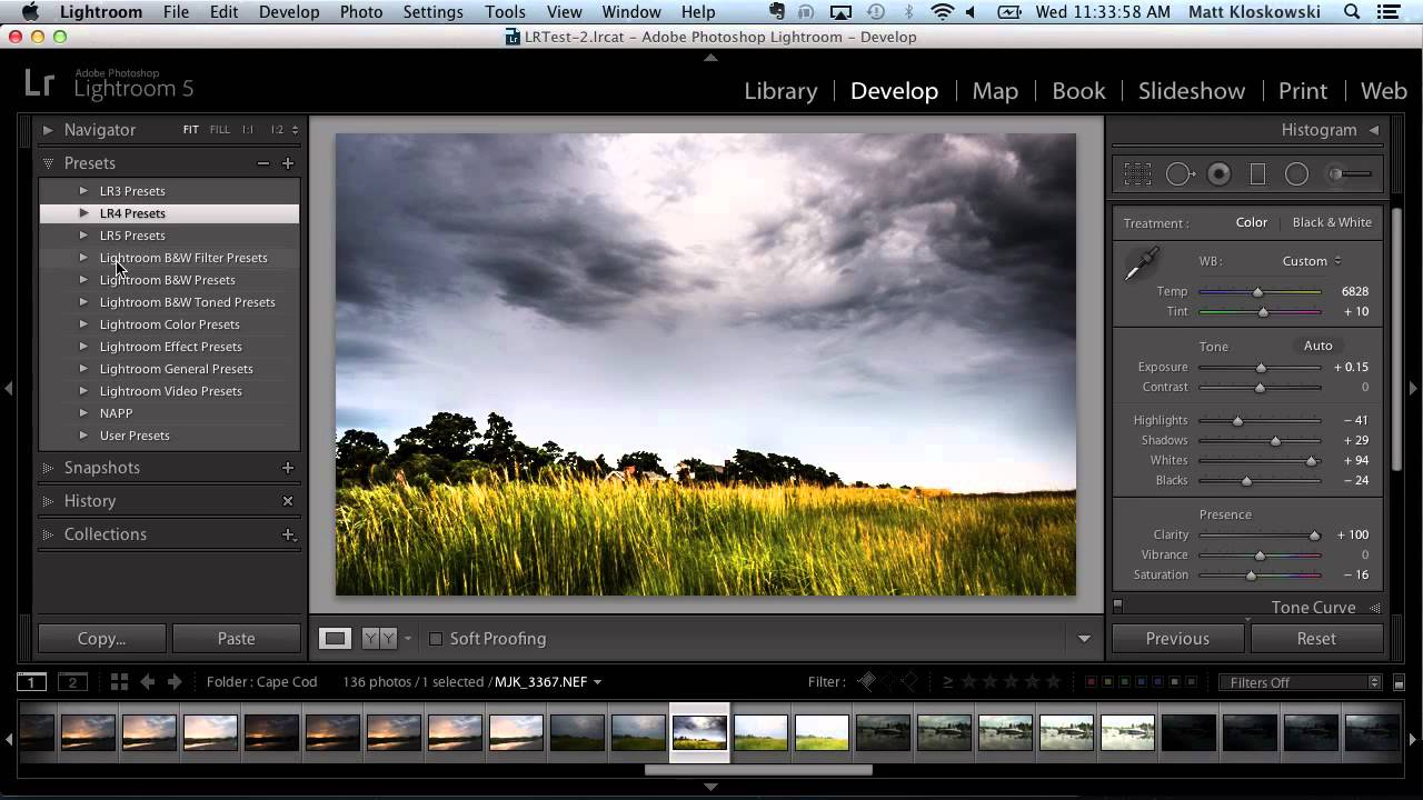
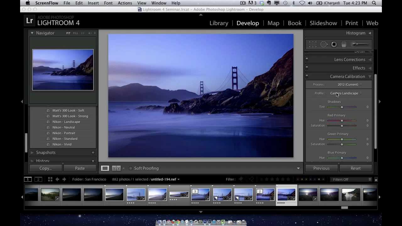
Every photographer who shoots raw has had the same deflating moment. You nail a landscape shot. The back of your camera shows a punchy, saturated image with great contrast. You import it into Lightroom, and suddenly it looks like a flat, lifeless file that makes you question your career choices. Nothing changed in the field. What changed is that Lightroom stripped out the picture style your camera was applying to the JPEG preview and replaced it with its own default Adobe Standard profile.
How to Build Lightroom Presets That Actually Travel Well Across Photos

How to Build Lightroom Presets That Actually Travel Well Across Photos

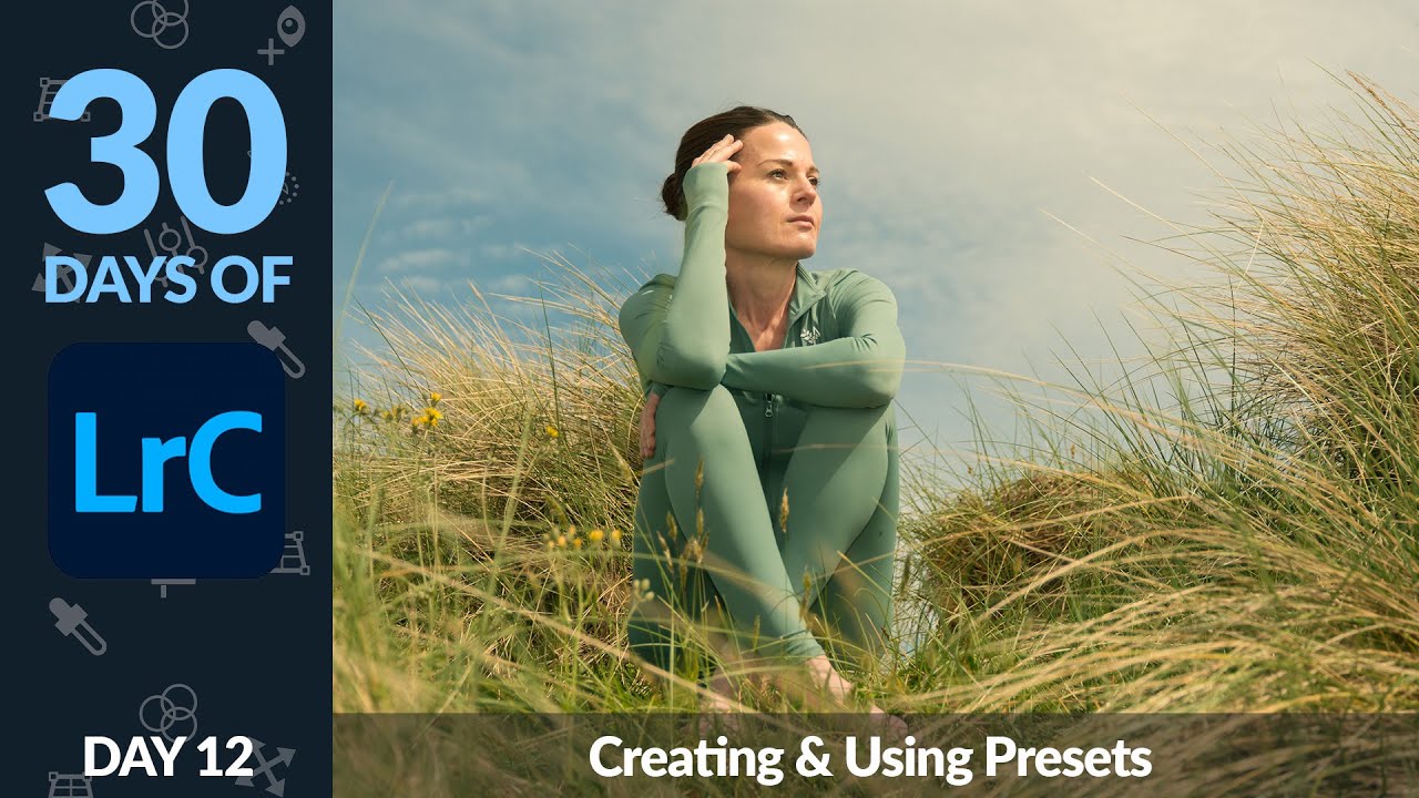
If you process images for a living, presets are not a luxury. They are infrastructure. I have spent fifteen years in commercial photography studios watching editors burn hours on repetitive color work that could be locked into a single click. When I moved into running my own post-production consultancy, building reusable settings in Lightroom became one of the first things I systematized for every client workflow. So when I came across Aaron Nace’s Day 12 tutorial from PHLEARN’s 30-day Lightroom Classic series, I paid close attention.

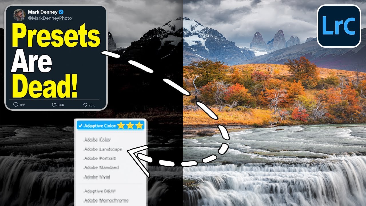
Why I'm Starting Every Landscape Edit with Lightroom's Adaptive Color Profile Now

Why I'm Starting Every Landscape Edit with Lightroom's Adaptive Color Profile Now

I’ve spent fifteen years watching editors reach for presets the moment a raw file hits the screen. I get it. Presets are fast, they’re consistent, and when you’re processing a hundred images for a client, speed matters. But presets have a fundamental problem: they apply a fixed look to images that are all fundamentally different. What works on a golden-hour desert shot falls apart on a flat, overcast forest scene. I’ve been hunting for a better starting point for a while, something that adapts rather than overrides.

The Hidden Amount Slider That Changes How I Use Lightroom's Local Adjustments

The Hidden Amount Slider That Changes How I Use Lightroom's Local Adjustments

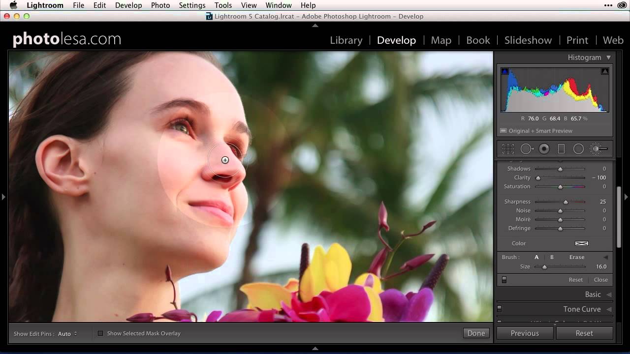
There’s a category of Lightroom feature I think of as “hiding in plain sight” — things that have been in the software for a while, that plenty of experienced editors have never noticed, and that quietly change the way you work once you find them. The Amount slider collapse in local adjustments is exactly that kind of feature. I stumbled across this tip in a recent tutorial from Matt Kloskowski, and my first reaction was genuine annoyance that I hadn’t known about it sooner.

How to Build Lightroom Presets That Actually Hold Up Across a Full Shoot

How to Build Lightroom Presets That Actually Hold Up Across a Full Shoot

I have a spreadsheet. It tracks every hour I’ve saved through automation across fifteen years of post-production work. The number is sitting above 2,400 hours right now, and a significant chunk of that comes from one deceptively simple habit: building reusable Lightroom presets before I start any serious editing session. When a client sends me 300 product shots from the same studio setup, I don’t want to be dialing in the same warm tone and compressed contrast curve by hand 300 times.

Stop Exporting Images One at a Time: A Practical Guide to Lightroom Export Presets

Stop Exporting Images One at a Time: A Practical Guide to Lightroom Export Presets

There is a certain kind of pain that only photographers know. You finish editing a set of images, they look great, and then you spend the next forty-five minutes manually exporting the same files at different sizes for Instagram, your client’s website, and the print lab. Same dialog box, slightly different numbers, over and over. I spent an embarrassing amount of time doing exactly this before I finally sat down and built a proper export preset system in Lightroom.

Lightroom's Adaptive Color Profiles Are the Starting Point I Wish I'd Had Years Ago

Lightroom's Adaptive Color Profiles Are the Starting Point I Wish I'd Had Years Ago

I track time obsessively. I have a spreadsheet that logs every hour my automation tools have saved me, and right now it’s sitting at over 2,400 hours. So when I see a feature that genuinely changes how fast I can get from import to edit-ready, I pay attention. Presets have always been my first line of defense against flat RAW files, but I’ve quietly suspected there was a smarter way to handle that initial color foundation.

From Three Phone Shots to Canvas-Ready Panorama: A Lightroom-to-Photoshop Workflow That Actually Works

From Three Phone Shots to Canvas-Ready Panorama: A Lightroom-to-Photoshop Workflow That Actually Works

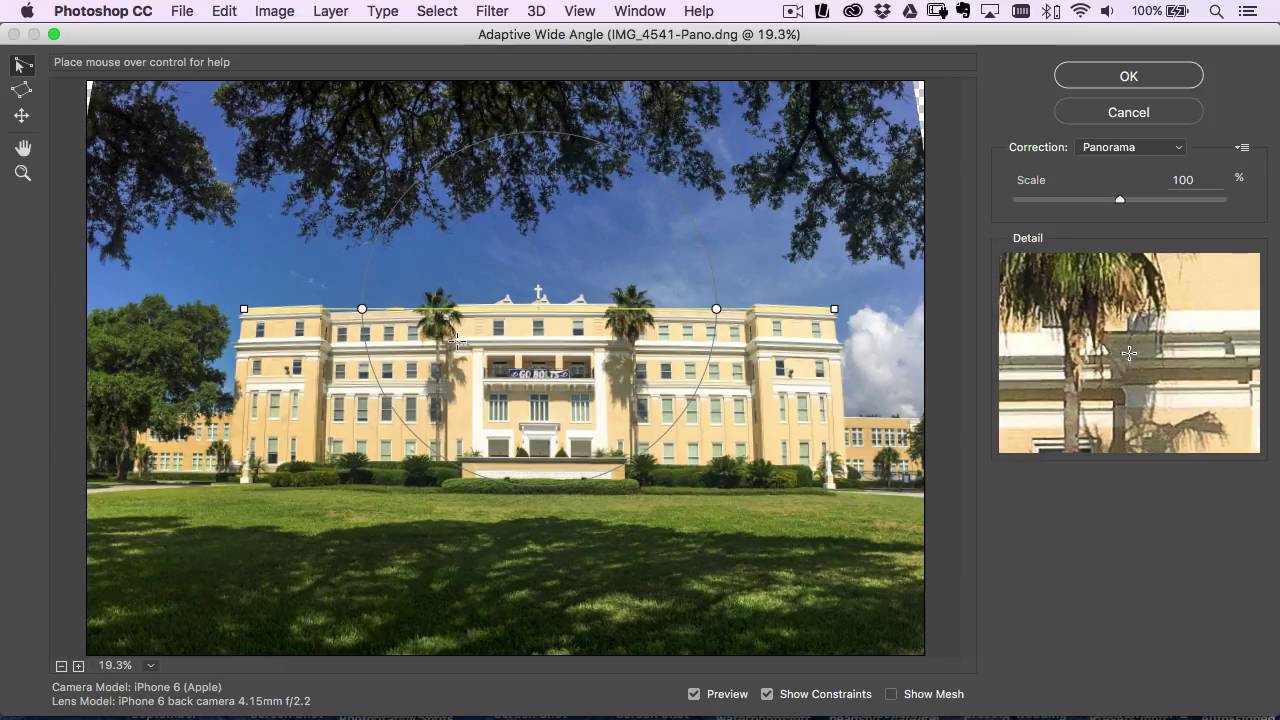
Most of my work runs through a pretty controlled pipeline. Commercial shoots, tethered capture, calibrated monitors, the whole setup. But I’ve been doing this long enough to know that the real test of a workflow isn’t how it performs under ideal conditions. It’s how it holds up when someone hands you three slightly overlapping iPhone photos and asks for a canvas print. That scenario comes up more than you’d think, and for a long time my answer was “I’ll do my best” followed by a lot of manual patching in Photoshop.

The One Lightroom Adjustment Brush Setting That's Quietly Wrecking Your Masks

The One Lightroom Adjustment Brush Setting That's Quietly Wrecking Your Masks

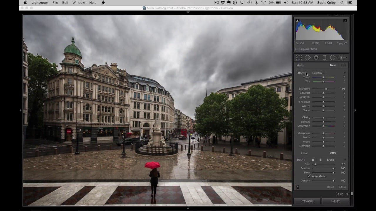
I’ve watched photographers abandon perfectly good tools because of a single default setting nobody bothered to explain to them. The Lightroom Adjustment Brush is one of the most frequently misunderstood features in the whole application, and the complaint is almost always the same: “It leaves gaps,” or “It paints unevenly,” or my personal favorite, “It misses spots.” After years of building post-production workflows for ad agencies and e-commerce clients, I can tell you those complaints are valid.

What Lightroom's Built-In Presets Can Actually Teach You About Retouching

What Lightroom's Built-In Presets Can Actually Teach You About Retouching

There’s a phase every retoucher goes through where they know what they want an image to look like but can’t quite connect that vision to specific slider values. I spent an embarrassing amount of time in that gap early in my career, guessing at Clarity adjustments and hoping for the best. What eventually pulled me out of it wasn’t a course or a book — it was slowing down and actually reading what existing presets were doing under the hood.

How to Install and Organize Lightroom Presets Without Losing Your Mind

How to Install and Organize Lightroom Presets Without Losing Your Mind

If you’ve ever handed a client a gallery and thought “I wish every shot had that look baked in from the start,” presets are the answer. The problem isn’t finding presets. The problem is that the installation process trips people up every single time, usually at the worst moment, right before a deadline. I’ve watched junior retouchers in my studio waste twenty minutes trying to drag a zip file directly into Lightroom and wondering why nothing happened.

Free Lightroom Calendar Print Templates: A Complete Installation and Workflow Guide

Free Lightroom Calendar Print Templates: A Complete Installation and Workflow Guide

Every December I end up with the same backlog: family portrait clients who want calendar prints, and a print module setup that needs to be rebuilt from scratch because I never saved a proper template the previous year. It’s one of those small inefficiencies that compounds badly when you’re trying to close out a busy fourth quarter. This year I finally stopped reinventing the wheel, thanks to a free resource I came across in this Matt Kloskowski tutorial.