If you process images for a living, presets are not a luxury. They are infrastructure. I have spent fifteen years in commercial photography studios watching editors burn hours on repetitive color work that could be locked into a single click. When I moved into running my own post-production consultancy, building reusable settings in Lightroom became one of the first things I systematized for every client workflow. So when I came across Aaron Nace’s Day 12 tutorial from PHLEARN’s 30-day Lightroom Classic series, I paid close attention. Watch the full tutorial on YouTube
What makes this tutorial worth your time is that it goes further than the usual “drag these sliders, save, done” approach. Aaron walks through building a preset that includes a radial gradient mask and color grading on top of standard tonal adjustments. That combination is where most beginner preset guides stop short. If you want a preset that creates a consistent mood rather than just bumping exposure, you need all three layers working together.
The other thing he makes clear early on is that presets can be exported and sold. That is not the focus here, but it is worth knowing as you build them. Every preset you create with intention is a potential asset, not just a personal shortcut.
Step 1: Start in the Develop Module and Understand Your History Panel
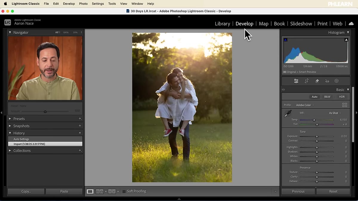 Develop module open with History and Presets panels visible
Before you touch a slider, orient yourself. In Lightroom Classic’s Develop module, the left panel has two tools you need to know. The History panel records every adjustment you make, in order, so you can roll back to any previous state. Directly below it is the Presets panel, where your saved presets live alongside Lightroom’s built-in options.
Develop module open with History and Presets panels visible
Before you touch a slider, orient yourself. In Lightroom Classic’s Develop module, the left panel has two tools you need to know. The History panel records every adjustment you make, in order, so you can roll back to any previous state. Directly below it is the Presets panel, where your saved presets live alongside Lightroom’s built-in options.
User presets appear in their own folder inside that panel. This is where anything you create will show up. Get comfortable clicking through the built-in presets to see how they behave on a preview before you commit. That hover-preview behavior is something you will want to use when testing your own presets later.
Step 2: Make Your Core Tonal and Color Adjustments
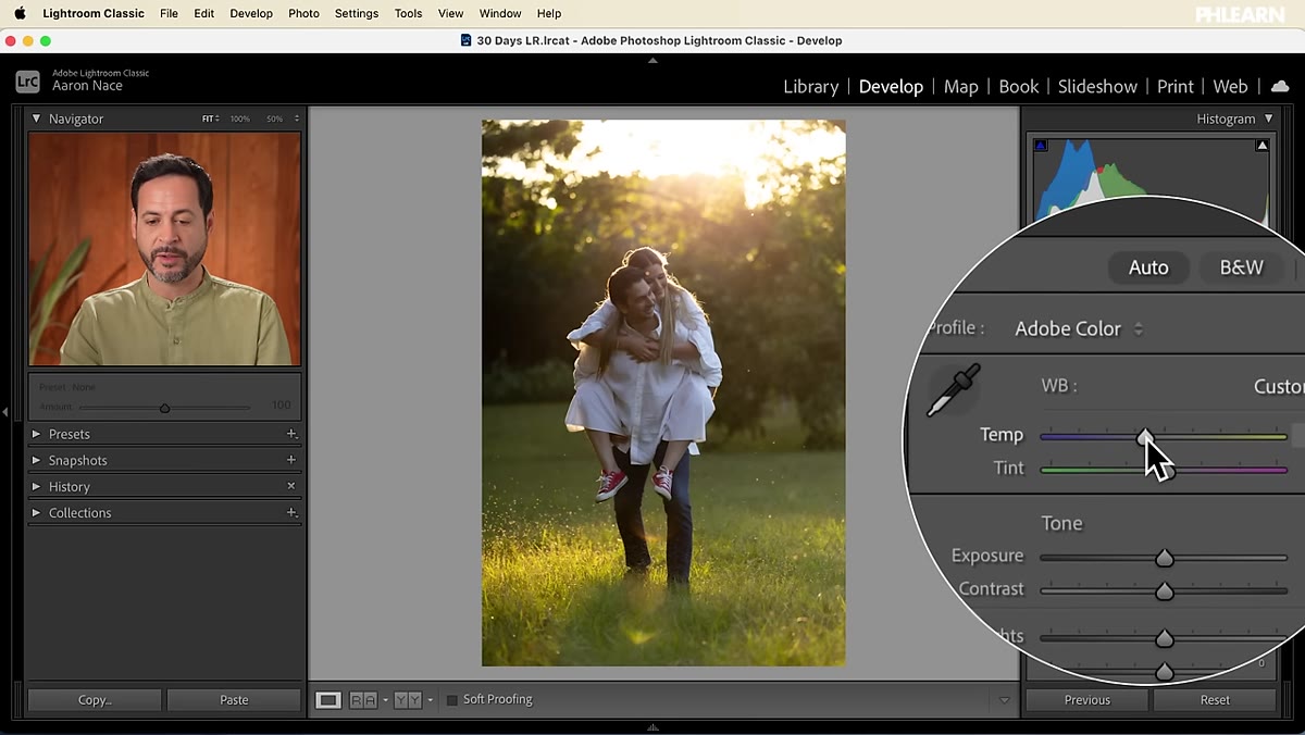 Basic panel open with Temperature, Shadows, and Vibrance sliders adjusted
Aaron’s approach here is deliberate: edit the image as you normally would, then decide what to save. For this example, he is building a warm, summery feel. He nudges the color temperature toward the warmer end, lifts the shadows slightly to open up the darker areas, and raises Vibrance to give the colors some life without oversaturating skin tones or skies.
Basic panel open with Temperature, Shadows, and Vibrance sliders adjusted
Aaron’s approach here is deliberate: edit the image as you normally would, then decide what to save. For this example, he is building a warm, summery feel. He nudges the color temperature toward the warmer end, lifts the shadows slightly to open up the darker areas, and raises Vibrance to give the colors some life without oversaturating skin tones or skies.
The values he uses are modest on purpose. A preset that pushes sliders to extremes might look dramatic on the hero image you built it on, but it will fight you on the next photo with different lighting conditions. Aim for adjustments that feel like a nudge in the right direction, not a complete transformation. You can always layer more on top later.
Step 3: Add a Radial Gradient Mask
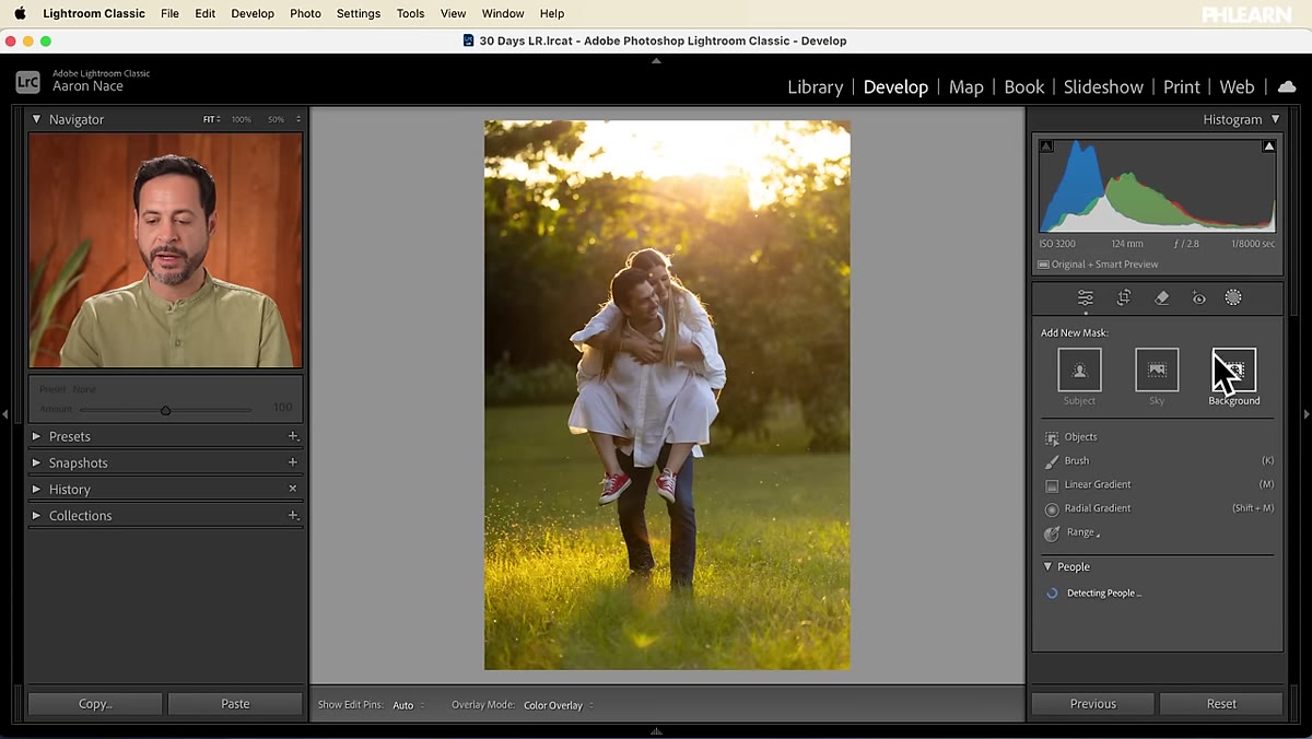 Masking panel open with radial gradient drawn from top of frame
This is where the tutorial separates itself from basic preset guides. Aaron opens the Masking panel and adds a radial gradient, dragging it from the top of the frame downward to isolate the sky area. Within that mask, he adds a touch more exposure and bumps the color temperature warmer, essentially building a warm light source into the top of the frame.
Masking panel open with radial gradient drawn from top of frame
This is where the tutorial separates itself from basic preset guides. Aaron opens the Masking panel and adds a radial gradient, dragging it from the top of the frame downward to isolate the sky area. Within that mask, he adds a touch more exposure and bumps the color temperature warmer, essentially building a warm light source into the top of the frame.
The key point he makes is one I have seen validated in my own work: keep masked adjustments subtle. A heavy-handed sky gradient that looks stunning on a wide landscape shot will look bizarre applied to a tight product photo or a portrait. Subtle adjustments give you a starting point you can tune, rather than a correction you have to fight.
Step 4: Add Color Grading in the Midtones and Shadows
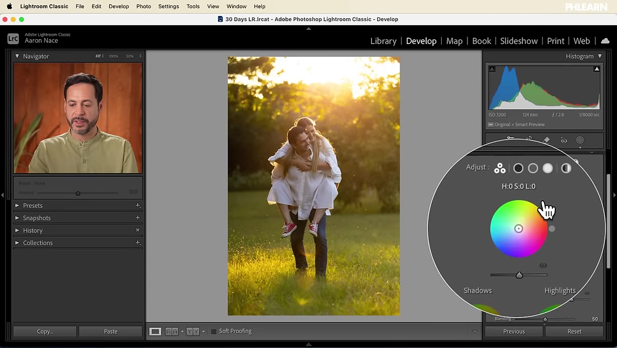 Color Grading panel open with midtone wheel nudged toward green-yellow
With the basic tonal work and the mask in place, Aaron moves into the Color Grading panel to add the final layer of mood. He moves the midtone color wheel slightly toward a green-yellow hue and shifts the shadows toward a cooler green. Both moves are extremely subtle. If you have not worked in the Color Grading panel before, these wheels can feel tempting to push hard. Resist it.
Color Grading panel open with midtone wheel nudged toward green-yellow
With the basic tonal work and the mask in place, Aaron moves into the Color Grading panel to add the final layer of mood. He moves the midtone color wheel slightly toward a green-yellow hue and shifts the shadows toward a cooler green. Both moves are extremely subtle. If you have not worked in the Color Grading panel before, these wheels can feel tempting to push hard. Resist it.
Color grading in a preset is about establishing a tonal relationship between highlights, midtones, and shadows that reads as a cohesive look. If your midtones lean warm-green and your shadows lean cool-green, you get a filmic quality that adds depth without screaming “filter applied.” Aaron points back to his Day 9 color grading tutorial for anyone who wants a deeper dive into this panel specifically.
Step 5: Save the Preset and Choose Your Settings Carefully
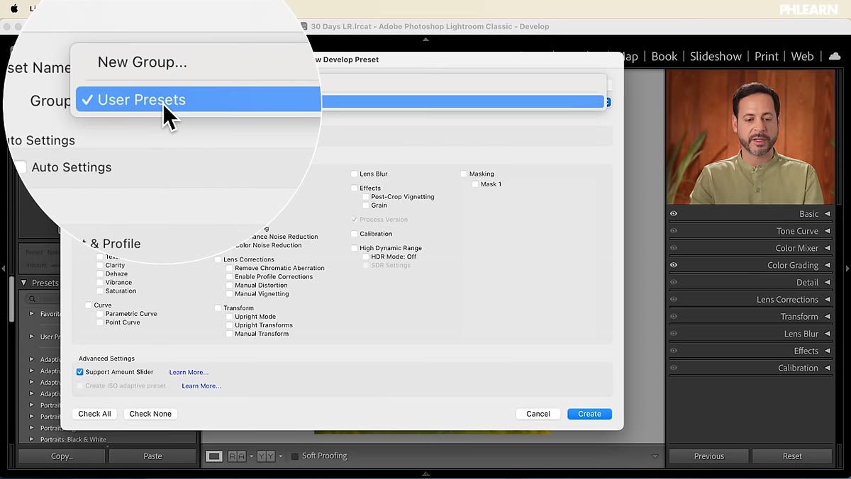
 New Preset dialog open showing checkbox options for included settings
Once your edits are complete, saving the preset is straightforward. Click the plus icon in the Presets panel to open the New Develop Preset dialog. Here is where most people rush and regret it later: you need to decide which settings to include.
New Preset dialog open showing checkbox options for included settings
Once your edits are complete, saving the preset is straightforward. Click the plus icon in the Presets panel to open the New Develop Preset dialog. Here is where most people rush and regret it later: you need to decide which settings to include.
Lightroom gives you checkboxes for every category of adjustment. If you select everything, the preset will override settings like crop, spot removal, and lens corrections on every photo it touches. That is usually not what you want. Be deliberate. Check the settings that define your look, such as white balance, tone, color grading, and any masks you built. Leave out anything that is image-specific. Name the preset something descriptive enough that you will still understand it six months from now, and save it to your User Presets folder.
Step 6: Test the Preset on a Different Image
 Second sample image with preset applied showing before and after
Aaron finishes by applying the preset to a second, different image. This is the real test. A preset that only works on the photo you built it on is not a preset, it is a saved edit. Apply it to an image with different lighting, a different color palette, or a different subject, and see what holds up.
Second sample image with preset applied showing before and after
Aaron finishes by applying the preset to a second, different image. This is the real test. A preset that only works on the photo you built it on is not a preset, it is a saved edit. Apply it to an image with different lighting, a different color palette, or a different subject, and see what holds up.
Look for which elements translate and which fight the new photo. If the color grading reads consistently but the radial gradient mask lands in the wrong part of the frame, that tells you something about how you might refine the mask position. Testing across at least two or three different images before you consider a preset finished will save you embarrassment later.
A Note From My Own Workflow
I work with e-commerce clients who shoot in controlled studio conditions, and I also work with ad agencies whose photographers shoot on location in wildly varying light. The single biggest mistake I see with presets in both contexts is over-specification. The more precise a preset is, the narrower the range of images it works on.
My own Lightroom presets are deliberately minimal. I use them as a starting point and build in a second layer of per-image adjustment on top. If you want to get more out of this approach, consider creating preset families: a lighter version, a standard version, and a pushed version of the same look. That gives you three tools instead of one and dramatically improves how often you reach for them.
Building a Lightroom preset that holds up across different images is about restraint as much as skill. The technique Aaron Nace walks through, combining tonal adjustments, a gradient mask, and subtle color grading, gives you a replicable mood rather than just a saved exposure tweak. That distinction is what makes the difference between a preset you use once and one you reach for on every job.
Watch the full tutorial on YouTube and follow along with the sample raw files Aaron provides. Building it yourself, on your own images, is the fastest way to understand where the limits are.
Comments (2)
The tip about how to build lightroom presets was the missing piece for me. Thank you.
I've watched a dozen tutorials on this and yours is the clearest by far.
Leave a Comment