Most of my work runs through a pretty controlled pipeline. Commercial shoots, tethered capture, calibrated monitors, the whole setup. But I’ve been doing this long enough to know that the real test of a workflow isn’t how it performs under ideal conditions. It’s how it holds up when someone hands you three slightly overlapping iPhone photos and asks for a canvas print. That scenario comes up more than you’d think, and for a long time my answer was “I’ll do my best” followed by a lot of manual patching in Photoshop.
In this Matt Kloskowski tutorial, he walks through exactly that situation: a friend needed a wide panoramic shot of her daughter’s school, didn’t have a camera, and sent over three photos from her phone. The result is a workflow that moves from Lightroom’s Photo Merge all the way to a print-ready file, and it’s cleaner than most people expect. Watch the full tutorial on YouTube if you want to follow along visually. The breakdown below gives you everything you need to replicate it step by step.
What caught my attention here wasn’t the difficulty level. It’s genuinely a beginner-accessible workflow. What caught my attention was how well-chosen each decision is. Nothing is overcomplicated. The tool choices match the output goal. That’s harder to teach than it looks.
Step 1: Shoot for the Stitch, Not for Perfection
 Three overlapping phone photos shown side by side in Lightroom
The source material here is three separate phone photos with deliberate overlap between each frame. Matt’s instruction to his friend was simple: if the built-in Pano mode doesn’t give you enough control over composition, just shoot three individual frames instead. That advice is worth internalizing. Pano modes on phones often decide the framing for you. Shooting separate frames and merging in Lightroom gives you more control over what’s included at the edges.
Three overlapping phone photos shown side by side in Lightroom
The source material here is three separate phone photos with deliberate overlap between each frame. Matt’s instruction to his friend was simple: if the built-in Pano mode doesn’t give you enough control over composition, just shoot three individual frames instead. That advice is worth internalizing. Pano modes on phones often decide the framing for you. Shooting separate frames and merging in Lightroom gives you more control over what’s included at the edges.
The practical note here is to keep your phone level and rotate from the waist, not the wrist. Consistent horizon height across frames makes the stitch cleaner and reduces the correction work you’ll need later.
Step 2: Import and Route Through Lightroom Mobile
 Photos appearing in Lightroom desktop after mobile sync
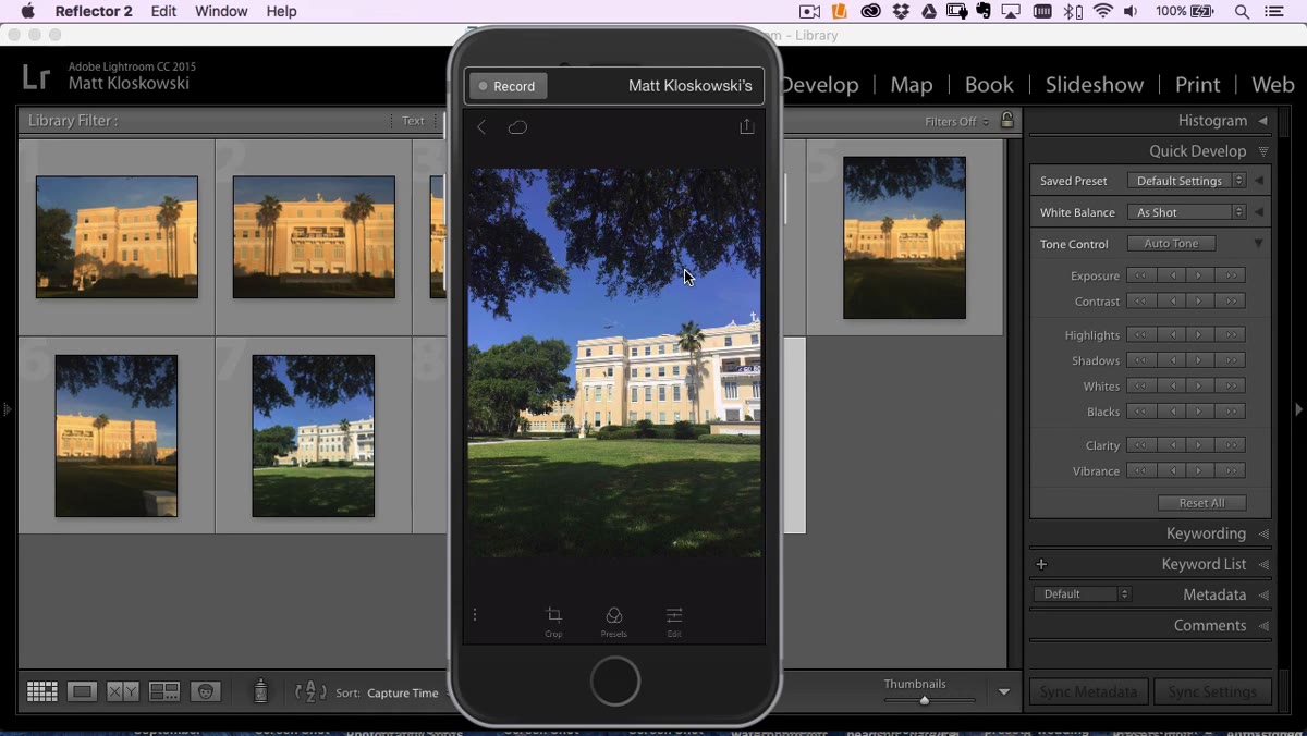
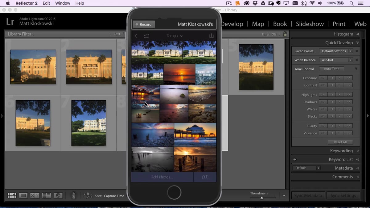
The transfer method in this tutorial is worth noting: the friend emailed the photos directly to Matt while they were out, and he dropped them into Lightroom Mobile on his phone. Because Lightroom Mobile syncs automatically to the desktop catalog, the files were waiting for him by the time he got home. No cables, no card readers, no manual import dialogs.
Photos appearing in Lightroom desktop after mobile sync
The transfer method in this tutorial is worth noting: the friend emailed the photos directly to Matt while they were out, and he dropped them into Lightroom Mobile on his phone. Because Lightroom Mobile syncs automatically to the desktop catalog, the files were waiting for him by the time he got home. No cables, no card readers, no manual import dialogs.
For anyone who still emails files to themselves and drags them into a desktop folder, this sync pipeline is a genuine time saver. The photos land in a synced collection and show up in your desktop catalog automatically. It’s not a new feature, but it’s one that a lot of people still aren’t using consistently.
Step 3: Run Photo Merge to Panorama with Boundary Warp
 Panorama merge dialog open with Boundary Warp slider at 100
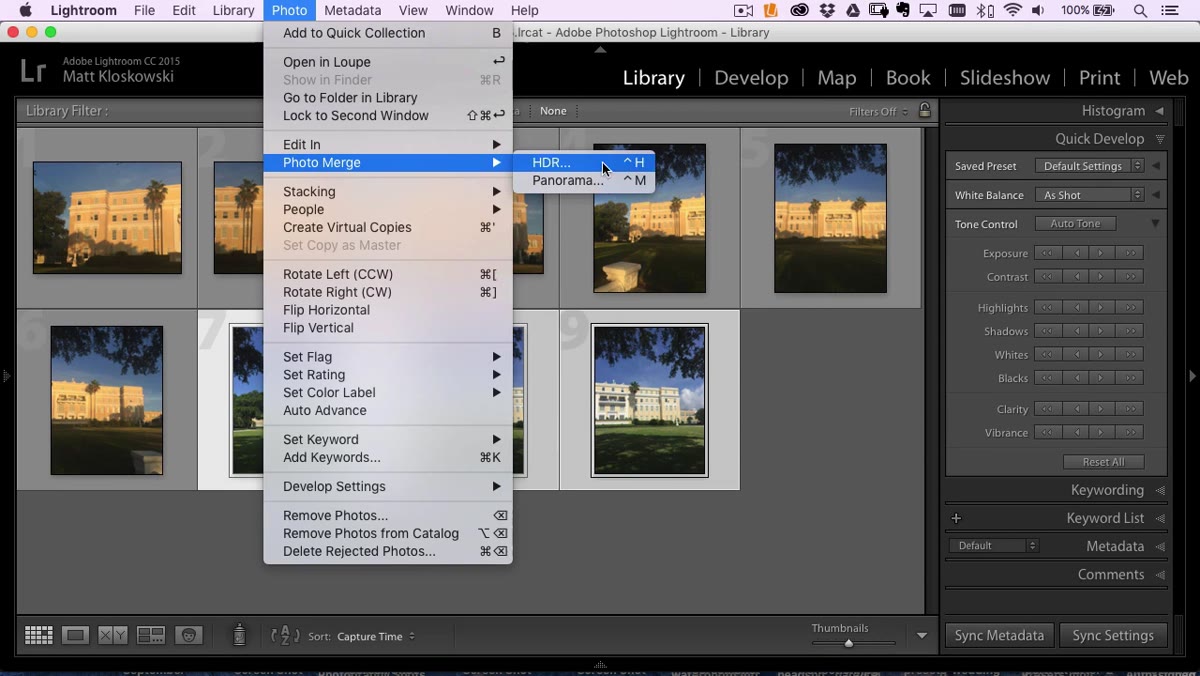
With the three frames selected in Lightroom, go to Photo, then Photo Merge, then Panorama. The merge dialog will open with a preview. The projection mode Matt uses here is Spherical, which handles wide shots like this well. But the setting that does the heavy lifting is Boundary Warp.
Panorama merge dialog open with Boundary Warp slider at 100
With the three frames selected in Lightroom, go to Photo, then Photo Merge, then Panorama. The merge dialog will open with a preview. The projection mode Matt uses here is Spherical, which handles wide shots like this well. But the setting that does the heavy lifting is Boundary Warp.
Panorama stitches almost always produce uneven, scalloped edges where the frames don’t align perfectly at the borders. The old fix was to crop into the image and lose real estate, or to manually fill the gaps in Photoshop using Content-Aware Fill. Boundary Warp warps the merged image to push those edges out to a clean rectangle. Drag the slider to 100 and the jagged borders disappear. It’s not magic; it’s introducing a small amount of geometric distortion at the periphery, but on landscape and architectural shots it’s nearly invisible. Hit Merge and let Lightroom build the file.
Step 4: Basic Panel Adjustments - Targeted and Minimal
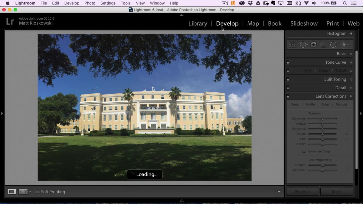 Lightroom Basic panel with shadows lifted and highlights pulled down
Once the merged panorama appears in your catalog, the editing is more restrained than you might expect. Matt lifts the Shadows slider to open up the darker areas under the tree line, and pulls Highlights down slightly to recover any blown sky. Both moves are about recovering range, not adding drama.
Lightroom Basic panel with shadows lifted and highlights pulled down
Once the merged panorama appears in your catalog, the editing is more restrained than you might expect. Matt lifts the Shadows slider to open up the darker areas under the tree line, and pulls Highlights down slightly to recover any blown sky. Both moves are about recovering range, not adding drama.
For Whites and Blacks, he uses the Option/Alt-click method on each slider. Hold the key and drag the Whites slider until you see the first small specks of clipping appear, then back off slightly. Do the same on the Blacks slider in the opposite direction until you see the first shadow clipping. This sets the tonal range to the actual limits of the image data rather than guessing by eye. A small bump in Vibrance and Clarity finishes the basic adjustments. The goal here is a clean, accurate file for print, not a stylized look.
Step 5: Apply Lens Corrections and Check Upright
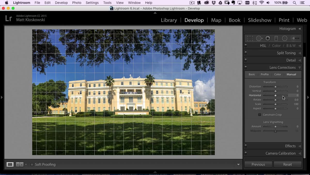 Lens Corrections panel with Profile Corrections enabled and Upright set to Auto
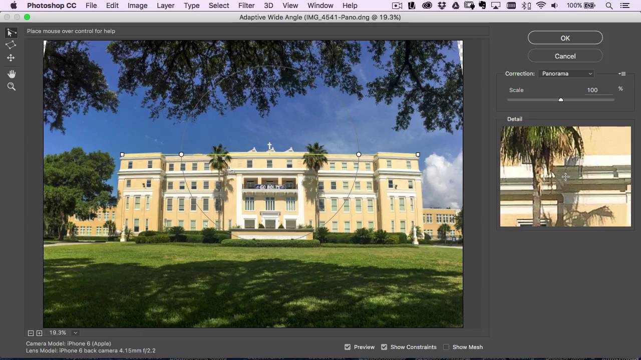
Go to the Lens Corrections panel and enable Profile Corrections. Even though this was shot on a phone without a traditional lens profile, Lightroom will apply a correction based on the device metadata. Then check the Upright options. Matt found that Auto did a solid job of leveling the horizon and straightening the vertical lines in the building without introducing visible distortion. Level produced a similar result. The other Upright modes introduced more aggressive perspective correction that didn’t suit the image.
Lens Corrections panel with Profile Corrections enabled and Upright set to Auto
Go to the Lens Corrections panel and enable Profile Corrections. Even though this was shot on a phone without a traditional lens profile, Lightroom will apply a correction based on the device metadata. Then check the Upright options. Matt found that Auto did a solid job of leveling the horizon and straightening the vertical lines in the building without introducing visible distortion. Level produced a similar result. The other Upright modes introduced more aggressive perspective correction that didn’t suit the image.
The takeaway is to try Auto first, then Level, and only go further if the architecture in the frame is visibly leaning. Over-correcting Upright on wide panoramas can stretch the sky or compress the foreground in ways that look worse than the original tilt.
Step 6: Spot Heal and Prepare for Export
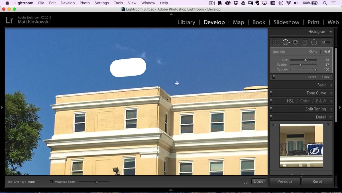 Spot healing brush removing small distractions in the zoomed-in view
Zoom in and use the Spot Removal tool in Heal mode to clean up any small distractions across the panorama. In this case there were a handful of minor elements to remove. On a canvas print, which has a slightly soft texture compared to photo paper, fine detail differences between a spot-healed area and the surrounding image become nearly invisible. Matt makes that point explicitly, and it’s a useful calibration for anyone who over-retouches files destined for canvas or fabric output.
Spot healing brush removing small distractions in the zoomed-in view
Zoom in and use the Spot Removal tool in Heal mode to clean up any small distractions across the panorama. In this case there were a handful of minor elements to remove. On a canvas print, which has a slightly soft texture compared to photo paper, fine detail differences between a spot-healed area and the surrounding image become nearly invisible. Matt makes that point explicitly, and it’s a useful calibration for anyone who over-retouches files destined for canvas or fabric output.
One Thing I’d Add From My Own Work
When I’m preparing a merged panorama for a large print, I take the exported DNG from Lightroom into Photoshop and run one additional check before sending to the printer. I flatten the image, then run Filter, Camera Raw Filter, and use the Calibration tab to do a final white balance check under a soft proofing profile. Lightroom’s soft proofing is solid, but for canvas specifically, where ink saturation can shift cooler than expected, I find this extra step catches color drift before it hits the physical print. It adds maybe three minutes to the process and has saved me reprint conversations more than once.
The biggest thing this workflow demonstrates is that the output goal should shape every decision. Canvas print for a bedroom wall doesn’t need the same level of retouching obsession as a magazine cover. The right amount of correction is the amount that makes the final object look good, not the amount that impresses you at 200% zoom on a calibrated monitor.
Watch the full tutorial on YouTube to see Matt walk through the merge and adjustments in real time. The pacing is efficient and the reasoning behind each choice is clear, which is rare in workflow tutorials.
Comments (1)
Wow, I had no idea you could do this. Mind blown.
Leave a Comment