
I have a spreadsheet. It tracks every hour I’ve saved through automation across fifteen years of post-production work. The number is sitting above 2,400 hours right now, and a significant chunk of that comes from one deceptively simple habit: building reusable Lightroom presets before I start any serious editing session. When a client sends me 300 product shots from the same studio setup, I don’t want to be dialing in the same warm tone and compressed contrast curve by hand 300 times. I want to make those decisions once, lock them in, and move.
That’s exactly what this tutorial addresses. In this Aaron Nace (PHLEARN) tutorial, the process is kept practical and clear, without overselling the technique or turning it into a style exercise. If you want the full visual walkthrough first, here it is: Watch the full tutorial on YouTube. But if you want a written guide you can follow step-by-step with your own images open, read on.
The approach Nace demonstrates is one I’d recommend to anyone working in Lightroom Classic at volume. The key insight is not just how to save a preset, but what to include in it and, just as importantly, what to leave out.
Step 1: Open Your Image in the Develop Module
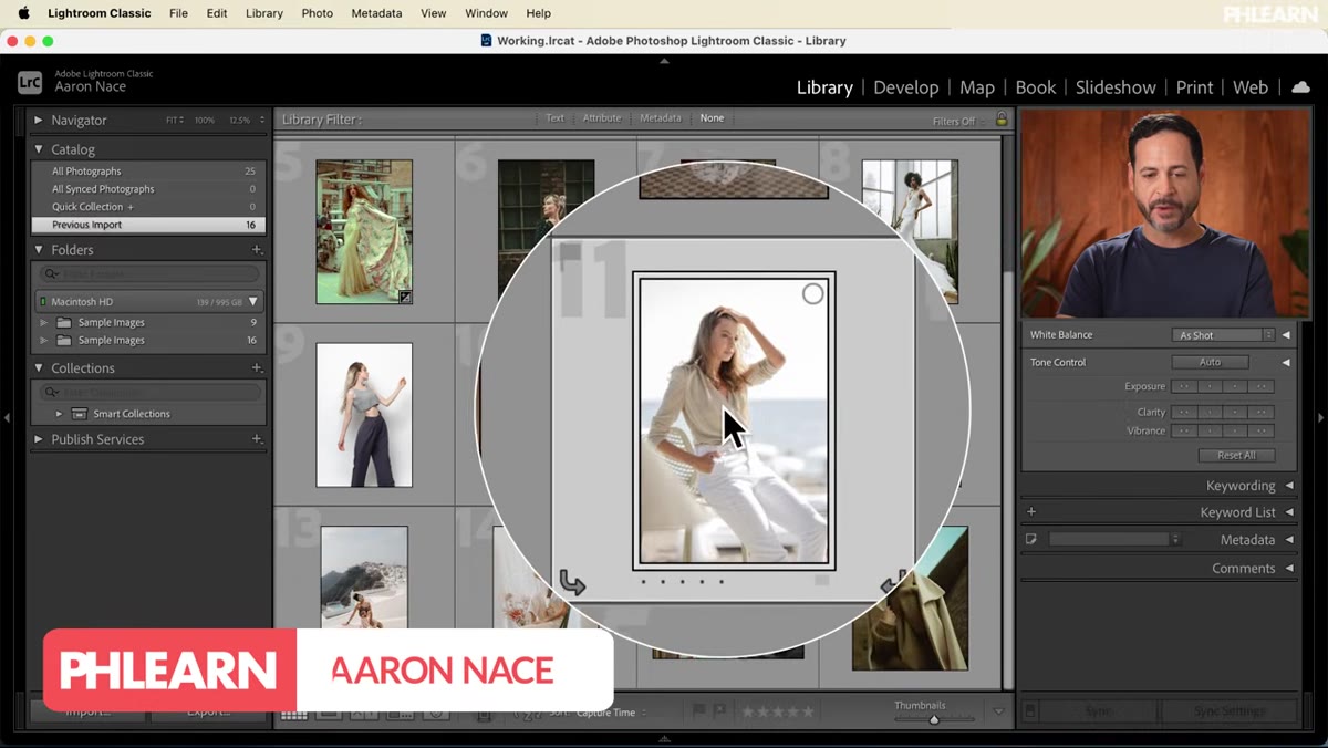 Lightroom Classic Develop module open with a single image
Start in Lightroom Classic by double-clicking the image you want to use as your preset reference. Switch to the Develop module using the tab in the top-right corner. This should be a photo that represents the general look you’re going for, not necessarily a perfect exposure, but something close enough that your adjustments will translate logically to similar shots.
Lightroom Classic Develop module open with a single image
Start in Lightroom Classic by double-clicking the image you want to use as your preset reference. Switch to the Develop module using the tab in the top-right corner. This should be a photo that represents the general look you’re going for, not necessarily a perfect exposure, but something close enough that your adjustments will translate logically to similar shots.
Resist the urge to pick an image with extreme lighting problems. You want a preset that’s doing a job, not one that’s compensating for a bad capture.
Step 2: Adjust Tone Settings in the Basic Panel
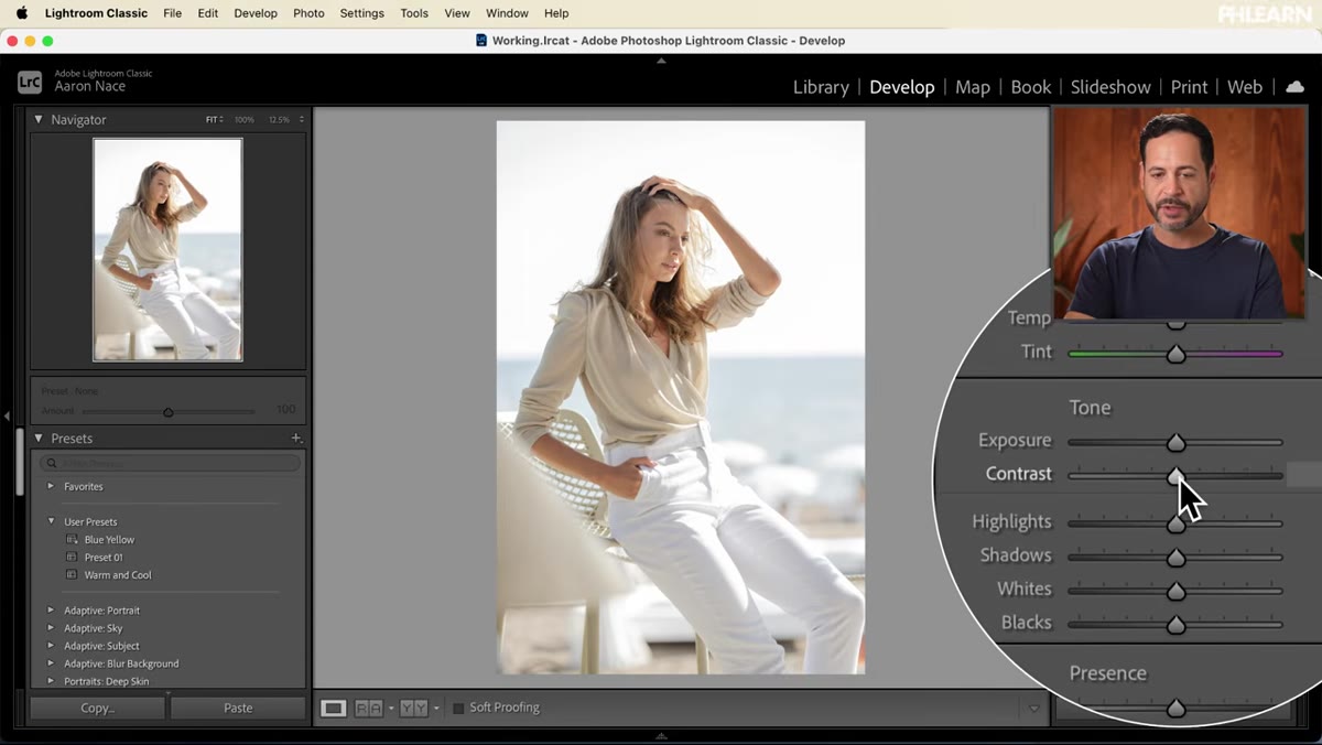 Basic panel with Contrast, Highlights, and Shadows sliders adjusted
With the Develop module open, go to the Basic panel on the right side. The adjustments in this tutorial are intentionally subtle: pull the Contrast down a bit, bring the Highlights down, and lift the Shadows. The goal is a flatter, softer base tone that still reads as natural.
Basic panel with Contrast, Highlights, and Shadows sliders adjusted
With the Develop module open, go to the Basic panel on the right side. The adjustments in this tutorial are intentionally subtle: pull the Contrast down a bit, bring the Highlights down, and lift the Shadows. The goal is a flatter, softer base tone that still reads as natural.
This kind of low-contrast treatment is popular for a reason. It gives you room. When a preset bakes in heavy contrast, it starts fighting with images that already have strong directional light. Keep the tonal moves modest here and let color grading carry the personality of the style.
Step 3: Apply Color Grading to the Midtones, Shadows, and Highlights
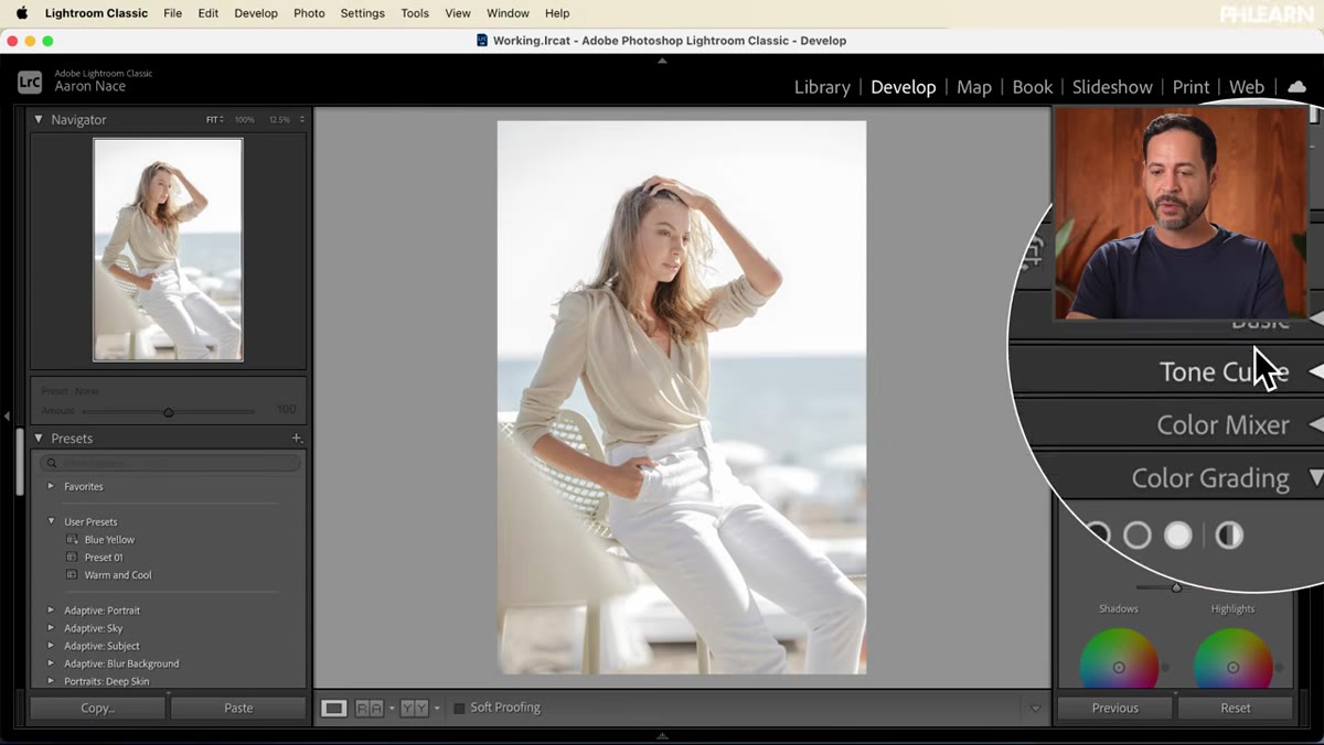 Color Grading panel showing midtone and shadow wheels adjusted
Collapse the Basic panel and scroll down to Color Grading. This panel gives you three separate color wheels for shadows, midtones, and highlights. To add a color cast, click the dot in the center of a wheel and drag outward toward the hue you want. The further you drag, the more saturated the effect.
Color Grading panel showing midtone and shadow wheels adjusted
Collapse the Basic panel and scroll down to Color Grading. This panel gives you three separate color wheels for shadows, midtones, and highlights. To add a color cast, click the dot in the center of a wheel and drag outward toward the hue you want. The further you drag, the more saturated the effect.
For this particular look, pushing the midtones toward warm orange-yellow gives the image a sunny, outdoor feel. Dragging the shadows slightly cooler (toward blue or teal) adds depth and separation without looking stylized. The Balance slider controls how much each zone bleeds into the adjacent tonal range. The small icon on the outer ring of each wheel lets you fine-tune the hue after you’ve set the saturation, which is a useful detail if you want precision without resetting everything.
Step 4: Check Your Before and After
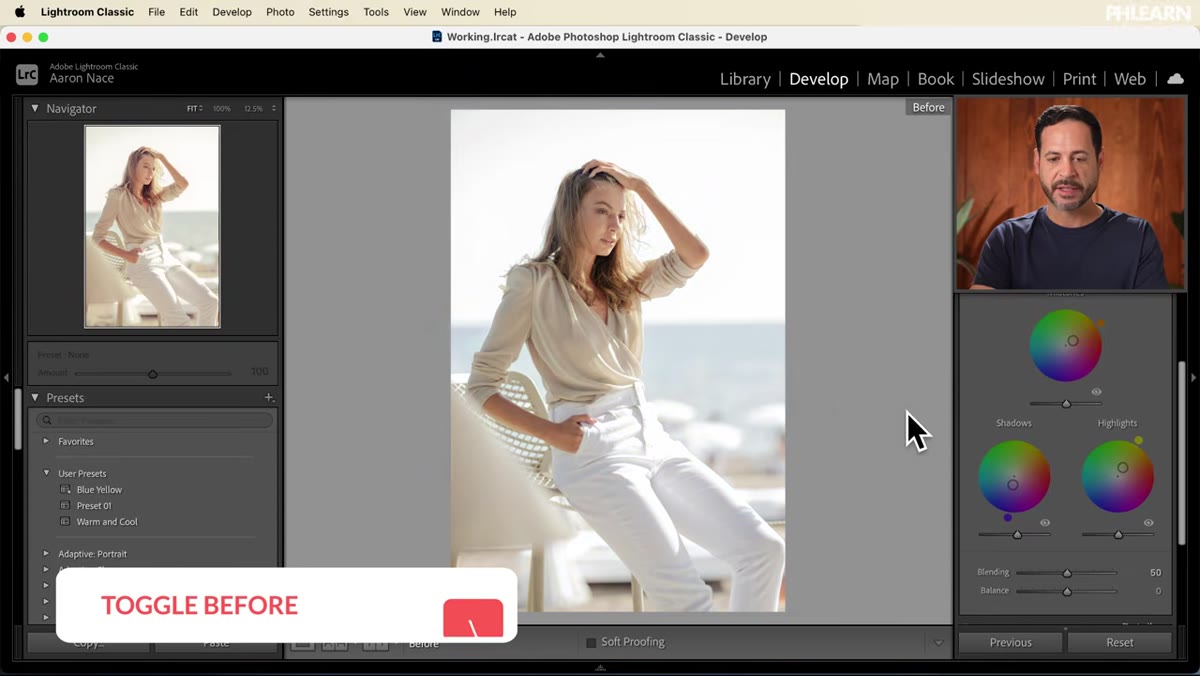 Before and after comparison using the backslash key toggle
Before saving anything, press the backslash key to toggle between your original image and your edited version. This is a quick gut-check moment. If the edit looks too heavy or the color feels forced, dial it back now. What you’re aiming for is a treatment that reads as “improved” on a first glance, not “filtered.”
Before and after comparison using the backslash key toggle
Before saving anything, press the backslash key to toggle between your original image and your edited version. This is a quick gut-check moment. If the edit looks too heavy or the color feels forced, dial it back now. What you’re aiming for is a treatment that reads as “improved” on a first glance, not “filtered.”
Presets with too strong a hand tend to get abandoned after the first month. The ones that stay in rotation are the ones you barely notice working.
Step 5: Save the Preset with the Right Name and Settings
 Create Preset dialog box with descriptive name entered and checkboxes selected
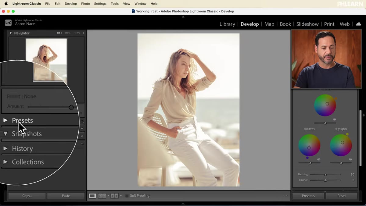
On the left panel in the Develop module, find the Presets section and click the small plus icon at the top. Select “Create Preset” from the menu that appears. Name it descriptively based on what it actually does, something like “Warm Low Contrast” rather than “Summer Vibes.” When you return to this preset six months later, the functional name tells you immediately what it’s going to do to an image.
Create Preset dialog box with descriptive name entered and checkboxes selected
On the left panel in the Develop module, find the Presets section and click the small plus icon at the top. Select “Create Preset” from the menu that appears. Name it descriptively based on what it actually does, something like “Warm Low Contrast” rather than “Summer Vibes.” When you return to this preset six months later, the functional name tells you immediately what it’s going to do to an image.
Here’s the part that matters most: in the preset creation dialog, hit “Check None” at the bottom before selecting anything. Then manually check only the settings you actually adjusted. In this case, that’s Contrast, Highlights, Shadows, and Color Grading. Leaving everything else unchecked means the preset won’t overwrite any exposure corrections or lens corrections you’ve already made to a target image. This is the difference between a preset that plays well with others and one that constantly creates extra cleanup work.
Step 6: Apply the Preset to Additional Images
 Warm Low Contrast preset applied to a second image in the Develop module
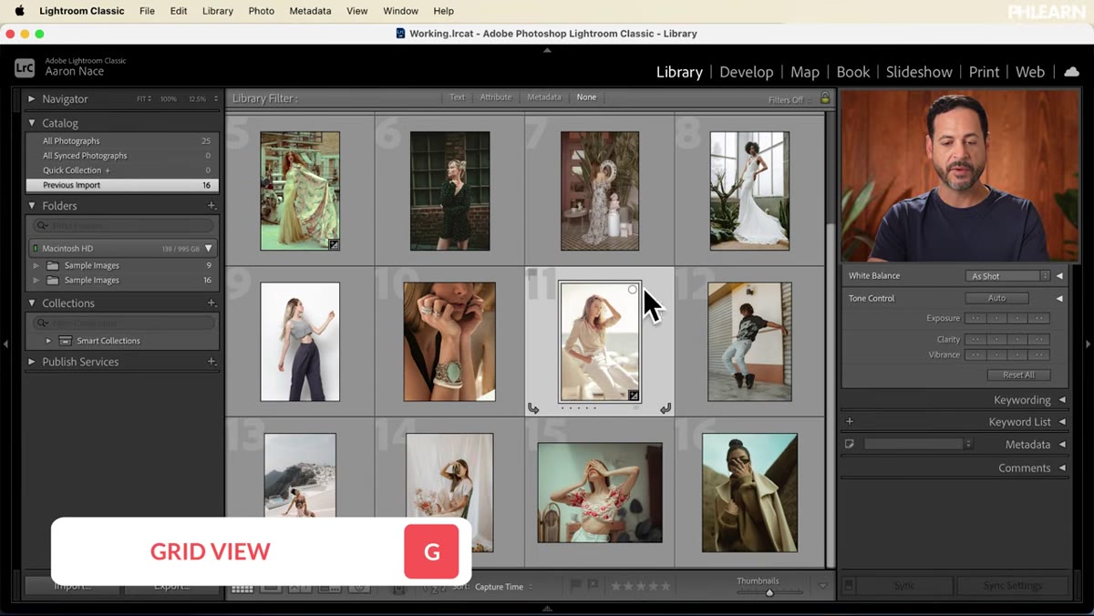
Return to the Library module by pressing G to get to the Grid view. Select any other image from the same shoot or a similar setting. Open it in the Develop module and click your new preset in the Presets panel on the left. The adjustments apply instantly.
Warm Low Contrast preset applied to a second image in the Develop module
Return to the Library module by pressing G to get to the Grid view. Select any other image from the same shoot or a similar setting. Open it in the Develop module and click your new preset in the Presets panel on the left. The adjustments apply instantly.
You can also apply presets directly from the Grid view by hovering over a preset name, which shows a live preview in the thumbnail. That preview feature alone can save significant time when you’re deciding which preset works across a batch.
A Note on Preset Scope from Commercial Work
One thing I’d add from years of doing this for ad agency clients: build presets in sets, not in isolation. I typically have three or four variants of any given look: one at full strength, one at roughly 60 percent intensity for difficult images, and one that handles highlights more conservatively for product shots with shiny surfaces. You create the first one following the exact steps above, then duplicate it and make small adjustments. Lightroom lets you organize these into named groups, and color-coding your folder structure (yes, even in Lightroom) makes the system faster to navigate under deadline pressure.
Also, keep a “neutral reset” preset in your User Presets folder. It sets everything back to zero. When you’re troubleshooting why an image looks strange after a preset is applied, a single click to reset and reapply is faster than hunting through sliders.
The single most important idea in this whole workflow is the “Check None, then select only what you changed” rule when creating the preset. That one habit prevents the majority of preset-related headaches: blown-out exposures, unexpected white balance shifts, lost crop settings. Everything else in this process is straightforward once you understand why that step exists.
Watch the full tutorial on YouTube to see Aaron walk through the color grading wheels and the preset panel in real time. Seeing the color wheels in motion makes the dragging behavior a lot easier to replicate than reading about it.
Comments
Leave a Comment