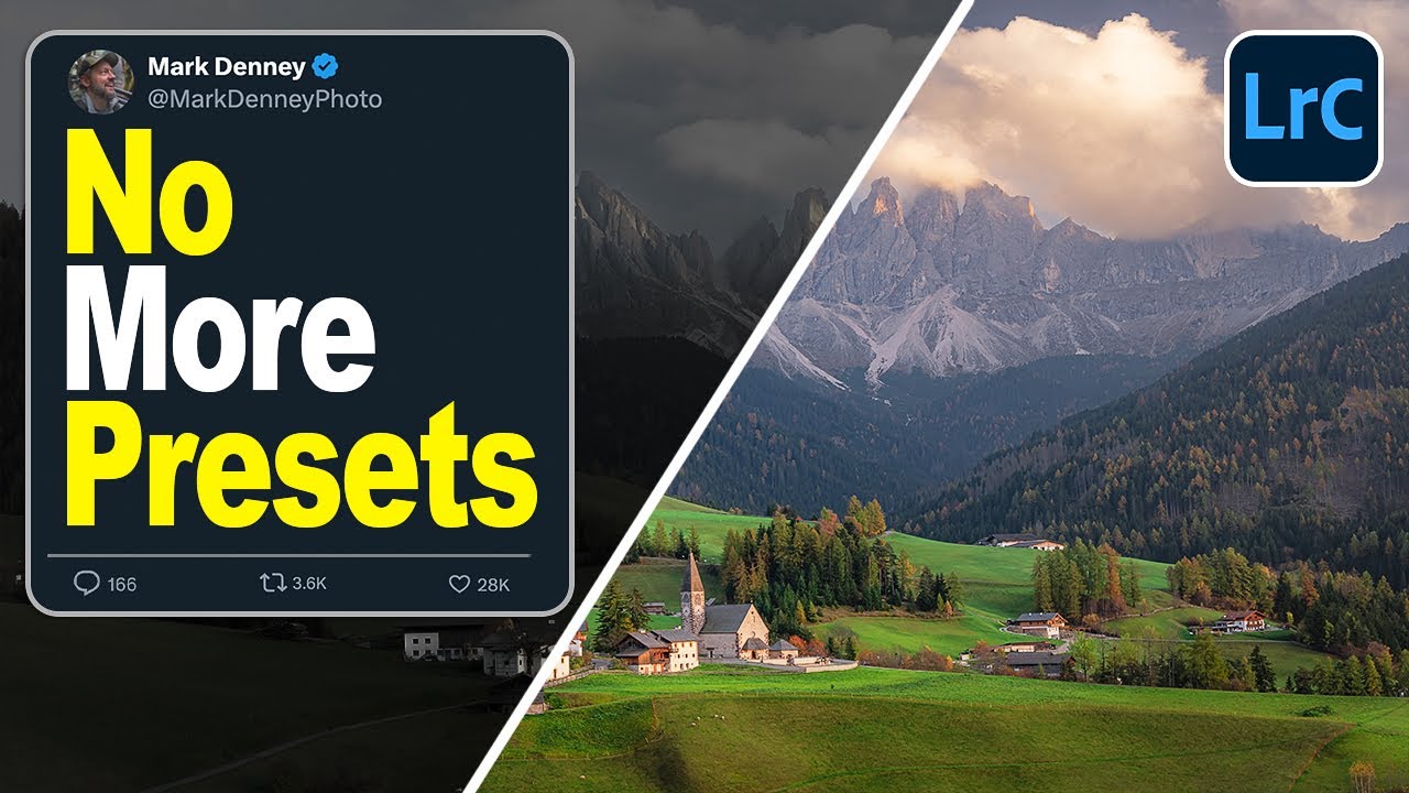
I track time obsessively. I have a spreadsheet that logs every hour my automation tools have saved me, and right now it’s sitting at over 2,400 hours. So when I see a feature that genuinely changes how fast I can get from import to edit-ready, I pay attention. Presets have always been my first line of defense against flat RAW files, but I’ve quietly suspected there was a smarter way to handle that initial color foundation. Turns out, Lightroom quietly added it.
In this Mark Denney tutorial, he walks through Lightroom’s adaptive color profiles, a feature that most people scroll right past when they’re hunting for a preset. Watch the full tutorial on YouTube before or after reading this breakdown. The core idea is simple but meaningful: instead of applying the same color treatment to every image, the profile actually analyzes what’s in the frame and adjusts accordingly. For landscape photographers especially, that distinction matters. A moody overcast shot and a golden-hour scene shouldn’t wear the same color coat.
What struck me most is how this changes the starting point rather than the finish line. I’m not replacing my editing process, I’m replacing the blank canvas I used to start from. Here’s how to put it to work.
Step 1: Understand What You’re Looking At When You Import a RAW File
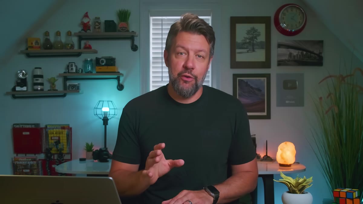 Flat, dull RAW file shown in Lightroom develop module
When a RAW file lands in Lightroom, it’s intentionally undercooked. The colors are muted, contrast is low, and the image looks nothing like what you actually saw when you pressed the shutter. That’s not a flaw in your camera or your exposure, it’s by design. RAW files are built to hold information rather than render a finished look, and that leaves the interpretation entirely up to you.
Flat, dull RAW file shown in Lightroom develop module
When a RAW file lands in Lightroom, it’s intentionally undercooked. The colors are muted, contrast is low, and the image looks nothing like what you actually saw when you pressed the shutter. That’s not a flaw in your camera or your exposure, it’s by design. RAW files are built to hold information rather than render a finished look, and that leaves the interpretation entirely up to you.
The traditional response to this is to start pulling sliders: white balance, contrast, shadows, highlights, vibrance, tone curves. It works, but it’s slow, and it means every image starts from the same neutral zero point regardless of what the scene actually contains.
Step 2: Open the Profile Browser
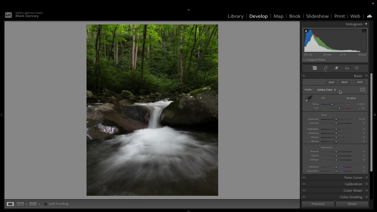 Profile browser icon (four squares) highlighted in top-right of Basic panel
The profile browser is easy to miss if you haven’t gone looking for it. In the Develop module, look at the very top of the Basic panel on the right side. You’ll see a small icon that looks like four squares arranged in a grid. Click that, and it opens the full profile browser.
Profile browser icon (four squares) highlighted in top-right of Basic panel
The profile browser is easy to miss if you haven’t gone looking for it. In the Develop module, look at the very top of the Basic panel on the right side. You’ll see a small icon that looks like four squares arranged in a grid. Click that, and it opens the full profile browser.
This is not the same as the Presets panel. Profiles work underneath your adjustments, they don’t touch your sliders at all. Think of a profile as the color science foundation the image is built on, while presets sit on top of that and move the controls you’d move manually.
Step 3: Browse the Standard Adobe RAW Profiles First
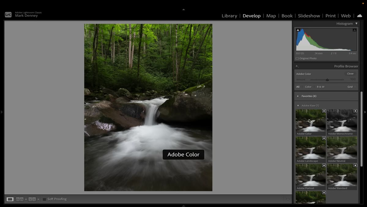 Adobe RAW profile options listed: Color, Landscape, Neutral, Portrait, Standard
Inside the profile browser, scroll down to the Adobe RAW section. You’ll find options like Adobe Color, Adobe Landscape, Adobe Neutral, Adobe Portrait, and Adobe Standard. Hovering over each one gives you a live preview on the image behind the panel, so you can see the effect without committing to anything.
Adobe RAW profile options listed: Color, Landscape, Neutral, Portrait, Standard
Inside the profile browser, scroll down to the Adobe RAW section. You’ll find options like Adobe Color, Adobe Landscape, Adobe Neutral, Adobe Portrait, and Adobe Standard. Hovering over each one gives you a live preview on the image behind the panel, so you can see the effect without committing to anything.
Most people default to Adobe Color and never look further. These standard profiles are solid, but their changes are subtle. Toggling between them on the same image, you’ll see gentle shifts in contrast and saturation rather than dramatic transformations. They’re useful, but they’re not responsive to your specific image.
Step 4: Locate the Adaptive Profiles Section
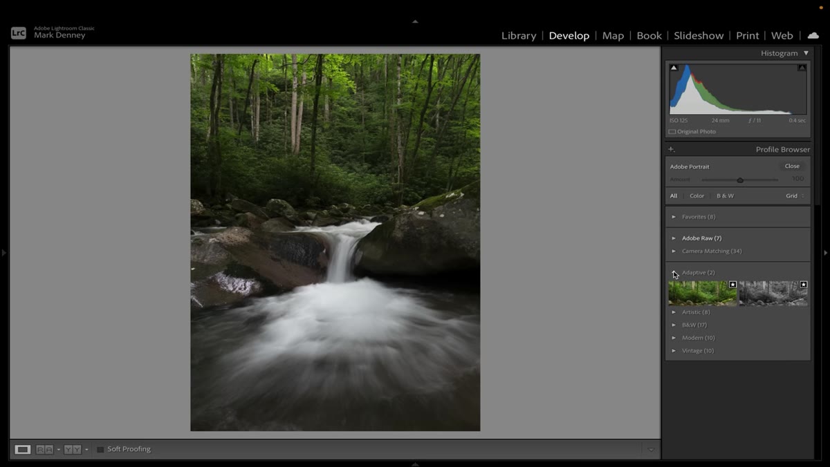 “Adaptive” section visible in profile browser with Adaptive Color and Adaptive Black and White options
Keep scrolling in the profile browser and you’ll find a section labeled Adaptive. There are two options: Adaptive Color and Adaptive Black and White. Hover over Adaptive Color and the shift you see will be noticeably more dramatic than anything in the Adobe RAW section.
“Adaptive” section visible in profile browser with Adaptive Color and Adaptive Black and White options
Keep scrolling in the profile browser and you’ll find a section labeled Adaptive. There are two options: Adaptive Color and Adaptive Black and White. Hover over Adaptive Color and the shift you see will be noticeably more dramatic than anything in the Adobe RAW section.
The reason is that this profile doesn’t apply a fixed formula. It reads the content of the image, the color range, the lighting conditions, the tonal distribution, and builds a treatment specific to that frame. Two different images will receive two different interpretations from the same profile. That’s the entire point, and it’s what separates it from every other option in that browser.
Step 5: Apply Adaptive Color and Check the Amount Slider
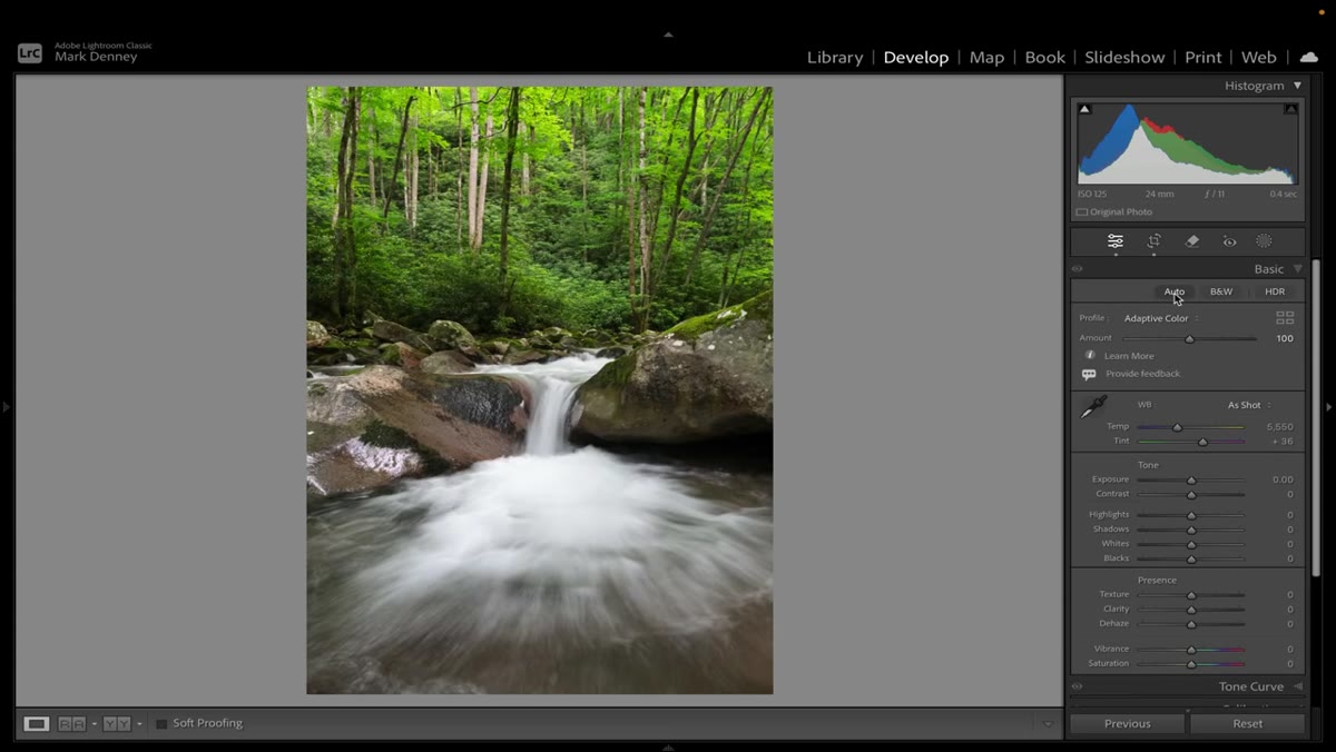 Adaptive Color applied, Amount slider visible below profile name in Basic panel
Once you select Adaptive Color, close the profile browser and look at the top of the Basic panel. You’ll now see a slider labeled Amount directly below the profile name. This controls the intensity of the adaptive treatment, and it runs from 0 to 100 (and possibly beyond, depending on your version).
Adaptive Color applied, Amount slider visible below profile name in Basic panel
Once you select Adaptive Color, close the profile browser and look at the top of the Basic panel. You’ll now see a slider labeled Amount directly below the profile name. This controls the intensity of the adaptive treatment, and it runs from 0 to 100 (and possibly beyond, depending on your version).
Mark’s recommendation is to dial it back to around 80 as a starting point rather than leaving it at full strength. I’d second that. At 100, some images feel pushed a little hard before you’ve even touched a slider yourself. At 80, you get the benefit of the image-aware color treatment while leaving room for your own adjustments to breathe on top of it. The key thing to notice: none of your sliders have moved. Your exposure, contrast, and tone curve are all still at zero. This is purely a shift in the color foundation.
Step 6: Use This as Your New Baseline, Not Your Final Look
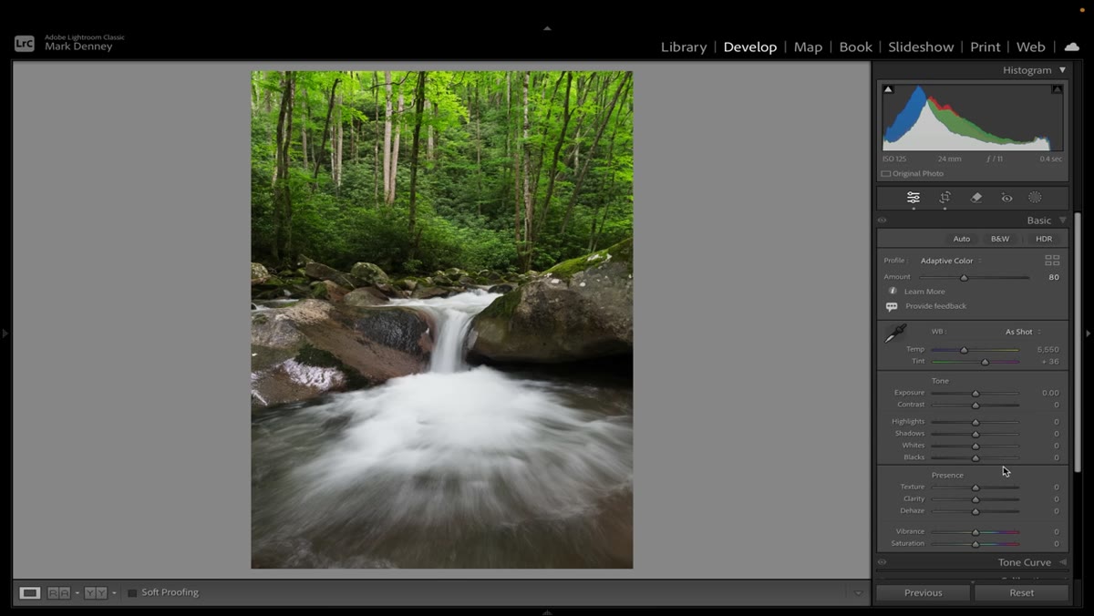 Sliders panel showing all values unchanged after Adaptive Color profile is applied
The real workflow shift here is treating Adaptive Color as the new import default rather than a finishing touch. Before reaching for a preset or starting to drag sliders, drop the adaptive profile in first. Let Lightroom do the scene analysis, set your Amount to somewhere between 70 and 85, and then look at what you’re actually working with.
Sliders panel showing all values unchanged after Adaptive Color profile is applied
The real workflow shift here is treating Adaptive Color as the new import default rather than a finishing touch. Before reaching for a preset or starting to drag sliders, drop the adaptive profile in first. Let Lightroom do the scene analysis, set your Amount to somewhere between 70 and 85, and then look at what you’re actually working with.
From that point, your manual adjustments become refinements rather than rescue operations. You’re not trying to pull color and life out of a flat file, you’re tuning an image that already has a reasonable foundation. For high-volume work, that time savings compounds fast.
How I’m Folding This Into My Own Workflow
I primarily shoot product and commercial work, not landscapes, so I came into this tutorial a little skeptical about how much of it would translate. But the underlying logic applies anywhere. When I’m processing a batch of e-commerce shots, the flat-RAW problem is real even when the subject is a bottle of shampoo instead of a mountain range.
What I’ve started doing is setting Adaptive Color as the default profile in my import presets, something you can do by building a Develop preset that includes only the profile change and no slider adjustments. That way, every RAW file I open already has image-aware color science applied. My actual editing presets layer on top of that. The result is fewer “why does this look so dead before I’ve done anything” moments, which used to eat more time than I’d like to admit.
One honest caveat: for images where you want precise, predictable color rendering (product shots against a controlled white background, for example) the adaptive behavior can occasionally push things in a direction you didn’t want. In those cases, Adobe Color or a camera-matching profile might give you a more neutral starting point. It’s worth testing both on your own subject matter.
The single biggest takeaway from this tutorial is that profiles and presets are doing fundamentally different jobs, and confusing the two means you’re probably starting your edits further back than you need to. Adaptive Color profiles give Lightroom the ability to make an informed first move based on what’s actually in your image. That’s not a small thing.
Watch the full tutorial on YouTube to see Mark walk through the before-and-after comparisons on his own landscape images. The visual difference when he flips from Adobe Color to Adaptive Color mid-video is worth seeing for yourself.
Comments (2)
Finally someone explains this in a way that actually makes sense.
Couldn't agree more. I've seen this make a huge difference in landscape work specifically.
Leave a Comment