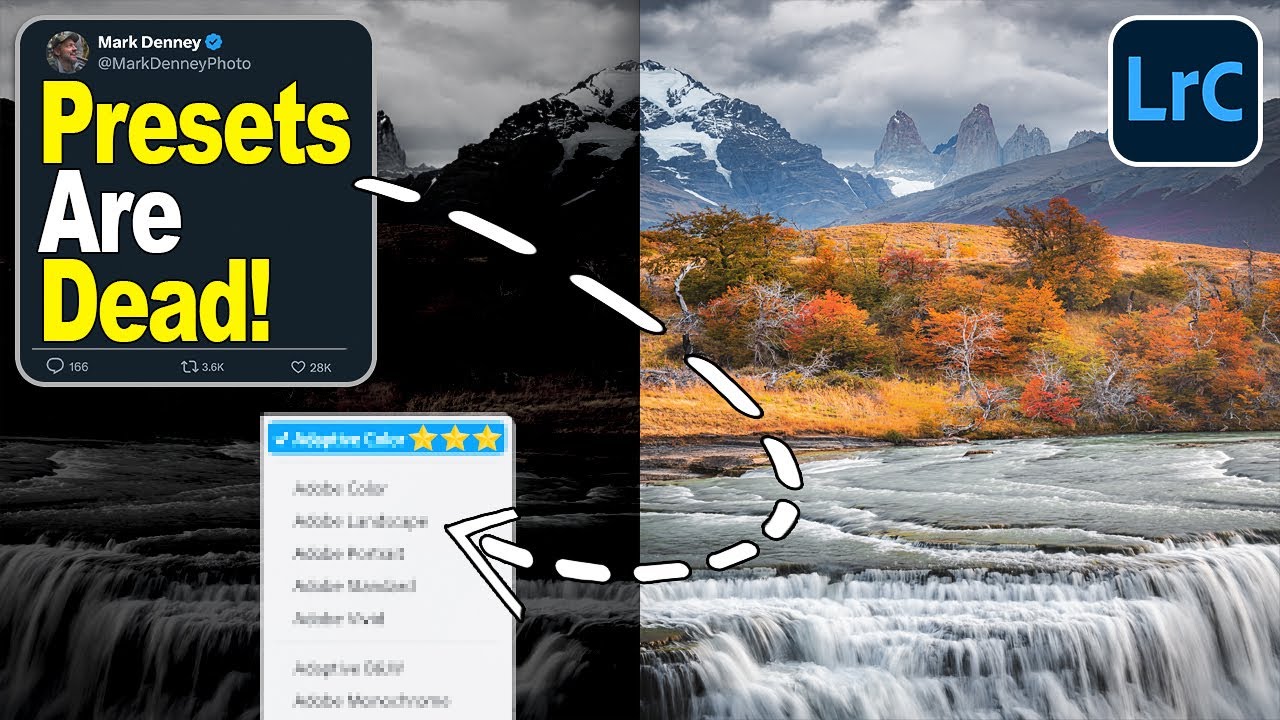
I’ve spent fifteen years watching editors reach for presets the moment a raw file hits the screen. I get it. Presets are fast, they’re consistent, and when you’re processing a hundred images for a client, speed matters. But presets have a fundamental problem: they apply a fixed look to images that are all fundamentally different. What works on a golden-hour desert shot falls apart on a flat, overcast forest scene. I’ve been hunting for a better starting point for a while, something that adapts rather than overrides.
That’s what stopped me mid-scroll when I came across Watch the full tutorial on YouTube from landscape photographer Mark Denney. In this tutorial, Denney walks through a complete edit of a Patagonia shot using Lightroom’s Adaptive Color profile, and he makes a compelling case that this profile isn’t just another option in a dropdown menu. It’s a fundamentally different kind of tool. Unlike a preset, it doesn’t impose a look. It reads the image and responds to what’s already there. That distinction matters more than it sounds.
What follows is a complete step-by-step breakdown of Denney’s workflow so you can follow along and apply it to your own landscape edits without pausing the video every thirty seconds.
Step 1: Switch the Profile from Adobe Color to Adaptive Color
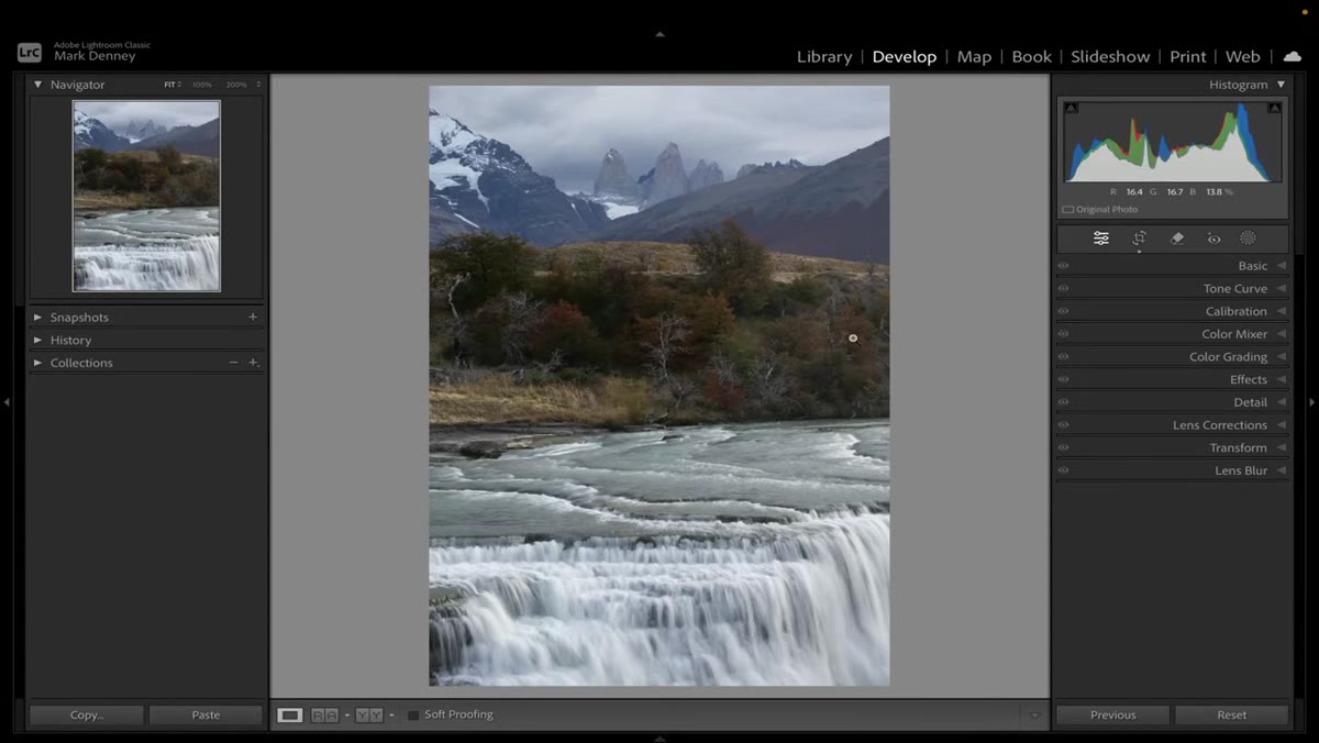 Changing profile from Adobe Color to Adaptive Color in Lightroom
Before touching a single slider, Denney opens the Profile section at the top of the Basic panel and swaps Adobe Color for Adaptive Color. This is the entire foundation of the edit. The shift is subtle on first glance, but once you increase the exposure temporarily to make the changes more visible, the difference in how the colors and tones respond becomes obvious. Adaptive Color is reading the image content and building its tone mapping around it. Adobe Color is applying a fixed curve regardless of what’s in the frame. That’s the distinction worth internalizing before you go any further.
Changing profile from Adobe Color to Adaptive Color in Lightroom
Before touching a single slider, Denney opens the Profile section at the top of the Basic panel and swaps Adobe Color for Adaptive Color. This is the entire foundation of the edit. The shift is subtle on first glance, but once you increase the exposure temporarily to make the changes more visible, the difference in how the colors and tones respond becomes obvious. Adaptive Color is reading the image content and building its tone mapping around it. Adobe Color is applying a fixed curve regardless of what’s in the frame. That’s the distinction worth internalizing before you go any further.
Step 2: Set Your Tone Foundation with Shadows, Blacks, Whites, and Highlights
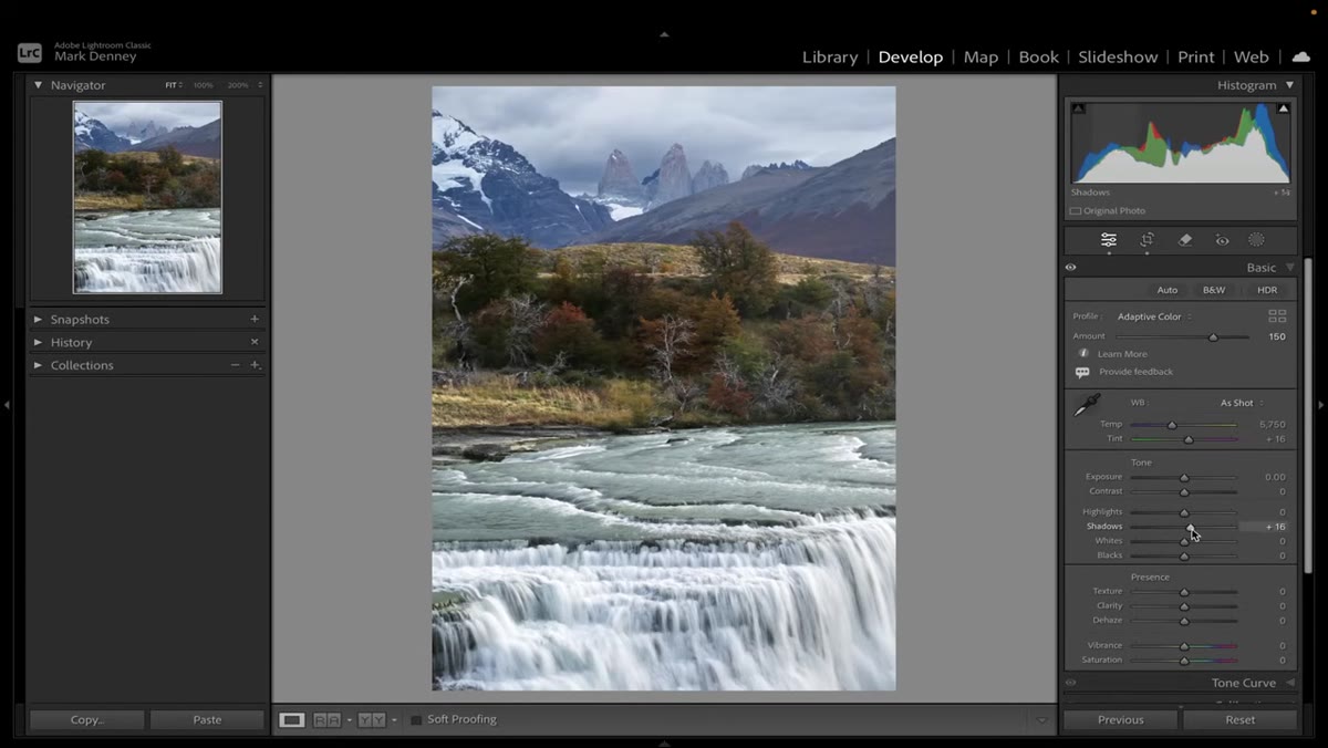 Shadows and blacks raised, whites and highlights pulled down in Basic panel
Denney’s first pass at the sliders follows a logic I recognize from my own work: lift the shadow detail, protect the highlights, and then dial in overall exposure. He raises the Shadows significantly, nudges the Blacks up slightly, then uses Option-click (Alt on PC) on the Whites slider to pull it down until clipping disappears entirely. Highlights come down a fair amount after that, and then overall Exposure is reduced just a touch to settle the image into a natural tonal range. This sequence matters because you want to see the full dynamic range of the raw file before you start making color decisions on top of a badly exposed base.
Shadows and blacks raised, whites and highlights pulled down in Basic panel
Denney’s first pass at the sliders follows a logic I recognize from my own work: lift the shadow detail, protect the highlights, and then dial in overall exposure. He raises the Shadows significantly, nudges the Blacks up slightly, then uses Option-click (Alt on PC) on the Whites slider to pull it down until clipping disappears entirely. Highlights come down a fair amount after that, and then overall Exposure is reduced just a touch to settle the image into a natural tonal range. This sequence matters because you want to see the full dynamic range of the raw file before you start making color decisions on top of a badly exposed base.
Step 3: Add Contrast, Then Use Clarity and Texture as Opposites
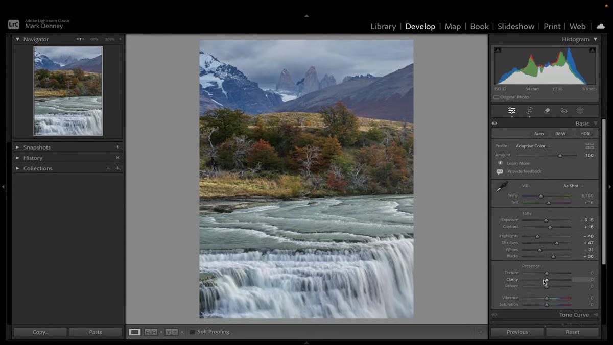 Clarity at minus 20, Texture at plus 15 in the Presence section
After the tone sliders, Denney adds a bit of Contrast, then does something I find genuinely useful: he sets Clarity to -20 and Texture to +15. These two controls work at different frequency levels of detail. Clarity affects the large-scale midtone contrast, the kind that makes images look punchy but can also make them look heavy and over-processed. Texture works on finer surface detail without touching the broader structure. By softening Clarity and boosting Texture, you get an image that feels smooth and natural but still has genuine detail. He also lifts Dehaze slightly. The result reads as crisp without looking like it was sharpened with a brick, which is a trap a lot of landscape edits fall into.
Clarity at minus 20, Texture at plus 15 in the Presence section
After the tone sliders, Denney adds a bit of Contrast, then does something I find genuinely useful: he sets Clarity to -20 and Texture to +15. These two controls work at different frequency levels of detail. Clarity affects the large-scale midtone contrast, the kind that makes images look punchy but can also make them look heavy and over-processed. Texture works on finer surface detail without touching the broader structure. By softening Clarity and boosting Texture, you get an image that feels smooth and natural but still has genuine detail. He also lifts Dehaze slightly. The result reads as crisp without looking like it was sharpened with a brick, which is a trap a lot of landscape edits fall into.
Step 4: Use the Calibration Panel to Deepen Fall Color
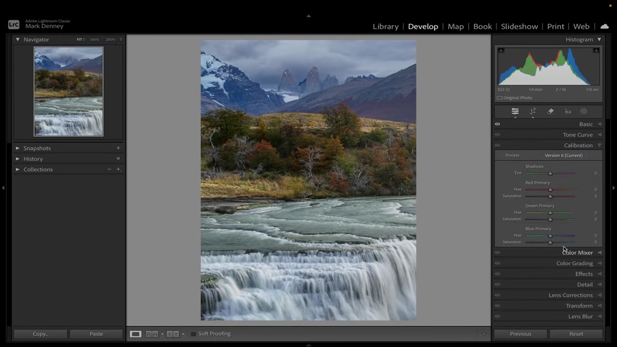 Blue Primary hue and saturation boosted in Calibration panel
This is the step most editors skip, and it’s doing a lot of the heavy lifting here. Denney goes to the Camera Calibration panel at the bottom of the panel stack and works the Blue Primary and Green Primary sliders. He pushes the Blue Primary Saturation up significantly and shifts the Hue slightly. Then he boosts the Green Primary Saturation and shifts that Hue as well. The Calibration panel changes the raw color primaries before any other processing happens, which means the effect is deep and global in a way that HSL adjustments can’t fully replicate. Yes, the image looks way too blue at this point. That’s intentional. You’re loading the palette, not finishing the painting.
Blue Primary hue and saturation boosted in Calibration panel
This is the step most editors skip, and it’s doing a lot of the heavy lifting here. Denney goes to the Camera Calibration panel at the bottom of the panel stack and works the Blue Primary and Green Primary sliders. He pushes the Blue Primary Saturation up significantly and shifts the Hue slightly. Then he boosts the Green Primary Saturation and shifts that Hue as well. The Calibration panel changes the raw color primaries before any other processing happens, which means the effect is deep and global in a way that HSL adjustments can’t fully replicate. Yes, the image looks way too blue at this point. That’s intentional. You’re loading the palette, not finishing the painting.
Step 5: Pull Back the Blues in the HSL Panel
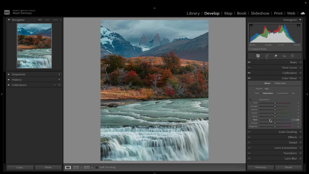 Blue saturation reduced significantly in HSL Saturation panel
With the Calibration panel loaded up, Denney heads to the HSL panel and drops the Blue Saturation substantially. This removes the oversaturated sky and mountain blues that the Calibration step introduced, while leaving the warmer colors it also enhanced untouched. This push-and-pull between Calibration and HSL is a smart workflow: use Calibration to shift the color DNA of the image globally, then use HSL to selectively walk back anything that went too far. It gives you more control than starting in HSL alone because you’ve shifted what those colors actually are at a deeper level before you start trimming them.
Blue saturation reduced significantly in HSL Saturation panel
With the Calibration panel loaded up, Denney heads to the HSL panel and drops the Blue Saturation substantially. This removes the oversaturated sky and mountain blues that the Calibration step introduced, while leaving the warmer colors it also enhanced untouched. This push-and-pull between Calibration and HSL is a smart workflow: use Calibration to shift the color DNA of the image globally, then use HSL to selectively walk back anything that went too far. It gives you more control than starting in HSL alone because you’ve shifted what those colors actually are at a deeper level before you start trimming them.
What I’d Do Differently for Product and Commercial Work
Denney’s workflow is built around landscapes, and for that use case it’s nearly perfect. But if you’re applying this logic to product photography or commercial work, you need to be careful with the Calibration panel step. Shifting the Blue and Green primaries on a product shot can drift colors away from the accurate, approved values your client signed off on. I’d suggest making the Calibration adjustments on a separate virtual copy and using the HSL panel for primary color control in those situations. The core idea still holds: build your tonal foundation first, then address color in layers. Just swap the Calibration panel for targeted HSL work and local adjustments to keep your colors true.
The other thing worth noting is that Adaptive Color performs best on raw files with real dynamic range to work with. If you’re starting with a flat or compressed file, the adaptive toning has less to respond to. I’ve seen it make a significant difference on well-exposed landscape raws and almost no difference on a crushed JPEG. Feed it good material and it earns its name.
The single biggest takeaway from Denney’s tutorial is that the profile you choose isn’t a stylistic flourish. It’s a structural decision that shapes every other adjustment you make on top of it. Starting with Adaptive Color instead of Adobe Color means you’re building on a foundation that’s already calibrated to your specific image, which makes every slider after it more predictable and more effective. It’s the kind of workflow change that seems small until you see how much easier the rest of the edit becomes.
Watch the complete walkthrough, including the final before-and-after profile comparison, here: Watch the full tutorial on YouTube
Comments (4)
Never thought of approaching it this way. Really creative.
Clear and practical. No fluff. Appreciate that.
Finally someone explains this in a way that actually makes sense.
This is fantastic. I've been recommending this approach to my readers too.
Leave a Comment