The Manual Glow Effect That Still Beats Every AI Filter I've Tried

The Manual Glow Effect That Still Beats Every AI Filter I've Tried

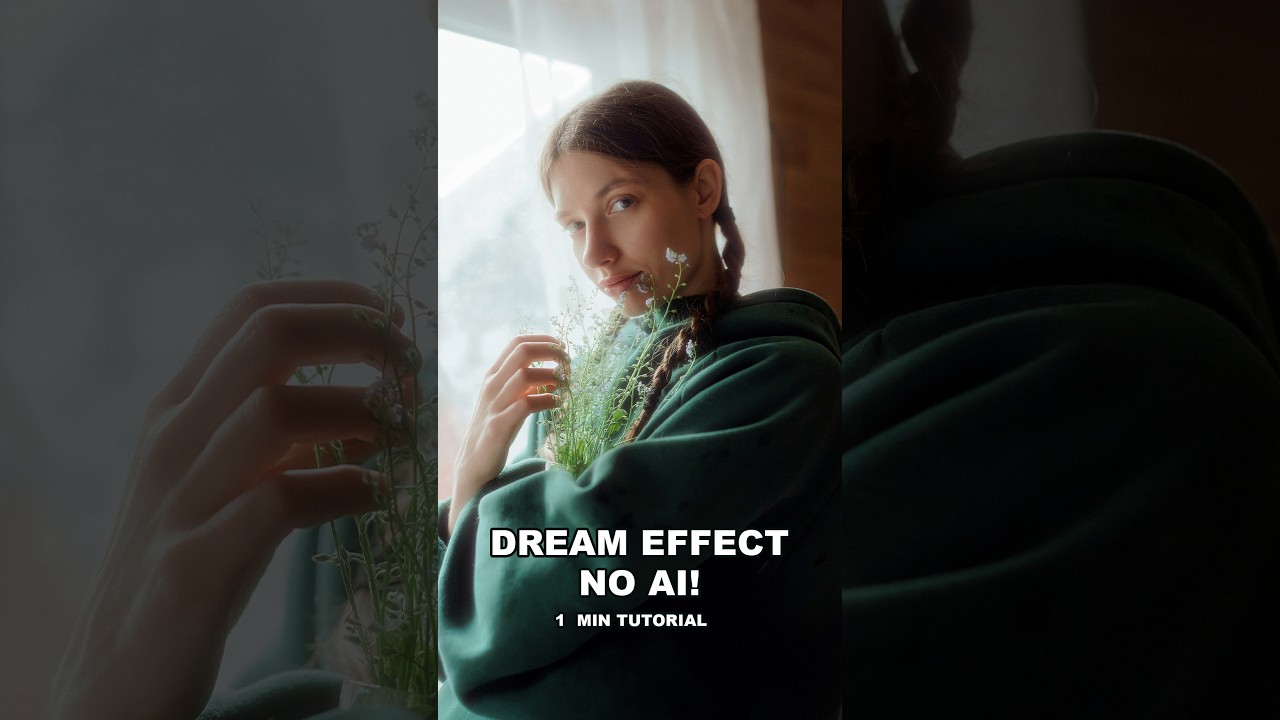
Client work has a way of humbling you. A few months back I was finishing a batch of lifestyle shots for a skincare brand, and the art director kept circling back to one note: “Can we make the light feel softer? More… luminous?” I’d already done my standard luminosity mask pass. I’d tried a couple of glow overlays from my preset library. None of it had the right quality. It looked processed rather than photographic.
How to Fake the Y2K Digicam Look in Photoshop (A Working Pro's Breakdown)

How to Fake the Y2K Digicam Look in Photoshop (A Working Pro's Breakdown)

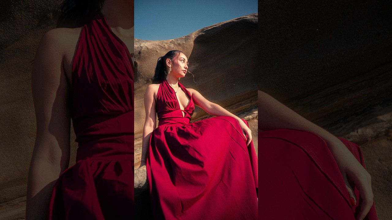
Clients have been asking me for that grainy, washed-out, early-2000s point-and-shoot look for about two years now. It started showing up in fashion e-commerce briefs, then lifestyle campaigns, and now I see it on Instagram ads from brands that would never have touched anything this lo-fi five years ago. The Y2K digicam aesthetic is genuinely everywhere, and if you’re doing commercial post-production work, you need a reliable way to produce it without spending an afternoon fiddling with sliders from scratch every single time.

How to Build a Custom Smoke Brush in Photoshop (And Actually Control the Result)

How to Build a Custom Smoke Brush in Photoshop (And Actually Control the Result)

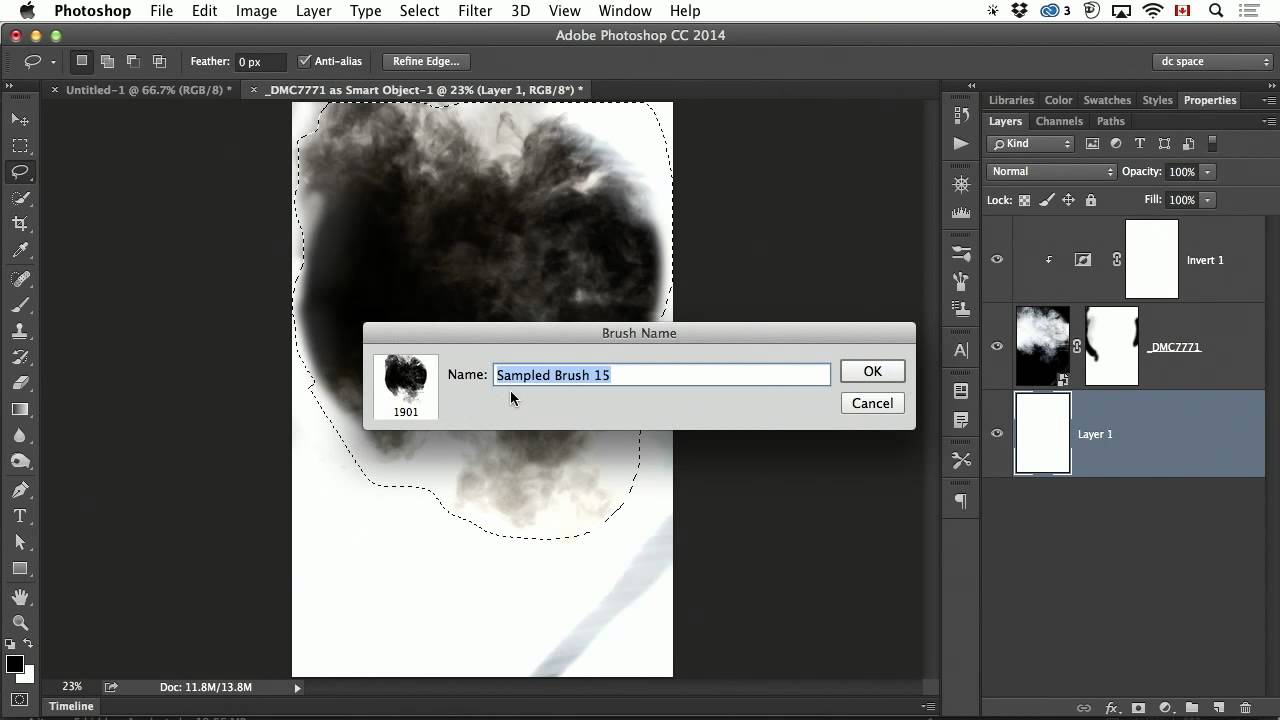
Most of the texture brushes I use in client work started as photographs. Concrete, fabric, water splashes, and yes, smoke. When you’re retouching a product shot for an ad agency and the art director wants “a little atmospheric haze,” you need something that blends naturally - not a canned plugin effect that looks like it came out of a 2009 tutorial. Building your own brush from real smoke footage solves that problem permanently.

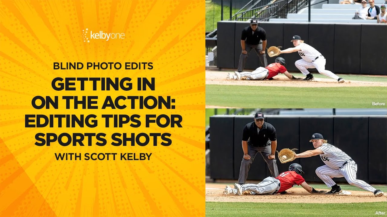
Fix, Mask, and Blur: A Camera Raw Workflow for Sports Photos That Actually Holds Up

Fix, Mask, and Blur: A Camera Raw Workflow for Sports Photos That Actually Holds Up

Sports photography hands you a specific kind of editing problem. The photographer wasn’t on a tripod. They weren’t waiting for perfect light. They were chasing a quarter-second window where everything happened at once, and they got it. The shot is good. The raw file is another story: slightly crooked, unevenly exposed across subjects, background fighting for attention it doesn’t deserve. I see this constantly in the post-production work that comes across my desk from ad agencies and editorial clients.

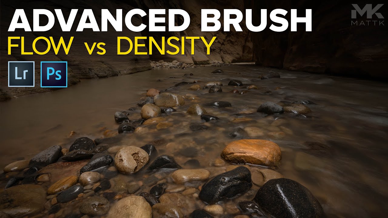
Flow vs. Density in Lightroom's Brush Tool: What They Actually Do and When to Use Each

Flow vs. Density in Lightroom's Brush Tool: What They Actually Do and When to Use Each

Most of my retouching errors over the years haven’t come from bad taste. They’ve come from blunt tools applied too broadly. Global sliders are fast, but they’re indiscriminate, and when you’re delivering product shots to an art director who will absolutely notice that the shadow recovery made the background go muddy, “I moved the Shadows slider” is not a great defense. Local adjustments saved my work more times than I can count, but for a long time I was using the brush tool in Lightroom like a blunt instrument too, mostly because I didn’t have a solid mental model for Flow and Density.

Work Smarter With Lightroom's Adjustment Brush: The Auto Mask Shortcut That Changes Everything

Work Smarter With Lightroom's Adjustment Brush: The Auto Mask Shortcut That Changes Everything

If you shoot anything that requires selective exposure adjustments — portraits, architecture, product work, anything with a foreground subject you want to separate from a background — you already know the adjustment brush is one of the most powerful tools in Lightroom and Camera Raw. You probably also know the frustration of painting too far, blowing past an edge, and having to redo a mask you spent five minutes building. That specific pain is what pulled me into Watch the full tutorial on YouTube from Matt Kloskowski, a photographer and educator whose approach to Lightroom workflow I’ve respected for years.

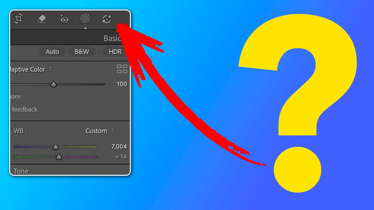
Lightroom's AI Edit Order Warning: What That Color-Coded Icon Actually Means for Your Workflow

Lightroom's AI Edit Order Warning: What That Color-Coded Icon Actually Means for Your Workflow

Order matters. I learned that the hard way running a commercial studio where consistency across hundreds of images isn’t a preference, it’s a contract requirement. When Adobe quietly added a new AI edit status icon to the Lightroom Classic toolbar, my first reaction was the same one I have whenever Adobe ships something new: is this going to break my existing workflow, or make it better? In this Matt Kloskowski tutorial, Watch the full tutorial on YouTube, Matt does something I appreciate in a good instructor: he doesn’t just explain the feature, he tells you when to ignore the rules it suggests.

Depth Masking in Camera Raw Is the Portrait Separation Trick I Wish I'd Had Years Ago

Depth Masking in Camera Raw Is the Portrait Separation Trick I Wish I'd Had Years Ago

Portrait work has a specific problem that product photography mostly avoids: the subject and background often share tones, colors, and edges that make clean separation genuinely painful. I’ve spent embarrassing amounts of time pushing luminosity masks and refining hair edges on location portraits where the background foliage was nearly the same brightness as the subject’s jacket. If you’ve been doing this work for any length of time, you know that the “select subject” button is great until it isn’t, and “isn’t” happens constantly with real-world portraits shot in natural environments.