Adding Window Textures and Light Overlays in Photoshop: A Workflow Worth Stealing

Adding Window Textures and Light Overlays in Photoshop: A Workflow Worth Stealing

Client work has a way of exposing the gaps in your toolkit. A few months back I was finishing up a portrait series for an ad agency, and the creative director kept asking for something “moodier, more atmospheric” without being able to articulate exactly what that meant. I knew the bones of the image were solid. What it needed was depth, some suggestion of environment and light without compositing in an entirely new background.


The Fastest Non-Destructive Color Grade in Photoshop (And It's Been There All Along)

The Fastest Non-Destructive Color Grade in Photoshop (And It's Been There All Along)

Color grading is one of those tasks that can swallow an afternoon if you let it. I know because I’ve let it. Early in my commercial work, I’d spend an hour tweaking HSL sliders on a single hero image, trying to land a cinematic look that matched a client’s mood board, only to have them request something warmer in the next round of feedback. Multiply that by a full product campaign and you start to understand why I became obsessed with building reversible, repeatable workflows.

Smart Objects Done Right: How to Build Photoshop Campaigns That Update Themselves

Smart Objects Done Right: How to Build Photoshop Campaigns That Update Themselves

If you work in commercial production long enough, you develop a sixth sense for fragile files. You know the ones. Five versions of a logo buried across twelve layers, each one manually resized, each one slightly different because someone eyeballed the transform. A client calls with a color change and suddenly you’re hunting through every PSD you built over the last three weeks. I’ve been there more times than I’d like to admit, and it’s the kind of workflow problem that quietly eats hours every month.

Smart Objects in Photoshop: The Workflow That Saves Commercial Composites (and Your Sanity)

Smart Objects in Photoshop: The Workflow That Saves Commercial Composites (and Your Sanity)

There’s a specific kind of dread that hits when a client emails at 4 p.m. asking for their logo to be swapped across 47 mockup files you built three weeks ago. If those files aren’t structured correctly, you’re spending your evening clicking through layers one by one. I’ve been there. Early in my commercial work I treated Smart Objects like a nice-to-have, something I’d use when I remembered. It took one particularly brutal product campaign revision round to make me treat them like load-bearing structure on every single project.

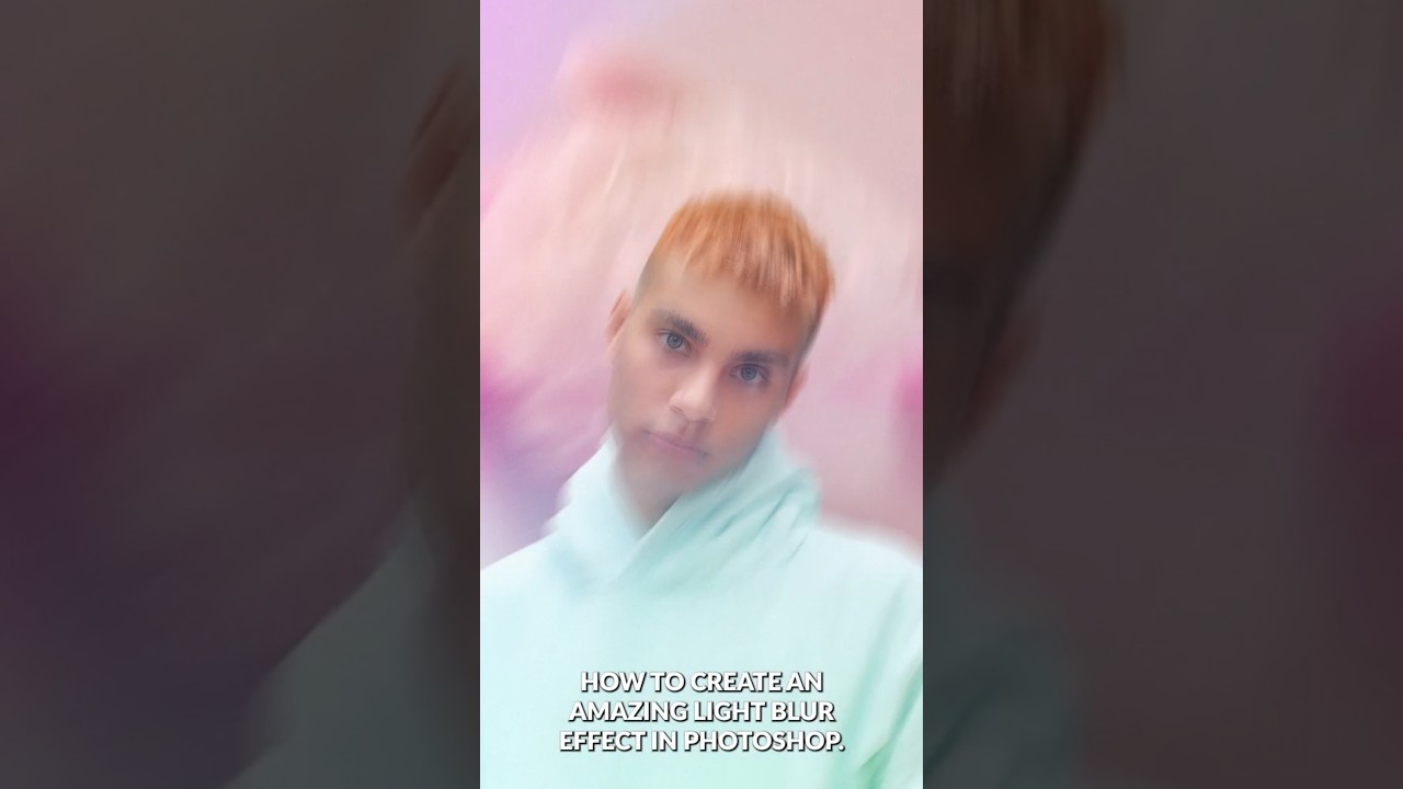
Master the Light Blur Effect: A Non-Destructive Workflow in Photoshop

Master the Light Blur Effect: A Non-Destructive Workflow in Photoshop

Composite portrait work makes up a significant chunk of what I do for ad agency clients, and the single biggest complaint I hear from art directors is that the subject looks “pasted in.” The background is sharp, the person is sharp, and nothing feels like it was shot together. What actually sells a composite is controlled imperfection: the right amount of blur, some light bleed, a little grain. Getting that to feel photographic rather than digital is the whole game.