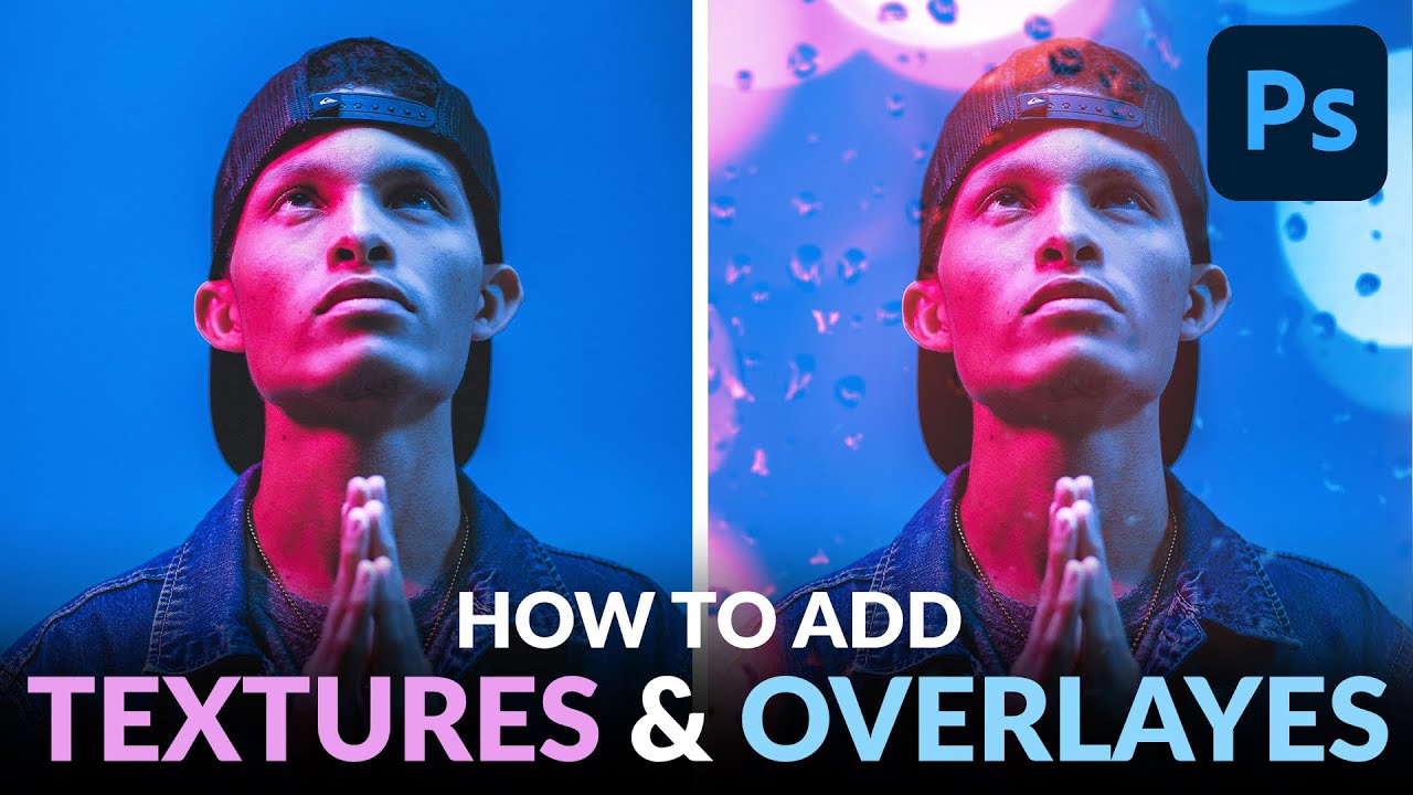
Client work has a way of exposing the gaps in your toolkit. A few months back I was finishing up a portrait series for an ad agency, and the creative director kept asking for something “moodier, more atmospheric” without being able to articulate exactly what that meant. I knew the bones of the image were solid. What it needed was depth, some suggestion of environment and light without compositing in an entirely new background. That’s when I went digging and landed on a technique Aaron Nace covers in his PHLEARN tutorial on adding textures and overlays to photos in Photoshop. Watch the full tutorial on YouTube
The core idea is elegantly simple: layer a dark-background texture image (think rain-streaked glass or bokeh lights) over your base photo, then use blend modes to make the dark areas disappear and leave only the light elements floating over your subject. What makes this technique practical for professional work is how Nace approaches the non-destructive side of things. He’s not just slapping a texture on and calling it done. There’s a logic to the order of operations that matters, especially if a client wants revisions at 9pm on a Tuesday.
Here’s the full walkthrough, step by step.
Step 1: Choose the Right Texture Image
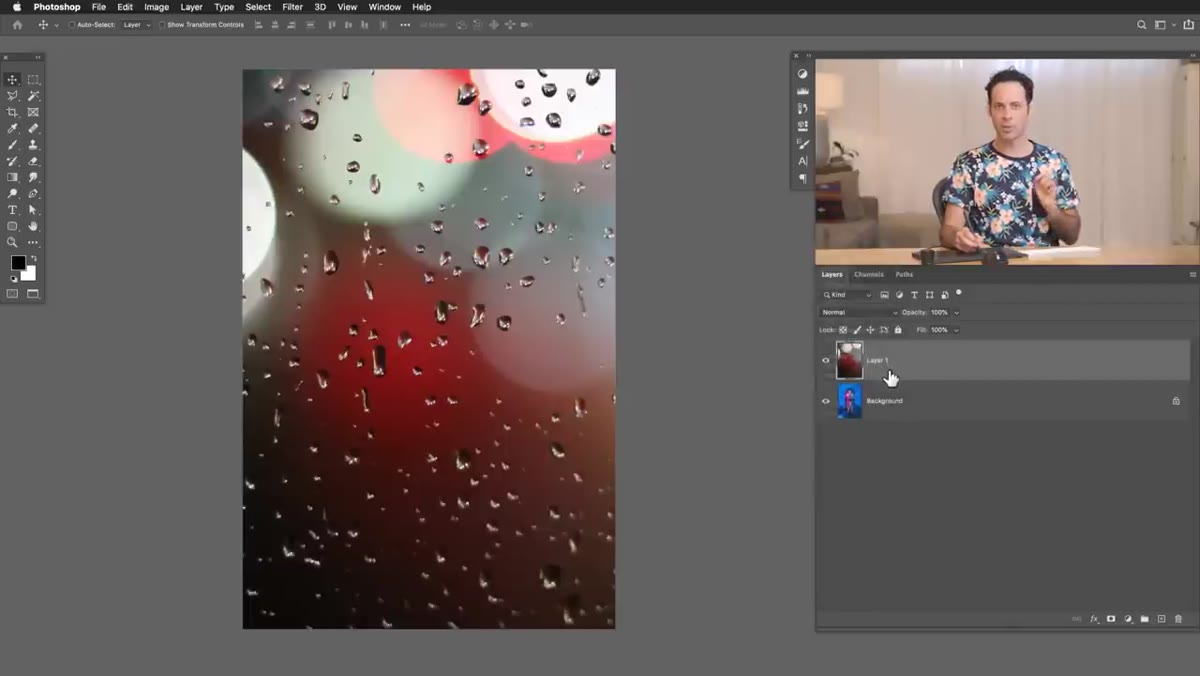
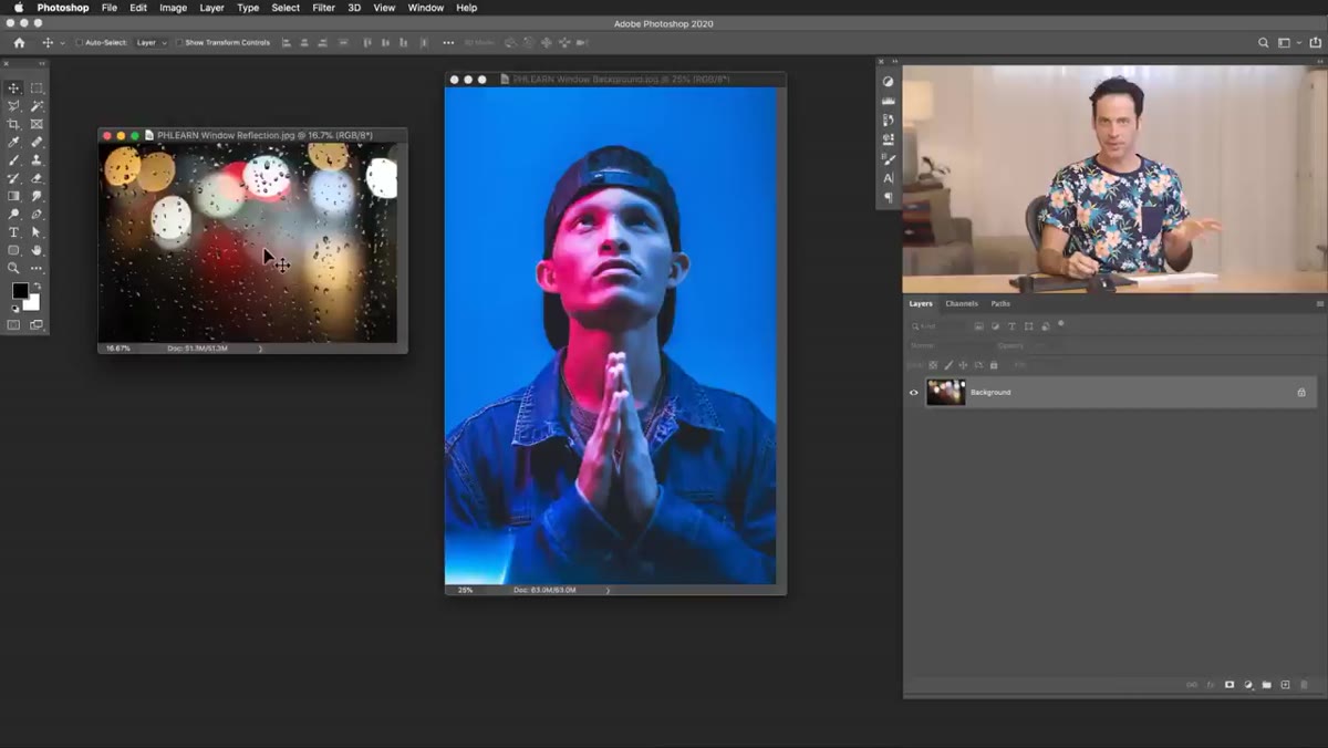 Raindrop and bokeh texture on dark background in Photoshop
Not every texture works for this technique. What you’re looking for is a light element on a predominantly dark background. Rain-streaked glass, window condensation with bokeh, streetlight halos, that kind of thing. The dark areas are what you’ll be hiding with the blend mode later, so the more contrast between the light and dark regions, the cleaner your result. Stock sites have plenty of these, and PHLEARN offers some free downloads on their site to get you started.
Raindrop and bokeh texture on dark background in Photoshop
Not every texture works for this technique. What you’re looking for is a light element on a predominantly dark background. Rain-streaked glass, window condensation with bokeh, streetlight halos, that kind of thing. The dark areas are what you’ll be hiding with the blend mode later, so the more contrast between the light and dark regions, the cleaner your result. Stock sites have plenty of these, and PHLEARN offers some free downloads on their site to get you started.
Once you have your base photo and your texture image both open in Photoshop, grab the Move tool and drag the texture onto your base image. Hit F for full screen if you want a cleaner workspace. You’ll likely need to scale the texture up immediately since texture images often don’t match your document dimensions.
Step 2: Scale and Position with Free Transform
 Free Transform handles on texture layer being scaled up
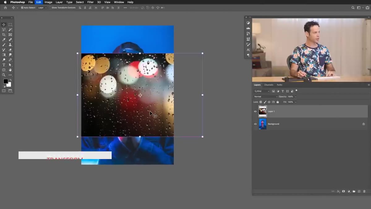
Hit Ctrl+T (Cmd+T on Mac) to enter Free Transform. Hold Alt (Option on Mac) while dragging a corner handle, and Photoshop scales from the center point rather than the corner. This makes it easier to keep the texture centered over your subject. Don’t obsess over the exact placement yet since you’ll be repositioning after you apply the blend mode and can see what’s actually landing where.
Free Transform handles on texture layer being scaled up
Hit Ctrl+T (Cmd+T on Mac) to enter Free Transform. Hold Alt (Option on Mac) while dragging a corner handle, and Photoshop scales from the center point rather than the corner. This makes it easier to keep the texture centered over your subject. Don’t obsess over the exact placement yet since you’ll be repositioning after you apply the blend mode and can see what’s actually landing where.
Get the texture large enough that it bleeds past the edges of your canvas on all sides. You want coverage everywhere, with room to nudge it around later without leaving gaps.
Step 3: Apply Screen Blend Mode
 Blend mode dropdown open with Screen selected on texture layer
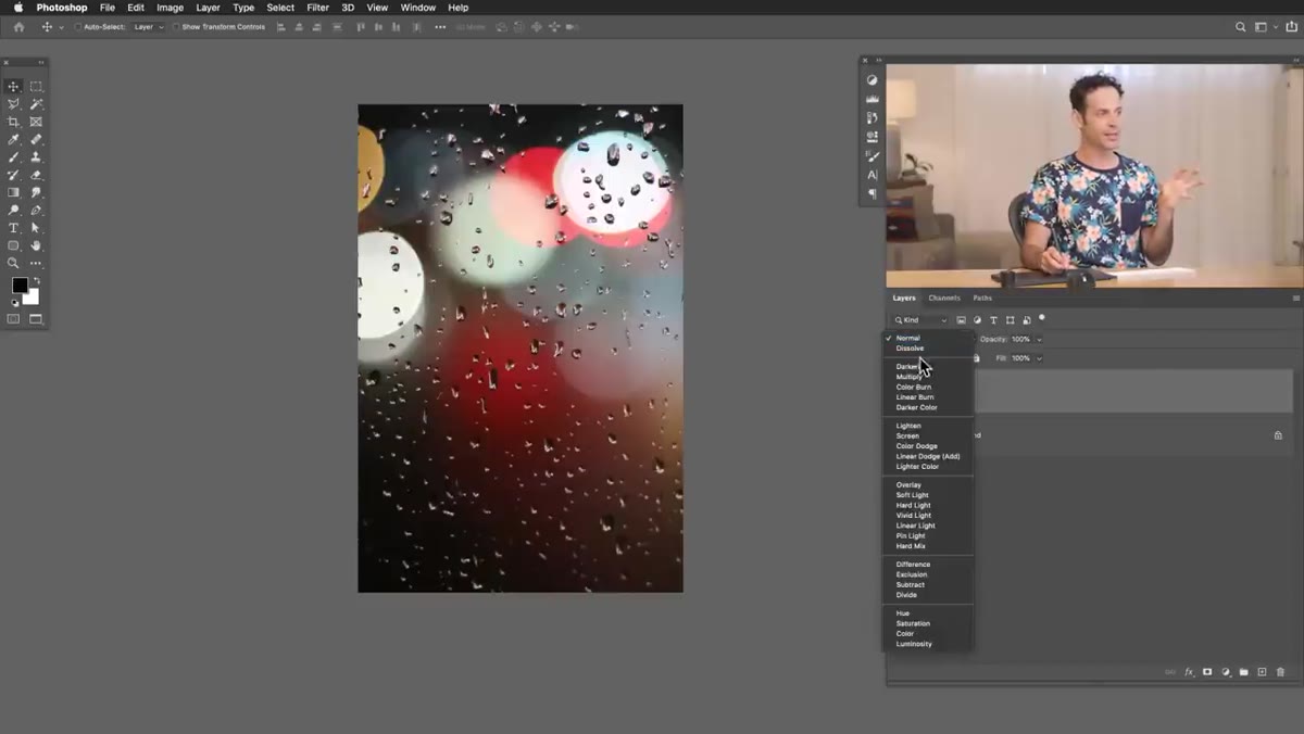
With your texture layer selected, open the blend mode dropdown at the top of the Layers panel and choose Screen. This is the move that makes the technique work: Screen mode makes anything dark become transparent, leaving only the lighter tones visible. Your texture’s dark background disappears and the water droplets or bokeh lights float over the subject below.
Blend mode dropdown open with Screen selected on texture layer
With your texture layer selected, open the blend mode dropdown at the top of the Layers panel and choose Screen. This is the move that makes the technique work: Screen mode makes anything dark become transparent, leaving only the lighter tones visible. Your texture’s dark background disappears and the water droplets or bokeh lights float over the subject below.
From here you can hold Shift and tap the arrow keys to nudge the texture layer left, right, up, or down in 10px increments. Find a position where the texture elements complement rather than compete with your subject’s face or the focal point of the image.
Step 4: Convert to Smart Object Before Blurring
 Right-click context menu showing Convert to Smart Object option
Here’s where the workflow discipline pays off. Before you apply any blur, switch the blend mode temporarily back to Normal, then right-click the layer in the Layers panel and choose “Convert to Smart Object.” Once it’s converted, switch back to Screen mode. The layer will look identical, but now any filter you apply becomes a Smart Filter, which means you can double-click it later and change the values without starting over.
Right-click context menu showing Convert to Smart Object option
Here’s where the workflow discipline pays off. Before you apply any blur, switch the blend mode temporarily back to Normal, then right-click the layer in the Layers panel and choose “Convert to Smart Object.” Once it’s converted, switch back to Screen mode. The layer will look identical, but now any filter you apply becomes a Smart Filter, which means you can double-click it later and change the values without starting over.
Nace flags this specifically, and it’s worth emphasizing: if you apply a blur to a regular pixel layer and a client asks you to soften it more (or pull it back) three rounds of revisions later, you’re rebuilding from scratch. Smart Objects eliminate that problem entirely. I have a standing rule in my own workflow that anything getting a blur or a filter gets converted first. No exceptions.
Step 5: Apply Box Blur for a Realistic Lens Effect
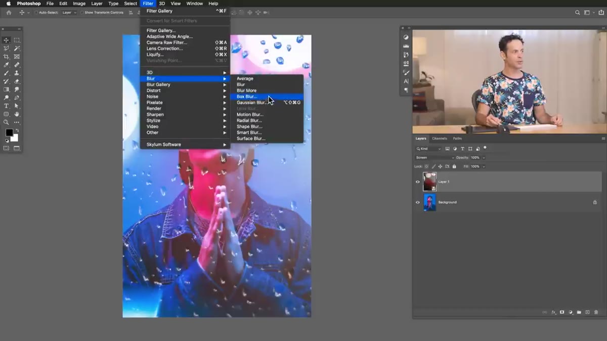 Box Blur dialog open with texture layer visible behind it
Go to Filter, then Blur, and choose Box Blur. Nace prefers Box Blur over Gaussian Blur for this application because it produces a quality that reads more like an actual lens blur than the smooth, even softening Gaussian gives you. The difference is subtle but noticeable once you’re looking for it.
Box Blur dialog open with texture layer visible behind it
Go to Filter, then Blur, and choose Box Blur. Nace prefers Box Blur over Gaussian Blur for this application because it produces a quality that reads more like an actual lens blur than the smooth, even softening Gaussian gives you. The difference is subtle but noticeable once you’re looking for it.
Dial in a radius that makes the texture feel like it belongs in front of the lens rather than printed on top of the image. There’s no universal number here since it depends on your source texture and the resolution you’re working at. Preview it at 100% zoom while adjusting. Because this is a Smart Filter on a Smart Object, you can come back and tweak this value any time.
Step 6: Deepen the Texture with a Levels Adjustment
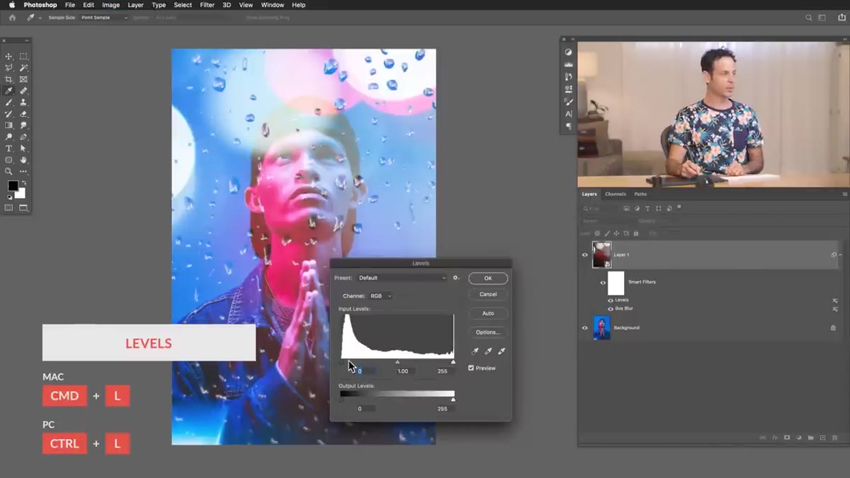 Levels dialog open with black point being pulled in on texture layer
With the texture layer still selected, hit Ctrl+L (Cmd+L) to open Levels. Pull the left (shadow) input slider inward toward the midpoint. This crushes the near-black tones in the texture layer, which has two effects: it cleans up any residual gray haze that survived the Screen blend, and it increases the overall contrast and punch of the light elements that remain visible. Think of it as sharpening the effect without touching sharpness at all.
Levels dialog open with black point being pulled in on texture layer
With the texture layer still selected, hit Ctrl+L (Cmd+L) to open Levels. Pull the left (shadow) input slider inward toward the midpoint. This crushes the near-black tones in the texture layer, which has two effects: it cleans up any residual gray haze that survived the Screen blend, and it increases the overall contrast and punch of the light elements that remain visible. Think of it as sharpening the effect without touching sharpness at all.
You’re essentially telling Photoshop to treat a wider range of dark tones as fully transparent, leaving only the brightest parts of the texture to show through.
One Thing I’d Add From My Own Work
Color matching the texture to your base image is the step that takes this from “interesting effect” to “this looks like it was always there.” Nace touches on this in the full tutorial, and it’s worth spending time on. I typically clip a Hue/Saturation adjustment layer directly to the texture layer and sample the dominant color temperature from the background. Warm portrait lit with golden hour tones? Shift the texture toward orange. Cool studio strobes? Push it slightly blue. When the texture shares the color language of the ambient light in your base image, the brain reads the whole thing as a unified scene instead of two images stacked on each other. That’s the difference between atmospheric and artificial.
The single most important thing to take from this technique is the Smart Object step. The actual overlay effect is fast and repeatable, and once you understand Screen blend mode, you can apply it to dozens of different texture types. But working non-destructively is what lets you actually use this on professional work where revision requests are a guarantee, not a maybe. Build the habit before you need it.
Watch the full tutorial on YouTube and grab the free texture images on PHLEARN.com if you want to follow along with the exact assets Aaron uses.
Comments (5)
This saved me so much time on my last edit. Wish I'd found this sooner.
Couldn't agree more. I've seen this make a huge difference in gear work specifically.
Would love to see a follow-up going deeper into this topic.
Tried this technique this morning. Game changer for real.
Couldn't agree more. I've seen this make a huge difference in compositing work specifically.
Leave a Comment