How to Get Lightroom Presets Working on Your Phone (Yes, Really)

How to Get Lightroom Presets Working on Your Phone (Yes, Really)

I’ll be straight with you: I resisted mobile editing for a long time. Fifteen years of working in commercial studios will do that to you. My workflow lives on a calibrated monitor, a fast desktop, and a filing system that would make most archivists nervous. But clients don’t care about any of that when they’re texting you at 8 p.m. asking why their Instagram post isn’t up yet. The phone has become a legitimate part of the job, and that means the editing tools need to follow.

Free Lightroom Calendar Print Templates: A Complete Installation and Workflow Guide

Free Lightroom Calendar Print Templates: A Complete Installation and Workflow Guide

Every December I end up with the same backlog: family portrait clients who want calendar prints, and a print module setup that needs to be rebuilt from scratch because I never saved a proper template the previous year. It’s one of those small inefficiencies that compounds badly when you’re trying to close out a busy fourth quarter. This year I finally stopped reinventing the wheel, thanks to a free resource I came across in this Matt Kloskowski tutorial.

A Focused Lightroom Landscape Workflow That Respects Your Time

A Focused Lightroom Landscape Workflow That Respects Your Time

I have a bad habit of over-engineering things. Fifteen years in commercial studios will do that to you. I’ve built Photoshop action sets with 40 steps, color-coded folder structures across four backup drives, and batch pipelines that could process half a year’s worth of product shots before lunch. So when I come across a landscape photographer who strips a complex editing process down to only what actually matters, I pay attention.

How to Build a Consistent Instagram Grid with Lightroom Presets (Mango Street's 6-Style System)

How to Build a Consistent Instagram Grid with Lightroom Presets (Mango Street's 6-Style System)

Consistency is the thing clients never mention until it’s missing. I’ve spent 15 years in commercial photography, and the single most common editorial note I get from art directors isn’t about sharpness or composition. It’s about color coherence across a campaign. The same problem shows up at a smaller scale for anyone building an Instagram portfolio: shoot a landscape one weekend, a portrait session the next, and suddenly your grid looks like three different photographers live in your phone.

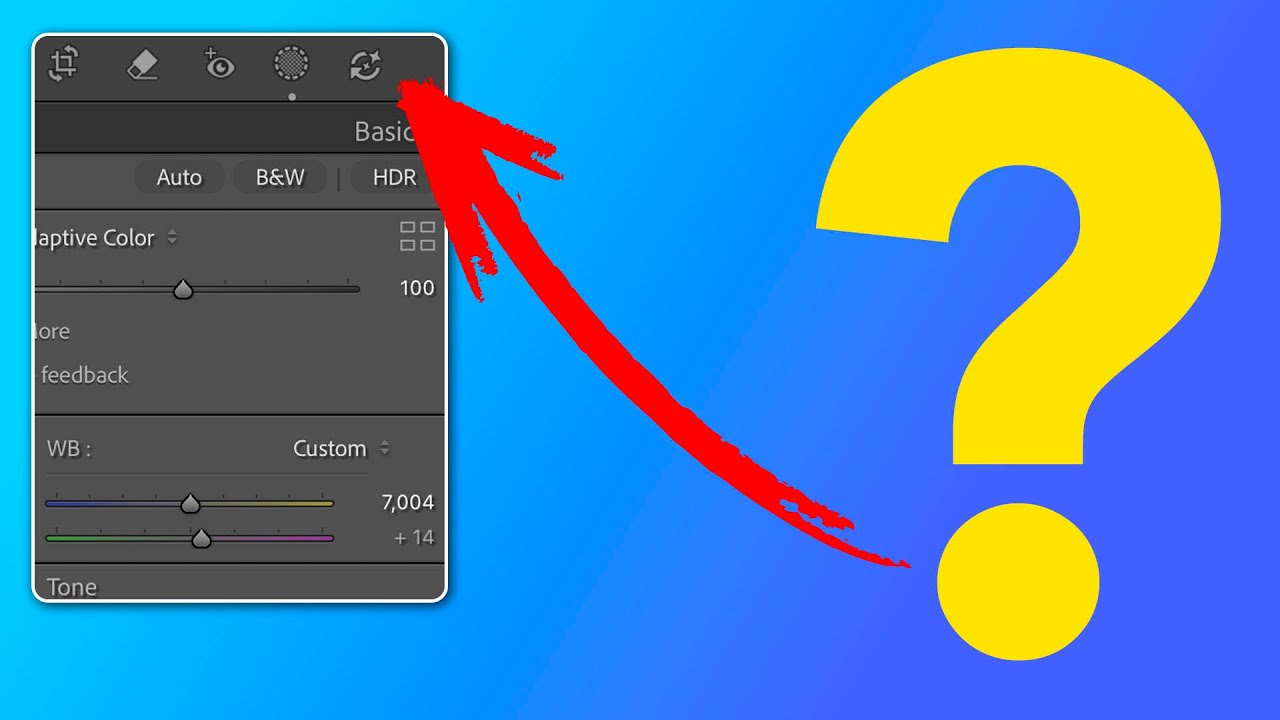
Lightroom's AI Edit Order Warning: What That Color-Coded Icon Actually Means for Your Workflow

Lightroom's AI Edit Order Warning: What That Color-Coded Icon Actually Means for Your Workflow

Order matters. I learned that the hard way running a commercial studio where consistency across hundreds of images isn’t a preference, it’s a contract requirement. When Adobe quietly added a new AI edit status icon to the Lightroom Classic toolbar, my first reaction was the same one I have whenever Adobe ships something new: is this going to break my existing workflow, or make it better? In this Matt Kloskowski tutorial, Watch the full tutorial on YouTube, Matt does something I appreciate in a good instructor: he doesn’t just explain the feature, he tells you when to ignore the rules it suggests.