
Consistency is the thing clients never mention until it’s missing. I’ve spent 15 years in commercial photography, and the single most common editorial note I get from art directors isn’t about sharpness or composition. It’s about color coherence across a campaign. The same problem shows up at a smaller scale for anyone building an Instagram portfolio: shoot a landscape one weekend, a portrait session the next, and suddenly your grid looks like three different photographers live in your phone.
Watch the full tutorial on YouTube
In this Mango Street tutorial, Rachel and Daniel walk through their collection of 16 Lightroom presets across six distinct style categories. Blues, coppers, goldens, grays, tans, and whites. Each category contains sub-presets tuned for different subject matter, which is the detail most preset roundups skip right over. This isn’t a one-size-fits-all filter pack. It’s a small system, and that distinction matters for anyone trying to build a repeatable editing workflow rather than just vibing through each photo individually.
What caught my attention professionally is how they handle the skin tone problem. Most presets look great on landscapes and fall apart the moment a face enters the frame. Mango Street built people-specific variants into several categories for exactly this reason. Let me walk through how the system actually works.
Step 1: Set White Balance and Exposure Before You Touch a Preset
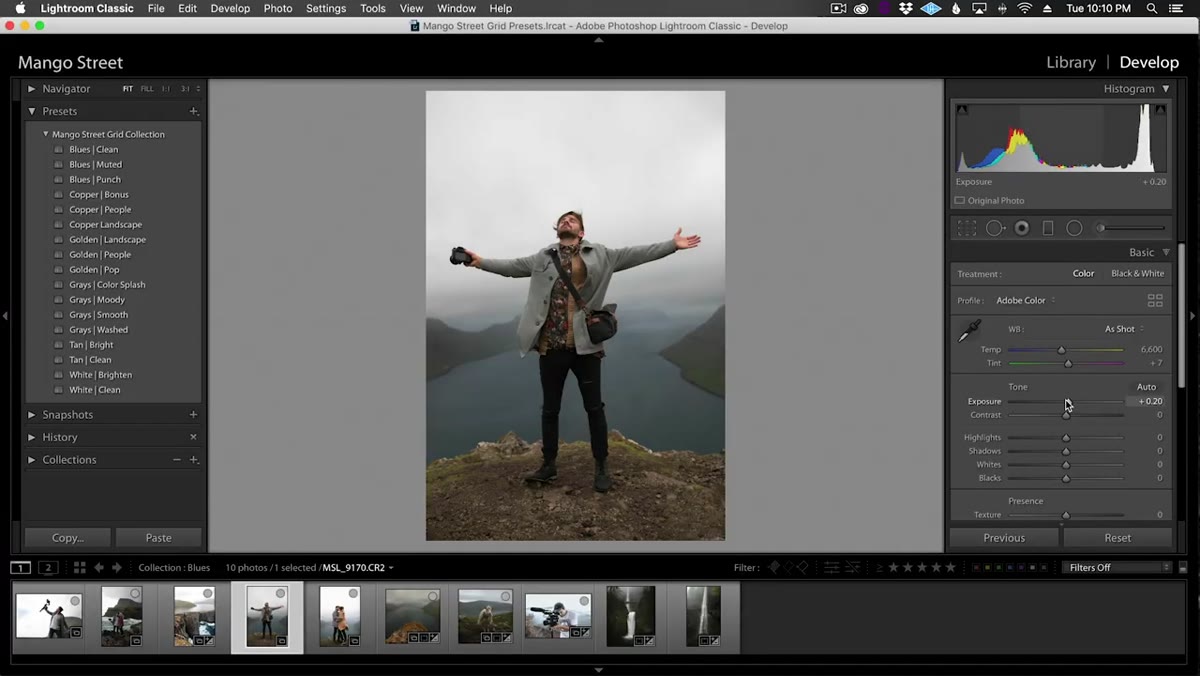 Adjusting white balance and exposure sliders before applying preset
Every preset in this collection assumes you’ve already done two things: corrected your white balance for the scene and set a reasonable exposure. Apply a preset on a photo that’s two stops underexposed and you’ll fight the preset the entire time. Get your white balance and exposure dialed first, then let the preset do its stylistic job on top of a clean foundation. This is the kind of discipline that separates a fast, repeatable workflow from one where you’re wrestling with each photo individually.
Adjusting white balance and exposure sliders before applying preset
Every preset in this collection assumes you’ve already done two things: corrected your white balance for the scene and set a reasonable exposure. Apply a preset on a photo that’s two stops underexposed and you’ll fight the preset the entire time. Get your white balance and exposure dialed first, then let the preset do its stylistic job on top of a clean foundation. This is the kind of discipline that separates a fast, repeatable workflow from one where you’re wrestling with each photo individually.
Step 2: Choose a Preset Category Based on What’s in Your Frame
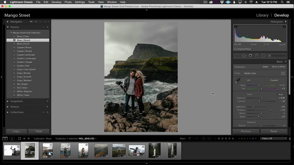
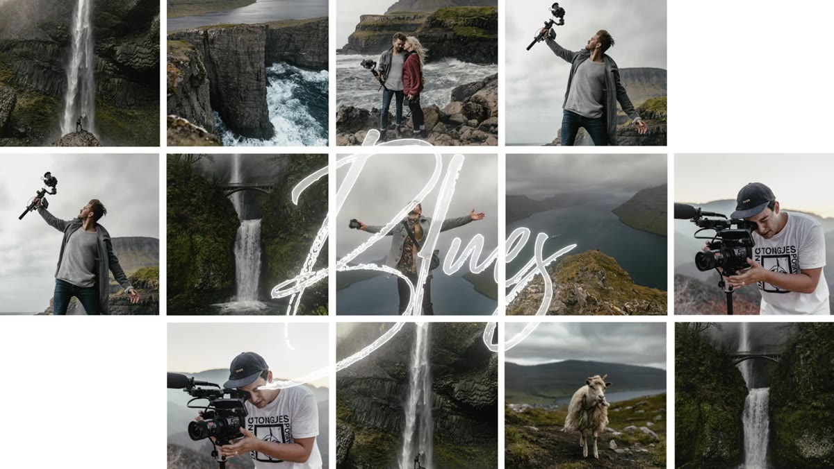 Blues preset applied to travel photo with rich natural colors
The six style categories aren’t interchangeable. Blues work best on images with even lighting and rich colors, making them a natural fit for landscape and travel work where you want deep contrast without blowing out the scene. Coppers are designed around images that already contain blues and reds in the frame. The preset shifts warm tones toward a copper hue and washes the blues toward aqua. Goldens are built for golden hour and backlit situations where you want to push that warm haze rather than correct it away. Before you even open Lightroom, think about what colors are dominant in the photo you’re editing. That tells you which category to start in.
Blues preset applied to travel photo with rich natural colors
The six style categories aren’t interchangeable. Blues work best on images with even lighting and rich colors, making them a natural fit for landscape and travel work where you want deep contrast without blowing out the scene. Coppers are designed around images that already contain blues and reds in the frame. The preset shifts warm tones toward a copper hue and washes the blues toward aqua. Goldens are built for golden hour and backlit situations where you want to push that warm haze rather than correct it away. Before you even open Lightroom, think about what colors are dominant in the photo you’re editing. That tells you which category to start in.
Step 3: Use the “People” Variant When Skin Tones Are in the Frame
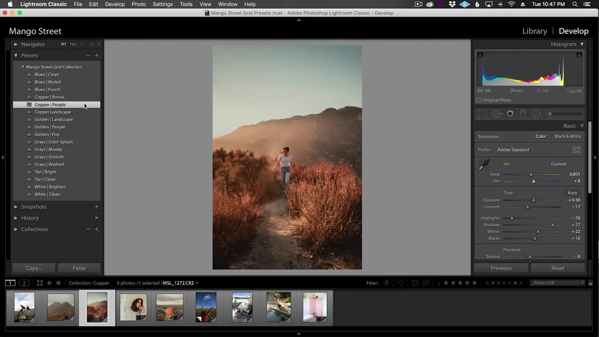 Copper people preset applied, skin tones controlled versus landscape version
Within the Copper and Golden categories, Mango Street includes separate sub-presets labeled for people versus landscape use. The landscape version pushes saturation and contrast harder, which looks incredible on terrain but turns skin tones orange-red in a way that reads as unnatural. The people variant pulls back on that red saturation to keep faces looking human. For portraits, always reach for the people sub-preset first. If you want something between the two, apply the landscape version and then drop into the Calibration panel in Lightroom. Lower the Red Saturation slider there until the skin reads naturally again. It’s a two-second fix once you know where to look.
Copper people preset applied, skin tones controlled versus landscape version
Within the Copper and Golden categories, Mango Street includes separate sub-presets labeled for people versus landscape use. The landscape version pushes saturation and contrast harder, which looks incredible on terrain but turns skin tones orange-red in a way that reads as unnatural. The people variant pulls back on that red saturation to keep faces looking human. For portraits, always reach for the people sub-preset first. If you want something between the two, apply the landscape version and then drop into the Calibration panel in Lightroom. Lower the Red Saturation slider there until the skin reads naturally again. It’s a two-second fix once you know where to look.
Step 4: Use Profile Corrections Intentionally
 Profile corrections toggle shown in Lightroom develop panel
All presets in this collection automatically enable lens profile corrections. That’s usually helpful because it removes vignetting and distortion introduced by the lens. But if you’re using a lens with a distinctive character and you actually want that vignette or slightly curved rendering, the preset will strip it. After applying any preset, check the Lens Corrections panel and toggle profile corrections off if that character was part of your creative intent. Small detail, but when you’re batch-applying presets to 50 travel photos, discovering you lost all your vignettes at the end is a painful retroactive fix.
Profile corrections toggle shown in Lightroom develop panel
All presets in this collection automatically enable lens profile corrections. That’s usually helpful because it removes vignetting and distortion introduced by the lens. But if you’re using a lens with a distinctive character and you actually want that vignette or slightly curved rendering, the preset will strip it. After applying any preset, check the Lens Corrections panel and toggle profile corrections off if that character was part of your creative intent. Small detail, but when you’re batch-applying presets to 50 travel photos, discovering you lost all your vignettes at the end is a painful retroactive fix.
Step 5: Sync Presets to Lightroom Mobile via Lightroom CC
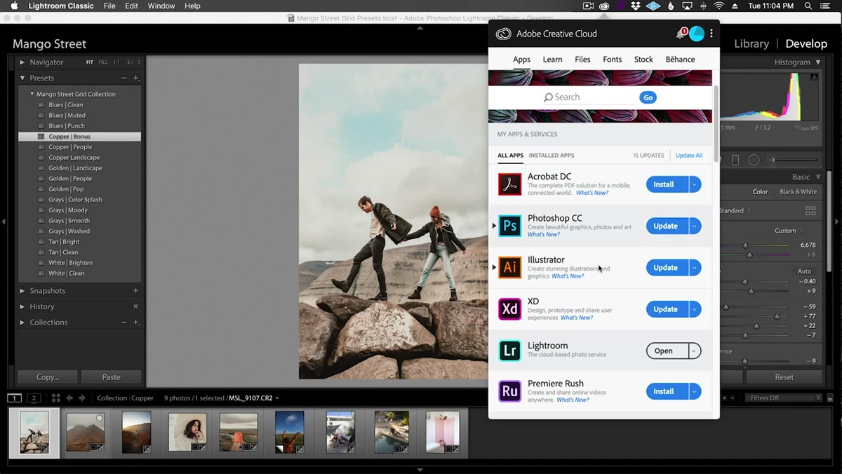 Lightroom CC import profiles and presets dialog on desktop
To get these presets onto your phone, open Lightroom CC on your desktop and go to File, then Import Profiles and Presets, and select the preset files. Once synced through your Adobe account, the presets appear in Lightroom Mobile under the Presets panel automatically. If you’re not on Lightroom CC, the collection includes a PDF with a manual workaround to get them onto your mobile device. The mobile workflow matters here because Mango Street demonstrates editing a photo entirely on an iPhone using the same presets, same white balance first approach, same sub-preset logic. Consistent results across desktop and mobile means your grid stays cohesive whether you’re at your desk or editing on the go.
Lightroom CC import profiles and presets dialog on desktop
To get these presets onto your phone, open Lightroom CC on your desktop and go to File, then Import Profiles and Presets, and select the preset files. Once synced through your Adobe account, the presets appear in Lightroom Mobile under the Presets panel automatically. If you’re not on Lightroom CC, the collection includes a PDF with a manual workaround to get them onto your mobile device. The mobile workflow matters here because Mango Street demonstrates editing a photo entirely on an iPhone using the same presets, same white balance first approach, same sub-preset logic. Consistent results across desktop and mobile means your grid stays cohesive whether you’re at your desk or editing on the go.
Step 6: Apply the Preset, Then Make Minor Finishing Adjustments
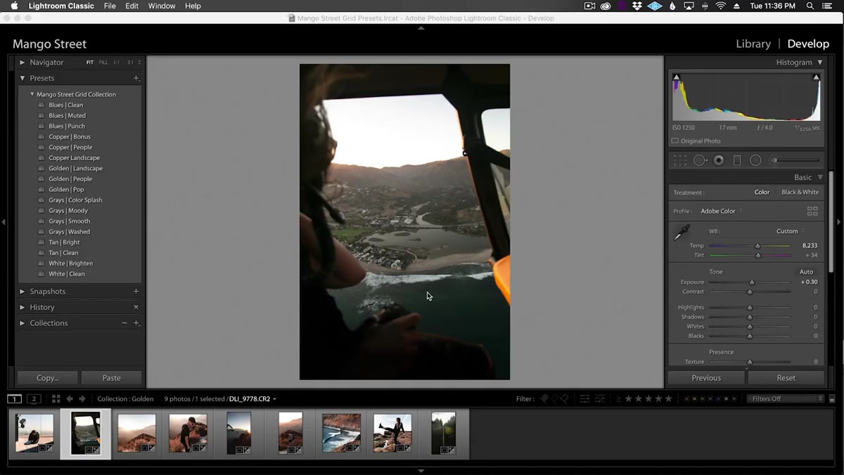 Golden preset applied to backlit portrait, hair light accentuated
A preset is a starting point, not a final render. After applying your chosen preset, look at the image and make small adjustments to Exposure, Highlights, and Shadows to account for the specific light in that frame. The Golden presets in particular are designed to accentuate hazy backlight, so if your golden hour shot is slightly more diffuse than the demo photos, you may need to pull the highlights down just a touch to avoid clipping. Think of the preset as setting the color character of the image and the finishing adjustments as fitting that character to the exact conditions you shot in.
Golden preset applied to backlit portrait, hair light accentuated
A preset is a starting point, not a final render. After applying your chosen preset, look at the image and make small adjustments to Exposure, Highlights, and Shadows to account for the specific light in that frame. The Golden presets in particular are designed to accentuate hazy backlight, so if your golden hour shot is slightly more diffuse than the demo photos, you may need to pull the highlights down just a touch to avoid clipping. Think of the preset as setting the color character of the image and the finishing adjustments as fitting that character to the exact conditions you shot in.
What I’d Add From My Own Workflow
I run a lot of preset-based workflows for e-commerce clients where the volume is high and consistency is contractual. One thing I always build on top of any preset collection is a Lightroom Smart Collection organized by preset applied. That way I can pull up every photo using, say, the Copper People preset and do a final consistency pass as a group, checking that exposure decisions are landing in the same range across the set. Instagram grids are essentially the same problem as a product catalog. The individual photos matter less than how they read as a unified sequence. If you treat your preset workflow as a consistency system rather than a per-photo shortcut, you’ll get a much more polished result at the output end.
One more note: these presets are designed with specific source color profiles in mind. If you shoot with a camera that renders reds unusually warm or blues unusually cool, your results may drift from what you see in the tutorial. Run a test on two or three images before committing to a full batch. Saves the kind of rework headache I used to track obsessively before I built systems specifically designed to catch it early.
The single biggest takeaway from this tutorial is the category-and-variant logic. Instead of hunting for one perfect preset, Mango Street gives you a color-based decision tree that takes most of the guesswork out of which preset to reach for. Pick your category by dominant colors in the frame. Pick your variant based on whether people are in the shot. Correct white balance and exposure first. That three-step decision makes a 16-preset collection feel far more manageable and far more consistent across a mixed portfolio.
Watch the full tutorial on YouTube
Comments
Leave a Comment