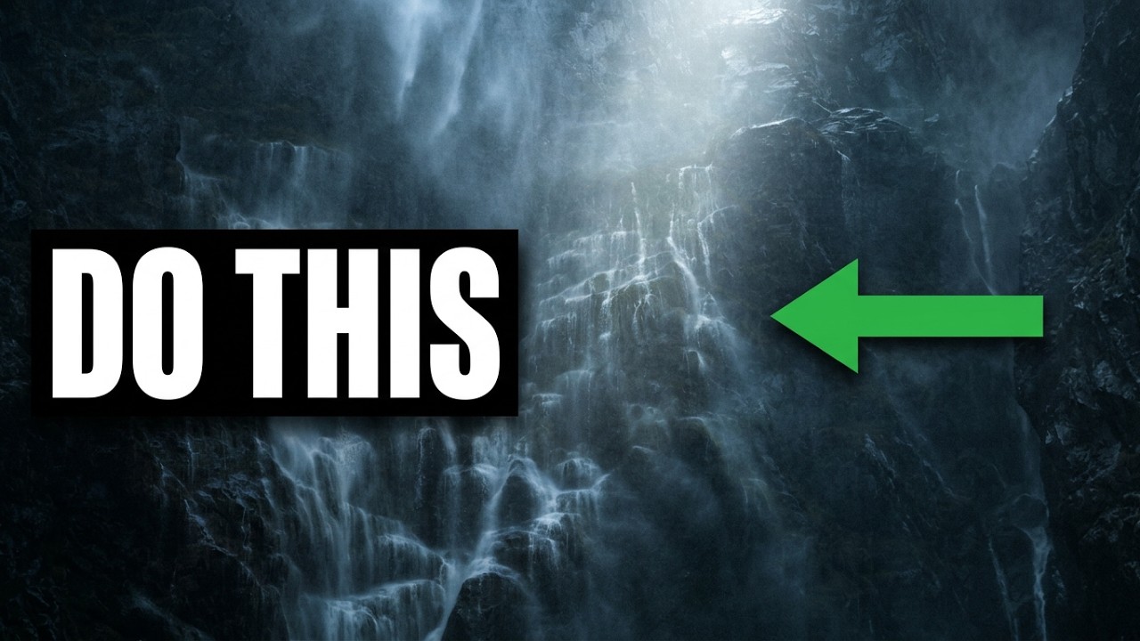
Flat photos are a studio problem as much as a landscape problem. I spend most of my working hours on commercial work, product shots and ad composites, but I shoot landscapes to stay sharp on natural light. And the same thing that makes a product photo look dead, that absence of perceived dimension, kills a landscape too. No depth, no story. The image just sits there.
I came across this William Patino tutorial on fixing dull, flat landscape photos, and even though my day job rarely involves waterfalls, the three core techniques he demonstrates translate directly to any image that needs to feel three-dimensional. Watch the full tutorial on YouTube before or after reading this, depending on how you learn. What follows is a step-by-step breakdown you can follow without the video open.
The whole edit takes place in Lightroom’s local adjustment tools, specifically the adjustment brush. No plugins, no complicated masking. The power is in how Patino uses those brushes with intention rather than just dragging sliders globally and hoping for the best.
Step 1: Identify Where Directional Light Would Naturally Fall
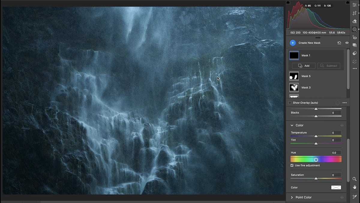 Flat waterfall image with no visible light source
Before you touch a single slider, look at your image and ask where light would logically be coming from. Patino opens with a waterfall scene shot against a flat rock wall. It’s a cloudy day, so the light is diffused and directionless. His first move is not corrective, it’s additive. He decides where a soft light source above the frame would logically illuminate the wall, and then he paints that light in.
This is the mindset shift that separates good landscape editing from slider-pushing. You’re not just recovering a photo, you’re completing the story the camera started.
Step 2: Set Up Your Adjustment Brush for Soft, Painterly Application
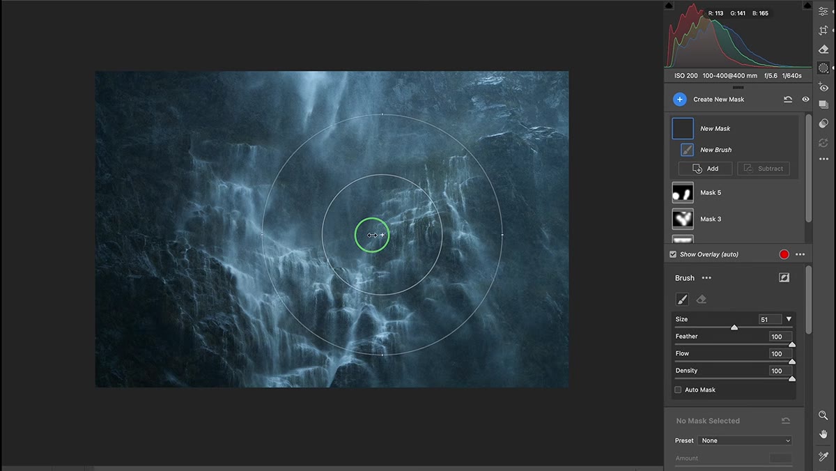 Adjustment brush panel with feather, flow, and density at 100
Press K in Lightroom to activate the adjustment brush. Set feather, flow, and density all to 100. If that sounds counterintuitive, here’s the logic: a fully feathered, full-flow brush applied quickly at the edge of an area gives you a soft, natural falloff. Patino specifically notes he loves this approach because it keeps the effect from looking like a selection mask was stamped on.
The brush size should be large enough that you’re making broad, loose strokes. You’re not cutting around individual leaves. You’re painting light the way light actually behaves, gradually and without hard edges.
Step 3: Paint in Directional Light With a Modest Exposure Increase
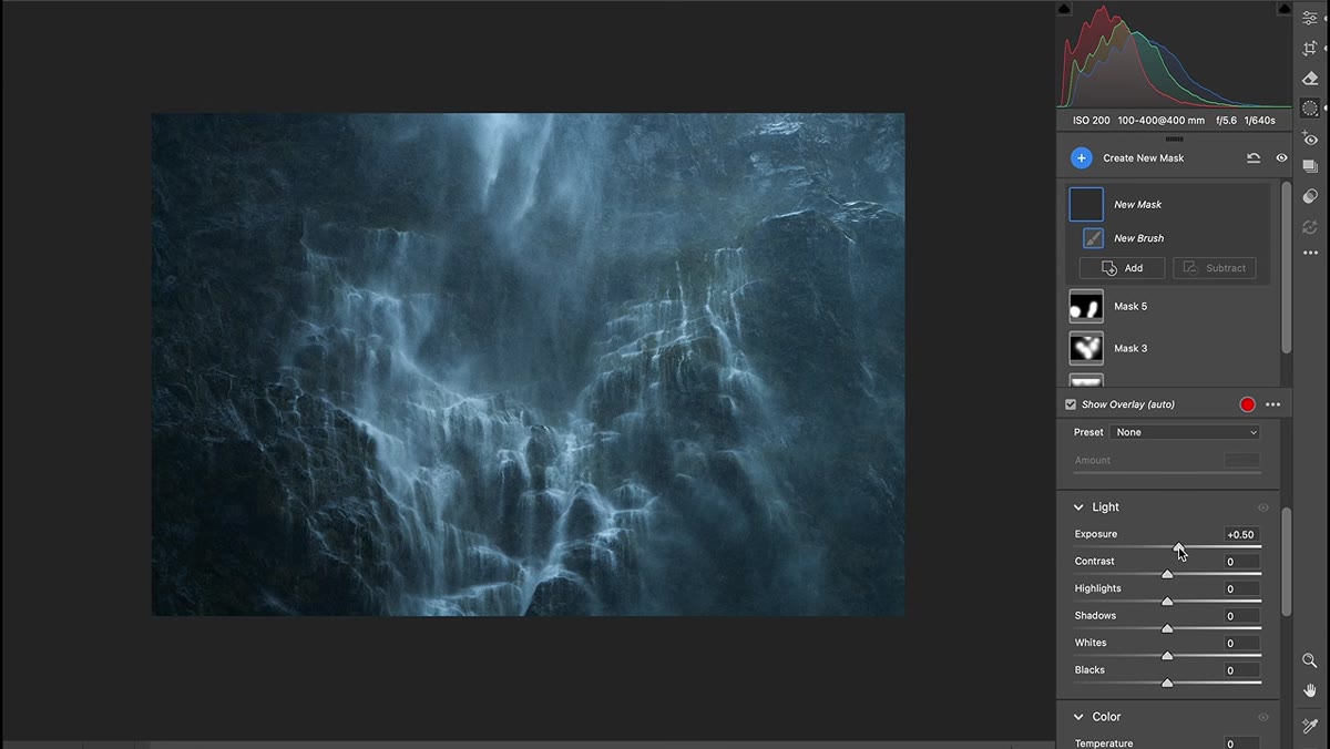 Brush stroke applied above waterfall, exposure slider raised
With the brush configured, increase the Exposure slider by roughly half a stop. No more. The goal is a suggestion of light entering the frame from above, not a blown-out highlight. Patino paints along the top edge of his waterfall scene, using just the edge of the large brush to keep the transition invisible.
Toggle the effect on and off using the adjustment pin to check your work. If the transition is visible, your brush was too small or your feather too low. The before-and-after should read as natural. Someone looking at the finished photo shouldn’t think “that was edited,” they should just feel that the image has more life.
Step 4: Add Contrast to the Foreground to Create Atmospheric Perspective
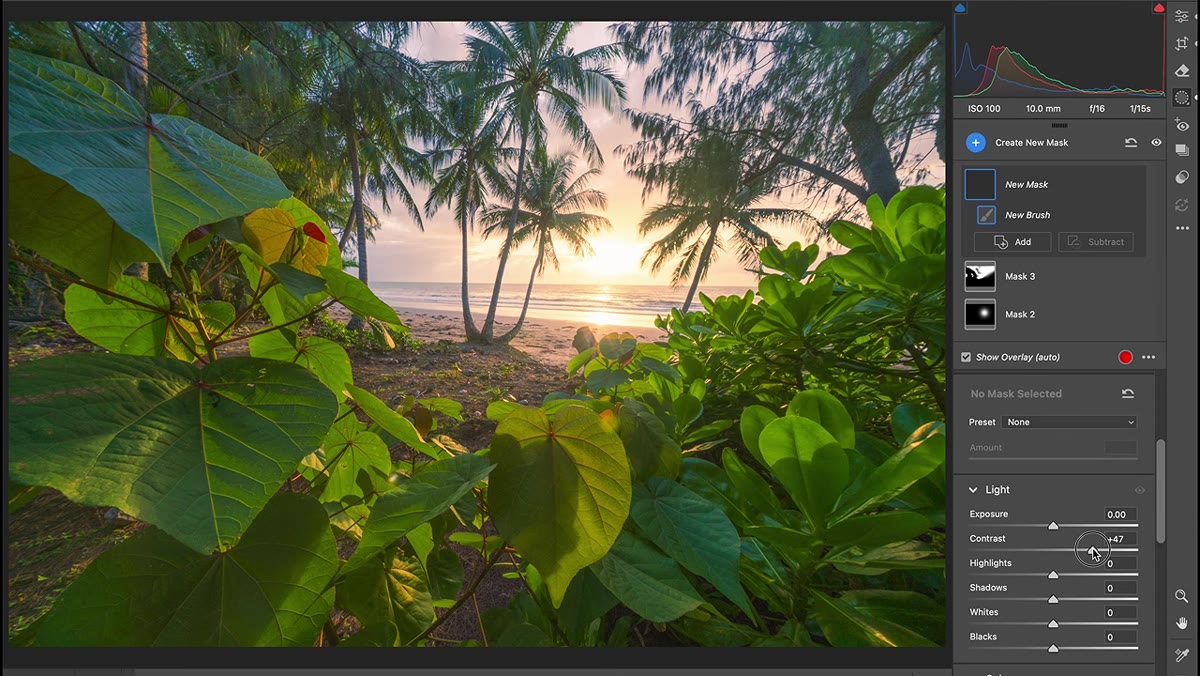 Wide angle forest scene with brush being dragged across foreground
Switch to a wide-angle image. Patino uses a 10mm shot where the foreground fills a significant portion of the frame. The principle here comes from how we actually perceive depth in the real world: objects closer to us have higher contrast, deeper shadows, and more tonal separation. Objects further away look slightly flatter and hazier.
With a new brush adjustment, drag contrast up to around 70 across the foreground. Use the same large-brush, high-feather setup. You can also push the Whites slider up slightly to make foliage or any foreground element with direct light pop. The result is a foreground that feels heavier and closer, which pulls the viewer’s eye deeper into the scene.
Step 5: Lift the Shadows in the Background to Push It Further Away
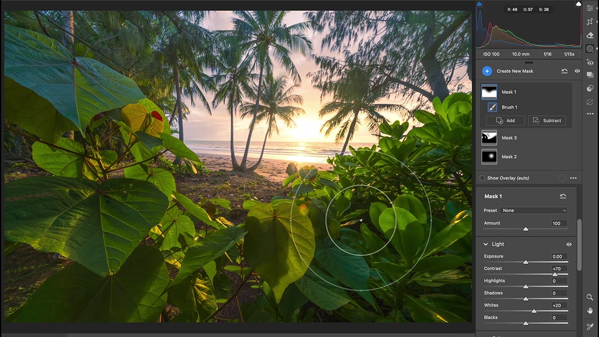 Separate brush adjustment applied to background, shadows lifted
Create a second, separate brush adjustment and paint only the background. This time, do the opposite: lift the Shadows and Blacks sliders so the dark tones become lighter. This reduces the contrast in the distant areas, mimicking the natural atmospheric haze that sits between us and anything far away.
The combination of these two adjustments, high contrast foreground and low contrast background, is atmospheric perspective. Patino points out that if you go outside and look at any wide landscape, you’ll see this gradient happening naturally. You’re just making the camera’s flat interpretation of that scene match what your eyes would have perceived standing there.
Step 6: Correct Oversaturated Warm Tones Without Flattening the Color
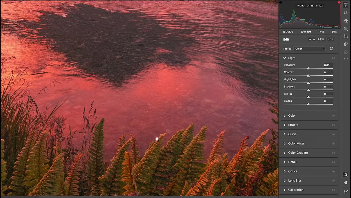 Sunset river scene with overly warm color cast across foreground
Automatic white balance frequently overcooks warm colors in golden hour and sunset shots. The whole scene ends up baked in orange, and the cooler shadows, which should read as a visual counterpoint, get lost. Patino’s approach here is selective color correction rather than a global white balance shift.
Rather than cooling the entire image and losing the warmth in the sky, use the adjustment brush to selectively address the areas that are too warm. Painting a cooler white balance or reducing the temperature on just the ferns, rocks, or water in the foreground lets the sky hold its drama while the rest of the scene regains tonal balance. The river reflections get to stay warm where they should, and cool where the sky isn’t directly reflected.
How I Apply This in Commercial Work
Atmospheric perspective and directional light are not exclusive to landscapes. When I’m retouching a lifestyle product shot, the same logic applies. If the background is competing with the subject because both have similar contrast and tonal depth, the image feels flat. Painting a subtle exposure increase where a window would logically be casting light, or slightly lifting the shadows on a background that should read as distant, creates the same sense of dimension Patino is describing in these landscape frames.
The other thing I’ve started doing, based on his brush setup approach, is saving a Lightroom preset for the high-feather, high-flow brush configuration so it’s already dialed in when I open an image. Small thing, but when you’re moving through a volume of shots, not having to reset your brush settings each time adds up.
The single most important idea in this tutorial is that depth is not something the camera captures automatically. It has to be constructed in post by mimicking the contrast and light relationships we perceive in three-dimensional space. Patino makes this feel straightforward because the tools are simple, the adjustment brush is not an advanced feature. What’s sophisticated is knowing what to paint, where to paint it, and by how much.
Watch the full tutorial on YouTube to see the before-and-after on each of Patino’s three source images. The waterfall comparison alone is worth the watch.
Comments (2)
This is going in my reference folder. Incredibly useful.
Wow, I had no idea you could do this. Mind blown.
Leave a Comment