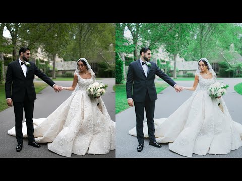
Most of my work runs through Photoshop and batch automation, but Lightroom is still the first stop for color grading when I hand off editing guides to photographers on client projects. The problem I hear constantly, especially from photographers just getting into wedding work, is that the preset marketplace has become a money pit. Twenty dollars here, forty dollars there, and half those preset packs deliver one usable look buried under fifteen unusable ones. So when a wedding photographer shares the actual technique behind that soft, airy, blue-toned look that dominates the genre, I pay attention.
In this Jessica Kobeissi tutorial, she walks through building that popular wedding preset from scratch inside Lightroom, no purchase required. Watch the full tutorial on YouTube before or after reading this, but my goal here is to give you a version you can follow step by step with the monitor open and your own image loaded. She’s specific about settings and honest about the why behind each move, which makes it easy to adapt rather than just copy.
One practical note she leads with: choose a photo that has visible greenery, grass, trees, anything with natural green tones. This isn’t incidental. One of the most distinctive moves in the edit happens in the HSL panel, and it only reads if there’s green in the frame to work with. Pull a wedding photo with some background foliage, or even just a garden shot, and you’re set.
Step 1: Shape the Tonal Range in the Tone Curve
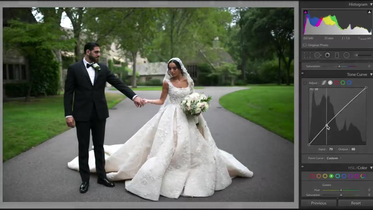 Tone curve panel open with two adjustment points added
Before touching exposure sliders, Kobeissi goes straight to the tone curve to establish the overall tonal character of the image. The move here is subtle but important: lift the bottom-left anchor point (which controls the deep blacks) slightly upward. This softens the darkest tones so they read as a dark gray rather than true black. It’s the foundational trick behind that “lifted shadow” look you see in almost every film-emulation preset on the market.
Tone curve panel open with two adjustment points added
Before touching exposure sliders, Kobeissi goes straight to the tone curve to establish the overall tonal character of the image. The move here is subtle but important: lift the bottom-left anchor point (which controls the deep blacks) slightly upward. This softens the darkest tones so they read as a dark gray rather than true black. It’s the foundational trick behind that “lifted shadow” look you see in almost every film-emulation preset on the market.
Then bring the top-right point (highlights and whites) slightly downward to pull the brightest areas away from pure white. On a wedding photo, watch what happens to the dress as you do this. The detail comes back, and the whole image takes on that matte, understated quality that reads as elegant rather than overprocessed. Two points on the curve, kept simple, and the image already shifts meaningfully.
Step 2: Shift the Temperature Toward Blue
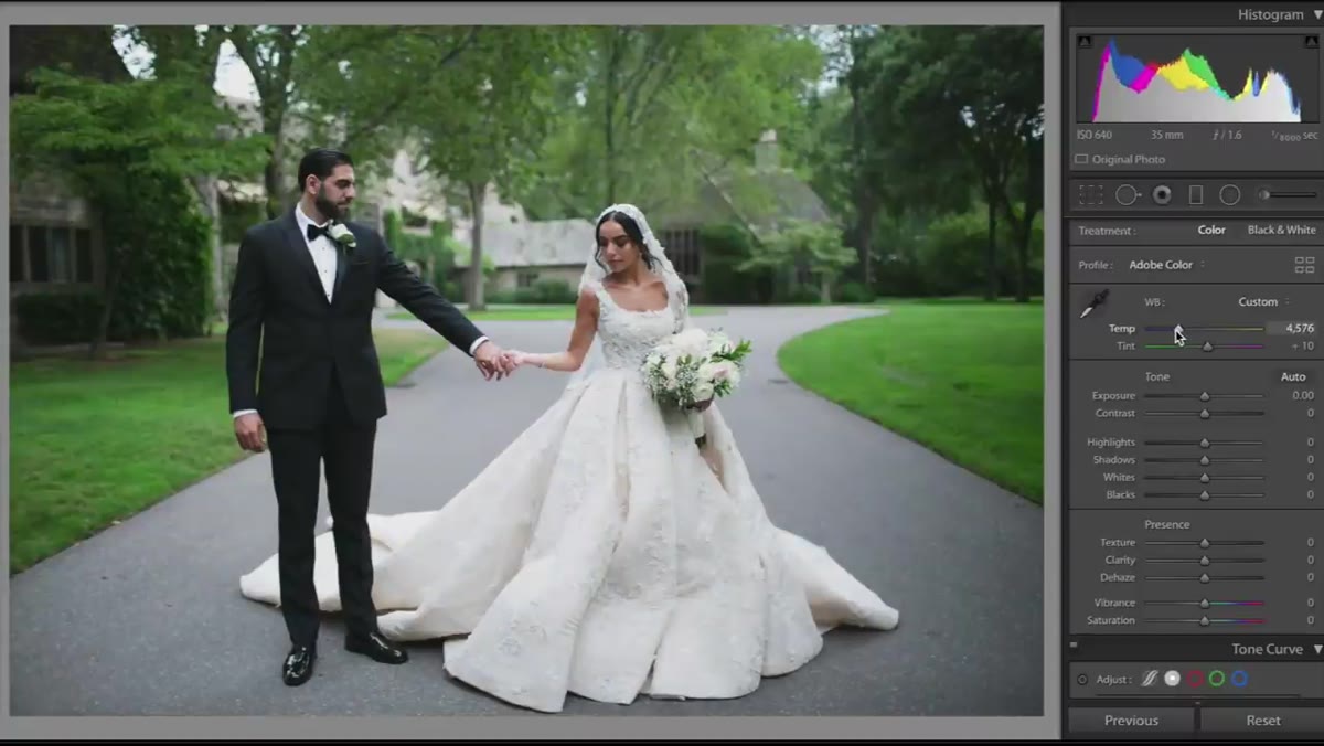 White balance temperature slider pulled left toward cooler tones
The color temperature adjustment here is deliberate and directional. Pull the temperature slider left, toward the blue/cool side. Kobeissi is clear that this blue lean is a defining characteristic of the wedding preset aesthetic. You’re not going for arctic or clinical, just a gentle coolness that reads as clean and modern rather than warm and golden.
White balance temperature slider pulled left toward cooler tones
The color temperature adjustment here is deliberate and directional. Pull the temperature slider left, toward the blue/cool side. Kobeissi is clear that this blue lean is a defining characteristic of the wedding preset aesthetic. You’re not going for arctic or clinical, just a gentle coolness that reads as clean and modern rather than warm and golden.
This is a matter of taste and will vary by original image. If you’re shooting in open shade, you may need less correction than a midday sun photo. Start conservatively and compare against the original. The goal is a noticeable shift without it looking like a mistake.
Step 3: Bring Up Exposure, Then Protect the Highlights
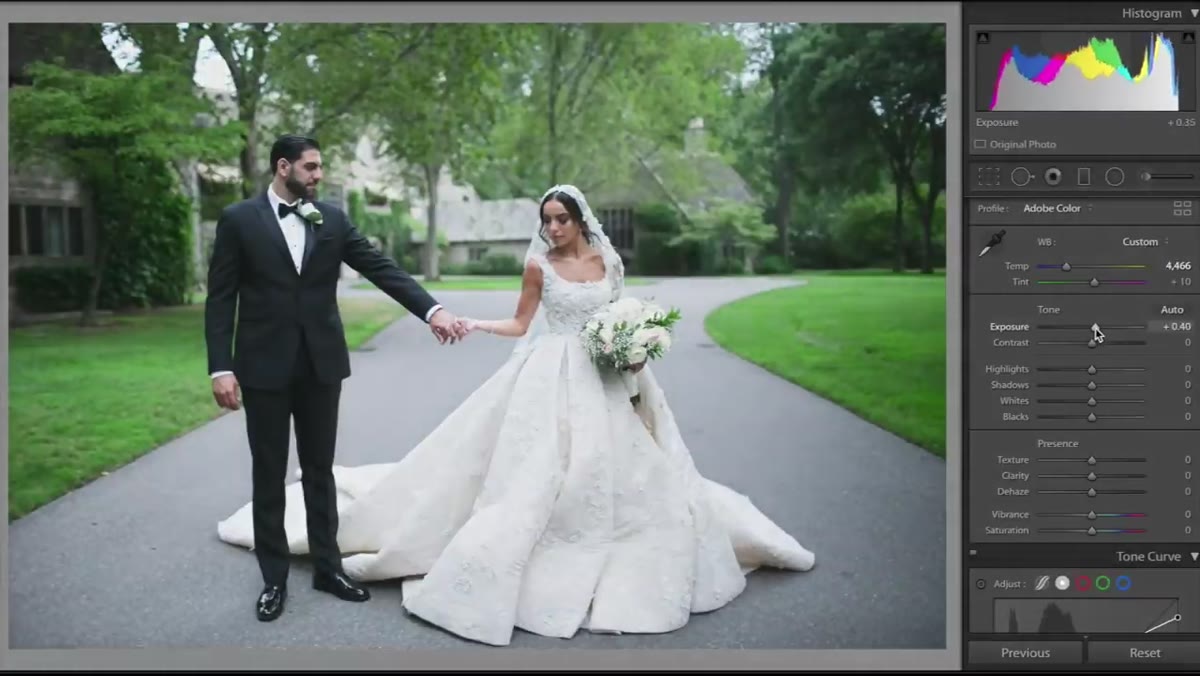 Exposure slider raised, highlights and whites sliders pulled down
Wedding presets tend to run bright. Kobeissi nudges the exposure up to push the image into that airy territory. But any exposure increase risks blowing out light-toned areas, especially a white dress, so immediately after bumping exposure, bring the Highlights slider down, then bring the Whites slider down as well. You’re essentially pushing brightness into the midtones while reining in the extremes.
Exposure slider raised, highlights and whites sliders pulled down
Wedding presets tend to run bright. Kobeissi nudges the exposure up to push the image into that airy territory. But any exposure increase risks blowing out light-toned areas, especially a white dress, so immediately after bumping exposure, bring the Highlights slider down, then bring the Whites slider down as well. You’re essentially pushing brightness into the midtones while reining in the extremes.
Think of it as expanding the luminosity of the image without losing the endpoints. The net result is an overall brighter, more open feel that still retains texture and detail in the dress or any other light-toned subject areas.
Step 4: Transform the Greens in HSL
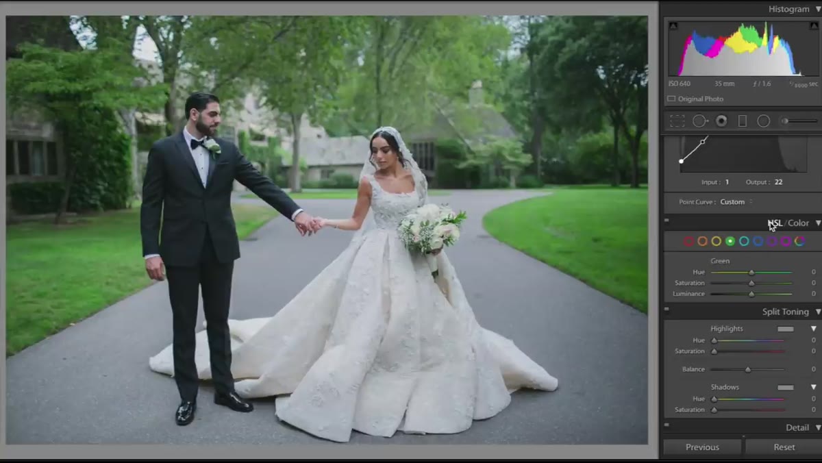 HSL panel open, green hue slider being adjusted
This is the step that justifies the whole “use a photo with greenery” requirement. Inside the HSL panel (Hue, Saturation, Luminance), navigate to the green channel in the Hue tab. Moving this slider changes what shade of green the camera-rendered greens actually become. Slide it one direction and the grass picks up a more synthetic, lime-toned quality. Slide it the other direction and it shifts toward a yellow-green or an olive, more muted and organic.
HSL panel open, green hue slider being adjusted
This is the step that justifies the whole “use a photo with greenery” requirement. Inside the HSL panel (Hue, Saturation, Luminance), navigate to the green channel in the Hue tab. Moving this slider changes what shade of green the camera-rendered greens actually become. Slide it one direction and the grass picks up a more synthetic, lime-toned quality. Slide it the other direction and it shifts toward a yellow-green or an olive, more muted and organic.
Find the hue that matches the feel you’re after, then consider whether to adjust the Saturation of that green up or down. Pulling saturation down gives a softer, more faded result. Pulling it up gives the greens more pop and presence. Luminance will brighten or darken the greens independently of everything else. Kobeissi leaves luminance mostly alone here, which is often the right call. Over-brightening the greens makes them look lit from within, which can read as artificial fast.
Step 5: Add Color to Highlights and Shadows Using Split Toning
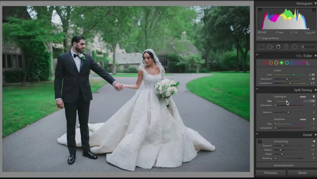 Split toning panel with blue highlights and yellow shadows selected
To finish the color grade, Kobeissi moves into the split toning section and adds a very small amount of blue to the highlights. She’s talking values in the single digits, around 2 or 3. This ties the highlight tones back to the cool temperature shift from step two and gives the brightest areas of the image a cohesive color feel.
Split toning panel with blue highlights and yellow shadows selected
To finish the color grade, Kobeissi moves into the split toning section and adds a very small amount of blue to the highlights. She’s talking values in the single digits, around 2 or 3. This ties the highlight tones back to the cool temperature shift from step two and gives the brightest areas of the image a cohesive color feel.
For the shadows, a slight yellow-warm tint is added, also kept subtle, around 5. This warm-cool contrast between shadows and highlights is a classic color grading technique. It creates depth and visual interest without being loud about it. The shadows feel grounded and slightly filmic; the highlights feel clean and cool.
Step 6: Fine-Tune in Camera Calibration
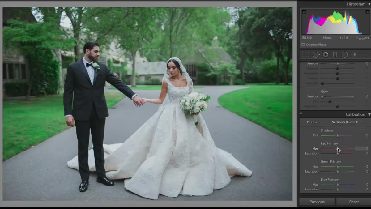 Camera calibration panel open at bottom of Develop module
The camera calibration panel sits at the bottom of the Develop module and gets overlooked by a lot of editors. Kobeissi describes it as one of her favorite sections, and after working with it consistently, I’d agree. The primary color channels here (red, green, blue) each have hue and saturation controls that work independently of the HSL adjustments you made earlier. Small moves here can shift the overall color balance in ways that feel more organic than the basic temperature and tint sliders.
Camera calibration panel open at bottom of Develop module
The camera calibration panel sits at the bottom of the Develop module and gets overlooked by a lot of editors. Kobeissi describes it as one of her favorite sections, and after working with it consistently, I’d agree. The primary color channels here (red, green, blue) each have hue and saturation controls that work independently of the HSL adjustments you made earlier. Small moves here can shift the overall color balance in ways that feel more organic than the basic temperature and tint sliders.
Experiment with the blue primary hue and saturation to reinforce the cool cast from earlier steps. Small adjustments here tend to have outsized effects, so treat this section as a fine-tuning layer rather than a primary grading tool.
A Note on Saving and Adapting This as an Actual Preset
Once you land on a combination of settings that works, save it as a named preset immediately. In Lightroom, that’s as simple as clicking the “+” in the Presets panel and capturing your current Develop settings. Where I’d push further is in creating variations: save one version with the saturation of the greens pulled back for overcast shooting conditions, and another with the exposure step dialed down for already-bright images. A single look rarely serves every lighting situation, and having two or three tonal variants of the same preset saves the manual adjustment work later.
Also worth noting: these color decisions are deeply photo-dependent. The calibration panel adjustments especially will shift in impact based on your camera’s color science. Canon RAWs will respond differently than Sony files. Build the preset on a camera-specific image and test it across a small batch before committing it to a whole shoot.
The single biggest takeaway here is that the wedding preset aesthetic is a formula, not a secret. Lifted blacks, pulled highlights, a cool temperature lean, manipulated greens, and a subtle split tone. Once you understand the components, you can reproduce or customize it for any look you’re chasing, without buying someone else’s packaged interpretation of it. Watch the full tutorial on YouTube to see Kobeissi demonstrate each adjustment in real time. Seeing the before-and-after comparisons she shows at each stage is worth the full watch, even if you’re already comfortable in Lightroom.
Comments
Leave a Comment