I keep a spreadsheet of the hours my automated workflows have saved me. Over 2,400 hours at last count. That number didn’t happen by accident. It happened because I’ve spent years paying attention to the small details that most people skip past, the kind of thing you notice when you’re processing hundreds of images for an e-commerce client and one weird behavior in your software costs you twenty minutes of confused clicking. Presets are one of those areas where the details matter enormously, and yet most photographers I know never dig deeper than dragging a slider and calling it done.
In this Matt Kloskowski tutorial on Lightroom Classic presets, Watch the full tutorial on YouTube – he runs through a handful of genuinely useful tips that the official documentation never bothers explaining clearly. Matt’s been around long enough to know which questions photographers actually ask, and this one is full of the kind of answers that make you feel slightly embarrassed you didn’t already know them. I’ll walk through each tip here with enough context that you can act on them immediately.
Step 1: Understand What Italicized Preset Names Are Telling You
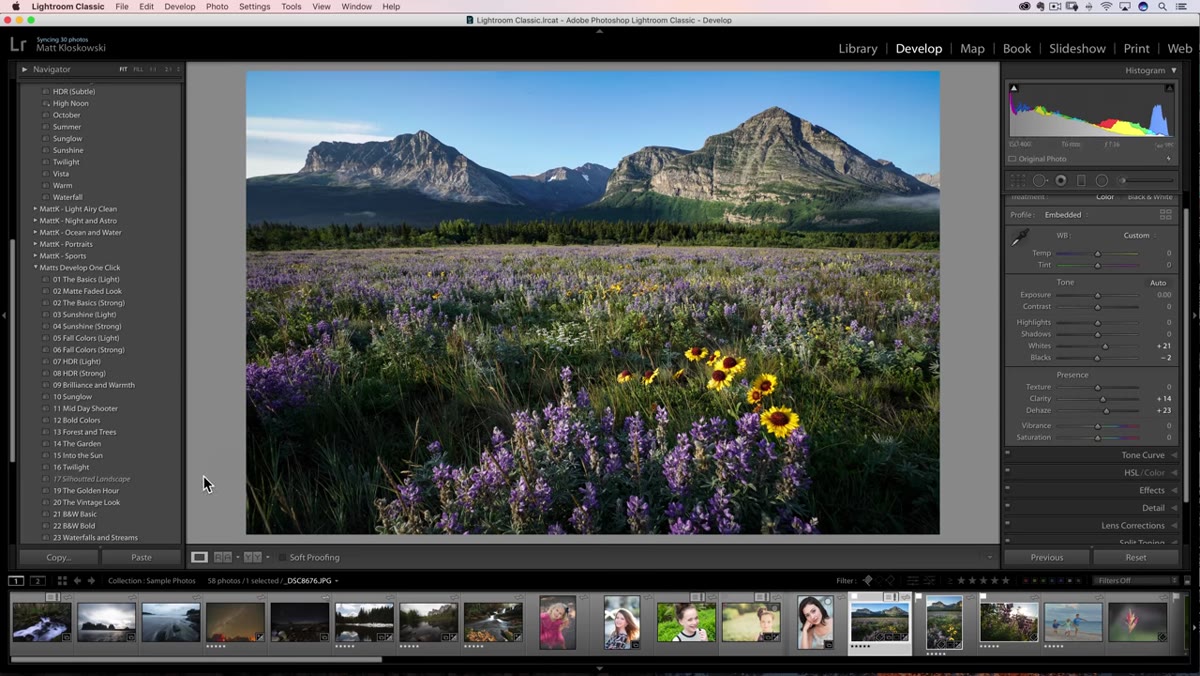 Preset panel showing italicized preset name alongside non-italicized presets
When you’re browsing your preset panel in Lightroom Classic and you notice that one preset name appears in italics while the others look normal, that is not a display glitch. It is Lightroom telling you something specific about compatibility. Italicized presets contain settings that were built for raw files, and you currently have a JPEG selected. The two most common culprits are a camera profile baked into the preset (some of Adobe’s own Camera Matching profiles are raw-only) or a specific process version setting buried in the Calibration panel.
Preset panel showing italicized preset name alongside non-italicized presets
When you’re browsing your preset panel in Lightroom Classic and you notice that one preset name appears in italics while the others look normal, that is not a display glitch. It is Lightroom telling you something specific about compatibility. Italicized presets contain settings that were built for raw files, and you currently have a JPEG selected. The two most common culprits are a camera profile baked into the preset (some of Adobe’s own Camera Matching profiles are raw-only) or a specific process version setting buried in the Calibration panel.
In practice, Matt notes that this usually does not create a visible difference in the result. The preset will still apply. But knowing why the italics appear saves you from that moment of second-guessing yourself mid-session, wondering if something is broken. When I’m running through a large client batch that mixes raw and JPEG files, this visual cue is actually useful – it tells me which presets I’ve built or bought that I should reserve for my raw workflow and which ones are format-agnostic.
Step 2: Use the Built-In Import Tool to Install Presets (Stop Doing It the Hard Way)
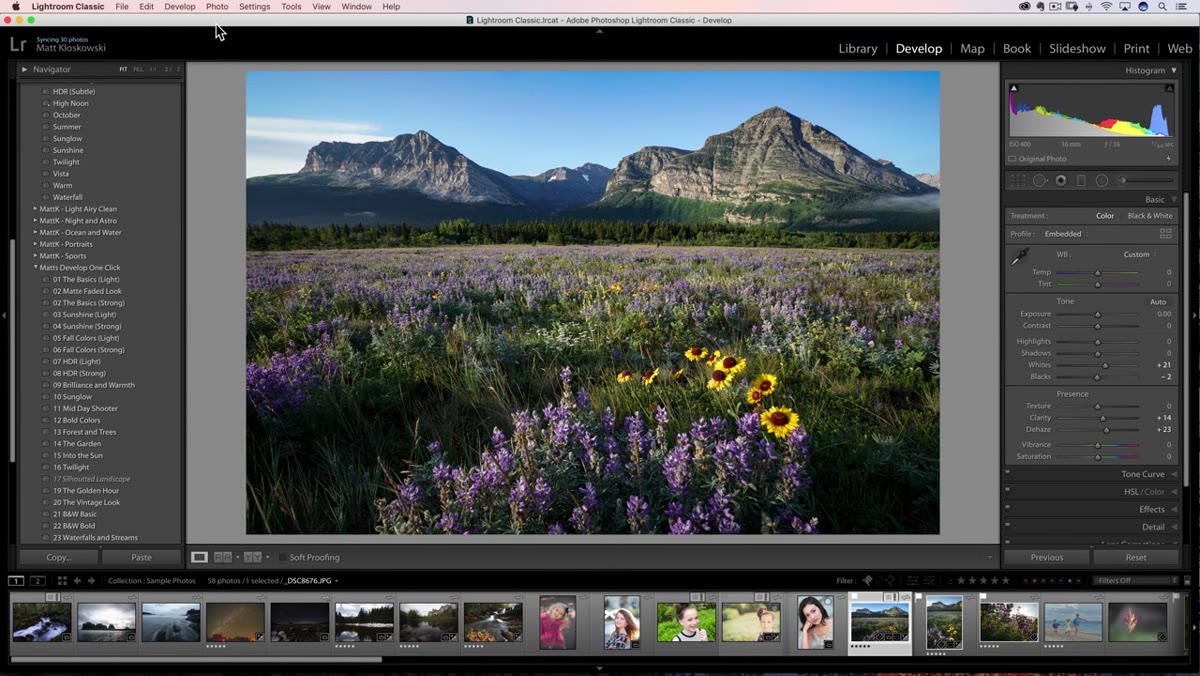 File menu open with Import Develop Profiles and Presets option highlighted
Adobe quietly made preset installation dramatically simpler in recent versions of Lightroom Classic, and a surprising number of photographers I talk to are still manually hunting down AppData folders and dragging files around. Stop doing that. The correct path is through the File menu, where you’ll find “Import Develop Profiles and Presets.” Click it, navigate to your preset file, and select it.
File menu open with Import Develop Profiles and Presets option highlighted
Adobe quietly made preset installation dramatically simpler in recent versions of Lightroom Classic, and a surprising number of photographers I talk to are still manually hunting down AppData folders and dragging files around. Stop doing that. The correct path is through the File menu, where you’ll find “Import Develop Profiles and Presets.” Click it, navigate to your preset file, and select it.
Here’s the part that makes this genuinely useful for anyone buying preset bundles: Lightroom will accept a zipped file directly. You do not need to unzip the package first. Select the ZIP, confirm the import, and Lightroom handles everything – both develop presets and any custom profiles that come bundled with them. This matters because some third-party preset systems include profiles alongside the XMP files, and the old manual method often meant profiles ended up in the wrong location. The import tool puts everything exactly where it needs to be.
Step 3: Recognize the Difference Between Presets Built for Modern Lightroom vs. Older Versions
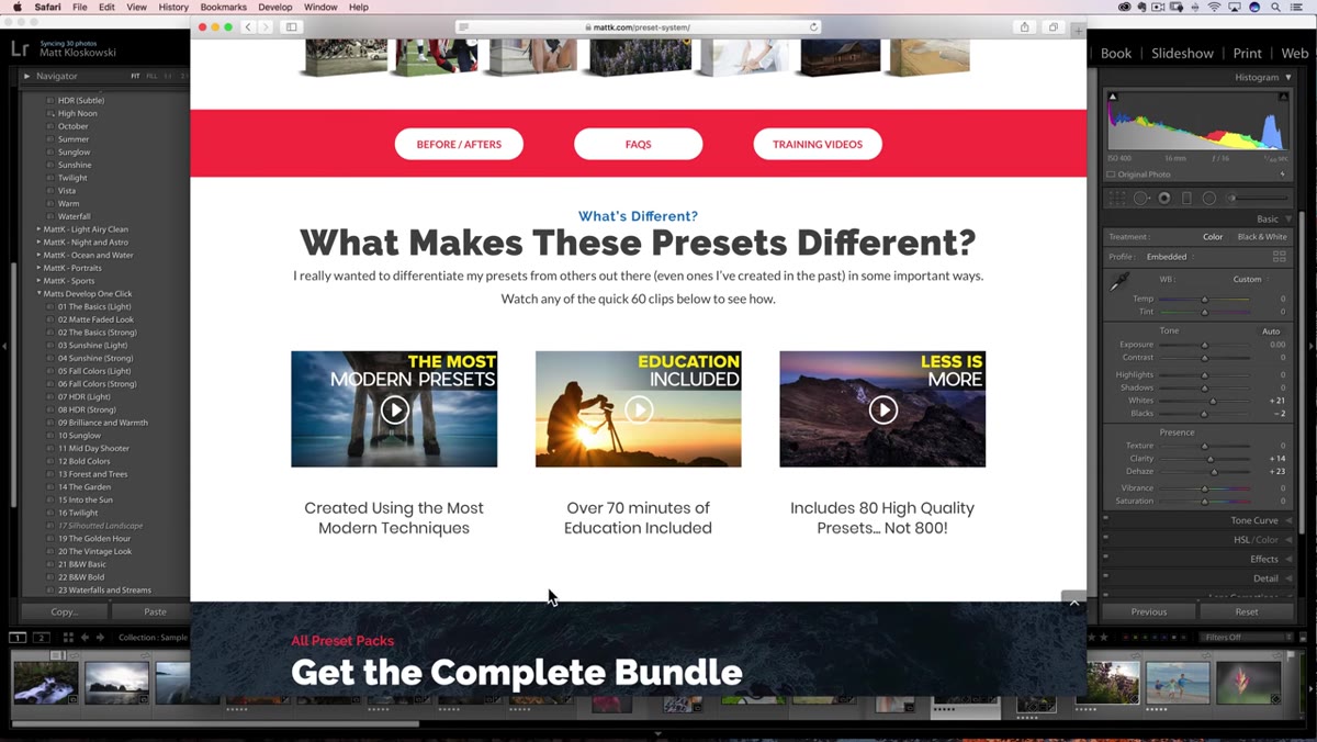 Webpage showing preset bundle designed for later versions of Lightroom Classic
Matt makes a point in this section that I think is worth expanding on from a professional standpoint. Presets built to be backward-compatible with older versions of Lightroom cannot take advantage of newer processing technology. If a preset creator wants their work to function in Lightroom from six years ago, they have to avoid using any controls or profiles that were introduced after that version. That is a real constraint.
Webpage showing preset bundle designed for later versions of Lightroom Classic
Matt makes a point in this section that I think is worth expanding on from a professional standpoint. Presets built to be backward-compatible with older versions of Lightroom cannot take advantage of newer processing technology. If a preset creator wants their work to function in Lightroom from six years ago, they have to avoid using any controls or profiles that were introduced after that version. That is a real constraint.
For my workflow, this becomes relevant when I’m evaluating whether to buy a preset pack or build my own. Presets optimized for current Lightroom Classic can use the full range of modern tools – newer masking features, updated tone curve behavior, improved profile options. If you’re running a current subscription and working on recent hardware, you’re leaving capability on the table by sticking with legacy preset sets. Matt’s philosophy of fewer, better presets built for the current toolset aligns with how I think about actions in Photoshop. A tightly built set of 80 presets that do exactly what you need beats 400 bloated ones that were designed to work everywhere and therefore work perfectly nowhere.
Step 4: Lean Into Education Bundled With Presets, Not Just the Presets Themselves
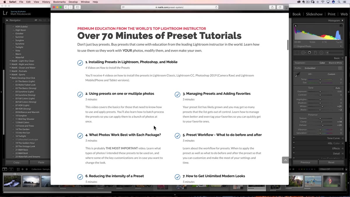 Preset bundle page showing video education alongside before and after examples
This is the tip in the tutorial that I think gets undervalued. Matt mentions that his preset bundle includes over 70 minutes of explanation – what settings he used, what types of photos each preset is suited for, and how to adapt the preset to your own image rather than just accepting the default result. That kind of documentation changes the nature of what you’re buying.
Preset bundle page showing video education alongside before and after examples
This is the tip in the tutorial that I think gets undervalued. Matt mentions that his preset bundle includes over 70 minutes of explanation – what settings he used, what types of photos each preset is suited for, and how to adapt the preset to your own image rather than just accepting the default result. That kind of documentation changes the nature of what you’re buying.
A preset without context is a shortcut that you’re blindly trusting. A preset with detailed reasoning behind it is a learning tool. When I’ve built batch processing systems for clients, the most time-consuming part is never the technical build – it’s the decision-making layer underneath it. Understanding why a particular preset pushes shadows a certain way, or why a profile choice was made, lets you adjust intelligently when the preset doesn’t quite land on a specific image. You stop being a preset consumer and start being someone who actually understands the edit.
From My Own Bench: A Note on Preset Audits
Every six months I go through my preset library and delete anything I haven’t used. This sounds obvious, but most photographers I know have preset panels that look like digital hoarding. The problem with too many presets is cognitive – when you’re working fast on a deadline, scrolling through 300 options is slower than having 40 good ones. I also flag any presets that were built before a major Lightroom update to check whether they’re still behaving as intended. Profiles change, process versions change, and a preset that looked right in 2019 can render differently today if it was built on older calibration logic.
The italics tip from this tutorial is actually a useful starting point for that kind of audit. If you’re seeing lots of italicized presets when working on JPEGs, that’s a signal your library may be weighted toward raw-only tools, and worth knowing if your clients regularly send you mixed file batches.
The single most important thing to take from Matt’s breakdown is this: presets are not a set-and-forget tool. The more you understand why they behave the way they do – what the italics mean, how installation actually works, what trade-offs were made when they were built – the more control you have over your own editing. These are not beginner topics. They’re professional ones.
Watch the full tutorial on YouTube to see Matt walk through each of these tips directly in Lightroom Classic.
Comments (2)
Applied this to my portfolio shots and the improvement is noticeable.
Printing this out and pinning it next to my monitor. That good.
Leave a Comment