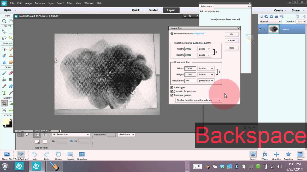
Most custom brush packs feel like someone else’s handwriting. You install them, they look great in the preview, and then you spend twenty minutes trying to make them fit your actual project. I’ve been there. After fifteen years in commercial studios, I’ve got folders full of brush sets I downloaded once and never opened again. The ones I actually reach for are the ones I made myself - because they carry the specific texture, weight, and imperfection that a stock pack can never replicate.
That’s why this CreativeLive tutorial caught my attention. Watch the full tutorial on YouTube - it runs through a genuinely clever approach: take a physical medium (in this case, chalk smeared with water to mimic paint), photograph it with your phone, and convert that image into a working brush inside Photoshop Elements. The whole workflow takes maybe fifteen minutes once you know the steps, and the result is a brush that looks organic because it literally is.
For anyone doing editorial compositing, digital illustration, or even product work where you need a handmade feel, this is a technique worth having locked in. Here’s the full breakdown.
Step 1: Prepare Your Source Photo
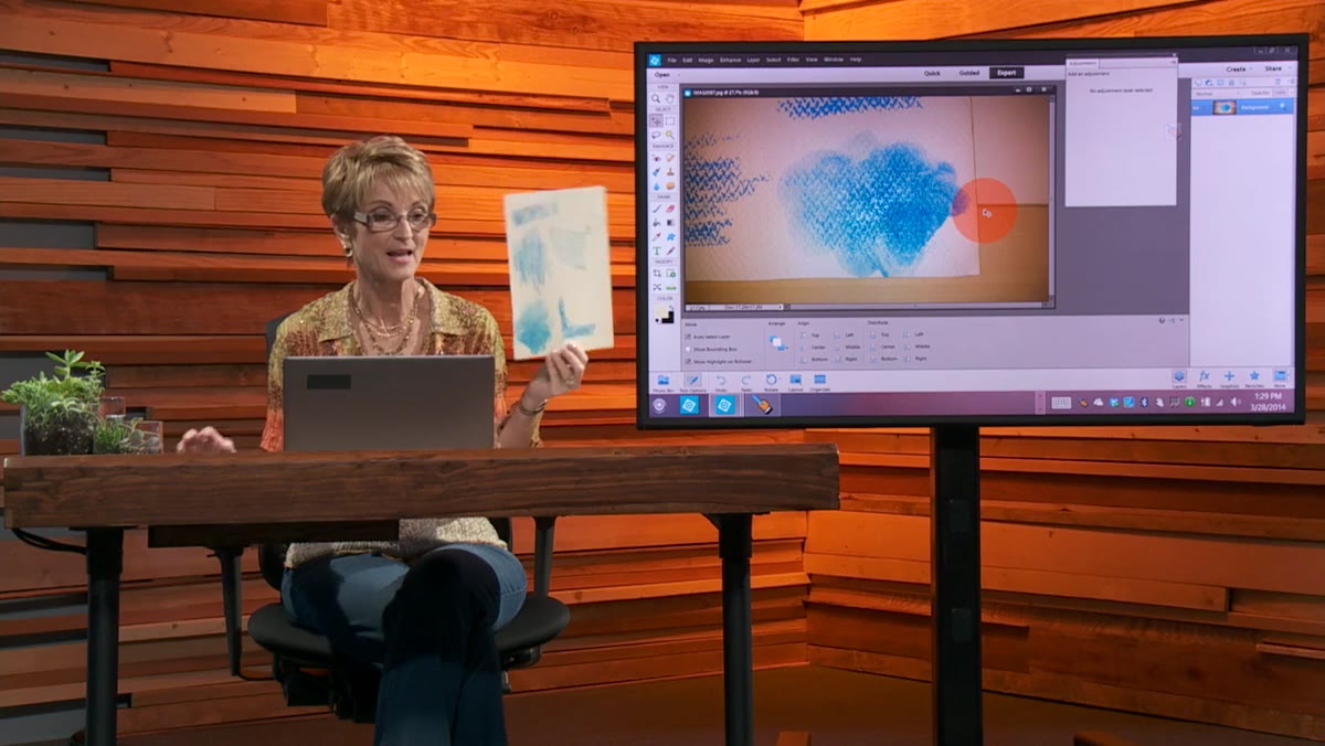 Chalk texture photo opened as background layer in PSE
Start by photographing your physical texture against a surface that will give you clean contrast. The tutorial uses chalk mixed with water on a dark background, but the principle works with ink washes, paint strokes, coffee rings - anything with irregular, organic edges. Shoot it with your phone, transfer it to your computer, and open it in Photoshop Elements.
Chalk texture photo opened as background layer in PSE
Start by photographing your physical texture against a surface that will give you clean contrast. The tutorial uses chalk mixed with water on a dark background, but the principle works with ink washes, paint strokes, coffee rings - anything with irregular, organic edges. Shoot it with your phone, transfer it to your computer, and open it in Photoshop Elements.
Once it’s open, convert the background to a regular layer so the software can treat it as editable. Crop out anything you don’t need - you only want the core texture area that will actually become the brush tip. Tighter is better at this stage.
Step 2: Convert to Black and White
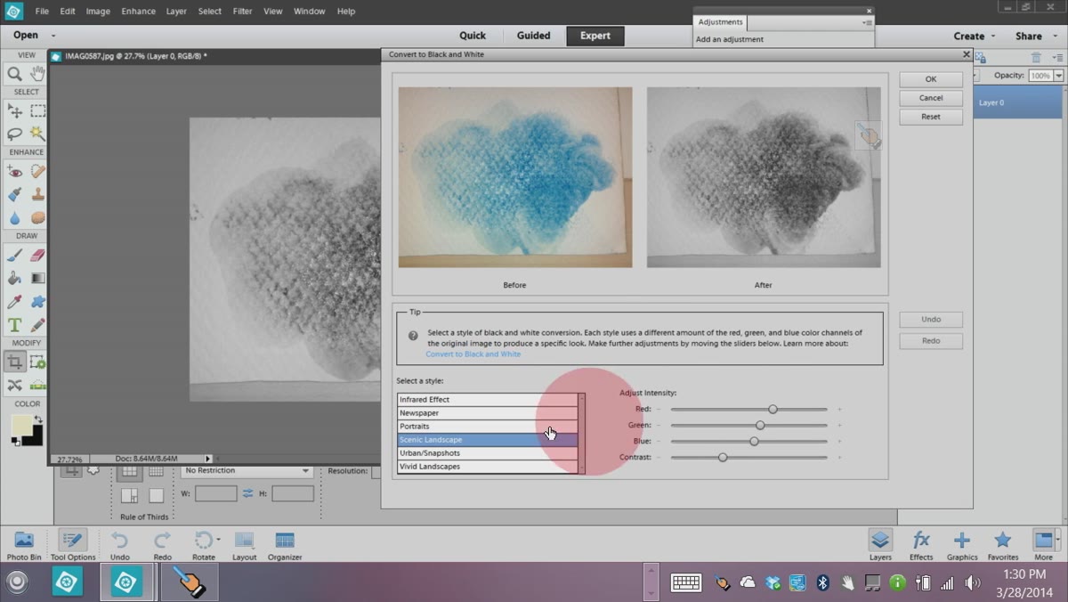 Convert to Black and White dialog with Vivid Landscape preset selected
Brushes in Photoshop are grayscale by definition. Black areas apply full paint, white areas apply nothing, and gray values fall in between. That’s why converting your photo to black and white isn’t just aesthetic - it’s structural. Head to the Enhance menu and use the Convert to Black and White option.
Convert to Black and White dialog with Vivid Landscape preset selected
Brushes in Photoshop are grayscale by definition. Black areas apply full paint, white areas apply nothing, and gray values fall in between. That’s why converting your photo to black and white isn’t just aesthetic - it’s structural. Head to the Enhance menu and use the Convert to Black and White option.
The tutorial finds that the “Vivid Landscape” preset produces the best result for this type of texture because it punches up contrast while keeping the soft, blobby edges intact. Experiment with the contrast slider, but resist the urge to crank it all the way. Those semi-transparent, feathered edges are what make the brush look like a real brushstroke rather than a rubber stamp.
Step 3: Resize the Image for Print-Quality Brushes
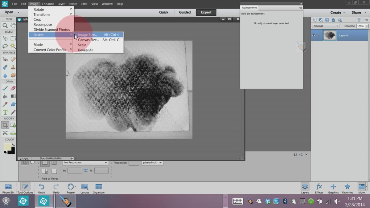 Image Size dialog showing resolution set to 300 PPI
A brush created from a 72 PPI image will look coarse and pixelated the moment you scale it up. Before you go any further, check Image Size and bump the resolution to 300 PPI. The tutorial targets a width of around 2500 pixels at that resolution - large enough to hold detail when the brush is used at scale.
Image Size dialog showing resolution set to 300 PPI
A brush created from a 72 PPI image will look coarse and pixelated the moment you scale it up. Before you go any further, check Image Size and bump the resolution to 300 PPI. The tutorial targets a width of around 2500 pixels at that resolution - large enough to hold detail when the brush is used at scale.
Make sure Constrain Proportions is checked before you change any values. This keeps your texture from stretching in ways that will look wrong when the brush is applied. It’s a small detail that matters more than people expect.
Step 4: Boost the Whites With a Levels Adjustment
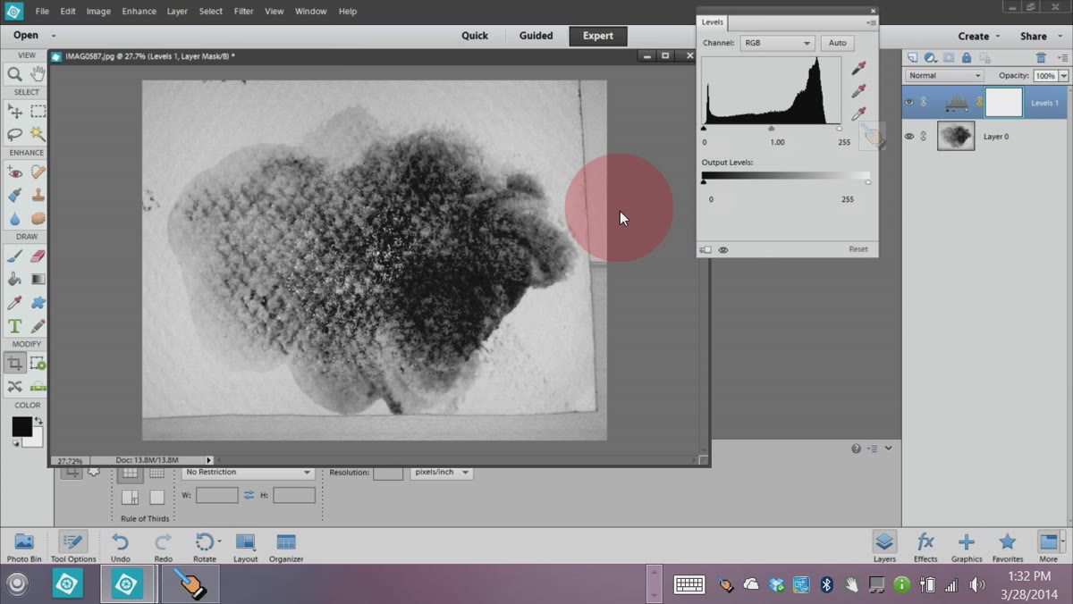 Levels adjustment layer dialog with white point slider pulled left
Even after the black and white conversion, most photos will still carry murky gray values in what should be the white areas. A Levels adjustment layer cleans this up fast. Go to Layer, New Adjustment Layer, Levels, and pull the white point slider inward from the right until the background whites are clean and bright.
Levels adjustment layer dialog with white point slider pulled left
Even after the black and white conversion, most photos will still carry murky gray values in what should be the white areas. A Levels adjustment layer cleans this up fast. Go to Layer, New Adjustment Layer, Levels, and pull the white point slider inward from the right until the background whites are clean and bright.
The goal is to maximize the contrast between the texture marks and the background without destroying the soft, transparent gradients along the edges of your brushstroke. Merge the adjustment layer down when you’re satisfied so you’re working with a single flattened image before the next step.
Step 5: Define the Brush
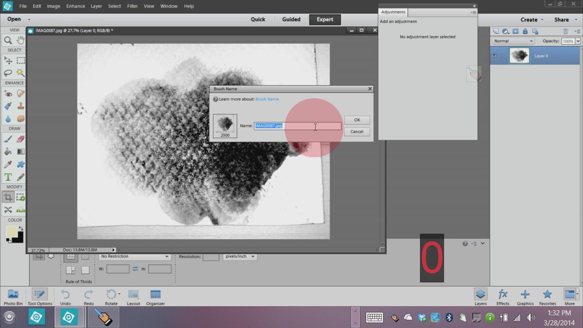 Edit menu open with Define Brush Preset option highlighted
This is the step most people don’t realize exists until someone shows them. Go to Edit and choose Define Brush. Photoshop Elements will prompt you to name your new brush, and then it saves it directly to your brush library. No export, no import, no third-party preset manager required.
Edit menu open with Define Brush Preset option highlighted
This is the step most people don’t realize exists until someone shows them. Go to Edit and choose Define Brush. Photoshop Elements will prompt you to name your new brush, and then it saves it directly to your brush library. No export, no import, no third-party preset manager required.
Your new brush will appear at the bottom of the brush picker. Create a new layer, set your foreground color to black, select the brush tool, and give it a single click. You’ll see your texture appear as a brush tip. It will probably look a little rough around the edges - that’s expected, and the next step handles it.
Step 6: Clean Up the Edges With a Layer Mask
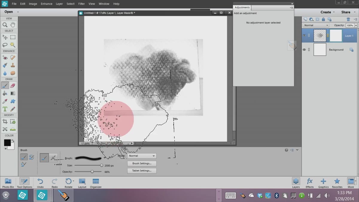 Layer mask added with soft black brush painting over brush stroke edges
The raw brush stamp will almost certainly have stray marks and uneven edges from the original photo. Rather than going back and re-editing the source image, apply a layer mask directly to the test stroke layer. This is a non-destructive way to clean things up without committing to permanent erasing.
Layer mask added with soft black brush painting over brush stroke edges
The raw brush stamp will almost certainly have stray marks and uneven edges from the original photo. Rather than going back and re-editing the source image, apply a layer mask directly to the test stroke layer. This is a non-destructive way to clean things up without committing to permanent erasing.
With the mask active, paint in black using a soft-edged brush set to lower opacity - somewhere around 50-60% to start. Work around the edges of your brushstroke, fading out the rough areas gradually. The goal isn’t a perfectly clean silhouette. You want to keep the natural imperfection of the stroke while removing the obvious photographic noise around it. Take your time at this stage. A well-masked edge is what separates a brush that looks handmade from one that looks like a photograph of something handmade.
From the Studio: Where This Fits Into a Real Workflow
I’ve started using a version of this process to build texture overlays for product retouching - specifically for clients who want a hand-crafted, artisanal look on packaging and print ads. The key difference in my workflow is that I photograph my textures on a light table rather than a dark background, which gives me cleaner white separation from the start and cuts the Levels adjustment work in half.
One thing the tutorial doesn’t cover but is worth adding: once you’ve defined the brush, open the Brush Settings panel and save a full preset with your spacing, scattering, and texture settings locked in. A brush tip alone is only half the equation. The dynamics are what make it behave naturally when you’re actually painting with it. I keep a small library of these full presets organized by medium type - chalk, ink, watercolor, dry brush - and it’s saved me a measurable amount of time on projects where the art director wants something that doesn’t look like it came out of a computer.
The biggest takeaway here is that your best custom assets often cost nothing except fifteen minutes and whatever you have lying on your desk. A piece of chalk, a glass of water, and a phone camera can produce a brush that no marketplace pack will ever match, because it came from your hands and your process.
Watch the full tutorial on YouTube to see each step in real time - the visual reference is especially useful for the Levels and masking stages where small slider movements make a significant difference in the final result.
Comments
Leave a Comment