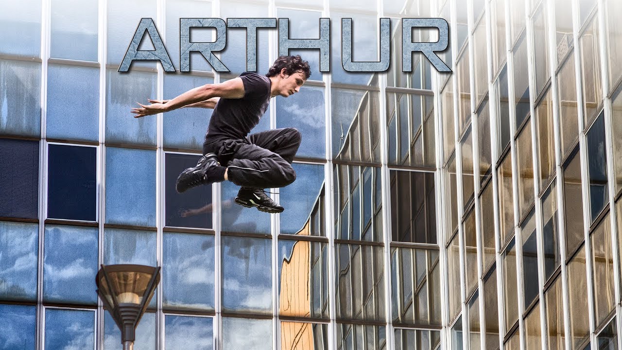
I’ve spent fifteen years in commercial studios where efficiency isn’t optional. Right now I’m deep in a run of action-sports campaign work for a Chicago ad agency, and the brief keeps pushing toward that kinetic, high-contrast look you see in parkour films and extreme sports content. So when I came across Serge Ramelli’s short action film featuring a character named Arthur, shot on the Canon 7D and 5D Mark II, I wasn’t watching it for entertainment. I was watching it as a workflow autopsy.
What Ramelli built here is genuinely instructive. Not because the film is flashy, but because the editing choices are deliberate in a way that translates directly to still photography post-production. The same logic that makes an action sequence feel urgent on screen is the logic that makes a commercial image pop off a product page.
Why Parkour Footage Forces Honest Editing Decisions
Parkour is unforgiving material. There’s no controlled lighting setup, no second-unit crew, no time to re-shoot a jump. Ramelli was working with Canon DSLRs that were groundbreaking at the time but required real discipline in post to look consistent across changing outdoor conditions. The color temperature shifts between shots taken in open sun versus under a building overhang are the exact same problem I face when processing e-commerce batches shot across a six-hour studio day where the ambient light creeps.
What you see in the film is a deliberate push toward a cooler, slightly desaturated base tone that acts as a unifying skin across inconsistent source footage. That’s not an accident. That’s a workflow decision made in post to solve a production constraint. Knowing why a choice was made matters more than knowing what button was pressed.
The Cinematic Color Grade: Cool Base, Lifted Shadows, Crushed Highlights
Ramelli’s signature in this piece leans on a few specific moves. The shadows are lifted slightly rather than pushed to pure black. This gives the image a film-like quality because it mimics the toe of a film curve, where deep shadows never fully clip to zero. In Photoshop terms, you’re pulling the black point on your Curves adjustment layer up from 0 to somewhere between 10 and 20 on the output side. That single adjustment separates a flat digital file from something that reads as intentionally graded.
The highlights are handled with restraint. Rather than blowing them out for a high-key look, they’re pulled back just enough to hold detail in the brightest parts of the frame. On a Curves layer, you’re pulling the top-right anchor point downward, maybe to an output of 235-240 instead of 255. Combined with the lifted blacks, this creates what colorists call a “contrast cage” where the image has punch without looking harsh.
The color itself skews cool in the midtones. A slight blue-cyan push in the midtone range of your Color Balance adjustment, or a corresponding warmth reduction in Hue/Saturation targeted specifically to yellows and reds, gives skin and concrete surfaces that silver-gray quality you see in action films from that era. Saturation overall is reduced by roughly 15-20 percent, not zeroed out, but tamed so the grade feels intentional rather than oversaturated.
Sharpening for Motion: When Clarity Works Against You
One thing I noticed in how the footage holds together is the restraint on sharpening. This is counterintuitive for photographers trained on landscape or product work, where maximum micro-contrast is usually the goal. In motion-influenced editing, over-sharpening creates a video-game aesthetic. The subjects start looking like they’ve been cut out and pasted rather than existing in the scene.
In Photoshop, this means using High Pass sharpening at a low radius (2-3 pixels set to Soft Light) rather than Unsharp Mask with an aggressive Amount. The result sharpens edges without adding halos, and it can be masked down easily on motion-blurred areas. I run this as a saved action in my own workflow, and it’s one I return to constantly on sports and lifestyle work.
Where This Approach Has Limits in Commercial Work
Here’s my honest caveat. This grade is beautiful for editorial and personal projects, and I genuinely admire what Ramelli built on a minimal production setup. But for product-focused commercial work, particularly anything involving apparel or branded color, the desaturation and cool shift will fight you. A client who has a specific Pantone red for their logo will not be thrilled when their hero product looks slightly maroon in a lifestyle shot graded this way.
My solution has been to grade the environment and background layers using this kind of cinematic approach, then protect the product layer on its own masked adjustment, keeping its saturation and color accuracy intact. You get the moodiness of a film look in the scene without compromising the brand asset. It’s more complex to set up as an action, but once it’s built, it’s repeatable. Everything repeatable goes in an action. That’s the rule.
The One Setting That Changes Everything
The lifted black point is the single technique from studying this piece that I’d hand to any photographer trying to modernize their editing style quickly. Pull your Curves output blacks from 0 to 15. Run it on your next ten images and see how many of them suddenly start looking like they belong in a campaign rather than a catalog.
Ramelli’s parkour short is a compact, well-executed demonstration of how cinematic thinking shapes post-production decisions. Watch the full video to see how these choices read in motion and get a sense of the pacing and tone that the grade is designed to support.
Comments
Leave a Comment