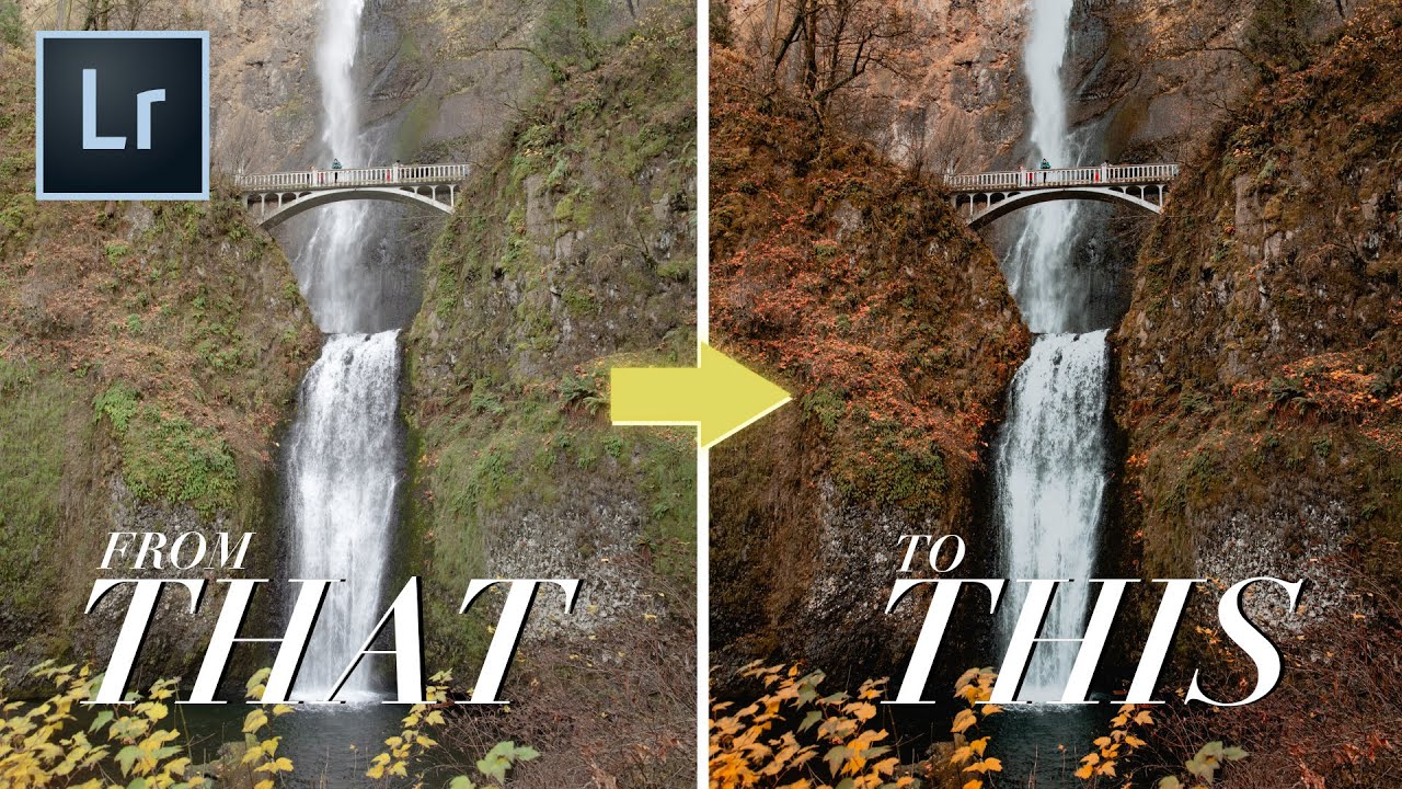
Every autumn I get a flood of requests from agency clients who shot outdoor campaigns in September and October and are now staring at RAW files that look like any other month. The foliage was stunning on location. On screen it reads beige. The problem isn’t exposure or white balance. It’s that fall color lives in a very specific tonal and hue relationship, and your all-purpose travel preset was never built to honor it.
In this Mango Street tutorial, Rachel and Daniel walk through building a dedicated fall preset from scratch in Lightroom Classic. Watch the full tutorial on YouTube before or alongside this breakdown. What I want to do here is slow down the steps, add the underlying logic, and give you enough specifics that you can actually rebuild this yourself without pausing the video every thirty seconds.
What makes this tutorial worth your time is the structure. Rather than throwing a single saturation slider at the problem, the approach here works through multiple systems in Lightroom: tone curve, basic panel, calibration, and HSL. Each layer adds something different. The result doesn’t look like a filter sitting on top of your photo. It looks like the photo was always supposed to be that color.
Step 1: Get Your Baseline Right First
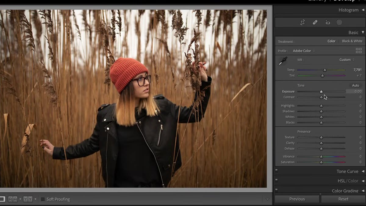 Lightroom Classic with fall photos loaded in Library
Before touching anything creative, get white balance and exposure to a reasonable starting point. This isn’t about perfection. It’s about making sure the preset you build actually transfers to other images. If you dial in a preset on a wildly underexposed photo, every setting that compensates for that underexposure becomes a liability when you apply it to something properly exposed. Shoot for neutral, then get creative.
Lightroom Classic with fall photos loaded in Library
Before touching anything creative, get white balance and exposure to a reasonable starting point. This isn’t about perfection. It’s about making sure the preset you build actually transfers to other images. If you dial in a preset on a wildly underexposed photo, every setting that compensates for that underexposure becomes a liability when you apply it to something properly exposed. Shoot for neutral, then get creative.
Step 2: Build Contrast in the Tone Curve (Point Mode)
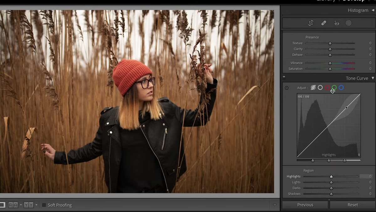 Tone curve panel in point mode showing S-curve variation
Switch to Point Curve mode in the Tone Curve panel. The default is a straight diagonal line, which means no contrast adjustment at all. For this fall look, the goal is a compressed, slightly moodier tonal range rather than a punchy contrast boost. Add a slight lift to the black point, pull shadows down gently, set a midpoint around the halfway mark, place another point three-quarters up, and then bring the top-right highlight point down a notch.
Tone curve panel in point mode showing S-curve variation
Switch to Point Curve mode in the Tone Curve panel. The default is a straight diagonal line, which means no contrast adjustment at all. For this fall look, the goal is a compressed, slightly moodier tonal range rather than a punchy contrast boost. Add a slight lift to the black point, pull shadows down gently, set a midpoint around the halfway mark, place another point three-quarters up, and then bring the top-right highlight point down a notch.
The effect is subtle compression. Your darkest darks lift just slightly, your highlights soften, and the overall feel becomes more cinematic without going full matte. After the point curve, switch to the Parametric Curve and drop Shadows to around negative 24 while pushing Highlights up to around positive 30. That combination creates local contrast while the global Contrast slider gets pulled back to roughly negative 15 to keep things from getting overdone.
Step 3: Adjust the Basic Panel for Tonal Balance
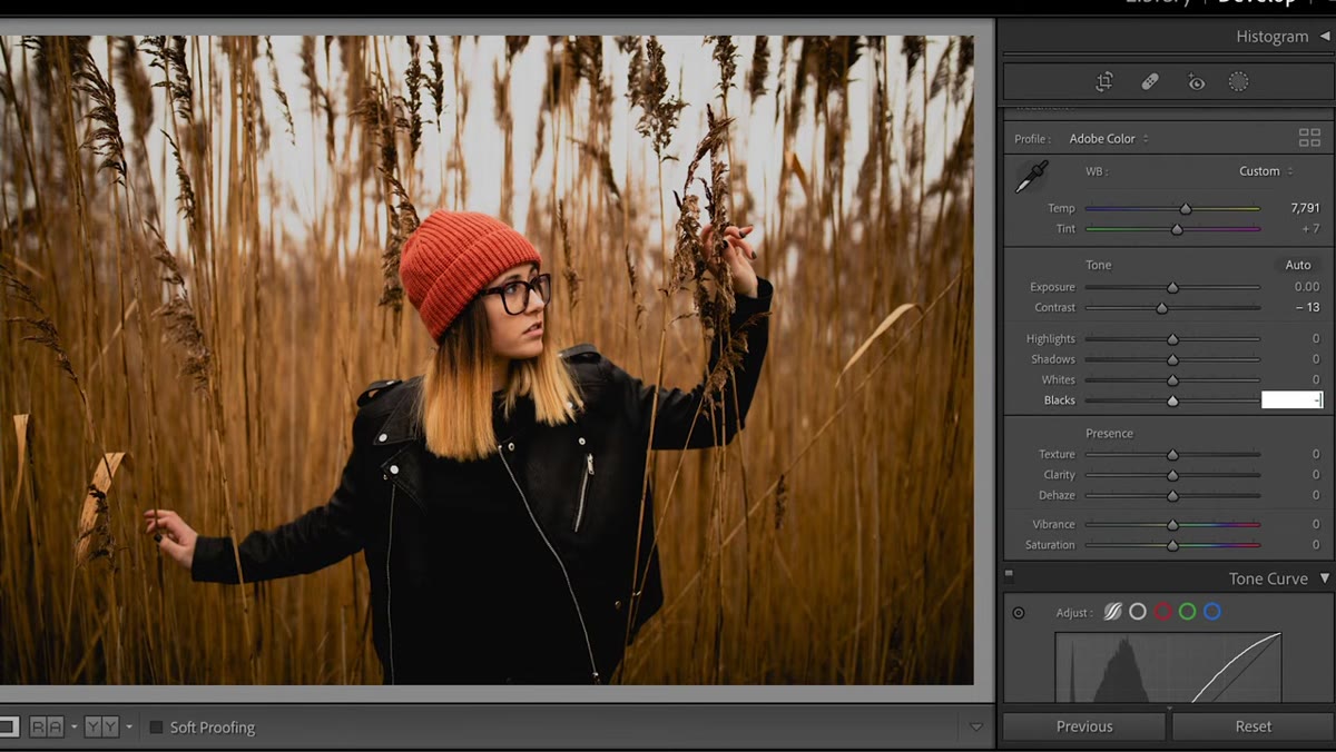 Basic panel with Blacks, Shadows, Highlights sliders adjusted
With the curve doing the heavy lifting on contrast shape, use the Basic panel to manage where detail lives. Pull Blacks down to around negative 10 to deepen the darkest tones slightly, then push Shadows up to approximately positive 70 so the darker areas of your image retain texture and information rather than going muddy. Highlights come down to around negative 35, which is less about this specific image and more about making the preset usable across a range of shots where skies or bright foliage might blow out.
Basic panel with Blacks, Shadows, Highlights sliders adjusted
With the curve doing the heavy lifting on contrast shape, use the Basic panel to manage where detail lives. Pull Blacks down to around negative 10 to deepen the darkest tones slightly, then push Shadows up to approximately positive 70 so the darker areas of your image retain texture and information rather than going muddy. Highlights come down to around negative 35, which is less about this specific image and more about making the preset usable across a range of shots where skies or bright foliage might blow out.
Then bump Dehaze up to positive 40. Dehaze adds micro-contrast and color saturation in a way that feels organic rather than oversaturated. Finally, drop Vibrance to negative 10. Vibrance specifically targets less-saturated colors in the image rather than globally cranking everything, which means your most dominant hues, reds, oranges, yellows, stay rich while the neutral or competing tones quiet down. That’s the key distinction between Vibrance and Saturation, and it’s why this adjustment works so well for fall.
Step 4: Reshape Color in the Calibration Panel
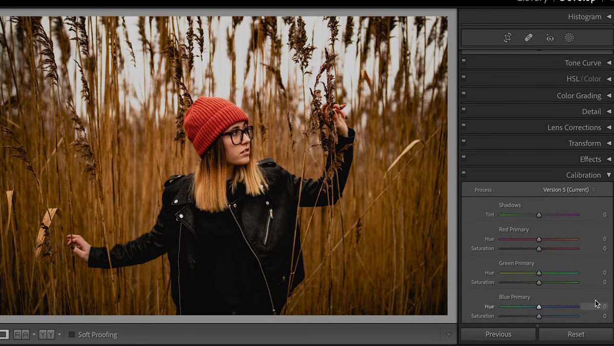 Camera Calibration panel with RGB primary sliders being adjusted
The Calibration panel sits at the very bottom of the Develop module and gets ignored by a lot of photographers. It shouldn’t. It works at the pixel level, shifting the underlying RGB primary values rather than applying a color cast on top of the image. For this preset, start by pulling the Shadow Tint toward green at around negative 20. It’s a subtle grounding shift you’ll barely see in isolation but will feel in the final result.
Camera Calibration panel with RGB primary sliders being adjusted
The Calibration panel sits at the very bottom of the Develop module and gets ignored by a lot of photographers. It shouldn’t. It works at the pixel level, shifting the underlying RGB primary values rather than applying a color cast on top of the image. For this preset, start by pulling the Shadow Tint toward green at around negative 20. It’s a subtle grounding shift you’ll barely see in isolation but will feel in the final result.
Move the Red Primary Hue slightly right (toward yellow-orange) and drop its saturation just a touch. For the Green Primary, crank the Hue up into the eighties. This is the boldest move in the whole preset and it pushes greens toward auburn and gold, which is exactly the color language of fall. Drop Green Primary Saturation to negative 20 to keep it from going neon. Finally, shift Blue Primary Hue to around negative 15, which pulls blues toward red-orange, and give Blue Primary Saturation a small positive bump to finish it off.
Step 5: Fine-Tune Specific Colors in the HSL Panel
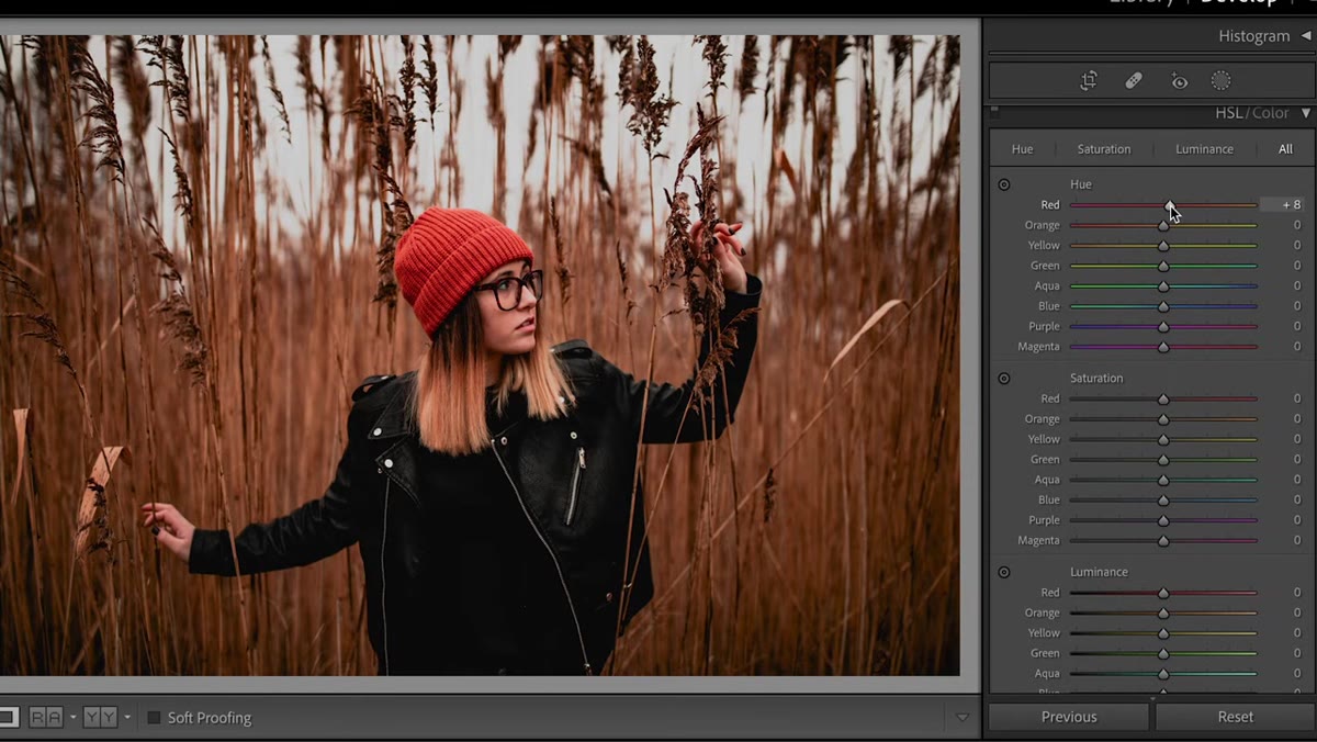 HSL panel open showing Hue sliders for Reds, Oranges, Yellows
The HSL panel is where you finalize the story the Calibration panel started. In the Hue section, shift Reds slightly toward orange, shift Oranges slightly toward yellow, and shift Yellows slightly back toward orange. This creates a tighter, warmer cluster of autumn tones rather than the broad spread of hues you’d see in a summer image.
HSL panel open showing Hue sliders for Reds, Oranges, Yellows
The HSL panel is where you finalize the story the Calibration panel started. In the Hue section, shift Reds slightly toward orange, shift Oranges slightly toward yellow, and shift Yellows slightly back toward orange. This creates a tighter, warmer cluster of autumn tones rather than the broad spread of hues you’d see in a summer image.
In the Saturation section, pull Reds and Oranges down a little. The Calibration adjustments already did the heavy color work, so HSL is about refinement rather than transformation. The goal is to avoid over-saturation in the skin and warmth tones, which is the fastest way to make a fall preset look fake on portraits.
A Note on Preset Portability Across Shooting Conditions
The smartest thing about this preset’s construction is that almost every adjustment is working in multiple directions at once. The contrast is added in the tone curve and then partially taken away in the global contrast slider. Saturation is boosted through Dehaze and then reined in through Vibrance and HSL Saturation. Calibration shifts the color without ever touching a Color Grading wheel.
In my own work processing batch jobs for ad clients, this kind of counterbalanced approach is what separates presets that hold up across fifty images from presets that only work on the hero shot you built them on. When adjustments offset each other rather than all pushing in the same direction, the preset has tolerance built in. A slightly brighter image or a different camera model won’t break it. If you plan to apply this across a whole session, test it on your darkest frame, your brightest frame, and one with skin tones before committing to a batch export.
The single most important idea in this tutorial is that fall color isn’t about adding orange. It’s about reorganizing the relationships between reds, greens, and blues so the image’s existing warmth comes forward. Work through the Calibration panel before you reach for the HSL sliders and you’ll get there in fewer moves with cleaner results.
Watch the full tutorial on YouTube to see Mango Street walk through the actual slider movements in real time, and download the free preset they link in the video description to use as a starting reference point for building your own version.
Comments
Leave a Comment