
Most Lightroom presets are black boxes. You click apply, something happens, and you have no idea whether it’s going to hold up across your next shoot or fall apart the moment your lighting changes. That’s a real problem in production work. I’ve spent years building systems for clients who need consistent color across hundreds of images, and the fastest way to waste time is to rely on a preset you don’t actually understand.
That’s what made this tutorial from Rachel and Daniel at Mango Street worth dissecting. In this Mango Street tutorial, they don’t just show you their final look. They build a preset from scratch, narrating every decision, which means you walk away understanding the logic behind the result rather than just copying settings. That understanding is the difference between a preset that works once and a workflow that scales.
What follows is a step-by-step reconstruction of their process, with the actual values they use and the reasoning behind each move. Follow along in Lightroom’s Develop module and you can recreate this from the ground up.
Step 1: Lock Down Your Foundation First
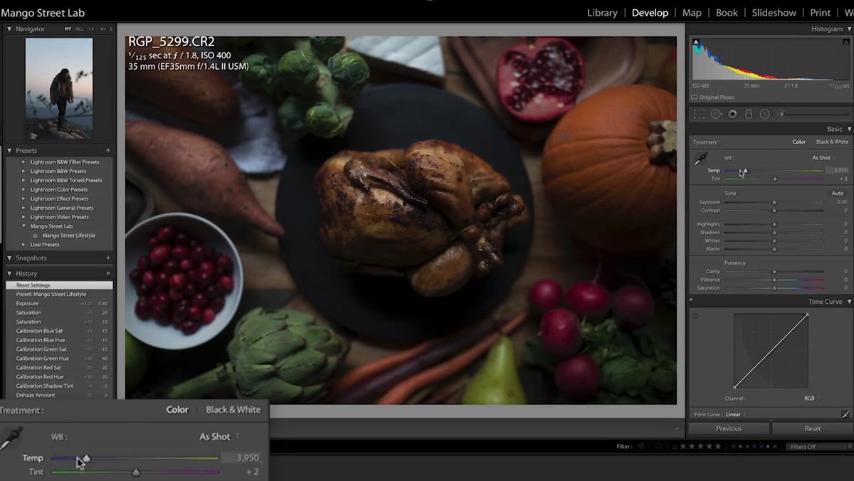 Exposure and white balance sliders adjusted before any color work
Before touching anything creative, get your exposure and white balance correct. This sounds obvious, but it’s the step most people skip when they’re excited to jump into color grading. Mango Street is explicit about it: exposure and white balance first, everything else second. In their example, they nudge the white balance slightly warm before doing anything else. A preset built on a correctly exposed image will generalize far better across different shots than one built on a corrected mess.
Exposure and white balance sliders adjusted before any color work
Before touching anything creative, get your exposure and white balance correct. This sounds obvious, but it’s the step most people skip when they’re excited to jump into color grading. Mango Street is explicit about it: exposure and white balance first, everything else second. In their example, they nudge the white balance slightly warm before doing anything else. A preset built on a correctly exposed image will generalize far better across different shots than one built on a corrected mess.
This is also the moment to decide what your image needs to feel like. Warm or cool? Heavy or airy? Make that call here at the foundation level, not halfway through.
Step 2: Shape the Tone in the Basic Panel
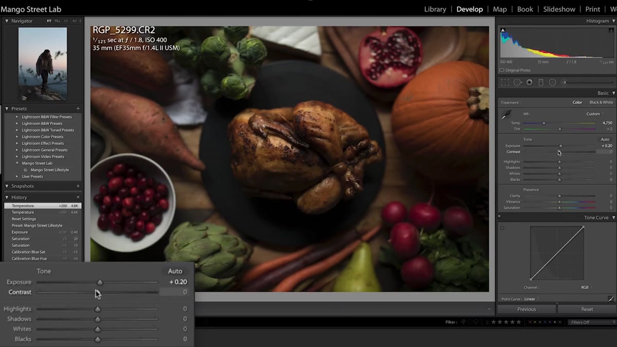 Contrast, highlights, shadows, whites, and blacks sliders set
With exposure locked, move through the tone sliders with intention. The Mango Street approach here is a specific signature: contrast bumped to around 30, highlights pulled down to recover detail and reduce harshness, shadows lifted significantly to open up the image and bring texture back into darker areas. Whites come down slightly. Blacks stay put. Clarity gets a small nudge upward, around five, which adds just enough midtone definition without that crunchy over-processed look that clarity abuse produces.
Contrast, highlights, shadows, whites, and blacks sliders set
With exposure locked, move through the tone sliders with intention. The Mango Street approach here is a specific signature: contrast bumped to around 30, highlights pulled down to recover detail and reduce harshness, shadows lifted significantly to open up the image and bring texture back into darker areas. Whites come down slightly. Blacks stay put. Clarity gets a small nudge upward, around five, which adds just enough midtone definition without that crunchy over-processed look that clarity abuse produces.
The lifted shadows combined with reduced highlights creates that balanced, slightly matte quality you see in a lot of contemporary portrait and lifestyle work. Nothing is blown out, nothing is crushed, and there’s detail throughout the tonal range.
Step 3: Use the Tone Curve to Control Contrast Precisely
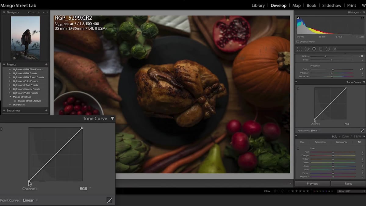 Tone curve with black point lifted and custom control points added
The Tone Curve is where you get surgical. Mango Street lifts the black point, that lower-left anchor, just slightly off true black. This is a subtle move that prevents the deepest shadows from going fully black, which contributes to a softer, more filmic quality. They are clear about why they are not crushing the black point further even though it is a popular Instagram look: you lose too much shadow detail.
Tone curve with black point lifted and custom control points added
The Tone Curve is where you get surgical. Mango Street lifts the black point, that lower-left anchor, just slightly off true black. This is a subtle move that prevents the deepest shadows from going fully black, which contributes to a softer, more filmic quality. They are clear about why they are not crushing the black point further even though it is a popular Instagram look: you lose too much shadow detail.
From there, they add a second control point in the lower-midtones and pull it down slightly to reintroduce contrast without slamming the blacks. On the highlights end, the white point stays close to its default position, with a slight upward nudge at a second point to keep the brights feeling luminous rather than clipped. Think of it as a gentle S-curve that does not announce itself.
Step 4: Dial In the HSL Panel Color by Color
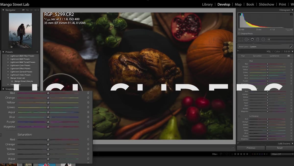 HSL panel open with hue, saturation, and luminance tabs visible
The HSL panel is where their look becomes recognizable. Working through Hue first, they shift reds slightly toward orange and oranges slightly toward yellow. The effect is subtle but it warms skin tones in a natural way without making the image look filtered.
HSL panel open with hue, saturation, and luminance tabs visible
The HSL panel is where their look becomes recognizable. Working through Hue first, they shift reds slightly toward orange and oranges slightly toward yellow. The effect is subtle but it warms skin tones in a natural way without making the image look filtered.
In the Saturation tab, nearly every channel gets brought down to desaturate the overall image. This is the move that gives the look its restrained, editorial quality. In the Luminance tab, oranges get lifted to around 15 to brighten skin, yellows pull back to around -50, and greens drop significantly to around -70 to tame the aggressive digital green that outdoor shots often produce. Adjust that green value based on how much foliage is in your frame since -70 can be dramatic on a forest shot.
Step 5: Add Shadow Warmth With Split Toning
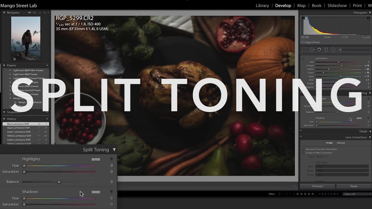 Split toning panel with yellow hue selected and low saturation in shadows
Split toning lets you color the highlights and shadows independently. Mango Street leaves the highlights alone and focuses on the shadows, adding a touch of warmth by selecting a yellow-orange hue and setting saturation to around eight. At that level, the effect is felt more than seen. It prevents shadows from going cold and blue, which is what happens when you simply lift them without any color correction.
Split toning panel with yellow hue selected and low saturation in shadows
Split toning lets you color the highlights and shadows independently. Mango Street leaves the highlights alone and focuses on the shadows, adding a touch of warmth by selecting a yellow-orange hue and setting saturation to around eight. At that level, the effect is felt more than seen. It prevents shadows from going cold and blue, which is what happens when you simply lift them without any color correction.
Keep the saturation value low here. Anything above 15 or so in the shadows starts reading as an obvious color cast, which pulls attention away from the subject.
Step 6: Sharpen Selectively and Correct for Lens Distortion
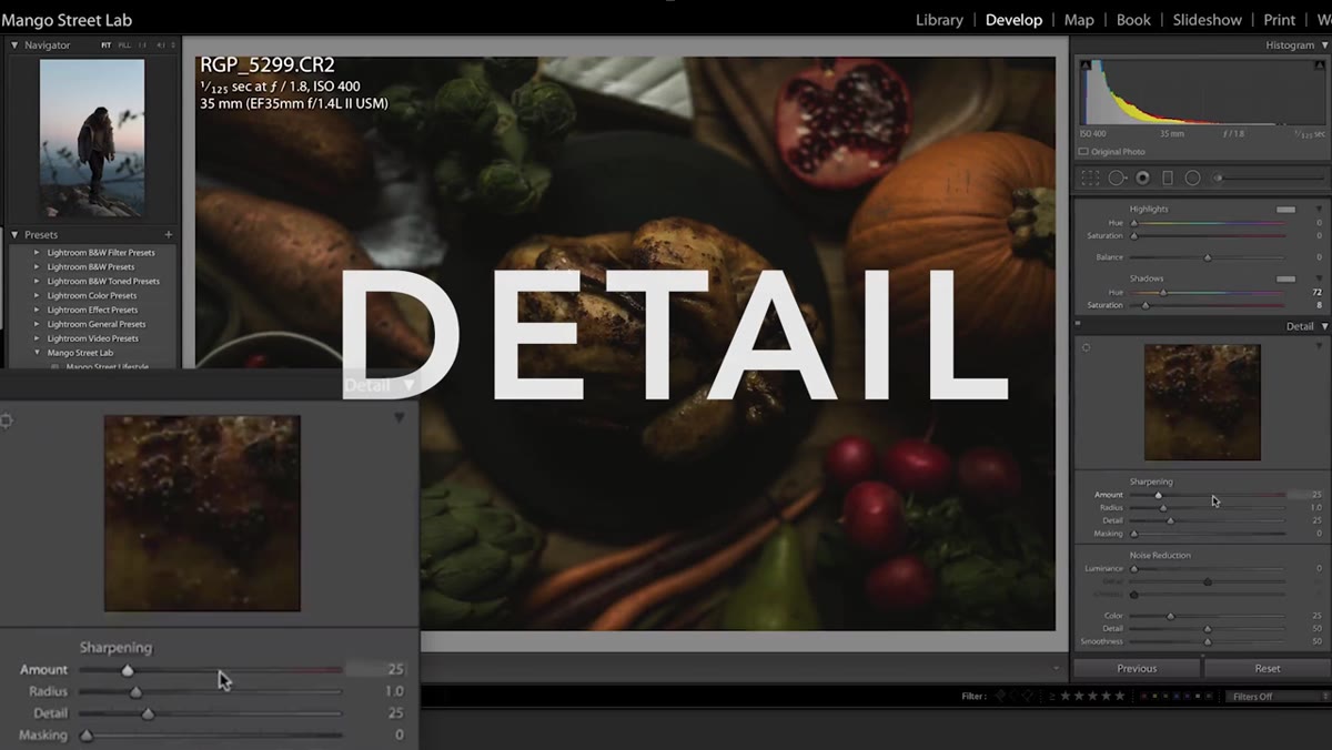 Sharpening panel with amount at 8 and masking near 100
For sharpening, the approach here is conservative and smart. Amount set to around eight, which is minimal on its own, but the Masking slider gets pushed up close to 100. Hold Option (Alt on PC) while dragging the Masking slider and Lightroom will show you a black-and-white mask preview, white areas being sharpened and black areas being protected. At high masking values, sharpening applies almost exclusively to the sharpest in-focus edges and ignores smooth areas like skin or sky where sharpening creates noise.
Sharpening panel with amount at 8 and masking near 100
For sharpening, the approach here is conservative and smart. Amount set to around eight, which is minimal on its own, but the Masking slider gets pushed up close to 100. Hold Option (Alt on PC) while dragging the Masking slider and Lightroom will show you a black-and-white mask preview, white areas being sharpened and black areas being protected. At high masking values, sharpening applies almost exclusively to the sharpest in-focus edges and ignores smooth areas like skin or sky where sharpening creates noise.
Enable Profile Corrections under Lens Corrections and set it to Auto. If you want the preset to work across multiple camera and lens combinations, this ensures Lightroom pulls the right correction profile automatically rather than applying the wrong one.
Step 7: Fine-Tune Color at the Camera Calibration Level
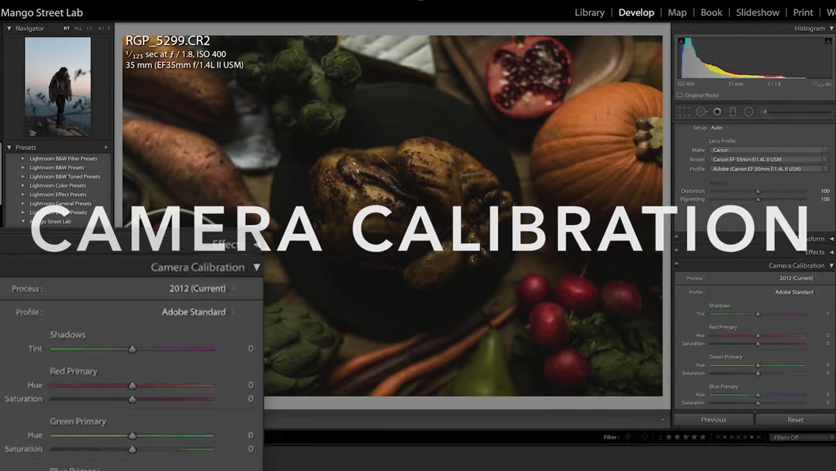 Camera calibration panel with shadow tint and RGB channel adjustments
Camera Calibration sits at the bottom of the panel stack and not enough people use it. Mango Street uses it to make overarching color shifts across the whole image: shadows pushed slightly green, the red channel hue shifted toward orange with its saturation reduced to around -19, the green channel hue shifted blue with saturation reduced to around -10, and the blue channel hue shifted toward cyan with its saturation pulled back. These are global shifts that work underneath all your HSL adjustments and affect how the whole image reads tonally.
Camera calibration panel with shadow tint and RGB channel adjustments
Camera Calibration sits at the bottom of the panel stack and not enough people use it. Mango Street uses it to make overarching color shifts across the whole image: shadows pushed slightly green, the red channel hue shifted toward orange with its saturation reduced to around -19, the green channel hue shifted blue with saturation reduced to around -10, and the blue channel hue shifted toward cyan with its saturation pulled back. These are global shifts that work underneath all your HSL adjustments and affect how the whole image reads tonally.
Finish by going back to the top-level Saturation slider and adding a small amount back, around ten, to compensate for all the desaturation work done in the HSL panel.
How I Adapt This for Commercial Work
The Mango Street preset is built for portraits and lifestyle photography, and it shows. When I run similar logic for product or e-commerce work, I skip the shadow warming in split toning because clients in those categories need neutrality and accurate product color. I also leave the green luminance alone or reduce the adjustment, since products photographed in studio environments do not carry the problematic digital green that shows up in outdoor locations.
What I do borrow directly is the structure: nail exposure first, shape tone in the Basic panel, use the Tone Curve for contrast precision, and finish with HSL and calibration for color character. That order of operations is sound regardless of subject matter, and it is the reason a preset built this way holds up across a range of images rather than only working on the one photo you used to build it.
The single most important idea in this whole workflow is the order. Every setting builds on the one before it. Get the foundation wrong and you are compensating through every step that follows. Get it right and the creative decisions become genuinely easier.
Watch the full tutorial on YouTube to see Rachel and Daniel walk through the full process, and grab their free preset in the video description if you want a starting point to reverse-engineer.
Comments (1)
Quality content like this is rare. Keep it up.
Leave a Comment