Texture brushes are one of those tools I kept meaning to build properly and kept bodging together at the last minute instead. I’d grab a photo, define it as a brush preset, and wonder why the result looked like I was stamping a visible square onto my composite. The edges were hard, the contrast was muddy, and the brush never quite blended the way I needed it to on client work. It wasn’t until I sat down with Watch the full tutorial on YouTube - Aaron Nace’s PHLEARN walkthrough on building texture brushes from scratch - that I understood how many steps I’d been skipping.
The technique Aaron demonstrates uses a frozen ice texture as the source image, but the process transfers to any high-contrast photo: cracked paint, concrete, fabric, smoke, water. Once you understand the logic behind each step, you stop thinking about individual brushes and start thinking about a repeatable system for turning raw photos into professional-grade brush assets. That shift matters a lot when you’re moving fast on a deadline.
Step 1: Boost Contrast With Levels Before You Do Anything Else
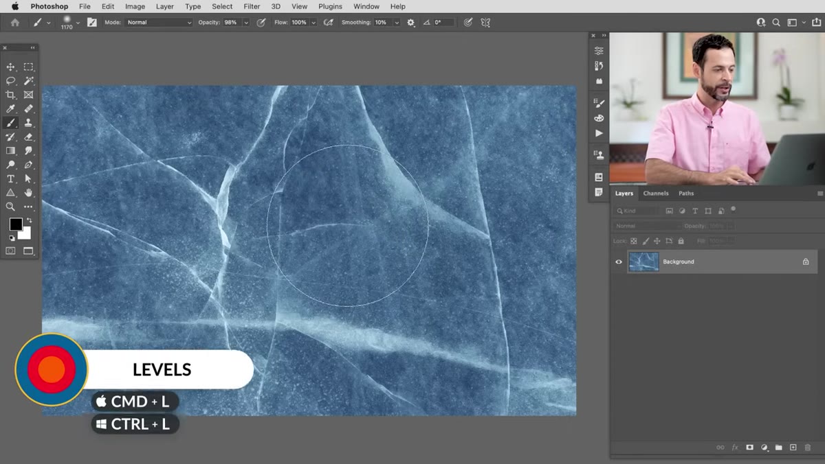 Levels dialog open on ice texture background layer
Open your source texture in Photoshop and go straight to Levels (Ctrl+L on Windows, Cmd+L on Mac). Pull the shadows slider inward from the left and the highlights slider inward from the right. You’re not going for a pretty image here - you’re going for maximum separation between light and dark areas. The dark regions will become the brush strokes themselves, so they need to be genuinely dark, not just slightly deeper than the midtones. If your source image looks a little blown out and a little crushed, you’re probably in the right territory.
Levels dialog open on ice texture background layer
Open your source texture in Photoshop and go straight to Levels (Ctrl+L on Windows, Cmd+L on Mac). Pull the shadows slider inward from the left and the highlights slider inward from the right. You’re not going for a pretty image here - you’re going for maximum separation between light and dark areas. The dark regions will become the brush strokes themselves, so they need to be genuinely dark, not just slightly deeper than the midtones. If your source image looks a little blown out and a little crushed, you’re probably in the right territory.
Step 2: Desaturate the Image Completely
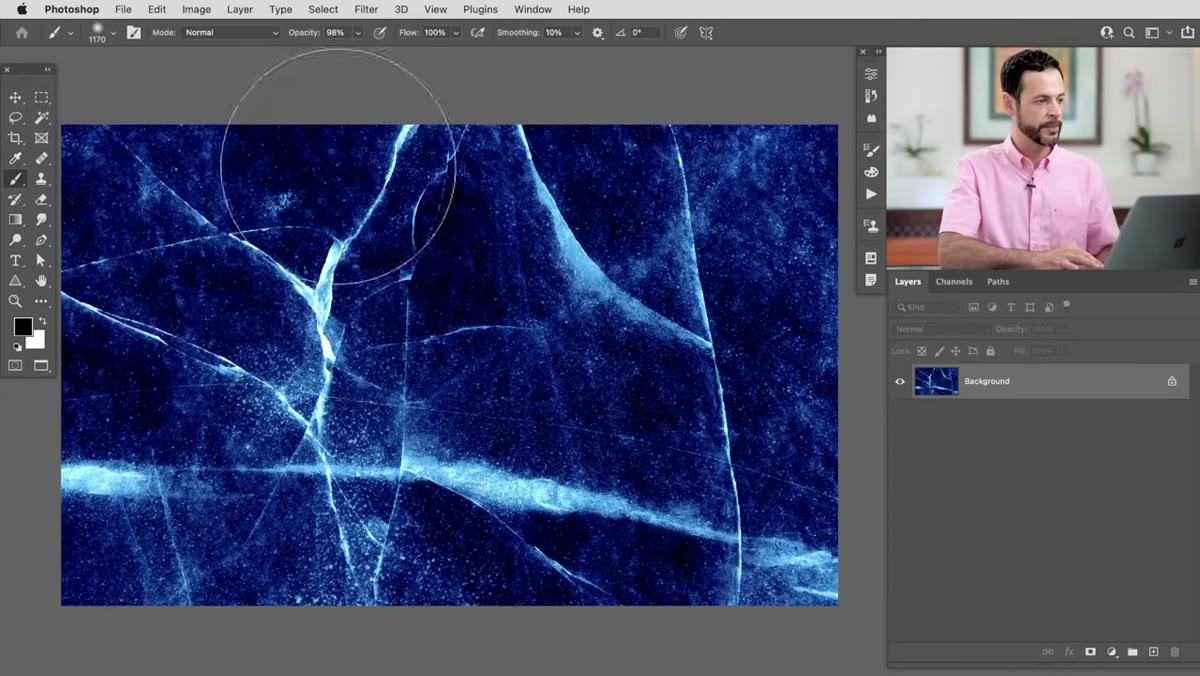 Image menu open showing Adjustments then Desaturate
Photoshop brushes don’t carry color information - the color you paint with comes from your foreground color swatch, not from the brush itself. So all that work you’d put into preserving tones in your source photo is irrelevant here. Go to Image, then Adjustments, then Desaturate. This strips the image to pure grayscale values while keeping it in RGB mode, which is exactly what you want. Don’t convert to Grayscale mode via the Image menu - that changes the color profile and can cause headaches later.
Image menu open showing Adjustments then Desaturate
Photoshop brushes don’t carry color information - the color you paint with comes from your foreground color swatch, not from the brush itself. So all that work you’d put into preserving tones in your source photo is irrelevant here. Go to Image, then Adjustments, then Desaturate. This strips the image to pure grayscale values while keeping it in RGB mode, which is exactly what you want. Don’t convert to Grayscale mode via the Image menu - that changes the color profile and can cause headaches later.
Step 3: Invert So the Brush Marks Are Black on White
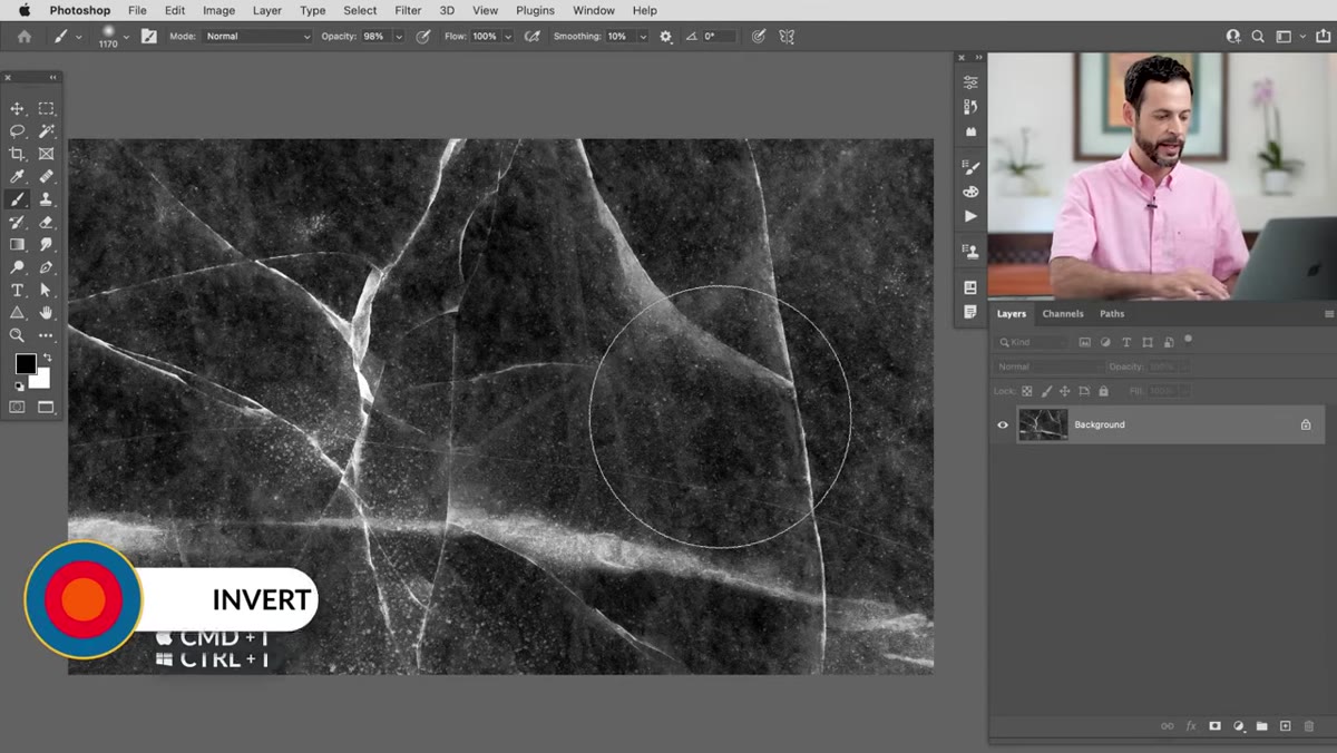 Inverted ice texture showing dark streaks on white background
Here’s the step that tripped me up for years. Photoshop reads black pixels as the brush and white pixels as transparent. If your texture has dark backgrounds with light streaks - which a lot of natural textures do - you need to flip that relationship before defining the brush. Hit Ctrl+I (Cmd+I on Mac) to invert the entire layer. What was a dark icy background becomes white, and the light streaks and cracks become black. Those black marks are exactly what will appear when you paint with the finished brush.
Inverted ice texture showing dark streaks on white background
Here’s the step that tripped me up for years. Photoshop reads black pixels as the brush and white pixels as transparent. If your texture has dark backgrounds with light streaks - which a lot of natural textures do - you need to flip that relationship before defining the brush. Hit Ctrl+I (Cmd+I on Mac) to invert the entire layer. What was a dark icy background becomes white, and the light streaks and cracks become black. Those black marks are exactly what will appear when you paint with the finished brush.
After inverting, run Levels again. Push those highlights hard toward white so any gray background noise disappears. You want the background to read as pure white and the brush strokes to read as rich black. Think of it like adjusting a stamp: the cleaner the plate, the cleaner the print.
Step 4: Paint Out the Edges With a Soft White Brush
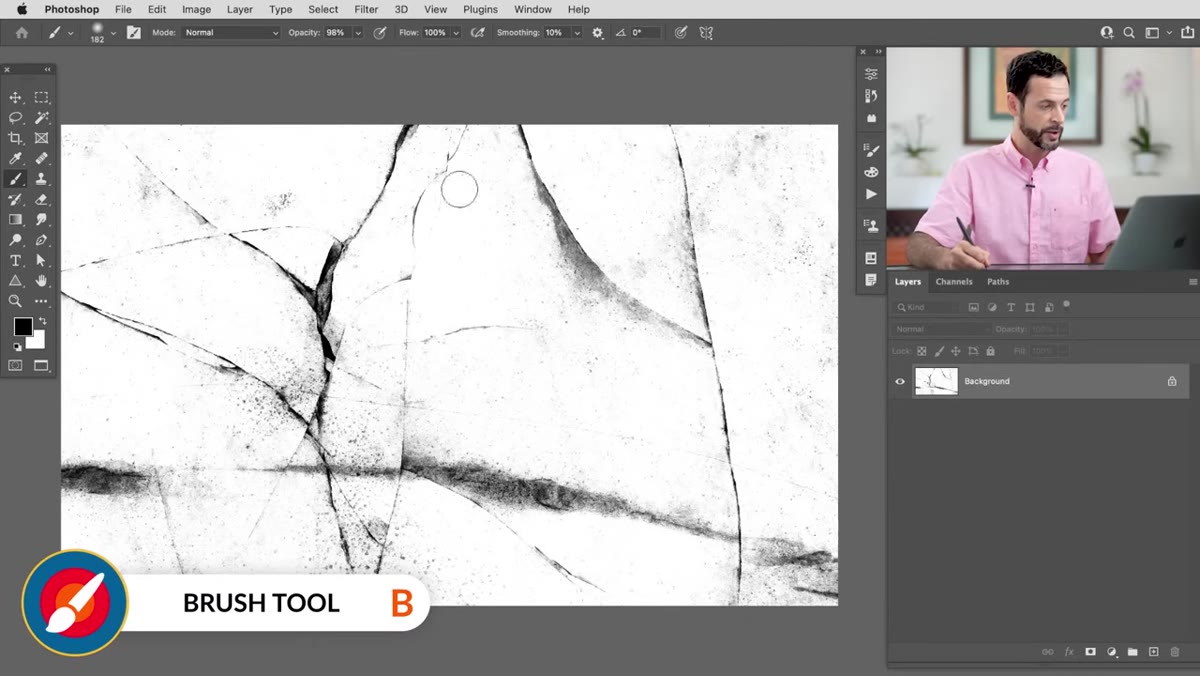 White soft brush being painted over texture edges near canvas border
This is the step most tutorials skip, and it’s the reason homemade brushes often look fake. If any texture detail reaches the very edge of the canvas, Photoshop will stamp a visible rectangular boundary every time you use the brush. It’s subtle but your eye picks it up immediately, especially on smooth backgrounds.
White soft brush being painted over texture edges near canvas border
This is the step most tutorials skip, and it’s the reason homemade brushes often look fake. If any texture detail reaches the very edge of the canvas, Photoshop will stamp a visible rectangular boundary every time you use the brush. It’s subtle but your eye picks it up immediately, especially on smooth backgrounds.
Select the Brush tool (B), set your foreground color to white, choose a large soft-edged brush, and paint along all four edges of the canvas. You’re feathering out the texture so it fades to nothing before it hits the boundary. Corners especially tend to collect dark detail - hit those first. The goal is a texture that appears to emerge from nothing and dissolve back into nothing, with no hard border giving away the rectangular shape underneath.
Step 5: Resize to 1500 Pixels Wide
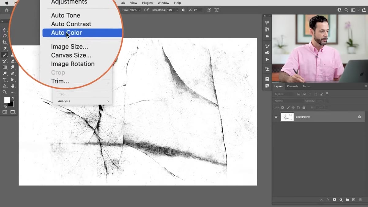 Image Size dialog with width set to 1500 pixels
Photoshop has a hard ceiling on brush size: 2500 pixels maximum, but performance gets unreliable well before that. Aaron recommends capping the width at 1500 pixels for a good balance of detail and usability. Go to Image, then Image Size, enter 1500 in the width field, make sure Constrain Proportions is checked, and hit OK. If your source image is smaller than 1500 pixels you can skip this step - never scale a texture up just to hit an arbitrary number, because you’ll only add blur and artifacts, not real detail.
Image Size dialog with width set to 1500 pixels
Photoshop has a hard ceiling on brush size: 2500 pixels maximum, but performance gets unreliable well before that. Aaron recommends capping the width at 1500 pixels for a good balance of detail and usability. Go to Image, then Image Size, enter 1500 in the width field, make sure Constrain Proportions is checked, and hit OK. If your source image is smaller than 1500 pixels you can skip this step - never scale a texture up just to hit an arbitrary number, because you’ll only add blur and artifacts, not real detail.
Step 6: Define the Brush Preset
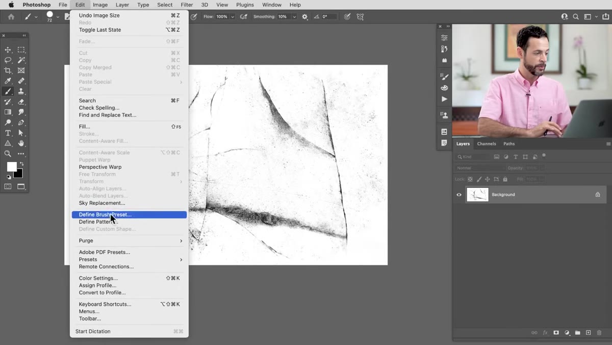 Edit menu open with Define Brush Preset highlighted
Go to Edit, then Define Brush Preset. Give it a name that’s specific enough to be searchable later - I use a convention like “texture-ice-01” so I can find it fast when I have 200 brushes in the panel. Hit OK, and the brush is registered. Switch to any working document, hit B for the Brush tool, right-click on the canvas, and scroll to the bottom of your brush library. Your new brush will be there, ready to test.
Edit menu open with Define Brush Preset highlighted
Go to Edit, then Define Brush Preset. Give it a name that’s specific enough to be searchable later - I use a convention like “texture-ice-01” so I can find it fast when I have 200 brushes in the panel. Hit OK, and the brush is registered. Switch to any working document, hit B for the Brush tool, right-click on the canvas, and scroll to the bottom of your brush library. Your new brush will be there, ready to test.
Aaron paints a quick test stroke in red to demonstrate the result - and he’s honest that at this stage the brush is “okay” but not yet refined. That honesty is useful. A raw brush definition is just the starting point. From here you’d go into the Brush Settings panel to adjust spacing, scatter, opacity jitter, and angle randomization to make it feel organic rather than repetitive.
Where I Take This Further: Build a Brush Library as a Team Asset
The single biggest upgrade I’ve made to this workflow is treating texture brushes as shared studio assets rather than personal files. After building a brush using Aaron’s method, I export it as an ABR file (Edit, then Export, then Brushes) and drop it into a shared drive folder that my whole post-production team can access. That way, when someone needs a concrete texture or a fabric overlay, they’re pulling from a vetted, properly built library rather than grabbing whatever random thing they downloaded in 2019.
I also keep a matching folder of the original source images used to create each brush. If a brush needs to be rebuilt at a different size or with slightly different contrast settings for a specific project, having the source means you never start from zero. It’s the same principle behind keeping layered PSDs instead of flattening everything - the original data is always the most valuable thing you have.
The core lesson from Aaron’s tutorial is that a good texture brush isn’t just a photo with a different file extension. It’s a carefully prepared grayscale image with controlled contrast, clean edges, and the right scale. Get those three things right before you define the preset, and you’ll build brushes that actually hold up in production work rather than brushes you abandon after one use.
Watch the full tutorial on YouTube to see Aaron walk through every step with the original ice texture file, including his real-time contrast adjustments and the edge-painting technique in action.
Comments (5)
Wow, I had no idea you could do this. Mind blown.
Love this. I referenced a similar technique in one of my recent posts. Always good to see other perspectives.
Applied this to my portfolio shots and the improvement is noticeable.
Just used this on a wedding shoot edit. Client was thrilled.
Just used this on a wedding shoot edit. Client was thrilled.
Leave a Comment