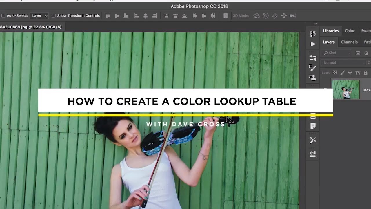
Client work has a way of forcing efficiency. When you’re juggling color-grading across a product catalog for an ad agency, rebuilding three-adjustment-layer looks from scratch for each new shoot stops being an inconvenience and starts costing real money. For years, the standard answer to “can I save this whole look as one preset?” was a frustrating no. You could save individual adjustment layer presets, sure, but the moment your look depended on a curves layer, a hue/saturation layer with a blend mode change, and an opacity tweak stacked together, you were on your own. You either dragged the layers manually or wrote the settings down and hoped you remembered.
That changed when Photoshop introduced the ability to export custom Color Lookup Tables, and Watch the full tutorial on YouTube from CreativeLive walks through the whole process cleanly. I’ve built this into my production workflow for e-commerce clients, and the time savings are real. Here’s how to do it, step by step.
Step 1: Understand What the Color Lookup Adjustment Layer Actually Is
 Color Lookup adjustment layer panel with preset dropdown open
Before you can export your own lookup table, it helps to understand what you’re working with. The Color Lookup adjustment layer is different from every other adjustment layer in Photoshop. There are no sliders. No curve points. You pick from a list of built-in presets with names like “Turquoise Sepia” or “Edgy Amber” and you either like the result or you move on. It’s a finished-look machine, not a tool you dial in manually.
Color Lookup adjustment layer panel with preset dropdown open
Before you can export your own lookup table, it helps to understand what you’re working with. The Color Lookup adjustment layer is different from every other adjustment layer in Photoshop. There are no sliders. No curve points. You pick from a list of built-in presets with names like “Turquoise Sepia” or “Edgy Amber” and you either like the result or you move on. It’s a finished-look machine, not a tool you dial in manually.
What makes it powerful is that it’s still a layer. That means you can change its blend mode, lower its opacity, paint on its mask, or use Blend If sliders to restrict where it affects the image. The look itself is locked, but everything around it is still fully flexible.
Step 2: Build Your Multi-Layer Look Using Standard Adjustment Layers
 Layers panel showing multiple adjustment layers stacked with blend modes
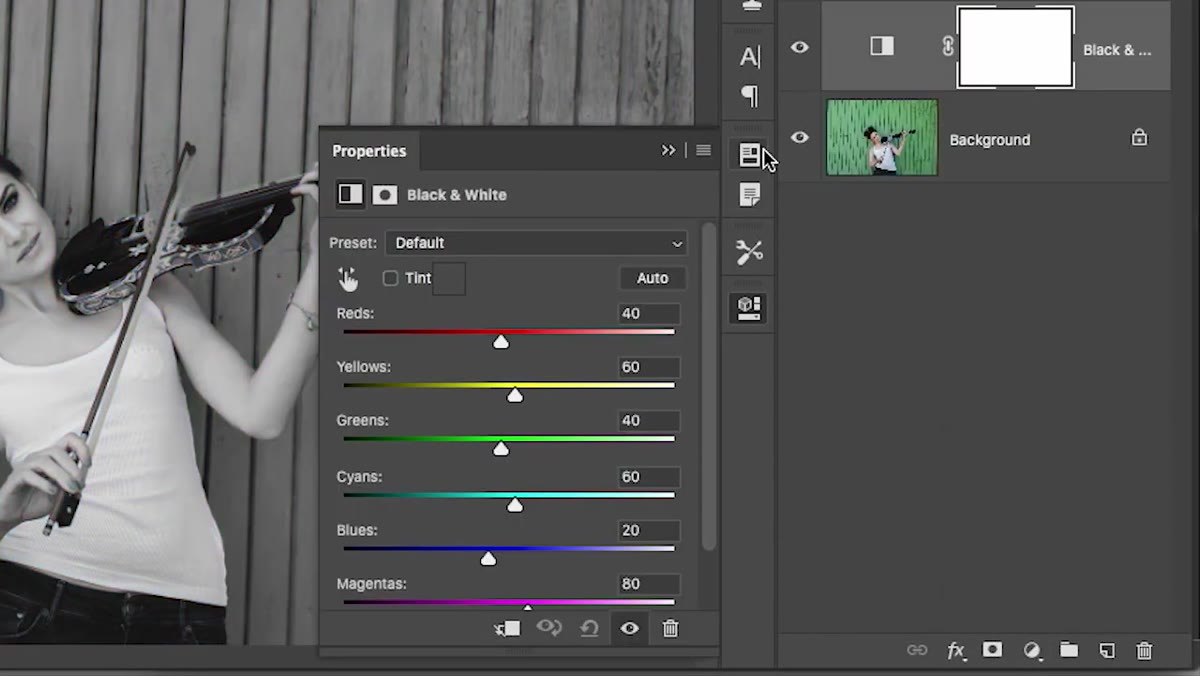
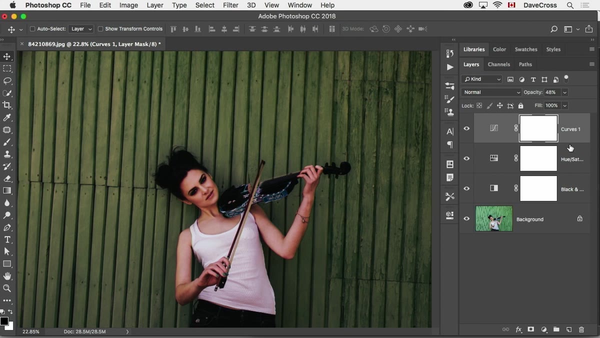
This is where you do your actual creative work. Stack up whatever combination of adjustment layers produces the look you want. A curves layer for contrast, a hue/saturation layer to shift the color cast, a solid color layer set to Multiply at reduced opacity for a tone wash - whatever it takes. In the tutorial, the instructor throws together a few adjustment layers quickly to demonstrate the concept, and the point is clear: the specific layers don’t matter, the combination does.
Layers panel showing multiple adjustment layers stacked with blend modes
This is where you do your actual creative work. Stack up whatever combination of adjustment layers produces the look you want. A curves layer for contrast, a hue/saturation layer to shift the color cast, a solid color layer set to Multiply at reduced opacity for a tone wash - whatever it takes. In the tutorial, the instructor throws together a few adjustment layers quickly to demonstrate the concept, and the point is clear: the specific layers don’t matter, the combination does.
Don’t stop at just the layer types. The blend modes and opacity values you set on each layer are part of the look and will be captured in the export. So if your hue/saturation layer is doing something specific at Soft Light rather than Normal, that gets baked in. Make sure you’re happy with the whole stack before moving to the next step.
Step 3: Flatten Your Thinking, Not Your File
 Layers panel with completed adjustment layer stack, background layer intact
One thing worth clarifying before you export: you do not flatten the document. Your adjustment layers stay as adjustment layers. What the export process does is calculate the cumulative color transformation that your stack produces and encodes it into a lookup table file. The actual pixels and layers in your document stay untouched.
Layers panel with completed adjustment layer stack, background layer intact
One thing worth clarifying before you export: you do not flatten the document. Your adjustment layers stay as adjustment layers. What the export process does is calculate the cumulative color transformation that your stack produces and encodes it into a lookup table file. The actual pixels and layers in your document stay untouched.
This distinction matters because it means you can keep iterating. If a client wants a slightly warmer version of the same look, you adjust, re-export, and you’ve got a new preset. Your working file remains non-destructive throughout.
Step 4: Export the Color Lookup Table via the File Menu
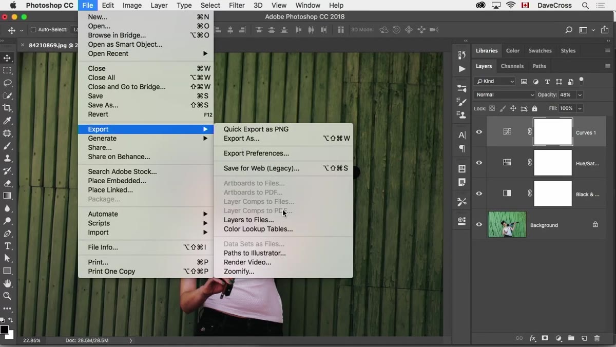 File menu open with Export submenu visible, Export Color Lookup Tables highlighted
Go to File, then Export, then Export Color Lookup Tables. A dialog box will open asking for a description (name your preset something that will actually mean something to you in six months - not “look1”), and then a set of format options. The two formats you’ll use most often are CUBE and 3DL. Both are widely supported.
File menu open with Export submenu visible, Export Color Lookup Tables highlighted
Go to File, then Export, then Export Color Lookup Tables. A dialog box will open asking for a description (name your preset something that will actually mean something to you in six months - not “look1”), and then a set of format options. The two formats you’ll use most often are CUBE and 3DL. Both are widely supported.
CUBE is the one to default to for Photoshop and Lightroom compatibility. 3DL is useful if you’re sharing the look with video editors working in Premiere or After Effects, which is one of the genuinely useful cross-application advantages of this format. Export both if you want maximum flexibility. The files are small, so there’s no reason to limit yourself.
Step 5: Load the Exported LUT Back Into Photoshop as a Preset
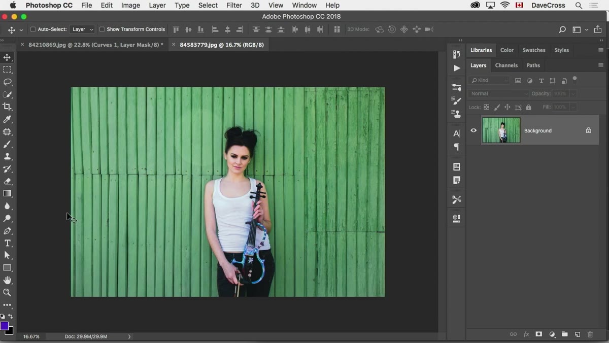 Color Lookup adjustment layer with Load 3DL option in preset dropdown
Once you’ve exported the file, open any other photograph and add a Color Lookup adjustment layer. In the properties panel, instead of choosing from the default presets, click the dropdown and select Load 3DL (or Load CUBE, depending on what you exported). Navigate to your saved file and apply it.
Color Lookup adjustment layer with Load 3DL option in preset dropdown
Once you’ve exported the file, open any other photograph and add a Color Lookup adjustment layer. In the properties panel, instead of choosing from the default presets, click the dropdown and select Load 3DL (or Load CUBE, depending on what you exported). Navigate to your saved file and apply it.
Your entire multi-layer look now applies in a single adjustment layer. One click. You can still modify opacity, blend mode, or mask it like any other adjustment layer. The look is yours, it’s portable, and it’s repeatable without rebuilding anything.
Step 6: Organize and Store Your LUT Library
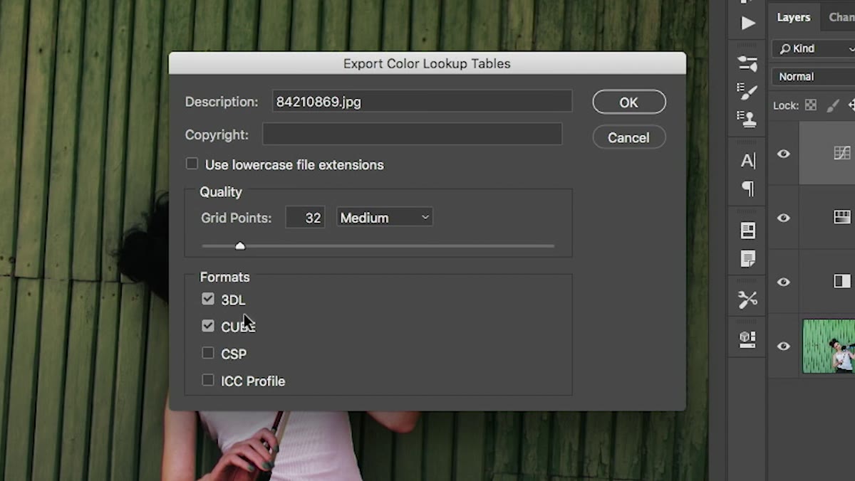 Save dialog for color lookup table export with file name field
This step isn’t in the tutorial explicitly, but it’s where the workflow either holds together or falls apart. Save your exported LUT files to a dedicated folder you’ll actually remember and back up. I keep mine in a folder structure organized by client type - product, lifestyle, automotive - because the looks I build for e-commerce white-background shots are not the same as what an ad agency wants for a brand campaign.
Save dialog for color lookup table export with file name field
This step isn’t in the tutorial explicitly, but it’s where the workflow either holds together or falls apart. Save your exported LUT files to a dedicated folder you’ll actually remember and back up. I keep mine in a folder structure organized by client type - product, lifestyle, automotive - because the looks I build for e-commerce white-background shots are not the same as what an ad agency wants for a brand campaign.
If you’re working across multiple machines or collaborating with a retoucher, LUT files are trivially easy to share. Drop them in a shared folder or include them in a job handoff package. Compared to trying to document “curves layer, output 210, blend mode Luminosity, opacity 60%” in a PDF, handing someone a .cube file is night and day.
What I’ve Learned Running This in a Real Production Environment
The one caveat I’d add to everything in the tutorial is that LUTs capture color transformation, not everything. Texture overlays, luminosity masks built from the actual image data, or effects that depend on pixel content rather than color mapping won’t translate into a LUT the way you might expect. What exports cleanly are tone and color shifts: curves, color balance, hue/saturation, selective color, and blending that creates color effects.
I tested this the hard way after trying to bake a dodge-and-burn-style look into a LUT and getting a result that worked fine on one image and looked completely wrong on the next. Stick to color grading work and the format behaves exactly as advertised. Try to use it for something pixel-dependent and you’ll get inconsistent results across different source images.
The single most useful thing this technique does is convert “something I built once and might be able to rebuild” into “something I can apply in ten seconds.” That shift, from fragile memory to repeatable system, is what separates a workflow that scales from one that collapses under volume. If you build looks in Photoshop that you want to reuse, this is worth understanding properly.
Watch the full tutorial on YouTube from CreativeLive to see the full process demonstrated from start to finish.
Comments
Leave a Comment