Every so often I’ll be retouching a composite for a client and I hit the same wall: the default Photoshop brush set just doesn’t have what I need. The standard round brushes are fine for blocking in masks, but the moment a project calls for realistic texture, organic edges, or painterly detail, they fall flat fast. I’ve bought brush packs over the years, and some of them are excellent, but there’s a constant nagging feeling that a pre-made pack is always someone else’s creative fingerprint, not mine.
That’s why this tutorial from Matt Kloskowski caught my attention. Watch the full tutorial on YouTube and you’ll see the core argument he’s making: you don’t need to spend money on third-party brush libraries when Photoshop gives you everything you need to build your own high-quality brushes from scratch. The technique is straightforward enough to follow in one sitting, but the payoff compounds over time the more brushes you build.
I’ve been doing commercial post-production work for fifteen years, and one pattern I’ve noticed is that the photographers and retouchers who produce the most consistent, distinctive work are the ones who have built their own custom toolsets. Brushes are a big part of that. Here’s the full breakdown of how Matt’s method works.
Step 1: Start with a High-Contrast Source Image
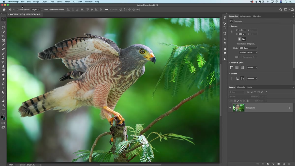 Opening a high-contrast texture image in Photoshop
The foundation of any custom brush is your source material. Photoshop defines a brush by reading the luminance values of a selection, so the higher the contrast in your source image, the more expressive and detailed your resulting brush will be. Matt pulls in a photographic texture for this reason, something with real tonal variation rather than a flat digital shape.
Opening a high-contrast texture image in Photoshop
The foundation of any custom brush is your source material. Photoshop defines a brush by reading the luminance values of a selection, so the higher the contrast in your source image, the more expressive and detailed your resulting brush will be. Matt pulls in a photographic texture for this reason, something with real tonal variation rather than a flat digital shape.
Look for images with strong darks and lights: foliage, cracked surfaces, fabric weave, splattered paint, even ink on paper. The dark areas of your source will become the brush’s “ink,” and the light areas will be transparent. If your source image looks muddy or low-contrast, desaturate it first and then push the levels hard toward black and white before you define the brush.
Step 2: Convert to Grayscale and Adjust Levels
 Adjusting Levels sliders on a desaturated texture layer
Once you have your source open, desaturate it. Image > Adjustments > Desaturate gets you there in one step. From there, open Levels (Command/Ctrl + L) and start pulling the black point and white point sliders inward. You want the texture detail to be sharp and decisive, not muddy gray in the midtones.
Adjusting Levels sliders on a desaturated texture layer
Once you have your source open, desaturate it. Image > Adjustments > Desaturate gets you there in one step. From there, open Levels (Command/Ctrl + L) and start pulling the black point and white point sliders inward. You want the texture detail to be sharp and decisive, not muddy gray in the midtones.
This is the step most people rush, and it’s where the quality of your brush lives or dies. Take your time here. Push the blacks dark enough that the background reads as pure white, but stop before you lose the fine edge detail in your texture. If you clip the highlights too hard, you’ll lose the feathering and softness that makes a brush feel natural rather than stamped.
Step 3: Make a Selection Around Your Brush Shape
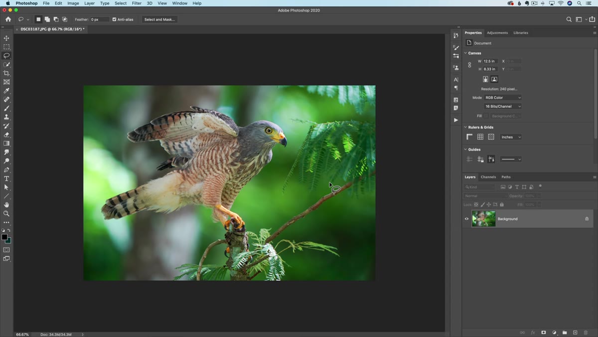
 Drawing a rectangular marquee selection around texture area
Before you define the brush, you need to isolate the area you want Photoshop to capture. The Rectangular Marquee tool is the standard choice here. Keep your selection tight around the texture detail you want, but leave a small amount of breathing room at the edges so the brush has a natural falloff rather than a hard-clipped border.
Drawing a rectangular marquee selection around texture area
Before you define the brush, you need to isolate the area you want Photoshop to capture. The Rectangular Marquee tool is the standard choice here. Keep your selection tight around the texture detail you want, but leave a small amount of breathing room at the edges so the brush has a natural falloff rather than a hard-clipped border.
One thing Matt points out that’s easy to overlook: Photoshop will capture everything inside that selection, including any white areas. That white reads as full transparency in your brush, which is usually what you want. If your source image has a pure white background, that’s ideal. If it’s gray or off-white, clean it up with Levels before you make your selection.
Step 4: Define the Brush Preset
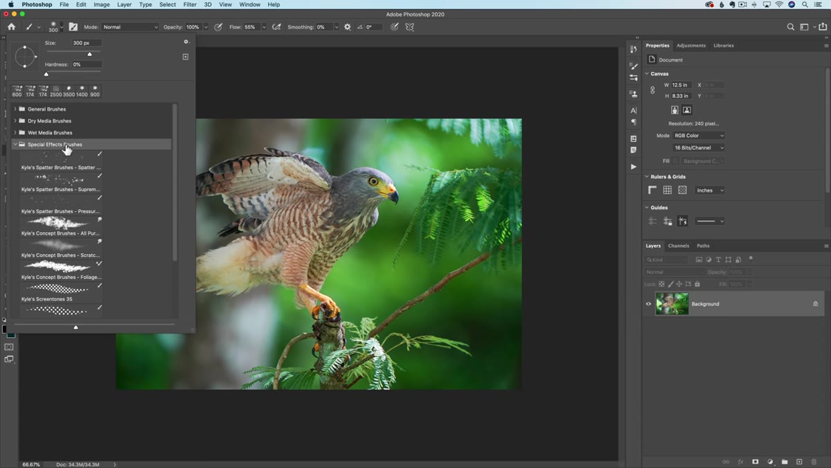 Edit menu open with Define Brush Preset option highlighted
With your selection active, go to Edit > Define Brush Preset. Photoshop will prompt you to name the brush. Give it something you’ll recognize in six months, not just “Brush 1.” I name mine with a descriptor and a date, something like “DrySplatter-Rough-2024,” which sounds fussy but saves real time when you’re building a library.
Edit menu open with Define Brush Preset option highlighted
With your selection active, go to Edit > Define Brush Preset. Photoshop will prompt you to name the brush. Give it something you’ll recognize in six months, not just “Brush 1.” I name mine with a descriptor and a date, something like “DrySplatter-Rough-2024,” which sounds fussy but saves real time when you’re building a library.
Once you click OK, the brush is immediately available in your Brush Picker. It won’t look like much yet at default settings, which is exactly why the next step matters so much.
Step 5: Refine Settings in the Brush Settings Panel
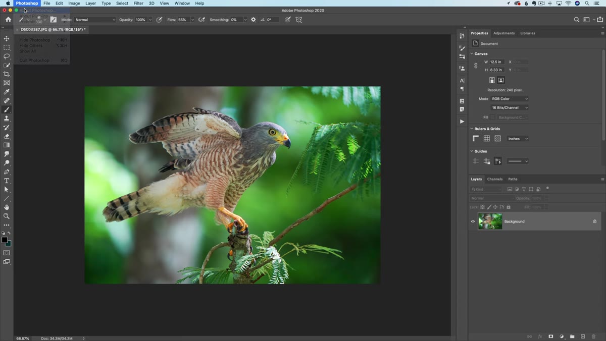
 Brush Settings panel open showing Shape Dynamics and Scattering options
Open the Brush Settings panel (Window > Brush Settings) and this is where the brush comes alive. The two settings Matt focuses on first are Shape Dynamics and Scattering. Under Shape Dynamics, increasing the Size Jitter gives each brush stamp a slightly randomized scale, which immediately removes the mechanical, repetitive look you’d get from painting straight strokes. Set your Control to “Pen Pressure” if you’re on a tablet, or “Off” if you’re using a mouse.
Brush Settings panel open showing Shape Dynamics and Scattering options
Open the Brush Settings panel (Window > Brush Settings) and this is where the brush comes alive. The two settings Matt focuses on first are Shape Dynamics and Scattering. Under Shape Dynamics, increasing the Size Jitter gives each brush stamp a slightly randomized scale, which immediately removes the mechanical, repetitive look you’d get from painting straight strokes. Set your Control to “Pen Pressure” if you’re on a tablet, or “Off” if you’re using a mouse.
Scattering spreads the brush stamps across the stroke path. A moderate Scatter value, somewhere in the 30-60% range, adds organic variation without making the brush feel chaotic. Experiment with Both Axes checked versus unchecked. The difference is noticeable and which one you want depends entirely on the texture you started with.
Step 6: Save the Brush as Part of a Custom Library
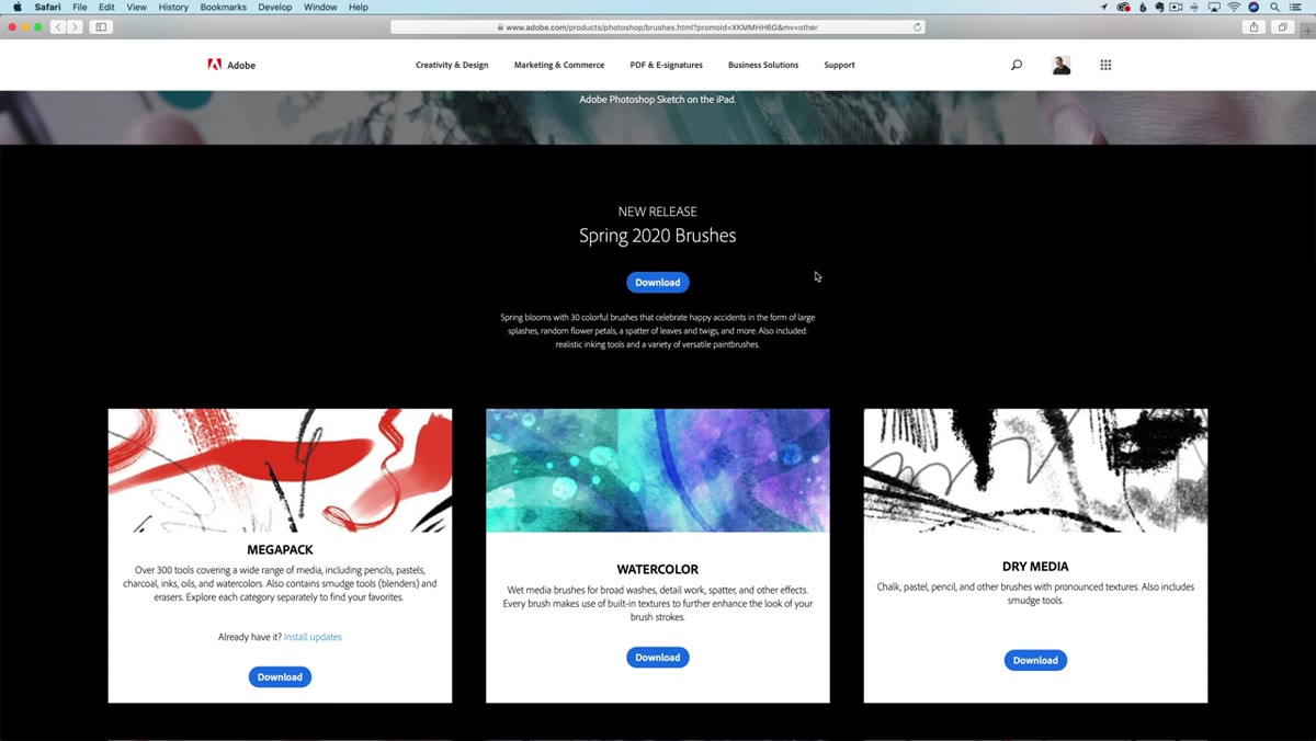 Brush Preset picker showing newly created brush saved in panel
Once you’ve dialed in your settings, save the brush properly so you don’t lose it. Click the folder icon in the Brush Preset picker to create a new group, then drag your new brush into it. From there, you can export the entire group as an ABR file (right-click the group, select Export Selected Brushes) and store it somewhere safe.
Brush Preset picker showing newly created brush saved in panel
Once you’ve dialed in your settings, save the brush properly so you don’t lose it. Click the folder icon in the Brush Preset picker to create a new group, then drag your new brush into it. From there, you can export the entire group as an ABR file (right-click the group, select Export Selected Brushes) and store it somewhere safe.
I keep a dedicated folder on my external drive labeled “Custom Tools” with subfolders for brushes, actions, and presets. That folder has followed me through three computer upgrades and I’ve never had to rebuild anything from scratch. Back it up. Seriously.
How I Use This Workflow for Commercial Retouching
Where this technique has paid off for me is in product and composite work, specifically when I need to add texture or break up an edge in a way that looks photographically real rather than digitally generated. I’ll take a scan of actual paper or fabric, run it through this exact process, and end up with a brush that matches the physical material in the shot.
One caveat worth naming: brush quality is directly tied to source resolution. If you’re building brushes you plan to use on high-resolution files (and in commercial work, that usually means 300 dpi at large print sizes), make sure your source texture is captured at equally high resolution. A brush built from a low-res phone photo will fall apart the moment you scale it up, and there’s no fixing that after the fact.
The single most useful thing Matt demonstrates here is that the creative ceiling on custom brushes is set by your source material, not by Photoshop’s defaults. Good texture photography combined with careful Levels work will produce brushes that feel genuinely hand-crafted, because in a real sense, they are.
Watch the full tutorial on YouTube and follow along with your own source image. Build three or four brushes in one session and you’ll start seeing where they fit into your existing workflow almost immediately.
Comments (1)
Simple but effective. Sometimes that's all you need.
Leave a Comment