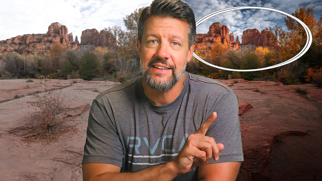
I spent the first few years of my post-production career convinced that getting faster and better meant learning more software. More shortcuts, more panel combinations, more batch scripts. And I did get faster. But the commercial work I was turning around for ad agencies still felt flat in ways I couldn’t name. The images were correct. They weren’t compelling. It wasn’t until I started thinking about where I wanted the viewer to look — before touching a single slider — that the quality of my edits actually jumped.
That’s exactly the lesson at the center of this Mark Denney tutorial, Watch the full tutorial on YouTube, and it hits differently coming from someone who’s processed thousands of landscape images over a decade. Denney isn’t teaching a new Lightroom feature. He’s teaching a way of thinking that makes every feature you already know work harder. Even if Lightroom isn’t your primary tool, the logic transfers directly to Photoshop, Capture One, or any masking workflow you’ve built.
The core argument is simple: brightness directs attention. Darker areas of a frame get skipped by the eye. Brighter areas pull focus. Once you internalize that, every local adjustment you make becomes a deliberate act of visual direction, not just tonal correction. Here’s how Denney applies it in practice.
Step 1: Assess the Luminance Map Before You Touch Anything
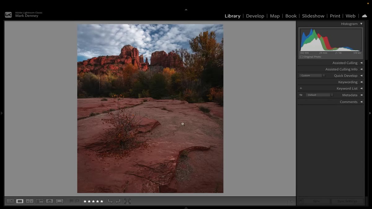 Wide shot of Sedona landscape with flat, even luminance across frame
Denney opens with a landscape from Sedona and immediately points out that the brightness values across the entire scene are nearly identical. The mountains, foreground, and mid-ground are all sitting at roughly the same luminance level. His diagnosis: when everything is the same brightness, the viewer’s eye doesn’t know where to go. Before making any adjustment, look at your image and ask which areas deserve attention and which ones are just filling space. This assessment phase is the actual work. The slider-moving comes after.
Wide shot of Sedona landscape with flat, even luminance across frame
Denney opens with a landscape from Sedona and immediately points out that the brightness values across the entire scene are nearly identical. The mountains, foreground, and mid-ground are all sitting at roughly the same luminance level. His diagnosis: when everything is the same brightness, the viewer’s eye doesn’t know where to go. Before making any adjustment, look at your image and ask which areas deserve attention and which ones are just filling space. This assessment phase is the actual work. The slider-moving comes after.
Step 2: Darken the Areas You Don’t Want the Viewer to See
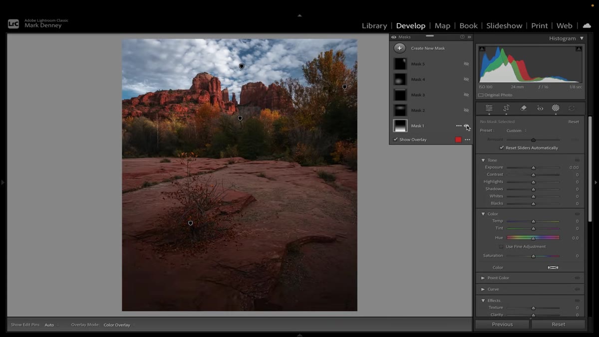 Foreground mask enabled showing significant darkening applied to lower third
The foreground in this Sedona shot has some visual content, but it isn’t the point of the image. The light on the mountains and the sky above them are. So Denney’s first active mask significantly darkens the foreground. Not to black, but enough to tell the eye: nothing important here, keep moving. He’s not correcting an exposure problem. He’s building a visual hierarchy from scratch using luminance as the tool. In Photoshop terms, this is the same logic behind burning your edges or using a luminosity mask to pull attention inward. The technique is secondary to the intention behind it.
Foreground mask enabled showing significant darkening applied to lower third
The foreground in this Sedona shot has some visual content, but it isn’t the point of the image. The light on the mountains and the sky above them are. So Denney’s first active mask significantly darkens the foreground. Not to black, but enough to tell the eye: nothing important here, keep moving. He’s not correcting an exposure problem. He’s building a visual hierarchy from scratch using luminance as the tool. In Photoshop terms, this is the same logic behind burning your edges or using a luminosity mask to pull attention inward. The technique is secondary to the intention behind it.
Step 3: Add Controlled Brightness Where You Want the Eye to Land
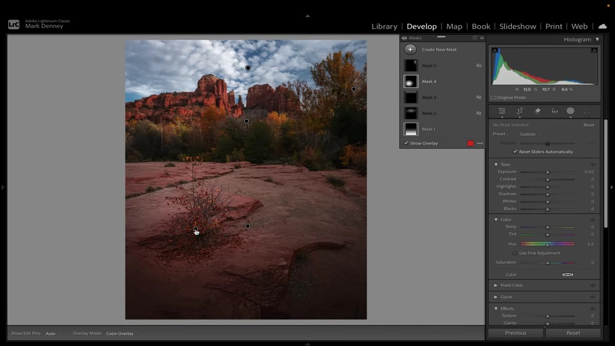 Second mask activated brightening mountains and mid-ground transition area
Once the “ignore this” areas are darkened, Denney activates a second mask that lifts brightness specifically on the mountains and the transition zone between foreground and background. This creates a tonal path. The eye enters the image, skips the dark foreground, and travels toward the light. Notice that he’s not just brightening the subject in isolation. He’s thinking about the journey the viewer takes through the frame, and engineering that journey with light. When I’m working on composite ads, this is exactly how I handle background-to-subject transitions. The subject doesn’t need to be the brightest thing in absolute terms. It just needs to be brighter than what surrounds it.
Second mask activated brightening mountains and mid-ground transition area
Once the “ignore this” areas are darkened, Denney activates a second mask that lifts brightness specifically on the mountains and the transition zone between foreground and background. This creates a tonal path. The eye enters the image, skips the dark foreground, and travels toward the light. Notice that he’s not just brightening the subject in isolation. He’s thinking about the journey the viewer takes through the frame, and engineering that journey with light. When I’m working on composite ads, this is exactly how I handle background-to-subject transitions. The subject doesn’t need to be the brightest thing in absolute terms. It just needs to be brighter than what surrounds it.
Step 4: Cap the Sky With a Subtle Darkening at the Top Edge
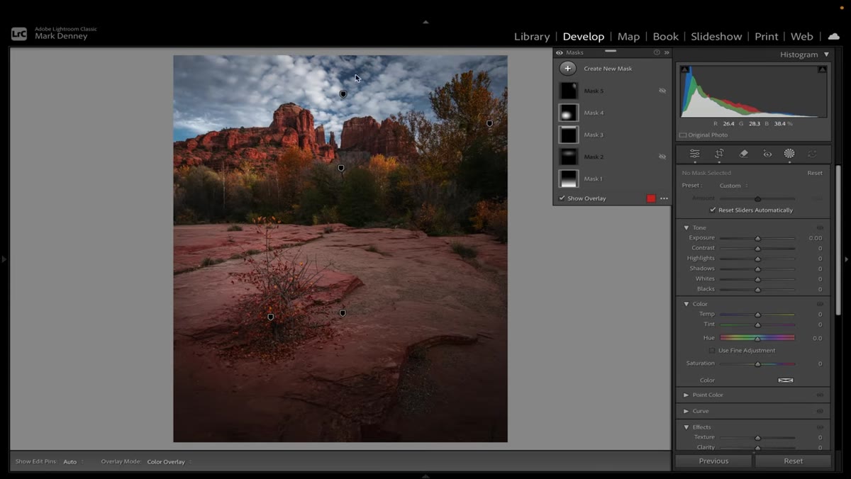 Gradient mask darkening upper sky edge acting as compositional lid
This is a small adjustment with a disproportionate effect on composition. Denney applies a gentle darkening to the uppermost portion of the sky. His description is useful: it acts like a lid on the image. Without it, the eye can drift out of the top of the frame. With it, the composition feels contained. The viewer’s attention stays inside the image. In Photoshop, a soft-edged gradient mask with a curves adjustment pulling down the highlights handles this in about 30 seconds. I have an action built for exactly this that I run on most landscape-style product backgrounds. It’s saved me from more “why does this feel unfinished?” conversations than I can count.
Gradient mask darkening upper sky edge acting as compositional lid
This is a small adjustment with a disproportionate effect on composition. Denney applies a gentle darkening to the uppermost portion of the sky. His description is useful: it acts like a lid on the image. Without it, the eye can drift out of the top of the frame. With it, the composition feels contained. The viewer’s attention stays inside the image. In Photoshop, a soft-edged gradient mask with a curves adjustment pulling down the highlights handles this in about 30 seconds. I have an action built for exactly this that I run on most landscape-style product backgrounds. It’s saved me from more “why does this feel unfinished?” conversations than I can count.
Step 5: Recover Detail on Secondary Elements That Got Clipped
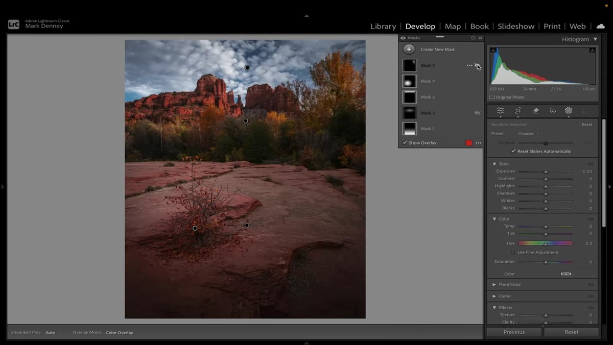 Mask brightening dark trees on right side of frame to restore visible detail
After all the darkening passes, Denney notices the trees on the right edge of the frame have gone too dark. He brings in a targeted mask to lift them back up slightly. Not bright enough to compete with the mountains, but enough that they read as trees rather than a dark blob. This step is a reminder that local adjustments interact with each other. You’ll often need a correction pass after your primary intent pass. Plan for it rather than treating it as a mistake. A non-destructive masking workflow, whether that’s Lightroom’s mask panel or Photoshop’s adjustment layers, makes this iteration cost nothing.
Mask brightening dark trees on right side of frame to restore visible detail
After all the darkening passes, Denney notices the trees on the right edge of the frame have gone too dark. He brings in a targeted mask to lift them back up slightly. Not bright enough to compete with the mountains, but enough that they read as trees rather than a dark blob. This step is a reminder that local adjustments interact with each other. You’ll often need a correction pass after your primary intent pass. Plan for it rather than treating it as a mistake. A non-destructive masking workflow, whether that’s Lightroom’s mask panel or Photoshop’s adjustment layers, makes this iteration cost nothing.
Step 6: Draw the Final Attention to the Hero Element
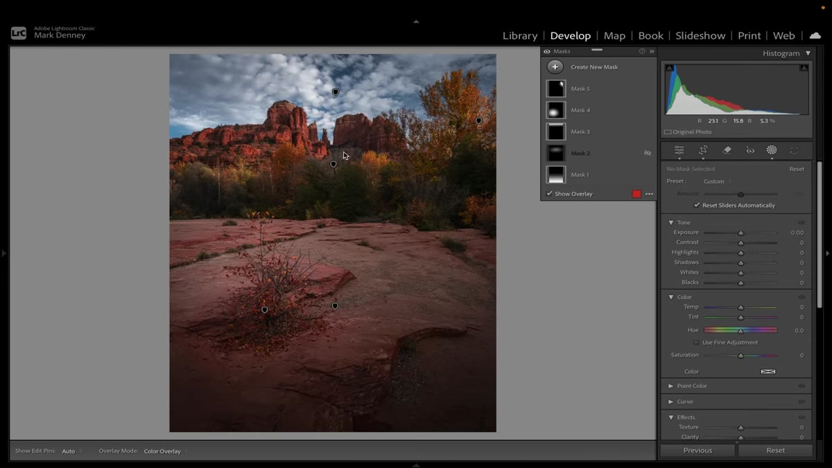 Final mask adding targeted brightness to backlit mountain peaks
The last mask is the most important one. Denney adds a brightness lift specifically to the illuminated mountains at the center of the frame. This is the payoff of everything that came before it. By the time you get here, every other area of the image has been calibrated to support this moment. The mountains are brighter than the foreground. Brighter than the sky’s midtones. Contained by the darkened top edge. The viewer has no choice but to land exactly where Denney wants them.
Final mask adding targeted brightness to backlit mountain peaks
The last mask is the most important one. Denney adds a brightness lift specifically to the illuminated mountains at the center of the frame. This is the payoff of everything that came before it. By the time you get here, every other area of the image has been calibrated to support this moment. The mountains are brighter than the foreground. Brighter than the sky’s midtones. Contained by the darkened top edge. The viewer has no choice but to land exactly where Denney wants them.
How This Changes the Way I Build Photoshop Actions
The practical implication for anyone building reusable workflows is this: your global adjustments and your local adjustments need different jobs. I used to build actions that applied both in sequence and called it a preset. The problem was that the local adjustments were always wrong for the specific image because they weren’t responding to anything. Now I separate them. Global corrections get automated. Local luminance direction gets a dedicated masking step that I build per image but with a consistent process. The thinking Denney describes, starting with “where do I want the viewer to look,” becomes the brief I write before I open the file. It sounds soft. It’s actually the most structural thing you can do before any technical work begins.
The single most transferable thing from this tutorial is the reframe from “how do I make this look better” to “where do I want the viewer to look.” Every slider move, every mask, every action you run should be answerable against that question. If you can’t say what it’s doing to guide attention, you’re probably not done thinking about the image yet. Watch the full tutorial on YouTube to see Denney walk through all three real-world examples and the before-and-after comparison that makes this mindset shift click.
Comments (1)
My workflow just got 10x faster. Not even kidding.
Leave a Comment