
I’ll be honest with you. Early in my commercial work, I treated presets the way a lot of people do: click, hope, move on. I bought packs, applied them wholesale to client images, and wondered why the results felt borrowed rather than intentional. It took a few years of production pressure, and eventually watching people who actually knew what they were doing, to understand that presets are a diagnostic tool first and a finishing tool second. That reframe changed how I use them across everything, from Lightroom to Capture One to the batch actions I’ve built in Photoshop.
In this Daniel Norton Photographer tutorial, Watch the full tutorial on YouTube, Daniel makes an argument I wish someone had handed me at the start: presets built around someone else’s shooting style, their light, their contrast preferences, their camera profile, won’t behave the same way on your files. It sounds obvious when you say it out loud, but it runs against the way presets are marketed. They’re sold as magic, and Daniel explains why they’re actually more useful as a mirror.
What follows is a breakdown of his approach, with some extensions from my own experience running post-production on high-volume commercial shoots.
Step 1: Question Whether You Actually Want Someone Else’s Preset
 Daniel explaining why his presets won’t work for others
Before you spend money on a preset pack, understand what you’re actually buying. A preset encodes a specific set of decisions: how shadows are crushed, how highlights roll off, how color channels are pushed. Those decisions were made with specific raw files in mind, shot under specific conditions. Daniel is direct about this: he regularly tells people who ask for his presets that handing them over would be close to useless unless that person is shooting with identical lighting, camera, and intent.
Daniel explaining why his presets won’t work for others
Before you spend money on a preset pack, understand what you’re actually buying. A preset encodes a specific set of decisions: how shadows are crushed, how highlights roll off, how color channels are pushed. Those decisions were made with specific raw files in mind, shot under specific conditions. Daniel is direct about this: he regularly tells people who ask for his presets that handing them over would be close to useless unless that person is shooting with identical lighting, camera, and intent.
That’s not gatekeeping. It’s accurate. When I’ve tested third-party presets against product files shot in a controlled studio environment, even the “neutral” ones shift colors in ways that require significant correction. You end up doing more work than if you’d started from scratch.
Step 2: Buy Presets to Learn, Not Just to Apply
 Daniel browsing Capture One preset packs on screen
Daniel admits he bought Capture One preset packs and rarely uses them in the traditional sense. The reason he bought them is worth paying attention to: he wanted reference points while he was still developing fluency with the software. This is a legitimate strategy, especially when you’re moving from one application to another and don’t yet have an intuitive feel for how the tools interact.
Daniel browsing Capture One preset packs on screen
Daniel admits he bought Capture One preset packs and rarely uses them in the traditional sense. The reason he bought them is worth paying attention to: he wanted reference points while he was still developing fluency with the software. This is a legitimate strategy, especially when you’re moving from one application to another and don’t yet have an intuitive feel for how the tools interact.
Think of it less as buying a finished look and more as buying a set of annotated examples. Each preset is a configuration you can open up, examine, and reverse-engineer. If you’re trying to understand how Capture One’s Color Balance tool works differently from Lightroom’s HSL panel, loading a preset and studying what it did is a fast path to that understanding.
Step 3: Use Presets as a Rapid Visual Audit
 Cycling through presets quickly to preview different contrast treatments
Here’s where Daniel’s workflow gets genuinely useful. Rather than opening an image and immediately reaching for sliders, he’ll cycle through presets quickly when he knows something about an image isn’t working but can’t immediately name what. It’s a way of asking the image a question: does it want more contrast? Desaturated tones? Crushed shadows?
Cycling through presets quickly to preview different contrast treatments
Here’s where Daniel’s workflow gets genuinely useful. Rather than opening an image and immediately reaching for sliders, he’ll cycle through presets quickly when he knows something about an image isn’t working but can’t immediately name what. It’s a way of asking the image a question: does it want more contrast? Desaturated tones? Crushed shadows?
The key is speed and detachment. You’re not committing to anything. You’re scanning options visually the same way you might flip through reference images when you’re trying to articulate a creative direction. I do something similar with my saved Photoshop action sets: I’ll run a few color grade variations on a duplicate layer just to see which direction the image is asking for, then undo everything and build it properly once I know the answer.
Step 4: Let the Preset Reveal the Direction, Then Reset and Build It Yourself
 Daniel resetting the image after previewing a preset and rebuilding manually
This is the core of Daniel’s method and the part most people skip. After using a preset to identify what an image needs, he resets the file and rebuilds that look manually from scratch. If the preset told him that crushing the shadows and pulling saturation made the image work, he’ll do exactly that with his own hands, dialing in the values to suit the specific file rather than accepting the preset’s approximation.
Daniel resetting the image after previewing a preset and rebuilding manually
This is the core of Daniel’s method and the part most people skip. After using a preset to identify what an image needs, he resets the file and rebuilds that look manually from scratch. If the preset told him that crushing the shadows and pulling saturation made the image work, he’ll do exactly that with his own hands, dialing in the values to suit the specific file rather than accepting the preset’s approximation.
This matters enormously for consistency across a shoot. A preset applies a fixed transformation. When you rebuild it manually, you can adjust for the image in front of you: a frame shot slightly darker gets a slightly different shadow treatment than the frame shot in full light. The aesthetic intent stays consistent while the technical execution adapts. That’s what separates a cohesive edit from a batch of images that technically have the same filter applied.
Step 5: Consider Film Emulation Presets as a Specific Starting Reference
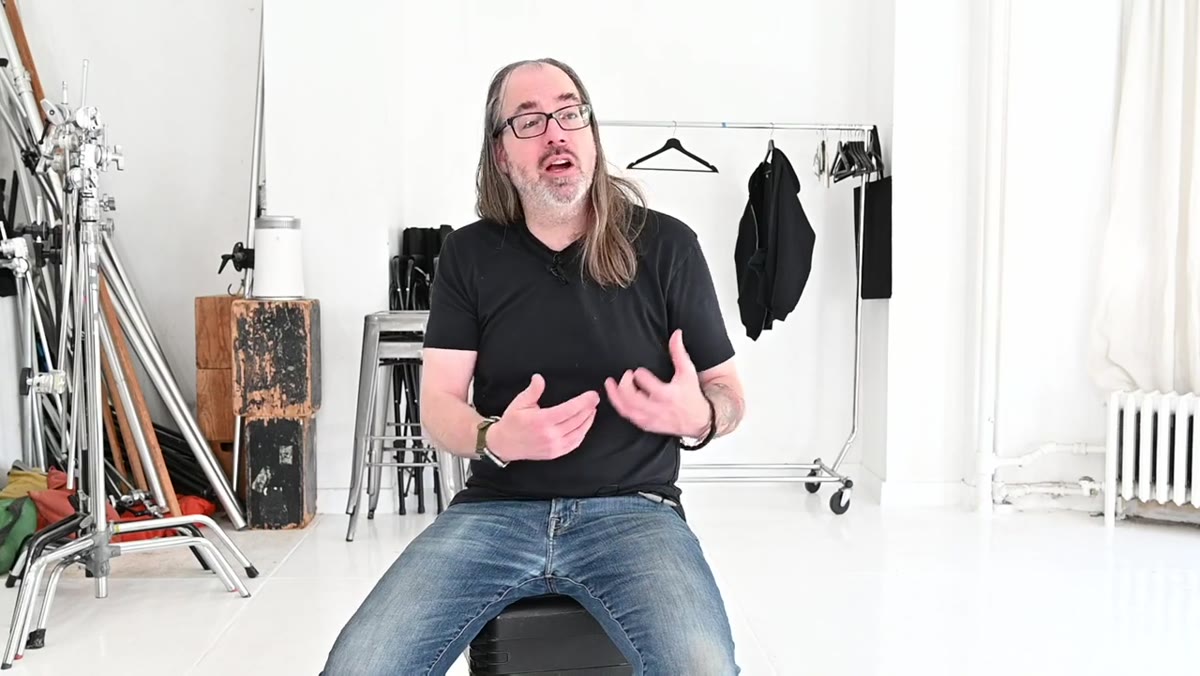 Discussing film emulation presets and their specific use case
Daniel mentions he’s used presets designed to emulate specific film stocks, particularly back when he was working heavily in Lightroom. These sit in a slightly different category from general-purpose contrast or color presets. If you’re trying to match a specific aesthetic reference, say a client wants something that reads like Kodak Portra or pushed Tri-X, a film emulation preset gives you a calibrated starting point that would take considerable trial and error to arrive at independently.
Discussing film emulation presets and their specific use case
Daniel mentions he’s used presets designed to emulate specific film stocks, particularly back when he was working heavily in Lightroom. These sit in a slightly different category from general-purpose contrast or color presets. If you’re trying to match a specific aesthetic reference, say a client wants something that reads like Kodak Portra or pushed Tri-X, a film emulation preset gives you a calibrated starting point that would take considerable trial and error to arrive at independently.
The same reset-and-rebuild discipline applies here. Use the emulation to understand what combination of grain, color response, and tonal compression creates that look, then adjust to match your actual files rather than accepting a generic approximation.
What I’d Add From the Production Side
Running post-production on e-commerce and advertising shoots, I’ve landed on a hybrid system that builds on exactly what Daniel describes. I maintain a small library of what I call “diagnostic presets” in Lightroom and Capture One: not looks I use in finished work, but extreme versions of common treatments (heavy contrast, strong desaturation, boosted clarity) that I cycle through quickly when an image isn’t resolving. They’re calibrated to my most common camera and lighting configurations, which means their behavior is predictable on my files in a way that purchased packs never quite are.
Building those took time. I logged the adjustments that kept appearing in my finished edits over about six months, identified the patterns, and saved them as starting references. It’s the same principle as building a Photoshop action: the initial investment pays back in compounding efficiency. My spreadsheet says I’m at over 2,400 hours saved through automated workflows. The preset discipline Daniel describes is what feeds that system at the front end.
The single most important takeaway here is this: a preset is most valuable as a question, not an answer. When it shows you what an image could be, that’s the moment to reset and build the answer yourself. That’s when you’re actually editing, rather than just applying.
Watch the full tutorial on YouTube and pay attention to how Daniel talks about the relationship between using tools and learning tools. That framing is worth more than any preset pack.
Comments (2)
I tried this on a client project yesterday and the results were way better than expected.
I tried this on a client project yesterday and the results were way better than expected.
Leave a Comment