There’s a specific kind of discouragement that hits landscape photographers and I’ve watched it happen to clients of mine for years. You nail the shot in the field, drive home buzzing, load the RAWs onto the computer, and then just… stall. The files look flat. The shadows are a mess. The sky is blown or the foreground is a muddy void. And because you don’t have a clear entry point into the edit, you close the application and tell yourself you’ll come back to it. You rarely do.
I’ve been doing post-production work for fifteen years, mostly commercial and product work where the process is ruthlessly systematized. But landscape editing is a different animal because every file has its own tonal problems. What I keep coming back to, and what I keep recommending to photographers who hire me to clean up their workflows, is the same core principle: fewer decisions made in a deliberate order. Watch the full tutorial on YouTube
In this William Patino tutorial, he works through a brutally backlit sunrise file, which is about as difficult a starting point as you can hand someone. About 80% of the image is deep shadow and compressed midtones. Rather than throwing a dozen tools at it, he walks through a tight, repeatable sequence that could genuinely replace the chaotic slider-grabbing most photographers default to. Here’s the full breakdown.
Step 1: Set Your Creative Intention Before Touching a Slider
 Flat, backlit RAW file loaded in Adobe Camera Raw
Before any adjustment happens, Patino asks one question: what is this image supposed to do? For this particular file, the answer is three things. Reveal shadow detail. Restore color that the RAW format has compressed. Lead the viewer’s eye toward the mountain range in the background. That’s it. Write those down if you have to. The reason this matters is that every slider decision after this point should be tested against that list. If an adjustment doesn’t serve one of those three goals, it probably shouldn’t happen.
Flat, backlit RAW file loaded in Adobe Camera Raw
Before any adjustment happens, Patino asks one question: what is this image supposed to do? For this particular file, the answer is three things. Reveal shadow detail. Restore color that the RAW format has compressed. Lead the viewer’s eye toward the mountain range in the background. That’s it. Write those down if you have to. The reason this matters is that every slider decision after this point should be tested against that list. If an adjustment doesn’t serve one of those three goals, it probably shouldn’t happen.
This is less obvious than it sounds. Most people open a file and start adjusting whatever bothers them first, which is usually the thing that jumps out visually rather than the thing that matters compositionally. Having a stated goal changes which sliders you even consider reaching for.
Step 2: Switch the Color Profile to Landscape
 Color profile dropdown open, Landscape option highlighted
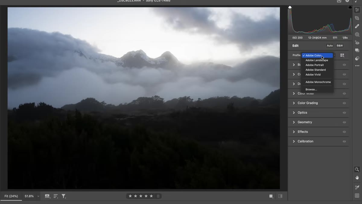
The first actual edit is selecting the Landscape color profile from the profile browser inside Adobe Camera Raw. This is available in both ACR and Lightroom under the same section. The Landscape profile does two things simultaneously: it lifts the darker tones slightly and pushes the colors toward more saturation, particularly greens and blues. Toggling it on and off on a flat RAW file makes the effect immediately obvious.
Color profile dropdown open, Landscape option highlighted
The first actual edit is selecting the Landscape color profile from the profile browser inside Adobe Camera Raw. This is available in both ACR and Lightroom under the same section. The Landscape profile does two things simultaneously: it lifts the darker tones slightly and pushes the colors toward more saturation, particularly greens and blues. Toggling it on and off on a flat RAW file makes the effect immediately obvious.
This is not a finishing move. Think of it as setting a better starting point so your subsequent adjustments are working from a more useful baseline. Patino doesn’t over-explain it and neither should you. Apply it, move on.
Step 3: Set the Global Temperature Before Anything Else
 Temperature slider pulled left, image cooling visibly
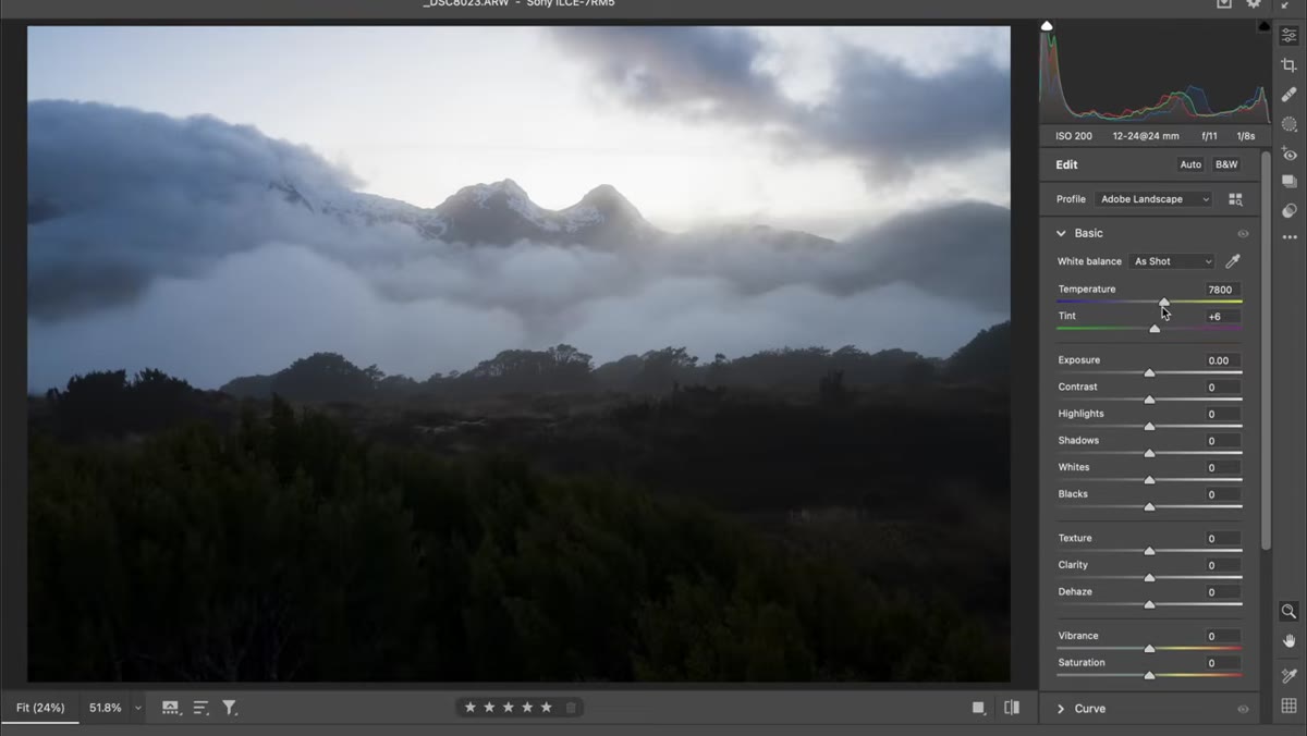
With the Basic panel open, Patino pulls the temperature slider cooler before touching exposure. His reasoning is straightforward: the fog in the image already carries subtle blue tones, and cooling the global temperature brings those forward rather than fighting them. Later he’ll warm the highlights separately, creating a natural contrast between a cool foreground and warm sky.
Temperature slider pulled left, image cooling visibly
With the Basic panel open, Patino pulls the temperature slider cooler before touching exposure. His reasoning is straightforward: the fog in the image already carries subtle blue tones, and cooling the global temperature brings those forward rather than fighting them. Later he’ll warm the highlights separately, creating a natural contrast between a cool foreground and warm sky.
The principle here applies broadly. If your image has a dominant color mood you want to lean into, establish that globally first. Trying to color-correct after you’ve already worked exposure and contrast means you’ll often be undoing tonal work to accommodate color shifts.
Step 4: Raise Exposure to Lift the Whole Frame Evenly
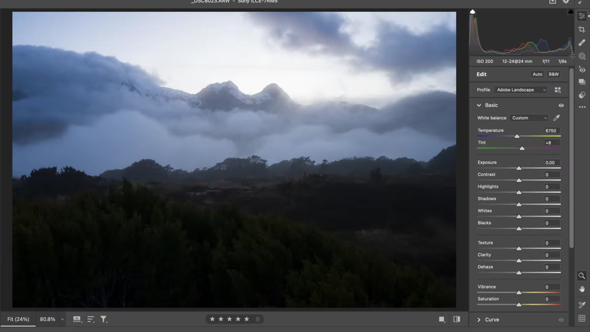 Exposure slider increased, histogram showing midtones lifting
Patino raises the global exposure slider rather than reaching immediately for shadows or blacks. The logic is sound: increasing exposure raises midtones, shadows, and highlights together, which preserves the relative tonal relationships across the image. It looks more natural than trying to surgically lift only the dark areas. The trade-off is that the sky, which was already the brightest part of the frame, will get pushed toward overexposure. That’s addressed in the next step.
Exposure slider increased, histogram showing midtones lifting
Patino raises the global exposure slider rather than reaching immediately for shadows or blacks. The logic is sound: increasing exposure raises midtones, shadows, and highlights together, which preserves the relative tonal relationships across the image. It looks more natural than trying to surgically lift only the dark areas. The trade-off is that the sky, which was already the brightest part of the frame, will get pushed toward overexposure. That’s addressed in the next step.
Keep an eye on the histogram throughout this adjustment. Patino shot the original image to protect highlights, letting the shadows fall wherever they fell. That means there’s latitude to raise exposure several stops before the brightest areas actually clip.
Step 5: Recover Highlights Conservatively, Raise Shadows Gently
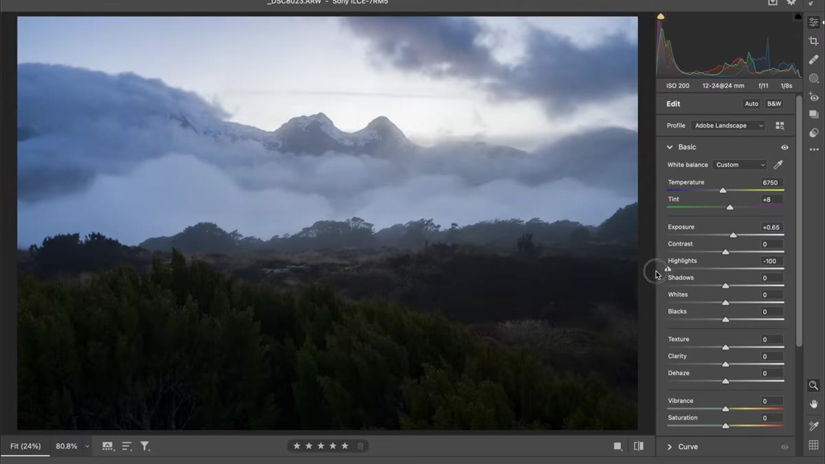 Highlights slider pulled left, Shadows slider raised moderately
Here is where a lot of photographers overcorrect. Pulling highlights down too aggressively recovers the sky but it also flattens the subtle highlight detail that exists in the midrange, things like texture in foliage, rim light on rocks, or the glow in fog. Patino recovers highlights partially and leaves room for some natural brightness in the upper tones.
Highlights slider pulled left, Shadows slider raised moderately
Here is where a lot of photographers overcorrect. Pulling highlights down too aggressively recovers the sky but it also flattens the subtle highlight detail that exists in the midrange, things like texture in foliage, rim light on rocks, or the glow in fog. Patino recovers highlights partially and leaves room for some natural brightness in the upper tones.
On the shadow end, he raises them to around 40 and stops. The reason is compositional: if the foreground becomes too bright, the eye parks there instead of traveling toward the subject. Dark edges and a darker foreground naturally push attention toward the center and background of the frame. This is one of those adjustments where the number on the slider matters less than the visual result, so keep looking at the image rather than the panel.
Step 6: Use Vibrance for Midtone Color, Skip Saturation for Now
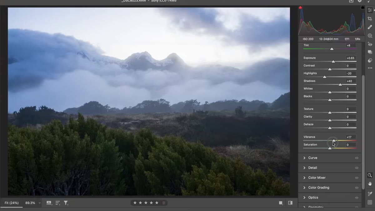 Vibrance slider raised, Saturation slider left at zero
Patino separates Vibrance from Saturation deliberately. Vibrance works primarily on midtones and has a protective effect on already-saturated colors, so it adds richness without blowing out skin tones or oversaturating narrow color ranges. Saturation is a blunter instrument that affects everything including shadows and highlights.
Vibrance slider raised, Saturation slider left at zero
Patino separates Vibrance from Saturation deliberately. Vibrance works primarily on midtones and has a protective effect on already-saturated colors, so it adds richness without blowing out skin tones or oversaturating narrow color ranges. Saturation is a blunter instrument that affects everything including shadows and highlights.
For a file like this, heavy on shadows with a specific color mood already established, Vibrance does the work without introducing the muddy or oversaturated look that a heavy Saturation push produces. Raise Vibrance to taste, watch the fog and sky respond, and leave Saturation alone unless the result still reads as visually flat.
What I’d Add From the Commercial Side
Patino’s workflow is built for landscape editing and it’s solid. The one layer I’d put on top of it for anyone doing higher-volume work is to run this sequence once on your best exposure from a shoot, save it as a preset, and use it as a starting point for every other frame from that session. You won’t get a perfect result on every file, but you’ll eliminate the blank-slate paralysis that makes editing feel endless.
I track time savings from systematized workflows obsessively and the single biggest return always comes from removing the “where do I even start” problem. Patino’s sequence is short enough to become a preset and deliberate enough that the preset actually makes sense rather than just being a random collection of slider positions.
The biggest thing to take away from this tutorial is the sequencing: color profile first, global temperature before exposure, exposure before targeted recovery, and Vibrance as a finishing color move rather than an afterthought. That order exists for reasons and following it keeps you from creating problems with one slider that you then have to fix with the next.
Watch the full tutorial on YouTube to see Patino walk through the complete edit with the actual RAW file.
Comments
Leave a Comment