Most photographers build presets the wrong way. They chase a look on one hero image, save it, and then discover it turns every other photo into a color disaster. I spent years doing exactly that before I got disciplined about the order of operations. When I came across Watch the full tutorial on YouTube from Mango Street, what struck me wasn’t the specific look they were going for. It was the sequence. They move through the panels in an order that makes the preset transferable, not just pretty on one frame.
In this Mango Street tutorial, Rachel and Daniel build a muted, film-influenced Lightroom preset in under five minutes using the tone curve, camera calibration panel, and a few targeted basic adjustments. The whole thing is practical and unpretentious. But the transcript moves fast, so I want to slow it down here and explain the reasoning behind each step, because understanding why is what separates a preset you’ll use for three years from one you’ll delete in three weeks.
One thing I’d add before we start: shoot your base image in the same lighting conditions you typically work in. I do a lot of studio and e-commerce work, so I always build new presets off a controlled studio shot before testing in ambient light. Mango Street makes the same recommendation, and they’re right. Your preset should be calibrated to your most common scenario first.
Step 1: Correct Your Exposure and White Balance First
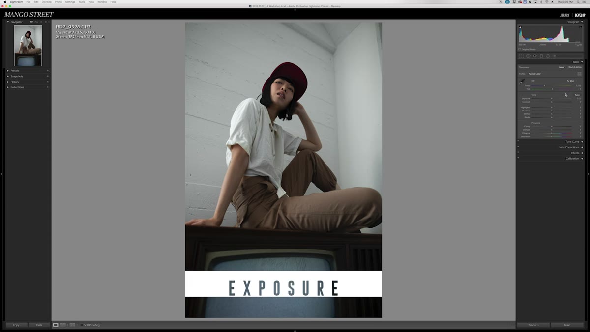 Warming white balance and bumping exposure on portrait
Before you touch anything creative, get your technical baseline right. Adjust your color temperature to match the intended warmth of the scene, and bring your exposure to where skin tones and midtones look natural. This step sounds obvious, but the reason it matters for preset-building specifically is that every adjustment you make downstream will be relative to this starting point. If you build your curves and calibration on a badly exposed image, those adjustments will fight you on every other photo you apply the preset to. Also enable lens correction at this stage. It won’t be part of the creative look, but it cleans up the foundation before you start painting.
Warming white balance and bumping exposure on portrait
Before you touch anything creative, get your technical baseline right. Adjust your color temperature to match the intended warmth of the scene, and bring your exposure to where skin tones and midtones look natural. This step sounds obvious, but the reason it matters for preset-building specifically is that every adjustment you make downstream will be relative to this starting point. If you build your curves and calibration on a badly exposed image, those adjustments will fight you on every other photo you apply the preset to. Also enable lens correction at this stage. It won’t be part of the creative look, but it cleans up the foundation before you start painting.
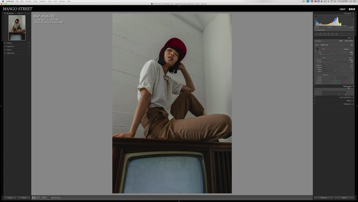
Step 2: Shape Your Contrast with the Tone Curve
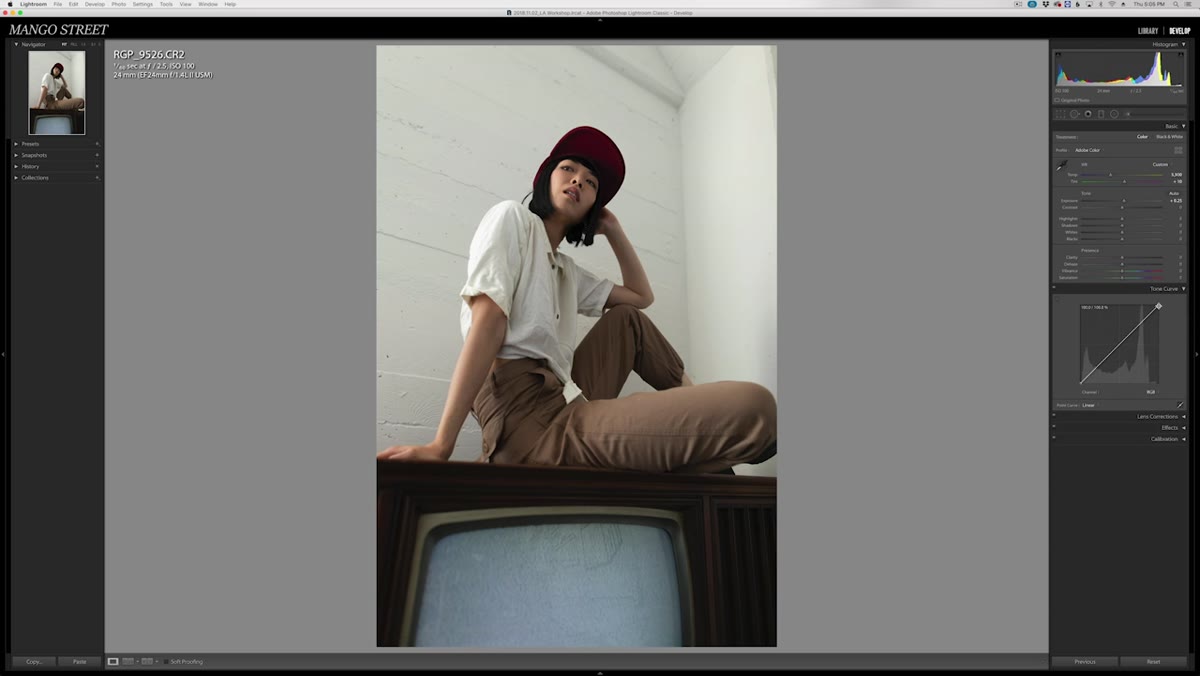 Tone curve panel open with white point being pulled down
The tone curve is where this particular look gets its muted character. Pull the white point down from the top right corner of the curve. This softens the highlights and gives the image that faded, analog quality. Then bring the black point up slightly from the bottom left. Combined, these two moves compress the overall tonal range, which is the signature of the faded film aesthetic.
Tone curve panel open with white point being pulled down
The tone curve is where this particular look gets its muted character. Pull the white point down from the top right corner of the curve. This softens the highlights and gives the image that faded, analog quality. Then bring the black point up slightly from the bottom left. Combined, these two moves compress the overall tonal range, which is the signature of the faded film aesthetic.
From there, add anchor points in the shadow region to push contrast back into the darker tones without crushing the blacks. One more point in the midtones to lift the overall brightness. What you’re doing here is controlling contrast locally instead of using the blunt instrument in the basic panel. The result is a more nuanced contrast that doesn’t flatten out the whole image.
Step 3: Back to the Basic Panel for Highlights and Shadows
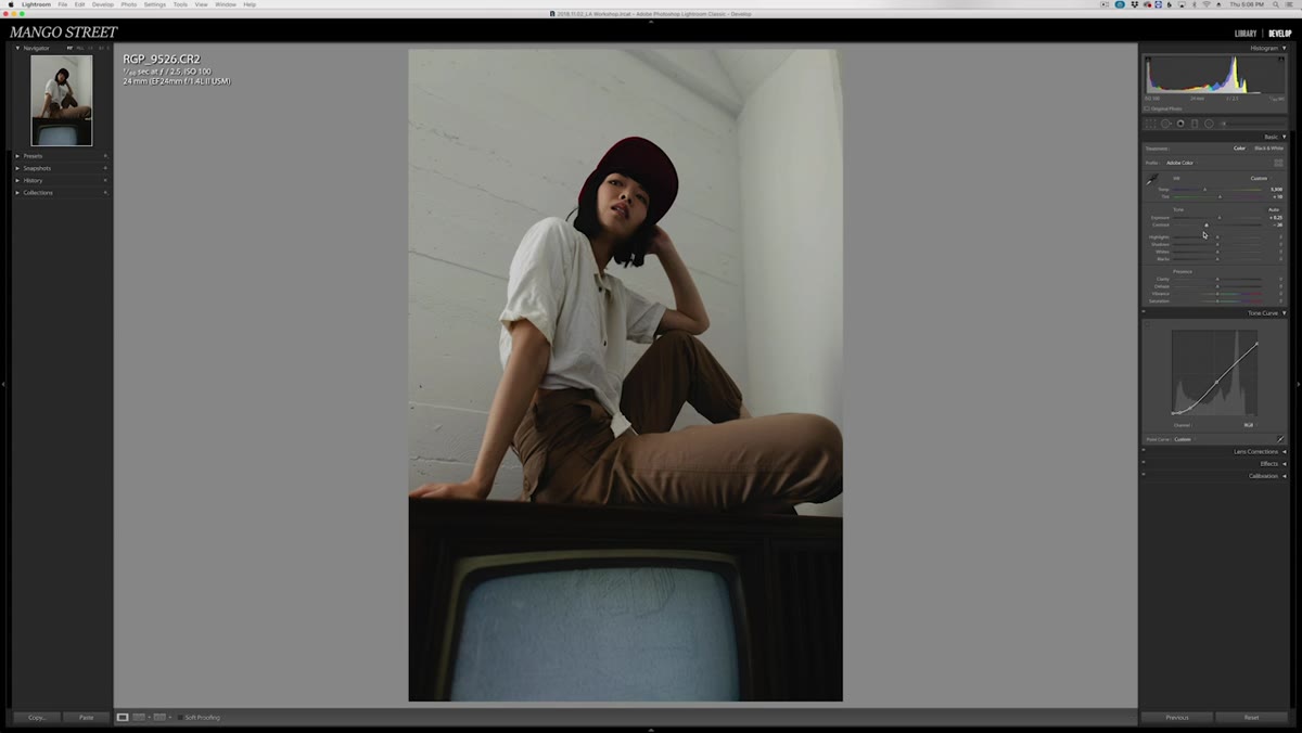 Basic panel with contrast dropped, highlights lowered, shadows boosted
After the curve work, go back to the basic panel and drop your overall contrast slider. I know this feels counterintuitive right after you just added contrast in the curve, but these two panels work differently. The basic contrast slider affects a broad, symmetrical range. The curve lets you be surgical. By dropping basic contrast and using the curve instead, you get more control over the final result.
Basic panel with contrast dropped, highlights lowered, shadows boosted
After the curve work, go back to the basic panel and drop your overall contrast slider. I know this feels counterintuitive right after you just added contrast in the curve, but these two panels work differently. The basic contrast slider affects a broad, symmetrical range. The curve lets you be surgical. By dropping basic contrast and using the curve instead, you get more control over the final result.
Bring highlights down significantly to recover detail in the brighter areas of the frame. Then push shadows up, somewhere in the range of 70, to open up the darker regions without making the image look artificially lifted. This combination of lowered highlights and raised shadows is what creates that open, airy feel that reads well on skin and on location backgrounds.
Step 4: Define the Color DNA with Camera Calibration
 Camera calibration panel with tint and primary sliders being adjusted
This is the panel most photographers ignore, and it’s where Mango Street’s approach gets genuinely interesting. The camera calibration panel adjusts the raw color response at a deeper level than the HSL sliders. Changes here affect the RGB balance across every pixel in the image, which means the adjustments behave more naturally across different exposures and skin tones.
Camera calibration panel with tint and primary sliders being adjusted
This is the panel most photographers ignore, and it’s where Mango Street’s approach gets genuinely interesting. The camera calibration panel adjusts the raw color response at a deeper level than the HSL sliders. Changes here affect the RGB balance across every pixel in the image, which means the adjustments behave more naturally across different exposures and skin tones.
Start by pulling the tint slider toward green, somewhere around -40. Then work through the primary color sliders. For the green primary, a small hue shift toward blue and magenta adds richness without looking processed. For the blue and red primaries, reduce saturation to keep the overall palette from getting too punchy. The goal here is to define a color signature that is distinctive but not aggressive. Think of this panel as tuning the instrument before you play it.
Step 5: Add Grain and Dehaze for Texture and Punch
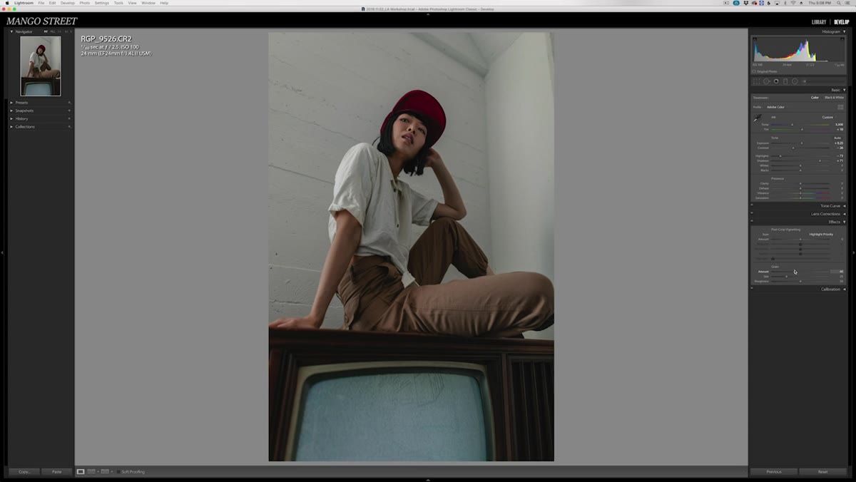 Dehaze slider being nudged up slightly in effects panel
A small amount of grain ties everything together if you’re going for an organic, non-digital feel. Mango Street uses it here because they had been leaning into that aesthetic across their work at the time. Keep grain subtle. You want the eye to register texture, not distraction.
Dehaze slider being nudged up slightly in effects panel
A small amount of grain ties everything together if you’re going for an organic, non-digital feel. Mango Street uses it here because they had been leaning into that aesthetic across their work at the time. Keep grain subtle. You want the eye to register texture, not distraction.
Dehaze is the last move. A small positive value adds micro-contrast and clarity that lifts the image without the heavy-handed look of the clarity slider. If you’ve never used dehaze on a portrait, try a value between 5 and 15 before judging it. It reads differently than you’d expect from the name.
Step 6: Save Smart, Then Test Hard
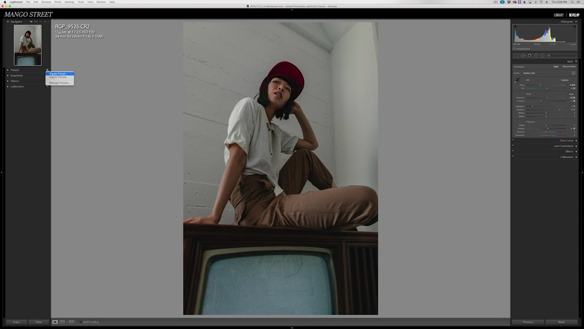 Save preset dialog with white balance and exposure unchecked
When you save the preset, uncheck white balance, exposure, and any photo-specific properties like spot removal or transformations. These values are tied to individual images. A preset that forces a specific color temperature onto every photo will fight you constantly. Save only the creative adjustments you want applied universally.
Save preset dialog with white balance and exposure unchecked
When you save the preset, uncheck white balance, exposure, and any photo-specific properties like spot removal or transformations. These values are tied to individual images. A preset that forces a specific color temperature onto every photo will fight you constantly. Save only the creative adjustments you want applied universally.
Then test the preset across a range of images, ideally from different shoots, different lighting conditions, and different subjects. A preset that only works on one set of photos isn’t really a preset. It’s a one-time grade. Keep refining and updating it until it holds up across at least a dozen different images without needing major corrections on each one.
Where I’d Take This Further
I keep a dedicated “preset test library” of about 30 images covering portraits, products, and environments in different lighting scenarios. Any time I build or revise a preset, I apply it to that whole library in one batch and scroll through quickly. You catch problems immediately that you’d miss looking at a single image. The camera calibration adjustments in particular can do unexpected things to certain skin tones or product colors, and you won’t see it until you test widely. It takes an extra five minutes and it has saved me from shipping bad presets to clients more than once.
The bigger lesson from this tutorial is that a good preset is built in layers, from technical foundation up through creative interpretation. Get the exposure right, shape tonal range with the curve, define colors through calibration, and add texture last. That order matters because each layer works on top of the previous one.
Watch the full tutorial on YouTube to see the before-and-after in motion. Seeing the calibration panel adjustments in real time is worth it.
Comments
Leave a Comment