
Every few months a client asks for that “text wrapping around a person” look — the kind you see on magazine covers and concert posters where the headline feels like it exists in the same physical space as the subject. For years I handled it with selection masks, layer clipping, and a level of manual fiddling that didn’t exactly scale when I had a deadline. So when I saw PHLEARN drop a one-minute tutorial on the new Dynamic Text Tool in Photoshop 2026, I stopped what I was doing and watched it twice. Watch the full tutorial on YouTube
What makes this genuinely useful rather than just flashy is how it collapses what used to be a multi-step workaround into something repeatable and non-destructive. The core trick is elegant: two copies of the same text layer, one in front of the subject and one behind, with the front layer made invisible except for its stroke. The Dynamic Text Tool handles the shaping. The layer stack handles the depth illusion. Once you see it, you’ll wonder why you ever did it any other way.
I want to walk through this in enough detail that you can follow along without needing to pause the video every fifteen seconds. All the settings and values are here.
Step 1: Create Your Text Box with the Type Tool
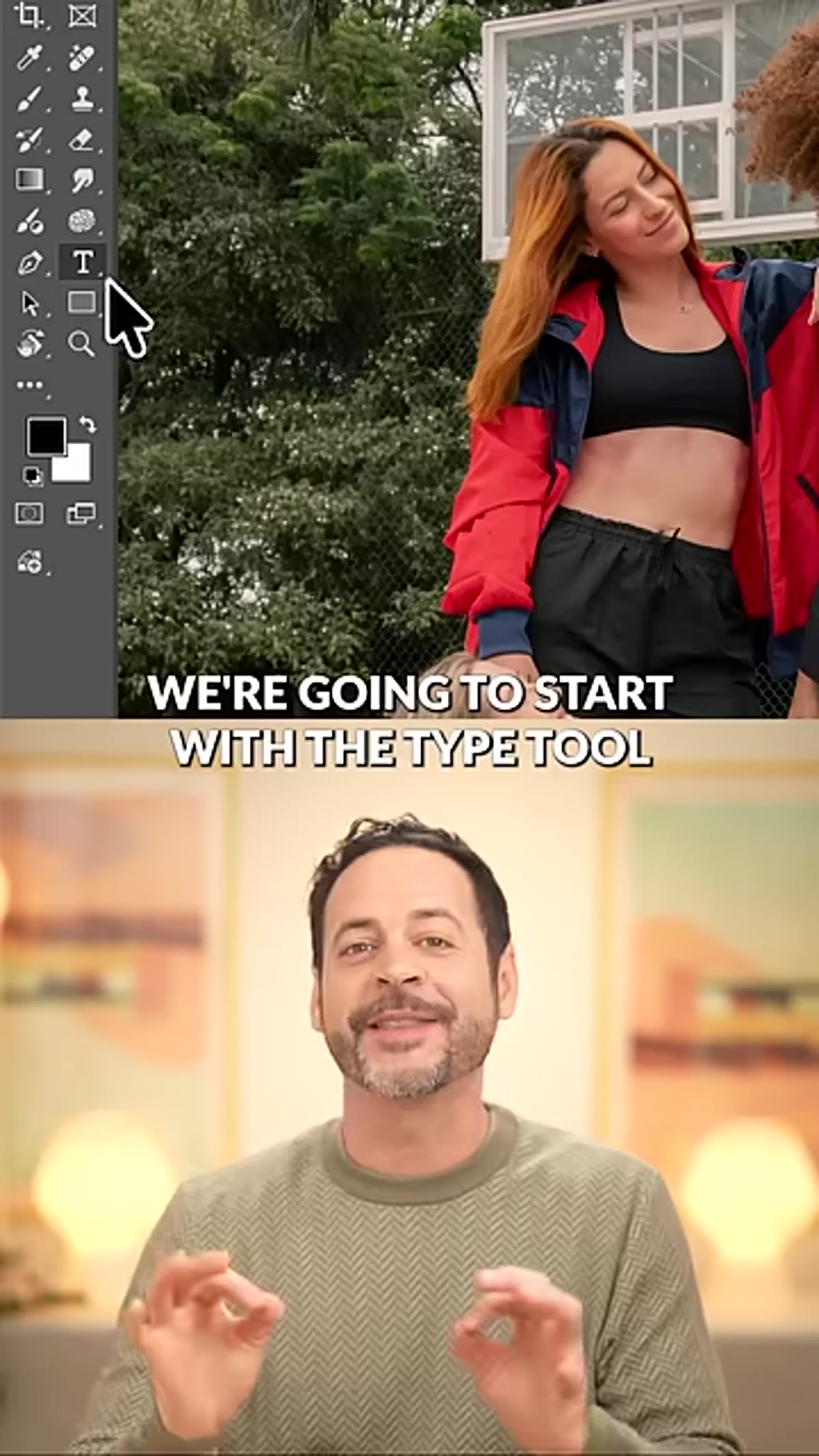 Type tool selected, text box being drawn on canvas
Select the Type Tool (T) and click and drag on your canvas to draw a text box rather than clicking a single point. This matters because Dynamic Text reformats your content relative to the box dimensions, and you want that control from the start. Type or paste in your text. Don’t worry about font size or layout yet. You’re going to let the shape handle most of that.
Type tool selected, text box being drawn on canvas
Select the Type Tool (T) and click and drag on your canvas to draw a text box rather than clicking a single point. This matters because Dynamic Text reformats your content relative to the box dimensions, and you want that control from the start. Type or paste in your text. Don’t worry about font size or layout yet. You’re going to let the shape handle most of that.
Step 2: Enable Dynamic Text from the Contextual Taskbar
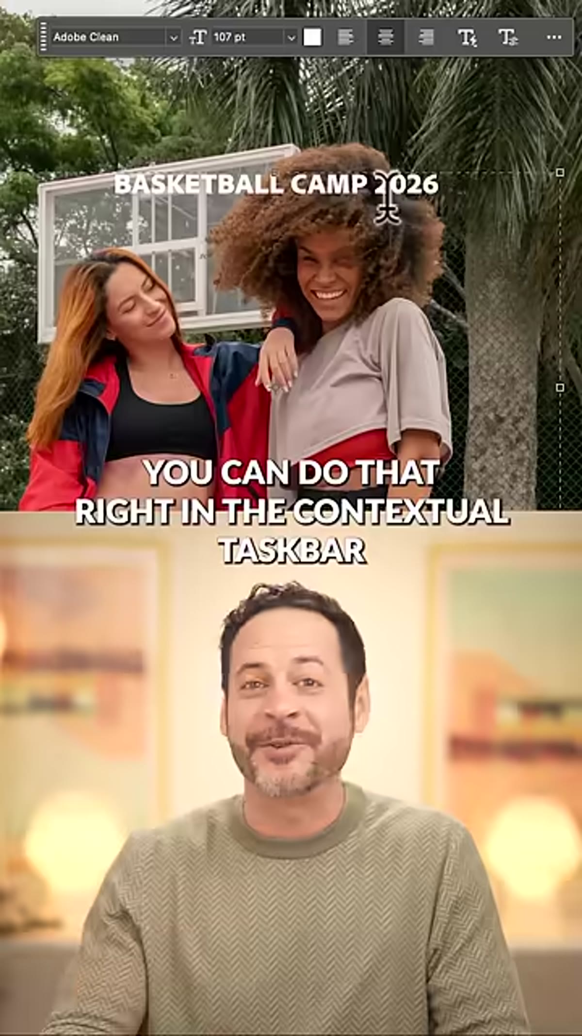 Contextual taskbar showing Dynamic Text toggle active
With your text layer selected, look at the contextual taskbar that runs along the bottom of the canvas area in Photoshop 2026. You’ll see the option to turn on Dynamic Text there. Click it. This is where Photoshop exposes four shape options: Block, Circle, Arch, and Bow. Each one reshapes how your text flows, and all of them stay fully editable after the fact – nothing is flattened or rasterized at this stage.
Contextual taskbar showing Dynamic Text toggle active
With your text layer selected, look at the contextual taskbar that runs along the bottom of the canvas area in Photoshop 2026. You’ll see the option to turn on Dynamic Text there. Click it. This is where Photoshop exposes four shape options: Block, Circle, Arch, and Bow. Each one reshapes how your text flows, and all of them stay fully editable after the fact – nothing is flattened or rasterized at this stage.
Step 3: Choose and Adjust Your Shape
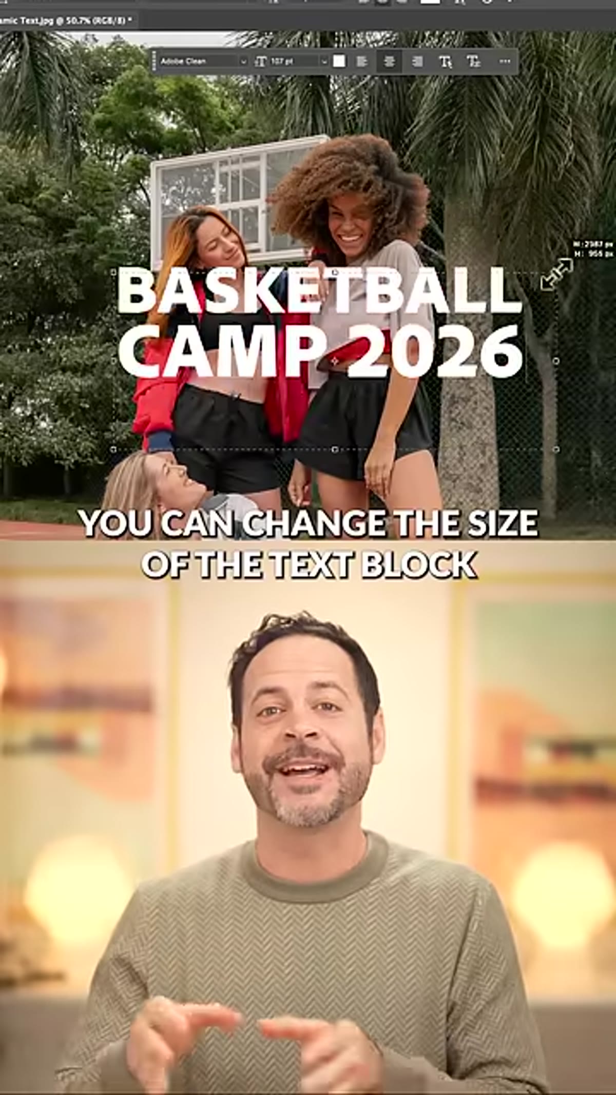 Properties panel open with shape position controls visible
For the text-behind-subject effect, the Arch shape tends to work best because it follows the natural curve of a shoulder, a hat brim, or a head. Select it from the Dynamic Text options. Once it’s applied, open the Properties panel (Window > Properties) where you can fine-tune the position of the text along the arch path. If you need to rotate the text or shift its start and end points, hold Control (Windows) or Command (Mac) while dragging directly on the shape. The Block shape behaves a bit differently – resize the bounding box and the text reflows automatically – but for this technique, stay with Arch.
Properties panel open with shape position controls visible
For the text-behind-subject effect, the Arch shape tends to work best because it follows the natural curve of a shoulder, a hat brim, or a head. Select it from the Dynamic Text options. Once it’s applied, open the Properties panel (Window > Properties) where you can fine-tune the position of the text along the arch path. If you need to rotate the text or shift its start and end points, hold Control (Windows) or Command (Mac) while dragging directly on the shape. The Block shape behaves a bit differently – resize the bounding box and the text reflows automatically – but for this technique, stay with Arch.
Take your time here. The position you set now will carry through to your duplicate layer, so dialing it in before you copy saves you from having to adjust two layers later.
Step 4: Duplicate the Text Layer
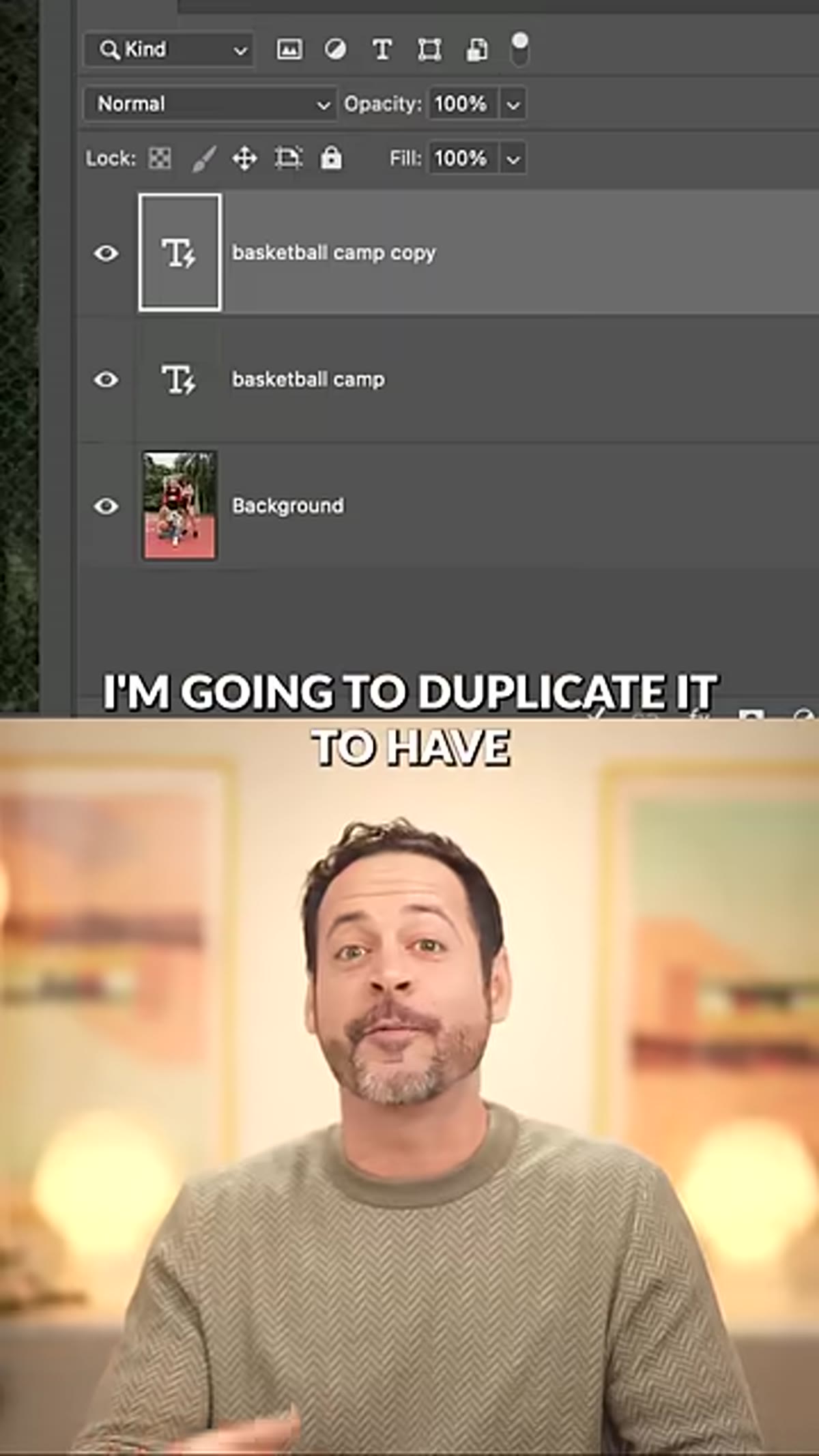 Layers panel showing two identical arch text layers
Once the shape and position look right, duplicate the layer. In the Layers panel, right-click the text layer and choose Duplicate Layer, or use Control+J (Command+J on Mac). You now have two identical Dynamic Text layers sitting on top of each other. One will live in front of your subject. The other will go behind. Rename them something useful – “Text Front” and “Text Behind” – because once you start moving layers around the stack, you’ll want to know which is which immediately.
Layers panel showing two identical arch text layers
Once the shape and position look right, duplicate the layer. In the Layers panel, right-click the text layer and choose Duplicate Layer, or use Control+J (Command+J on Mac). You now have two identical Dynamic Text layers sitting on top of each other. One will live in front of your subject. The other will go behind. Rename them something useful – “Text Front” and “Text Behind” – because once you start moving layers around the stack, you’ll want to know which is which immediately.
Step 5: Position the Layers in the Stack
 Layer stack showing text layers repositioned above and below subject layer
In your Layers panel, you should already have a subject layer – either a cutout on a transparent background or a layer with a mask isolating your subject from the background. Place “Text Behind” below the subject layer. Place “Text Front” above it. The text should now appear fully in front of the subject. That’s intentional. You’ll fix the visibility in the next step.
Layer stack showing text layers repositioned above and below subject layer
In your Layers panel, you should already have a subject layer – either a cutout on a transparent background or a layer with a mask isolating your subject from the background. Place “Text Behind” below the subject layer. Place “Text Front” above it. The text should now appear fully in front of the subject. That’s intentional. You’ll fix the visibility in the next step.
If your subject doesn’t have a clean cutout yet, this is the moment to do that work. The Remove Background button in the Properties panel or the Select Subject tool will get you most of the way there on a clean studio shot.
Step 6: Make the Front Text Layer Invisible Except for Its Stroke
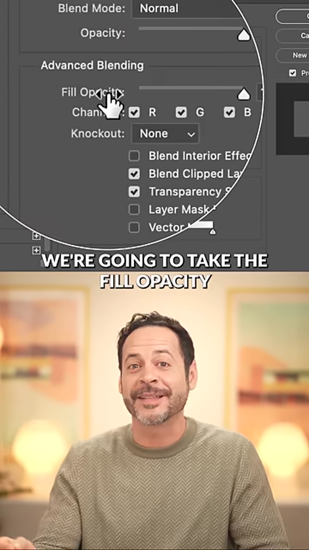 Fill opacity set to 0%, stroke added in Layer Style dialog
Select “Text Front” and go to the Fill opacity slider in the Layers panel. This is different from the main Opacity slider at the top. Fill opacity controls only the pixel content of the layer – the text characters themselves – without affecting any layer styles applied to it. Drag Fill opacity to zero. The text disappears, but any layer styles you add will remain visible.
Fill opacity set to 0%, stroke added in Layer Style dialog
Select “Text Front” and go to the Fill opacity slider in the Layers panel. This is different from the main Opacity slider at the top. Fill opacity controls only the pixel content of the layer – the text characters themselves – without affecting any layer styles applied to it. Drag Fill opacity to zero. The text disappears, but any layer styles you add will remain visible.
Now open Layer Style (double-click the layer thumbnail or go to Layer > Layer Style > Stroke). Add a stroke in whatever color and width fits your design. This stroke will appear to outline the letters in front of the subject, selling the illusion that the text is physically wrapping around the person while the actual letterforms pass behind them.
Step 7: Link the Two Layers for Easy Repositioning
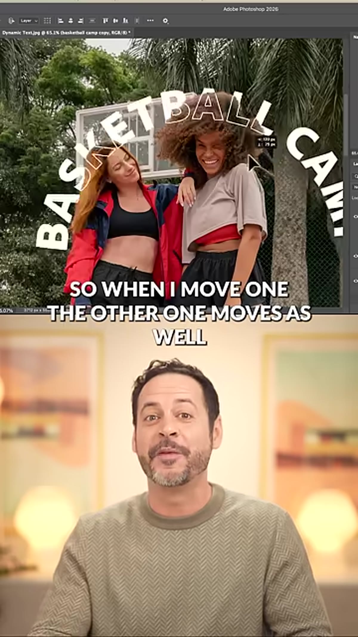 Two text layers linked in Layers panel, being moved together on canvas
Select both layers in the Layers panel by holding Shift and clicking each one, then click the Link Layers icon at the bottom of the panel. Linked layers move as a unit. When you reposition your text composition – nudging it left, scaling it up, rotating slightly – both the front and back layers travel together and stay perfectly registered. Without this link, any adjustment becomes a two-step process and alignment errors creep in.
Two text layers linked in Layers panel, being moved together on canvas
Select both layers in the Layers panel by holding Shift and clicking each one, then click the Link Layers icon at the bottom of the panel. Linked layers move as a unit. When you reposition your text composition – nudging it left, scaling it up, rotating slightly – both the front and back layers travel together and stay perfectly registered. Without this link, any adjustment becomes a two-step process and alignment errors creep in.
One Thing I’d Add for Commercial Work
The PHLEARN tutorial keeps things tight for good reason – it’s a one-minute format – but in a production context I’d take this a step further before sending anything to a client. Smart Objects. Before you duplicate the text layer, convert it to a Smart Object first. That way, if you need to update the copy (a product name changes, a date shifts), you edit the Smart Object and both layers update simultaneously. Doing it after the fact means relinking manually. I learned this the hard way on a campaign that went through four rounds of copy revisions and involved more Control+Z than I want to admit.
Also worth noting: this technique pairs well with a saved action. The layer duplication, Fill opacity drop, stroke application, and layer linking are all recordable steps. I have this sequence saved and it runs in about three seconds. Given that I track my automation savings obsessively, I can already tell this one’s going to earn its place in the spreadsheet.
The single most important thing the Dynamic Text Tool changes is that the shape is never baked in. You can come back tomorrow, adjust the arch, shift the text position, and the whole effect updates without rebuilding anything. That kind of flexibility is what separates a technique worth learning from one you use once and abandon.
Watch the full tutorial on YouTube for the sample image download and the full PHLEARN walkthrough with visual reference at every step.
Comments (3)
Been doing this wrong for years apparently. Thanks for the wake-up call.
Shared this with my photography group. Everyone loved it.
Excellent tutorial. I'd add that from a photography standpoint, this technique is incredibly versatile.
Leave a Comment