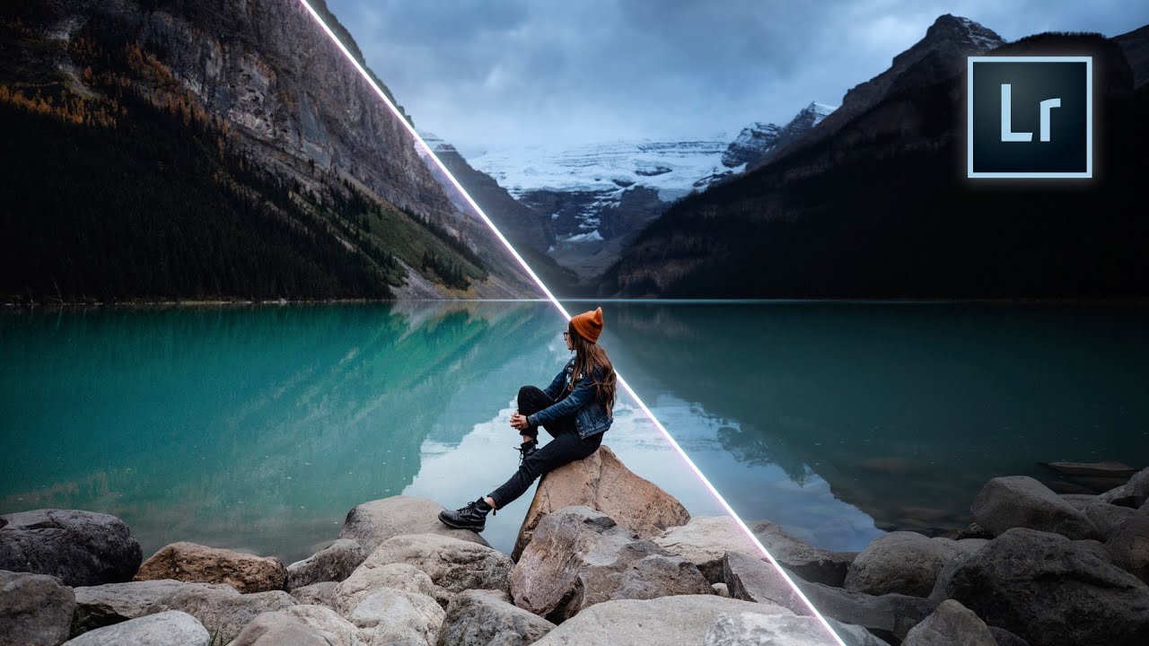
There’s a specific kind of frustration I know well: you’ve shot a great set of portraits, the lighting is solid, the composition is clean, and then you spend 45 minutes in Lightroom pushing the same six sliders around until something feels almost right. Multiply that by a client gallery of 200 images and you’ve just lost half a day to guesswork. What I’ve always wanted is a preset built on principles, not trends – something I can actually understand, modify, and trust across different lighting conditions and subject types.
That’s exactly what Rachel and Daniel from Mango Street set out to build in their tutorial, Watch the full tutorial on YouTube. Their stated goal is a preset that avoids the heavily stylized looks that date quickly and instead creates a clean, refined starting point that holds up over time. After watching it, I took notes, rebuilt it from scratch on a test batch of portrait and product images, and I want to walk you through exactly what they do and why each decision matters.
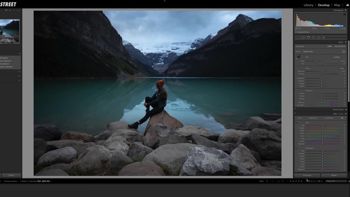
Step 1: Fix Exposure and White Balance First
 Lightroom basic panel with exposure and white balance sliders
Before any preset logic touches your image, get your exposure and white balance into the right neighborhood. Mango Street’s rule of thumb for portraits is direct: skin tones need to be correct before anything else happens. A preset built on a color-shifted base image will look wrong no matter how good the preset is.
Lightroom basic panel with exposure and white balance sliders
Before any preset logic touches your image, get your exposure and white balance into the right neighborhood. Mango Street’s rule of thumb for portraits is direct: skin tones need to be correct before anything else happens. A preset built on a color-shifted base image will look wrong no matter how good the preset is.
This step is intentionally left out of the preset itself because exposure and white balance are image-specific. Think of this as clearing the canvas. Small white balance tweaks, often just 100-200 Kelvin in either direction, can resolve color casts that would otherwise fight everything downstream.
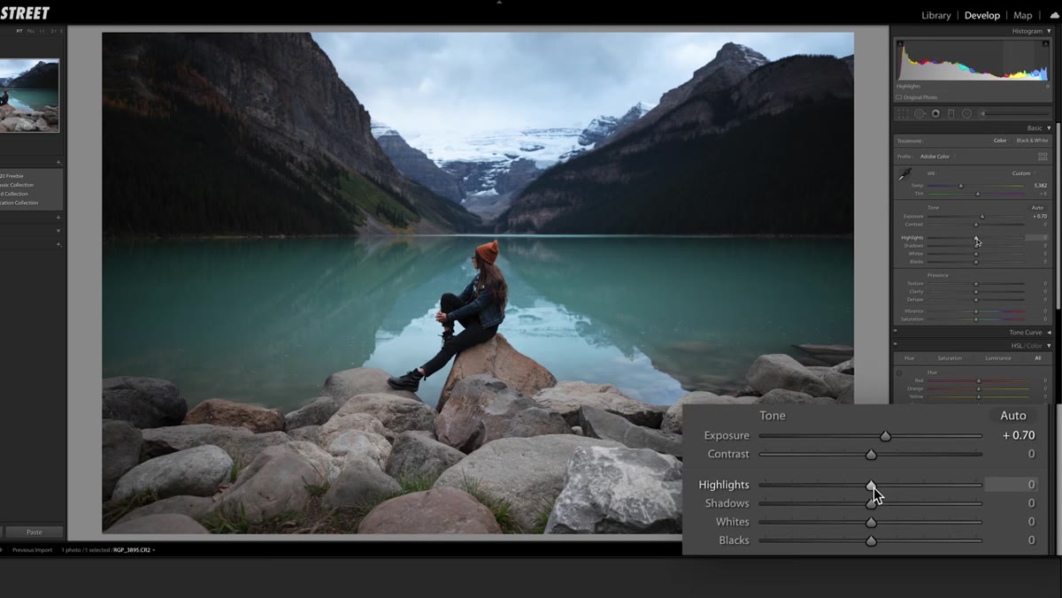
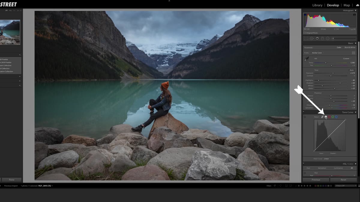
Step 2: Set Highlights, Shadows, Whites, and Blacks
 Basic panel showing highlights pulled down to negative 80
Here’s where the preset’s tonal foundation gets laid. Highlights come down hard, somewhere around -80, which pulls detail back into bright areas like skies or overexposed skin. Shadows lift to around +60, which opens up the darker areas of the frame without making the image look flat. Whites pull back to roughly -55, and blacks lift slightly to around +25.
Basic panel showing highlights pulled down to negative 80
Here’s where the preset’s tonal foundation gets laid. Highlights come down hard, somewhere around -80, which pulls detail back into bright areas like skies or overexposed skin. Shadows lift to around +60, which opens up the darker areas of the frame without making the image look flat. Whites pull back to roughly -55, and blacks lift slightly to around +25.
What this combination does is compress the overall dynamic range in a controlled way. You’re trading harsh contrast for detail retention at both ends. The image will look a little washed out at this stage – that’s expected and deliberate. The contrast gets rebuilt more precisely in the tone curve section, which is a much better tool for shaping contrast than the basic panel sliders are.
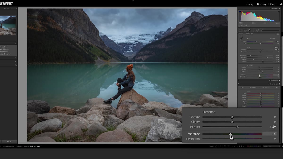
Step 3: Add Dehaze and Reduce Vibrance
 Presence panel with dehaze slider moved to positive 20
After the tonal compression from Step 2, the image loses some punch. A small amount of dehaze, around +20, adds atmospheric clarity without pushing things into an over-processed, HDR territory. It’s a subtle but effective way to restore visual density.
Presence panel with dehaze slider moved to positive 20
After the tonal compression from Step 2, the image loses some punch. A small amount of dehaze, around +20, adds atmospheric clarity without pushing things into an over-processed, HDR territory. It’s a subtle but effective way to restore visual density.
Vibrance drops to -10. This one surprises people, but slightly desaturating the image at this stage keeps the preset from pushing colors too hard once it lands on images with strong color casts or heavily saturated environments. It keeps the look versatile. If you’re editing images that need more color energy, this is one of the first values to walk back when applying the preset.
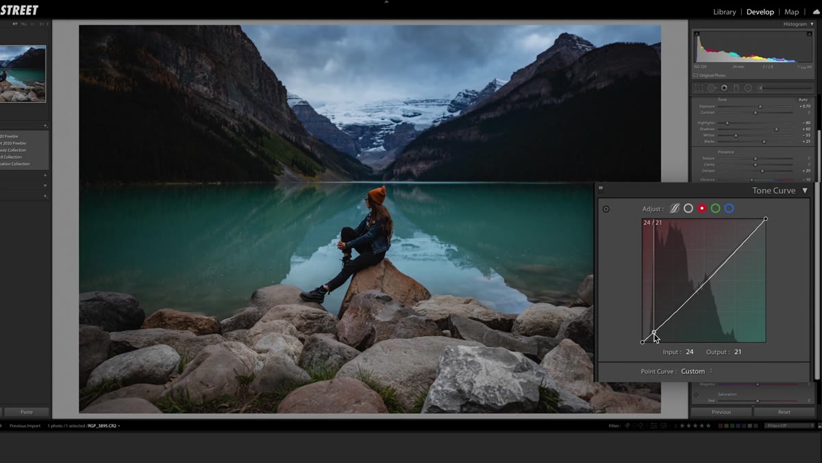
Step 4: Build the S-Curve in Point Curve Mode
 Tone curve panel in point mode with S-curve being drawn
Switch your tone curve to point curve mode – this is critical. The parametric sliders and the point curve operate independently in Lightroom, which is exactly what the next two steps take advantage of.
Tone curve panel in point mode with S-curve being drawn
Switch your tone curve to point curve mode – this is critical. The parametric sliders and the point curve operate independently in Lightroom, which is exactly what the next two steps take advantage of.
Draw a classic S-curve: lift the black point very slightly off the bottom-left corner, create a dip in the lower midtones, then a lift in the upper midtones, and bring the highlights back down slightly at the top. This adds contrast in a way that’s much more controlled than the basic panel contrast slider. The slight lift on the black point is worth paying attention to – it’s what creates that soft, slightly lifted shadow look that keeps the image from feeling harsh.
Step 5: Apply the Same Curve to the Red Channel
 Red channel selected in tone curve with a dip added in shadows
Still in point curve mode, switch to the red channel. Add a small dip in the shadows and a slight lift in the midtones to bring the curve back to neutral. This subtle manipulation cools down the shadows slightly while keeping the midtones and highlights clean. The effect is a very gentle split-tone quality – shadows lean slightly cooler, which reads as more cinematic without screaming “filter.”
Red channel selected in tone curve with a dip added in shadows
Still in point curve mode, switch to the red channel. Add a small dip in the shadows and a slight lift in the midtones to bring the curve back to neutral. This subtle manipulation cools down the shadows slightly while keeping the midtones and highlights clean. The effect is a very gentle split-tone quality – shadows lean slightly cooler, which reads as more cinematic without screaming “filter.”
Copy these channel settings and paste them into both the green and blue channels. If you’re on an older version of Lightroom that doesn’t support copy-paste for channel curves, you’ll need to draw the same shape manually in each channel, or just download the free preset from the video description and inspect it there.
Step 6: Use Parametric Mode to Refine the Contrast
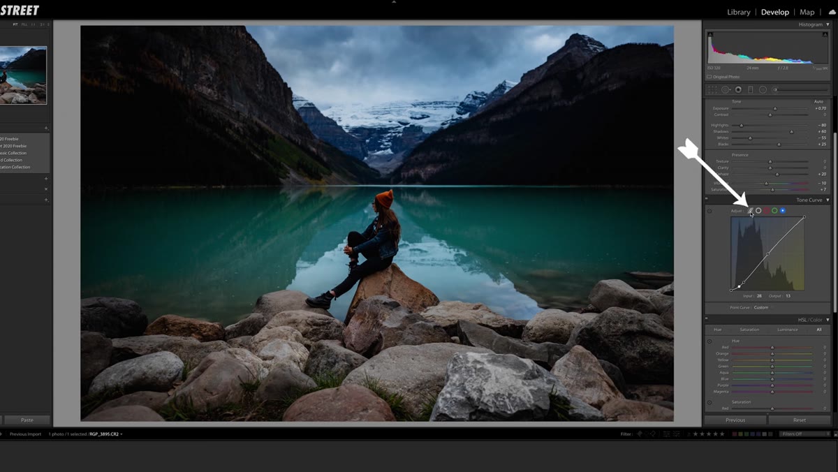 Tone curve in parametric mode with highlights and darks lifted
Now switch to parametric mode. Because this operates separately from the point curve you drew, you can make additional tonal adjustments without undoing your curve work. Lift the highlights to around +40, the darks to +30, and the shadows to +10. These adjustments push detail into the brighter regions of the image and open up the transition zones between tones.
Tone curve in parametric mode with highlights and darks lifted
Now switch to parametric mode. Because this operates separately from the point curve you drew, you can make additional tonal adjustments without undoing your curve work. Lift the highlights to around +40, the darks to +30, and the shadows to +10. These adjustments push detail into the brighter regions of the image and open up the transition zones between tones.
Finally, go back to the basic panel and drop the overall contrast slider to -25. This might feel counterintuitive after all that curve work, but it softens the overall contrast just enough to keep the image from feeling crunchy. The curve handles the shape of the contrast; the basic panel slider is just dialing back any global harshness.
What I’d Add After 15 Years of Preset Building
The technique Mango Street walks through is solid precisely because it separates concerns. Exposure first, dynamic range compression second, contrast rebuilt from scratch in the curve. That’s a principled workflow, not a guess-and-check process.
One thing I always do when I build a preset for client work is create a bracketed version – essentially the same preset with contrast pushed slightly harder for outdoor natural light, and softer for studio strobe work. A single preset almost never fits every lighting scenario perfectly. If you’re going to invest the time to build something like this, spend another 20 minutes making two or three variations at different contrast intensities. Save them as a set. You’ll reach for the right one faster than you’d think, and the consistency across a gallery will be noticeably better.
The real value here isn’t the specific slider values – it’s the order of operations. Get your tonal foundation right before you touch color. Build contrast with curves, not the contrast slider. Test across different images before you commit. Those habits are what separate presets that actually hold up in production from ones that look great on one photo and terrible on the next.
Watch the full Mango Street tutorial here and grab the free preset in the video description: Watch the full tutorial on YouTube.
Comments (1)
Wow, I had no idea you could do this. Mind blown.
Leave a Comment