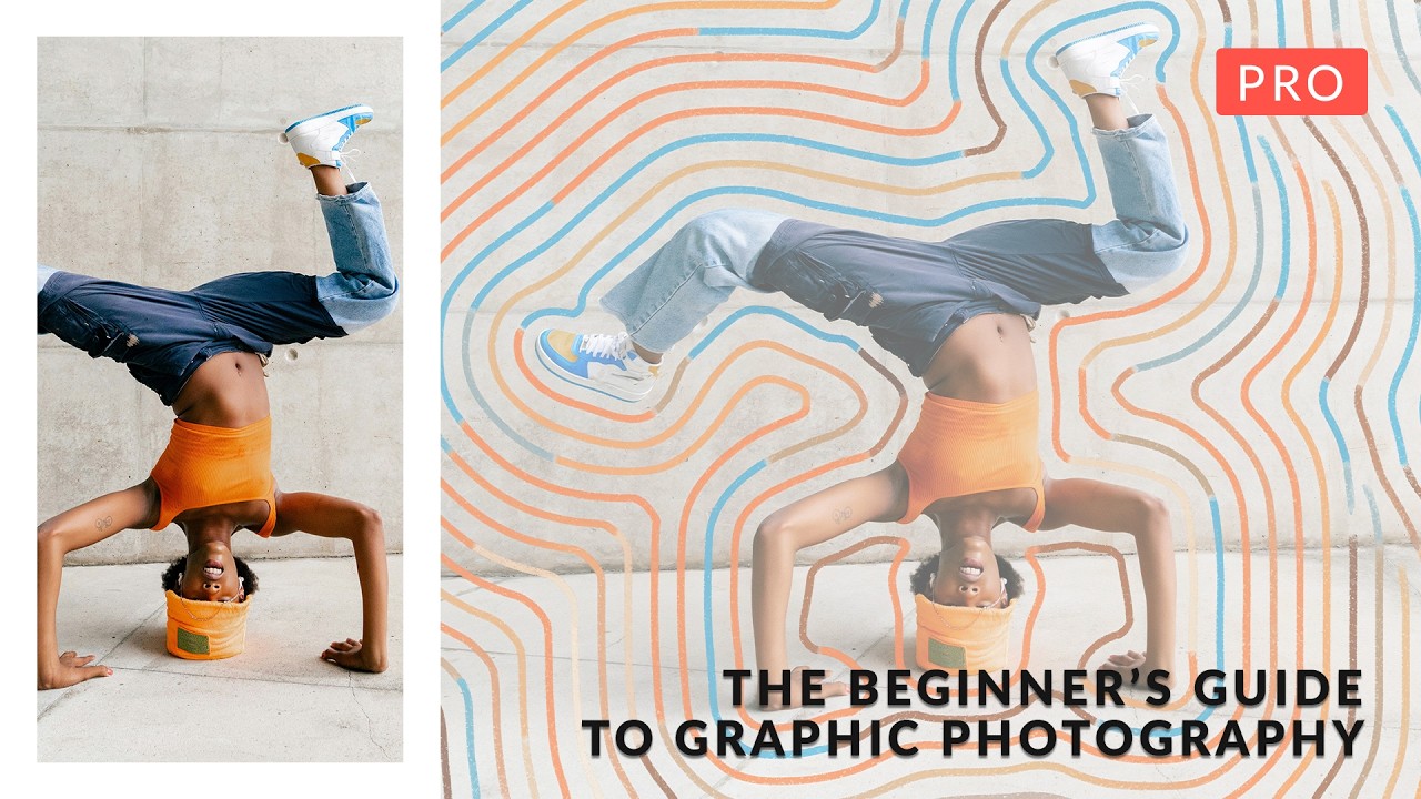
Client work has a way of pushing you into techniques you’d never have explored on your own. Ad agencies started asking me for portraits with a graphic, illustrated feel about two years ago, and I spent an embarrassing amount of time cobbling together workflows from scattered forum posts. So when PHLEARN released their Graphic Portrait Pro tutorial, hosted by Aaron Nace, I watched the whole thing twice before breakfast. Not because the concepts were brand new to me, but because seeing six complete workflows in one place, with all the source files included, is the kind of resource that would have saved me weeks of trial and error.
What makes this course genuinely useful for working professionals is how each example builds on a core idea: photography and illustration don’t have to fight each other. They can share the same space convincingly if you understand blending modes, masking, and layer structure. That’s not a new idea, but the range of techniques Nace demonstrates, from AI-generated sketches to animated GIFs to halftone overlays, shows how many directions you can take that single principle. Watch the full tutorial on YouTube if you want to follow along with the source files. Here’s how the six core techniques break down.
Step 1: The Sandwich Composite with Blending Modes
 Multiple photographs layered using blending modes in Photoshop
The first technique introduces what Nace calls the “sandwich method,” and it’s something I wish I’d had a name for years ago. You start with multiple photographs, then use blending modes to merge them so the textures interact naturally rather than sitting on top of each other like stickers. The key move here is creating a precise selection of your subject, masking them cleanly, and then placing texture layers both behind the subject and in front. The foreground texture layer is what makes this work. A single background texture feels flat. The moment you drape something in front of your subject too, the whole composition gains depth and dimension. Start with Multiply or Screen depending on whether your texture is dark or light, then fine-tune opacity until the blend reads as intentional rather than accidental.
Multiple photographs layered using blending modes in Photoshop
The first technique introduces what Nace calls the “sandwich method,” and it’s something I wish I’d had a name for years ago. You start with multiple photographs, then use blending modes to merge them so the textures interact naturally rather than sitting on top of each other like stickers. The key move here is creating a precise selection of your subject, masking them cleanly, and then placing texture layers both behind the subject and in front. The foreground texture layer is what makes this work. A single background texture feels flat. The moment you drape something in front of your subject too, the whole composition gains depth and dimension. Start with Multiply or Screen depending on whether your texture is dark or light, then fine-tune opacity until the blend reads as intentional rather than accidental.
Step 2: Combining Real Flowers with AI-Generated Sketches
 Flower photographs converted to sketch drawings using AI
This one caught my attention because it sidesteps a problem I run into constantly: illustrated elements that look digitally pasted rather than photographically integrated. The approach here is clever. You photograph the flowers, run them through an AI tool to generate sketch versions, and then composite both the original photograph and the sketch back together over your portrait. You’re not choosing between real and illustrated. You’re layering them so each one reinforces the other. The result reads as something that exists in its own visual universe, not quite real, not quite drawn. When integrating these into the portrait, treat the sketch layer like you would any texture: use blending modes and masks to control where it appears and at what intensity. The three-dimensional placement, some elements behind the subject, some in front, is the same sandwich logic from Step 1 applied to illustrated content.
Flower photographs converted to sketch drawings using AI
This one caught my attention because it sidesteps a problem I run into constantly: illustrated elements that look digitally pasted rather than photographically integrated. The approach here is clever. You photograph the flowers, run them through an AI tool to generate sketch versions, and then composite both the original photograph and the sketch back together over your portrait. You’re not choosing between real and illustrated. You’re layering them so each one reinforces the other. The result reads as something that exists in its own visual universe, not quite real, not quite drawn. When integrating these into the portrait, treat the sketch layer like you would any texture: use blending modes and masks to control where it appears and at what intensity. The three-dimensional placement, some elements behind the subject, some in front, is the same sandwich logic from Step 1 applied to illustrated content.
Step 3: Building Concentric Line Effects with a Photoshop Action
 Lines being created around subject with Photoshop action recorded
This is the step that made me pull up my actions panel immediately. The technique involves drawing lines that radiate or concentrate around your subject, which sounds tedious until you realize the workflow: create the first line manually, then record a Photoshop action to repeat and offset it automatically. If you’ve never built an action for a repetitive geometric task, this is a perfect introduction. Record the steps once, assign a keyboard shortcut, and let Photoshop do the iteration. Once the lines exist, you have three coloring options: a flat solid color, a gradient applied across the line stack, or running the line artwork through AI to generate color variations. The bonus technique here is turning those color variations into an animated GIF, which I’ll be using for social content immediately.
Lines being created around subject with Photoshop action recorded
This is the step that made me pull up my actions panel immediately. The technique involves drawing lines that radiate or concentrate around your subject, which sounds tedious until you realize the workflow: create the first line manually, then record a Photoshop action to repeat and offset it automatically. If you’ve never built an action for a repetitive geometric task, this is a perfect introduction. Record the steps once, assign a keyboard shortcut, and let Photoshop do the iteration. Once the lines exist, you have three coloring options: a flat solid color, a gradient applied across the line stack, or running the line artwork through AI to generate color variations. The bonus technique here is turning those color variations into an animated GIF, which I’ll be using for social content immediately.
Step 4: Custom AI Illustration with the Firefly Workspace
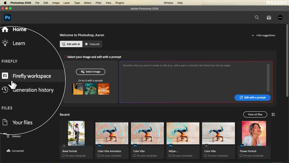 Adobe Firefly workspace open inside Photoshop interface
Adobe’s Firefly integration is now built directly into Photoshop, and this tutorial is one of the clearest demonstrations I’ve seen of how to use it practically rather than experimentally. The goal here is generating a custom illustration that matches the specific content of your photograph, not a generic background, but something contextually related to what’s actually in the image. Once the illustration is generated, the compositing work is straightforward: mask your subject, position the illustration, and use blending modes to unify the two. The key is that Firefly gives you enough control over the generation that the result doesn’t feel random. You’re directing it toward a specific aesthetic rather than hoping for something usable.
Adobe Firefly workspace open inside Photoshop interface
Adobe’s Firefly integration is now built directly into Photoshop, and this tutorial is one of the clearest demonstrations I’ve seen of how to use it practically rather than experimentally. The goal here is generating a custom illustration that matches the specific content of your photograph, not a generic background, but something contextually related to what’s actually in the image. Once the illustration is generated, the compositing work is straightforward: mask your subject, position the illustration, and use blending modes to unify the two. The key is that Firefly gives you enough control over the generation that the result doesn’t feel random. You’re directing it toward a specific aesthetic rather than hoping for something usable.
Step 5: Halftone Portrait Overlay
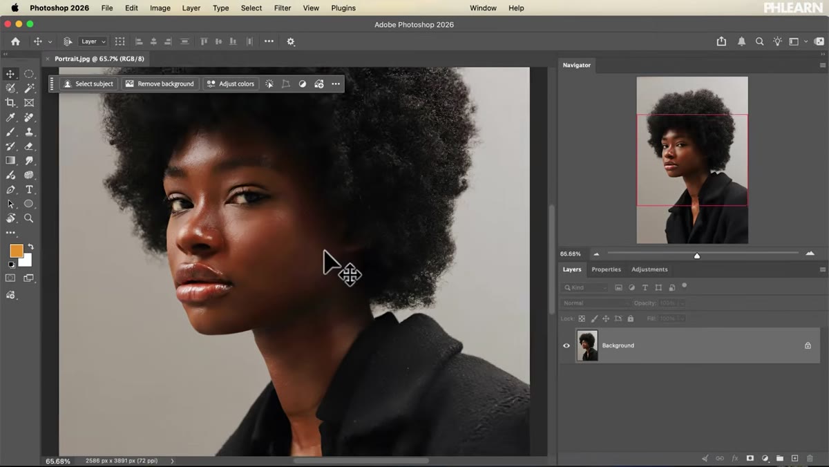 Halftone pattern overlaid on top of original portrait photograph
Halftone effects have been cycling back into editorial and advertising work, and this workflow shows how to do them properly rather than just applying a filter. The process starts with generating a halftone pattern from your photograph, then compositing that pattern back over the original image. You’re not replacing the photo with the halftone. You’re blending both so the photographic detail shows through the dot pattern. Nace also covers adding vector-based compositional elements in the background using Photoshop’s vector tools, refining layer masks, adding stroke effects, and then bringing everything into Camera Raw for a final pass. That Camera Raw step is worth emphasizing: it’s where the whole composition gets unified tonally so it reads as a poster rather than a collection of separate parts.
Halftone pattern overlaid on top of original portrait photograph
Halftone effects have been cycling back into editorial and advertising work, and this workflow shows how to do them properly rather than just applying a filter. The process starts with generating a halftone pattern from your photograph, then compositing that pattern back over the original image. You’re not replacing the photo with the halftone. You’re blending both so the photographic detail shows through the dot pattern. Nace also covers adding vector-based compositional elements in the background using Photoshop’s vector tools, refining layer masks, adding stroke effects, and then bringing everything into Camera Raw for a final pass. That Camera Raw step is worth emphasizing: it’s where the whole composition gets unified tonally so it reads as a poster rather than a collection of separate parts.
Step 6: Colorized Pencil Sketch with Abstract Textures
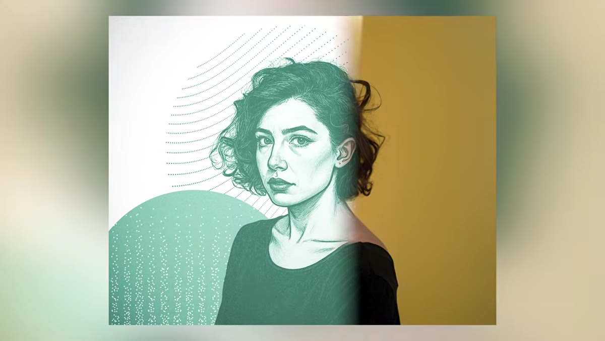 Portrait converted to pencil sketch using Firefly image model 5
The final example uses Firefly Image Model 5 to convert a portrait into a pencil sketch, which is a more controlled result than earlier AI sketch methods. Once you have the sketch, the workflow layers in abstract shapes using the ellipse tool, adds texture layers, and uses blending modes throughout to keep everything cohesive. The finishing move is a colorization step applied across the entire composition so that the sketch, the textures, and any other elements all shift toward the same color temperature. This is the technique I find most clients respond to because it has a handmade quality even though the construction is entirely digital. The Camera Raw final pass here does the same job as in Step 5: it’s the unifying step that makes a layered composition look finished.
Portrait converted to pencil sketch using Firefly image model 5
The final example uses Firefly Image Model 5 to convert a portrait into a pencil sketch, which is a more controlled result than earlier AI sketch methods. Once you have the sketch, the workflow layers in abstract shapes using the ellipse tool, adds texture layers, and uses blending modes throughout to keep everything cohesive. The finishing move is a colorization step applied across the entire composition so that the sketch, the textures, and any other elements all shift toward the same color temperature. This is the technique I find most clients respond to because it has a handmade quality even though the construction is entirely digital. The Camera Raw final pass here does the same job as in Step 5: it’s the unifying step that makes a layered composition look finished.
What I’d Add from My Own Experience
The action-building step in the line effect technique deserves its own dedicated practice session if you haven’t built actions before. My suggestion: before you try it inside a creative project, spend 20 minutes building a throwaway action on a test document. Get comfortable with where the recording starts and stops, and what kinds of steps Photoshop records accurately versus where it gets inconsistent with positioning. Position-dependent steps sometimes need to be recorded with specific layer structures in place to replay correctly. Once you understand those edges, building actions for geometric repetition like this becomes one of the fastest productivity gains available in Photoshop. I’ve logged over 2,400 hours saved through actions since I started tracking it, and the geometric repetition category is one of the biggest contributors.
The single most transferable idea across all six techniques is this: place elements at multiple depth layers relative to your subject, not just behind them. That one habit, putting something in front of your subject as well as behind, is what separates a flat composite from one that holds up at print resolution. Every technique in this tutorial applies it in a different way, which is why the course works as a cohesive whole rather than six unrelated demos. Watch the full tutorial on YouTube to follow along with the included source files and PSD layers.
Comments (1)
This is the kind of content that keeps me coming back.
Leave a Comment