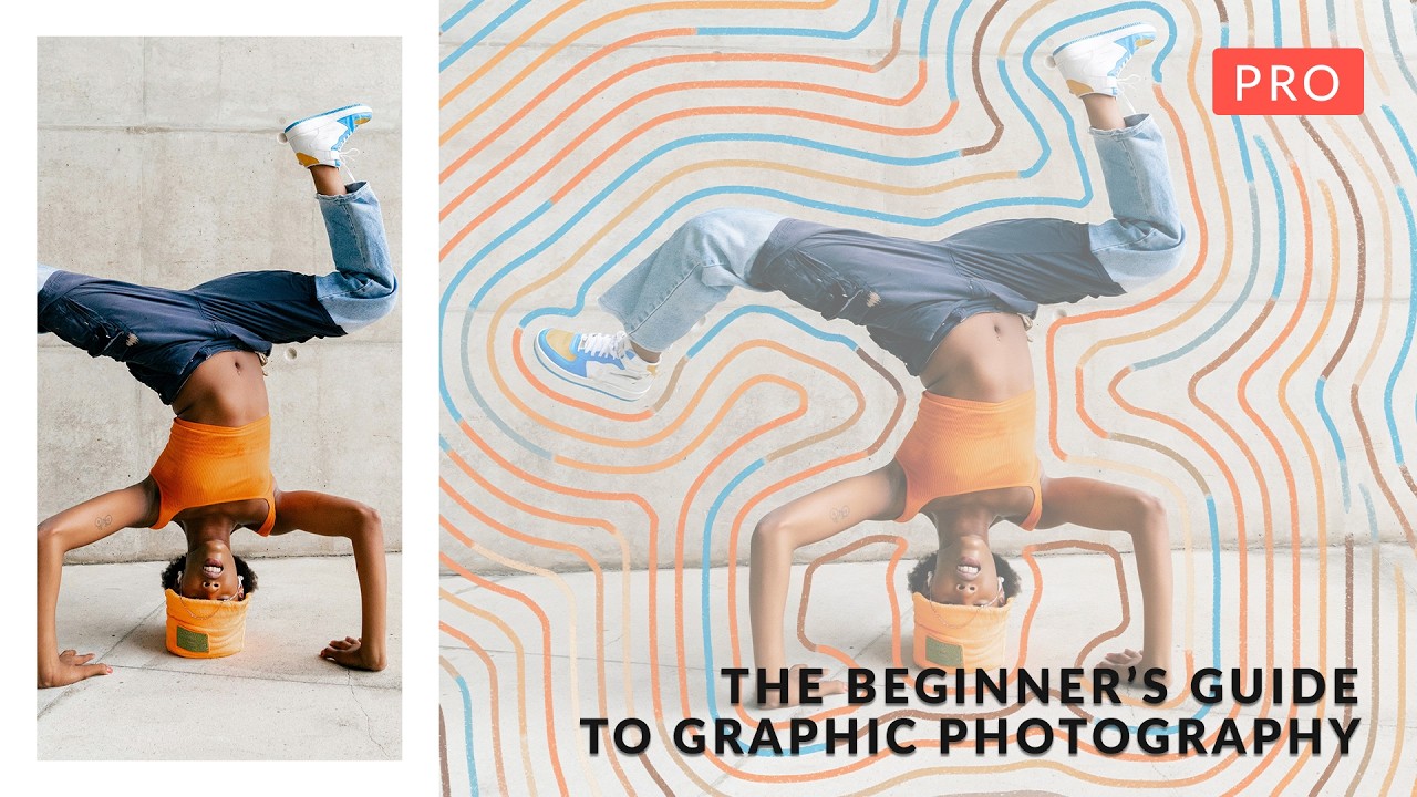
Ad agencies have been asking for this aesthetic for the past two years and I kept patching together my own workflows from half a dozen different sources. You know the look: photography that sits inside an illustration, or a portrait that bleeds into a graphic texture system, or product shots that feel more like poster art than catalog images. My e-commerce clients used to consider that kind of work out of scope. Now they’re putting it in briefs. So when Aaron Nace dropped a full beginner-to-intermediate course on exactly this, I watched the whole thing in one sitting.
Why “Graphic Photography” Is Now a Commercial Skill, Not Just an Art Project
The phrase sounds like it belongs on a design school syllabus, but the reality is that social media has collapsed the wall between photography and illustration. Brands need assets that hold up as a static image, an animated story frame, and a print piece simultaneously. Photography alone doesn’t always carry that load. Neither does pure illustration. The hybrid is where the work lives now.
In this Aaron Nace (PHLEARN) tutorial, six distinct projects walk you through the full range of that hybrid territory, from vintage collage aesthetics to clean, modern composites. What makes this course genuinely useful rather than just inspirational is that Nace treats the workflow as a system, not a series of one-off tricks.
The Masking Approach That Actually Holds Up at Export Size
The foundational skill running through the entire course is masking, and Nace is specific about technique in a way that matters at production scale. He uses Select and Mask for hair and complex edges, but he doesn’t rely on it as a magic button. The key move is refining the edge detection radius manually rather than letting Photoshop guess. For most portrait subjects against a studio background, he pulls the radius to around 3-5 pixels and toggles Smart Radius on to let the algorithm hug natural edges without bleeding into the background tone.
What separates this from tutorial-grade masking is what he does after the initial selection. He converts to a layer mask and then paints corrections with a low-opacity brush (20-30%) in areas where the algorithm made bad decisions, typically around flyaway hair and collar edges. The point is that no automated selection, including the new AI-powered Remove Background, handles every subject cleanly. You need a correction pass built into your standard workflow, not just for edge cases.
Building 3D Depth Without Actual 3D Software
One of the six projects focuses on making flat photography feel spatially dimensional inside a graphic environment. Nace does this through a combination of shadow construction and layer stacking logic. The shadow work is manual: he creates a new layer set to Multiply, picks a color from the darkest tone in the scene, and paints soft-edged shadows beneath the subject at roughly 40-60% opacity. The brush is large, soft, and slightly warmer than neutral gray to avoid that tell-tale fake look.
The stacking logic is what actually sells the depth. He places graphic elements both behind and in front of the subject on separate layers, so the photography doesn’t just sit on top of the composition, it reads as embedded inside it. For one project, a foreground graphic element overlaps the bottom edge of the subject, which immediately convinces the eye that the figure exists within a dimensional space rather than being pasted onto it. This is a compositing principle as old as matte painting, but Nace applies it in a way that’s approachable for photographers who haven’t spent years in VFX workflows.
Where Photoshop Actions Fit Into a Course Like This
Nace incorporates automated Photoshop actions for the repetitive steps in his process, specifically the setup work: creating the base document structure, setting up adjustment layer groups, and applying starting texture overlays. This is exactly where actions earn their keep. I’ve tracked more than 2,400 hours of time saved through action-based automation over the past 15 years, and the consistent pattern is that actions work best when they handle the scaffolding so you can focus on the decisions.
He also demonstrates how the new AI tools in Photoshop (Generative Fill in particular) work as a complement to manual technique rather than a replacement. He uses it to extend backgrounds and fill gaps created by repositioning a subject, then refines the output by hand. The honest take is that Generative Fill produces usable results about 70% of the time on first pass. The other 30% needs rework, so building a correction step into your action sequence rather than treating the AI output as finished is the smarter approach.
What I’d Do Differently on Agency Deadlines
The course is structured as learning projects, which means Nace is thorough in a way that production timelines don’t always allow. When I’m delivering 20 graphic composite variants to an ad agency by end of week, I can’t rebuild the shadow and texture system from scratch for each one. My adaptation is to take the layer architecture Nace demonstrates and convert it into a template PSD with locked base groups, then use actions to batch-apply the texture and color grading passes across variants.
The course includes seven sample PSDs, which are genuinely worth studying as starting templates. If you pull those apart and understand why each group is structured the way it is, you can rebuild them as reusable frameworks. That’s the move from learning to production.
The single most important thing this tutorial reinforces is that graphic photography is a workflow discipline, not just a visual style. Get the layer logic right, build in your correction passes, and the creative work stops fighting the technical work. Watch the full course at PHLEARN for the visual walkthrough of all six projects, because the before-and-after on each one makes the technique land in a way that written steps alone can’t fully replicate.
Comments
Leave a Comment