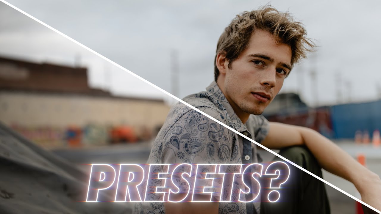
I have a spreadsheet that tracks every hour I’ve saved through automation. Right now it sits at over 2,400 hours. That number didn’t come from being lazy. It came from being obsessive about building systems that hold up under pressure, whether that’s a batch of 500 product shots for an e-commerce client or a full commercial campaign where consistency across every frame is non-negotiable. Presets are part of that system, but only when they’re built the right way.
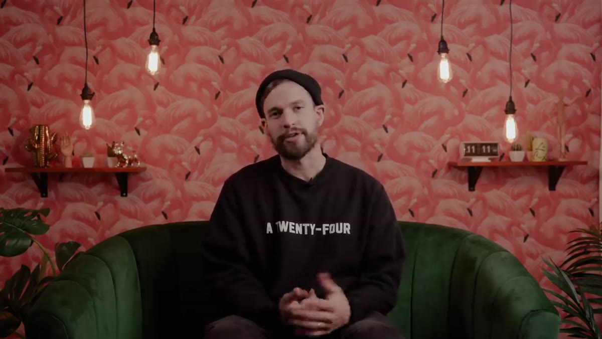
That’s why this Mango Street tutorial landed differently than most preset discussions I’ve seen. Watch the full tutorial on YouTube — Rachel and Daniel aren’t trying to sell you a magic look. They’re working photographers who also make presets, and they spend the video being genuinely honest about why presets fail and what separates a useful one from a waste of money. The technical point at the center of the video is something I’ve believed for years but rarely heard explained this clearly.
The short version: most presets fail because of where their color changes live, not because presets are inherently flawed. Here’s how to think about it.
Step 1: Understand What Film Stock Actually Teaches Us About Presets
 Film photography comparison introducing consistent look concept
Before getting into sliders and panels, Mango Street grounds the whole conversation in film photography. Every film stock produced a consistent, recognizable look across wildly different subjects and lighting situations. Photographers didn’t apply a different stock for indoor portraits versus outdoor landscapes. One stock, one set of characteristics, everything run through it.
Film photography comparison introducing consistent look concept
Before getting into sliders and panels, Mango Street grounds the whole conversation in film photography. Every film stock produced a consistent, recognizable look across wildly different subjects and lighting situations. Photographers didn’t apply a different stock for indoor portraits versus outdoor landscapes. One stock, one set of characteristics, everything run through it.
That’s the model worth copying. A good preset should behave like a film stock: opinionated about tone and color relationships, but flexible enough to work whether you’re shooting a bride in open shade or a reception under tungsten chandeliers. If your preset can only do one thing well, it was built wrong.
Step 2: Identify Why HSL-Heavy Presets Break Across Lighting Conditions
 HSL panel shown as source of preset inconsistency
Here’s the core technical argument. Presets that rely heavily on Hue, Saturation, and Luminance adjustments are making changes tied to specific colors that already exist in the image. If a preset cranks the saturation on blues to create a certain sky look, it works beautifully on a golden-hour outdoor portrait. Apply that same preset to an indoor reception shot lit by warm tungsten bulbs, and you get mud. The blue channel it was tuned for barely exists in that image.
HSL panel shown as source of preset inconsistency
Here’s the core technical argument. Presets that rely heavily on Hue, Saturation, and Luminance adjustments are making changes tied to specific colors that already exist in the image. If a preset cranks the saturation on blues to create a certain sky look, it works beautifully on a golden-hour outdoor portrait. Apply that same preset to an indoor reception shot lit by warm tungsten bulbs, and you get mud. The blue channel it was tuned for barely exists in that image.
This is why so many preset packs end up requiring you to buy an “indoor version” and an “outdoor version” and a “cloudy day version.” That’s not a feature. That’s a sign the presets were built around a specific set of source colors rather than around tone relationships that survive any lighting scenario. The more HSL work a preset does, the narrower its effective range.
Step 3: Shift Your Focus to Parameters That Work Across Any Scene
 Tone curve and calibration panels highlighted as flexible tools
The alternative is to build or buy presets that do their heavy lifting through tone curves, the Camera Calibration panel, and controlled use of split toning. These parameters affect the underlying structure of the image rather than targeting specific hue ranges.
Tone curve and calibration panels highlighted as flexible tools
The alternative is to build or buy presets that do their heavy lifting through tone curves, the Camera Calibration panel, and controlled use of split toning. These parameters affect the underlying structure of the image rather than targeting specific hue ranges.
Tone curves change how the entire tonal range responds. Calibration adjustments shift the raw color profile at a foundational level, affecting how colors relate to each other rather than boosting specific ones. Split toning adds color to shadows and highlights in a way that reads consistently whether the scene is warm or cool. A preset built on these tools will land closer to “right” on an overcast beach shoot and a warehouse product shoot without requiring you to swap to a different preset entirely.
Step 4: Apply One Preset Across a Full Shoot as a Baseline
 Single preset applied across full wedding day shoot example
Mango Street makes this concrete with their wedding workflow. One preset applied across an entire eight-hour wedding day, multiple locations, indoors and outdoors, mixed lighting throughout. They describe that preset getting the images roughly 95 percent of the way there in every scenario, leaving only minor per-image tweaks like pulling shadows up or adjusting exposure.
Single preset applied across full wedding day shoot example
Mango Street makes this concrete with their wedding workflow. One preset applied across an entire eight-hour wedding day, multiple locations, indoors and outdoors, mixed lighting throughout. They describe that preset getting the images roughly 95 percent of the way there in every scenario, leaving only minor per-image tweaks like pulling shadows up or adjusting exposure.
That’s the practical test for any preset you’re considering building or buying. Run it across 20 frames from a real shoot that covers different lighting situations. If you’re doing major corrective work on more than a handful of those frames, the preset is fighting you instead of helping you. A strong baseline preset should make your per-image edit feel like finishing work, not rescue work.
Step 5: Use Presets as a Learning Tool, Not Just a Time-Saver
 Turning off individual panels to study preset effect
This is the part of the video I’d emphasize most for anyone earlier in their editing career. After applying a preset, go through the panels and turn them off one at a time. Watch what happens to the image. Most people assume the color is coming from HSL when it’s actually all in the calibration panel, or they think split toning is doing the heavy lifting when the tone curve is responsible for 80 percent of the mood.
Turning off individual panels to study preset effect
This is the part of the video I’d emphasize most for anyone earlier in their editing career. After applying a preset, go through the panels and turn them off one at a time. Watch what happens to the image. Most people assume the color is coming from HSL when it’s actually all in the calibration panel, or they think split toning is doing the heavy lifting when the tone curve is responsible for 80 percent of the mood.
That diagnostic habit is how you build intuition. You stop seeing Lightroom as a set of sliders and start seeing it as a set of distinct operations that stack on each other. I built my first serious Photoshop action at 26 because I spent a week analyzing exactly what I was doing manually, step by step, until I could describe it precisely enough to automate it. The same logic applies here. You can’t improve a preset or build your own until you can explain what each piece is actually doing.
Step 6: Edit Intentionally, Not Automatically
 Before/after comparison showing preset as starting point
The last point Mango Street makes is the one that separates photographers who get good results from presets from those who get inconsistent ones. Don’t blindly apply and export. Apply the preset, then go through every panel and ask whether that setting is serving this specific image.
Before/after comparison showing preset as starting point
The last point Mango Street makes is the one that separates photographers who get good results from presets from those who get inconsistent ones. Don’t blindly apply and export. Apply the preset, then go through every panel and ask whether that setting is serving this specific image.
This takes maybe 90 extra seconds per image. What it buys you is a consistent look that still feels considered rather than stamped. In commercial work especially, clients notice when every image feels processed the same way regardless of what’s in the frame. A preset handles the repetitive structure. Your judgment handles the final 5 percent.
What I’d Add From the Studio Side
In product and e-commerce work, the calibration-first philosophy Mango Street describes becomes even more important because clients often review images side by side. A skin tone that shifts between frames on a fashion shoot or a product color that reads differently against a white background versus a lifestyle background gets flagged immediately.
My own batch presets are nearly empty of HSL work. Almost everything lives in the tone curve and a calibration adjustment I’ve refined over years of shooting similar products under controlled lighting. When I need to apply that across 400 frames in one session, it holds. The few images that need extra attention stand out clearly instead of every image needing a different level of correction.
That’s the real value of understanding what’s inside your preset: you stop fixing everything and start only fixing what actually needs it.
The single most important idea from this tutorial is that preset consistency is an engineering problem, not an aesthetic one. Build around tone structure and calibration. Keep HSL minimal. Test against your real shooting conditions before committing to any preset as a workflow baseline.
Watch the full tutorial on YouTube to hear Mango Street walk through their own preset philosophy and see the specific examples they use to illustrate each point.
Comments
Leave a Comment