
There’s a particular kind of frustration that comes from applying a preset to a batch of client images and watching half of them go sideways. Skin turns swamp green. Shadows collapse. The look that seemed locked in during testing falls apart the moment the subject changes. I’ve been there more times than I’d like to admit, and for a while I chalked it up to presets just being unreliable. Turns out, the presets weren’t the problem. The way I was building them was.
In this Aaron Nace (PHLEARN) tutorial, Watch the full tutorial on YouTube, Aaron lays out a genuinely useful framework for creating presets that translate cleanly across different images. Not just the hero shot you developed them on, but portraits, landscapes, and everything in between. His three core rules are simple enough to remember and specific enough to actually change how you work. Here’s a step-by-step breakdown of the full process.
Step 1: Set Up a Multi-Image Testing Environment
 Two different photos open in Lightroom’s library grid
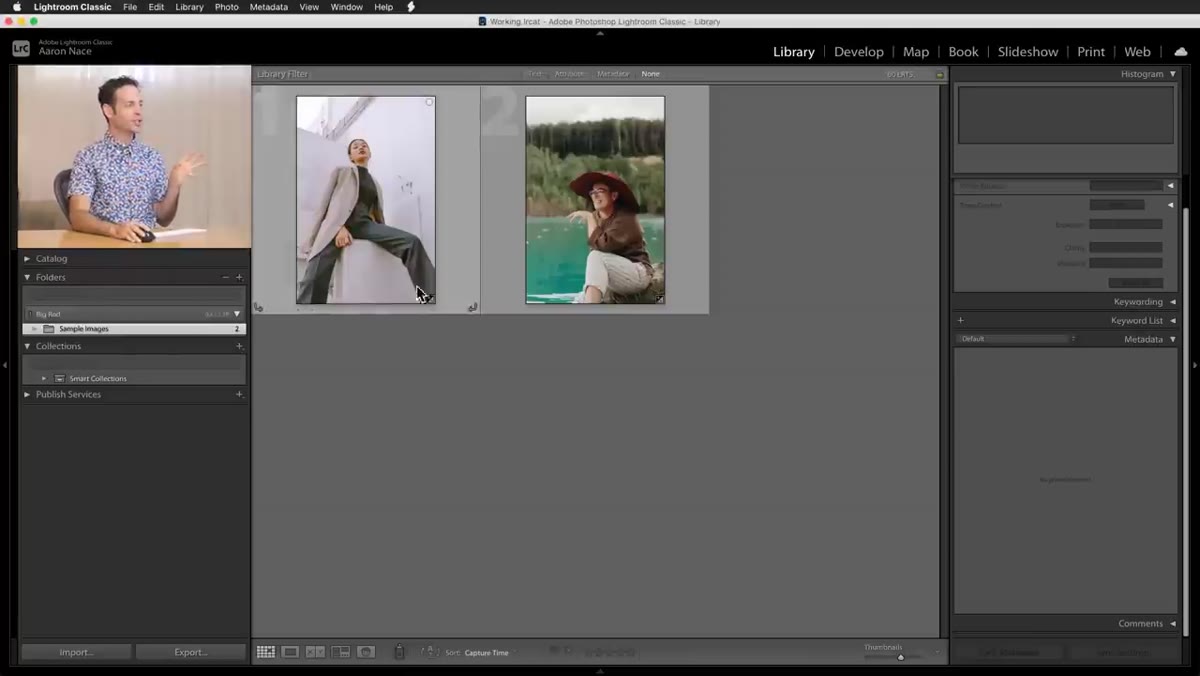
Before you touch a single slider, pull up at least two photos that are meaningfully different from each other. Not two shots from the same session with similar lighting. Different subjects, different backgrounds, different tonal ranges. Aaron works with two photos side by side precisely because a preset that only looks good on one image isn’t really a preset, it’s just a one-time edit you saved. The whole point of a preset is portability. Testing against a range of images from the start forces you to build with that portability in mind rather than bolt it on later.
Two different photos open in Lightroom’s library grid
Before you touch a single slider, pull up at least two photos that are meaningfully different from each other. Not two shots from the same session with similar lighting. Different subjects, different backgrounds, different tonal ranges. Aaron works with two photos side by side precisely because a preset that only looks good on one image isn’t really a preset, it’s just a one-time edit you saved. The whole point of a preset is portability. Testing against a range of images from the start forces you to build with that portability in mind rather than bolt it on later.
Step 2: Lock In Your Exposure and White Balance Before You Start
 Develop module open with basic panel sliders visible
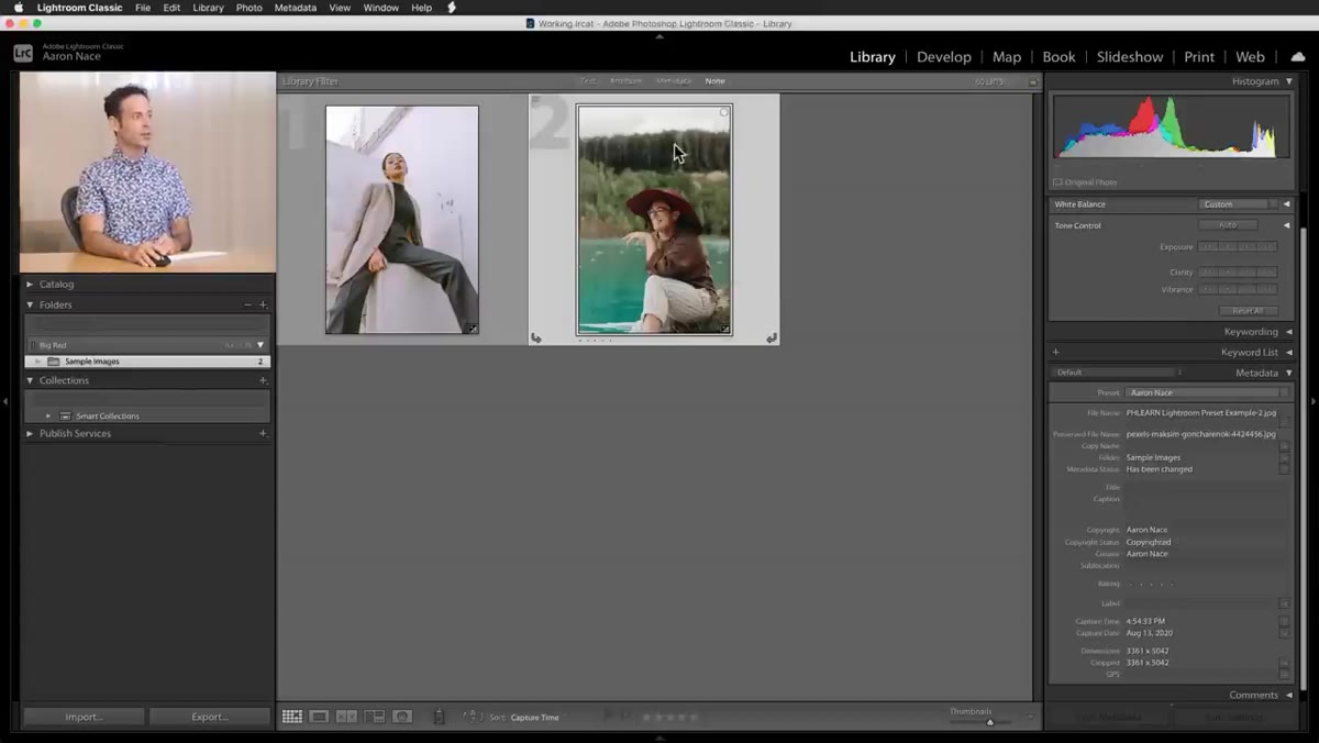
Switch to the Develop module and make sure the image you’re working on is already properly exposed and color balanced before you start crafting the look. This is Rule One from Aaron, and it’s the one that trips up most people who are new to preset building. The logic is straightforward: if you bake a specific exposure or white balance value into a preset, every image you apply it to inherits that value regardless of what it actually needs. Apply a preset that darkens exposure by half a stop to an image that’s already underexposed, and you’ve just buried your subject in shadow.
Develop module open with basic panel sliders visible
Switch to the Develop module and make sure the image you’re working on is already properly exposed and color balanced before you start crafting the look. This is Rule One from Aaron, and it’s the one that trips up most people who are new to preset building. The logic is straightforward: if you bake a specific exposure or white balance value into a preset, every image you apply it to inherits that value regardless of what it actually needs. Apply a preset that darkens exposure by half a stop to an image that’s already underexposed, and you’ve just buried your subject in shadow.
Get your base image to a good neutral starting point first. Then, when you eventually save the preset, make sure the “Exposure” and “White Balance” checkboxes are unchecked in the preset save dialog. The look goes in. The image-specific corrections stay out.
Step 3: Use the Tone Curve for Color Grading
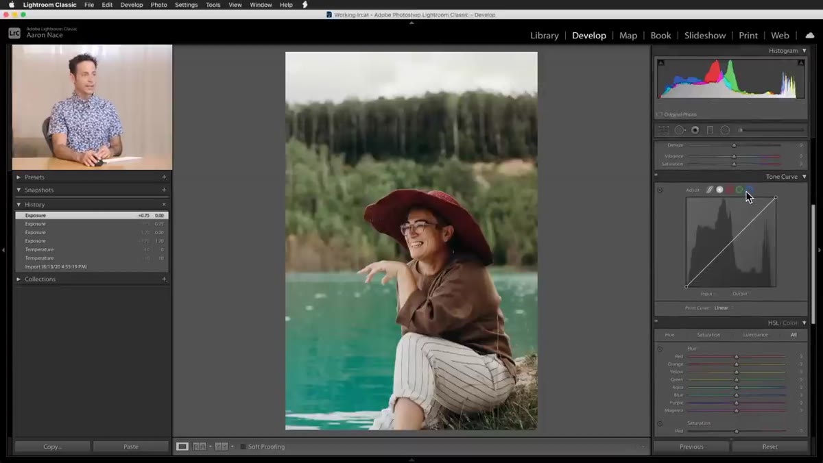 Tone curve panel open with green channel selected
The tone curve is where the actual character of a preset gets built. Aaron demonstrates this by pulling into individual color channels, specifically Red, Green, and Blue, rather than just pushing the overall RGB curve. This gives you control over how color behaves in the shadows, midtones, and highlights independently. Subtle S-curves in the individual channels are what give a look its signature without making the image feel processed.
Tone curve panel open with green channel selected
The tone curve is where the actual character of a preset gets built. Aaron demonstrates this by pulling into individual color channels, specifically Red, Green, and Blue, rather than just pushing the overall RGB curve. This gives you control over how color behaves in the shadows, midtones, and highlights independently. Subtle S-curves in the individual channels are what give a look its signature without making the image feel processed.
The key move here is adding a point somewhere in the midtone-to-highlight range of a given channel and nudging it up or down. A slight lift in the Red channel through the highlights warms the brightest parts of the frame. A gentle pull down on Blue in the shadows adds a cooler, deeper tone to the darker areas. These shifts don’t need to be dramatic to be effective. A few percentage points of movement on the curve is often all it takes.
Step 4: Keep Highlight Colors Warm to Protect Skin Tones
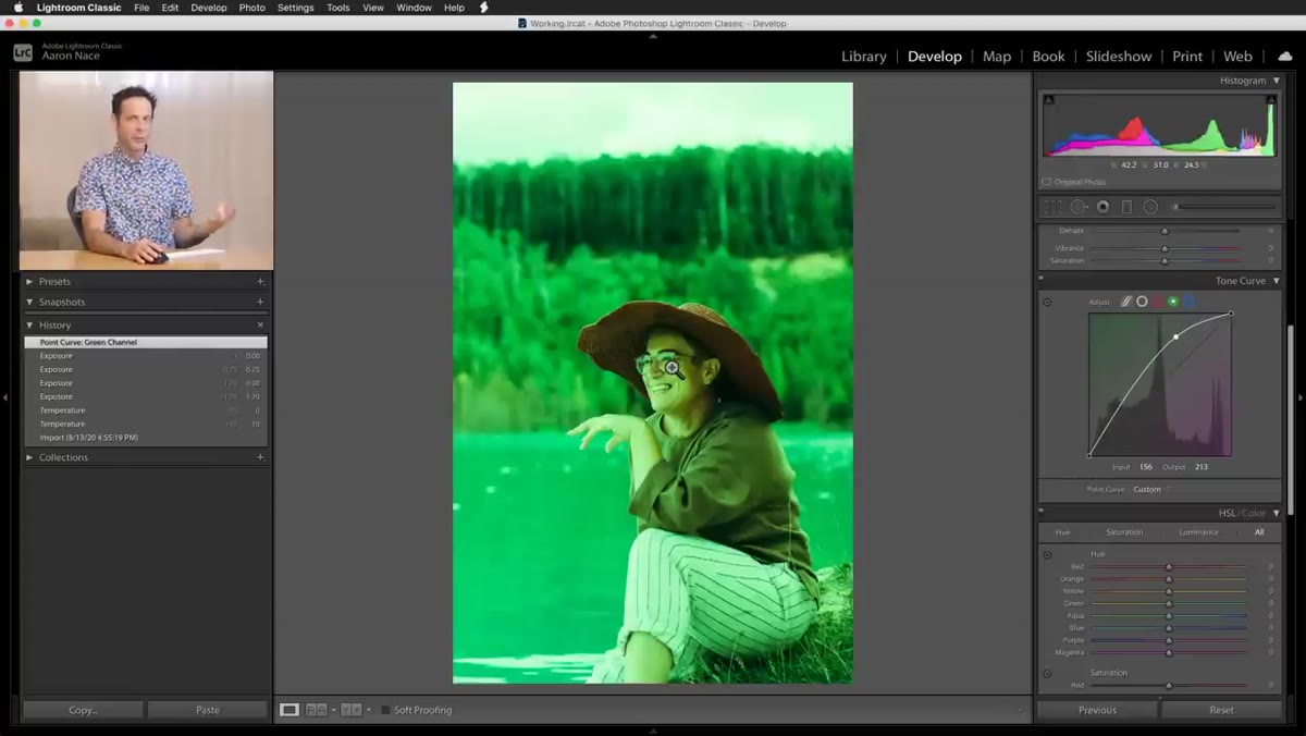 Skin tone comparison showing green highlight shift vs warm highlight shift
This is Rule Two, and Aaron demonstrates it clearly by showing what happens when you push highlights toward green or blue in the tone curve. The result looks interesting on a landscape. On a portrait, it makes your subject look like they’re standing under fluorescent lighting in a basement. The problem is that skin tones, across a wide range of complexions, sit in roughly the same luminosity zone as your image highlights. Whatever color you push into the highlights, skin absorbs it.
Skin tone comparison showing green highlight shift vs warm highlight shift
This is Rule Two, and Aaron demonstrates it clearly by showing what happens when you push highlights toward green or blue in the tone curve. The result looks interesting on a landscape. On a portrait, it makes your subject look like they’re standing under fluorescent lighting in a basement. The problem is that skin tones, across a wide range of complexions, sit in roughly the same luminosity zone as your image highlights. Whatever color you push into the highlights, skin absorbs it.
The fix is to keep highlights biased toward warmth. Pulling a little red into the highlights and reducing blue slightly keeps skin looking natural no matter who’s in the frame. You can still have a stylized, cool-toned look in the shadows and midtones. Just protect those highlights. Aaron’s example shows a noticeable warming of the overall image while the skin remains clean and readable, which is exactly what you want from something you plan to apply across a whole shoot.
Step 5: Resist the Urge to Overdo It
 Develop panel with moderate, simple adjustments applied
Rule Three is the one that’s hardest to follow when you’re deep in creative mode: keep it simple. The more extreme the adjustments, the narrower the range of images the preset will work on. A subtle tone curve shift and a slight color grade will apply cleanly to a family portrait, a product shot, and a travel landscape. A heavy-handed treatment with crushed blacks, a strong color shift, and aggressive curve shaping will fight every image that wasn’t shot in the same conditions as your test photo.
Develop panel with moderate, simple adjustments applied
Rule Three is the one that’s hardest to follow when you’re deep in creative mode: keep it simple. The more extreme the adjustments, the narrower the range of images the preset will work on. A subtle tone curve shift and a slight color grade will apply cleanly to a family portrait, a product shot, and a travel landscape. A heavy-handed treatment with crushed blacks, a strong color shift, and aggressive curve shaping will fight every image that wasn’t shot in the same conditions as your test photo.
When saving your preset, only check the panels where you’ve actually made changes. If you haven’t touched HSL, don’t include it. If you haven’t adjusted sharpening, leave it unchecked. A lean preset is easier to stack, easier to troubleshoot, and more likely to hold up over time.
One Thing I’d Add From My Own Work
I run a lot of batch jobs for e-commerce clients, sometimes several hundred frames from a single product shoot. What Aaron’s framework gave me was a way to build presets I could actually trust at scale. But the extra step I’ve added is maintaining two or three “stress test” images in a dedicated folder, one high-key, one low-key, one with a person in frame, and I apply every new preset to all three before I ever use it on client work.
It sounds like extra overhead, but it takes about 90 seconds and has saved me from shipping a bad batch more than once. The goal isn’t just a preset that looks good. It’s a preset that fails gracefully when conditions aren’t ideal. That’s the difference between a tool and a liability.
The single most important thing Aaron communicates here is that a well-built preset is really a set of constraints. You’re deciding upfront what the preset controls and what it leaves alone. Exposure and white balance stay in the hands of the image. Everything else, tone, color character, mood, lives in the preset. Get that separation right, and you’ll stop fighting your own tools.
Watch the full tutorial on YouTube to see Aaron walk through each of these adjustments live in Lightroom. It’s worth watching even if you’ve been building presets for years.
Comments
Leave a Comment