Fifteen years of sitting behind a monitor has taught me one thing above almost everything else: the less you have to fix in post, the more time you have to shoot, refine, and actually think. I track my saved hours obsessively, and the biggest gains rarely come from a faster action or a smarter batch script. They come from decisions made at the point of capture. That is why, when I first watched RC walk through in-camera picture styles in this KelbyOne tutorial, something clicked for me in a way it probably should have years earlier.
Watch the full tutorial on YouTube
The core idea RC presents is deceptively simple: your camera already has a layer of creative processing baked into its firmware, and almost nobody uses it intentionally. Portrait shooters especially leave this entirely on default. But if you dial in your picture style before you shoot, what you see on the back of your camera is a much closer representation of the final image. That tighter feedback loop changes how you compose, how you expose, and how quickly you can move on during a session. For anyone shooting kids, events, or anything else where you have maybe one second to nail a moment, that is not a small thing.
Step 1: Access the Quick Control Menu on Your Canon
 Canon 5D Mark III Q mode screen showing camera settings
On a Canon 5D Mark III, press the Q button on the back of the camera to enter Quick Control mode. This pulls up a grid of your current shooting parameters: aperture priority, ISO, metering, white balance, and more. You are looking for the box labeled “Standard” or whatever picture style is currently active. It sits toward the lower-left area of the grid. Navigate to it using the multi-controller or the touchscreen if your body has one, and press the Set button to open the picture style selection menu.
Canon 5D Mark III Q mode screen showing camera settings
On a Canon 5D Mark III, press the Q button on the back of the camera to enter Quick Control mode. This pulls up a grid of your current shooting parameters: aperture priority, ISO, metering, white balance, and more. You are looking for the box labeled “Standard” or whatever picture style is currently active. It sits toward the lower-left area of the grid. Navigate to it using the multi-controller or the touchscreen if your body has one, and press the Set button to open the picture style selection menu.
Step 2: Choose and Customize a Built-In Picture Style
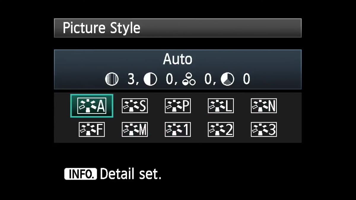 Canon picture styles list: Auto, Standard, Portrait, Landscape, Neutral, Faithful, Monochrome
Canon gives you several factory picture styles: Auto, Standard, Portrait, Landscape, Neutral, Faithful, and Monochrome. Select one, then press the Info button. This opens a detail panel where you can adjust four parameters: sharpness, contrast, saturation, and color tone. These are not destructive changes to your RAW file in the traditional sense, but they do affect the JPEG preview embedded in the RAW, which is what your camera displays on the LCD. Dialing up contrast and sharpness here, for example, gives you a much more accurate sense of how a high-contrast edit would read before you commit to it in Lightroom or Camera Raw.
Canon picture styles list: Auto, Standard, Portrait, Landscape, Neutral, Faithful, Monochrome
Canon gives you several factory picture styles: Auto, Standard, Portrait, Landscape, Neutral, Faithful, and Monochrome. Select one, then press the Info button. This opens a detail panel where you can adjust four parameters: sharpness, contrast, saturation, and color tone. These are not destructive changes to your RAW file in the traditional sense, but they do affect the JPEG preview embedded in the RAW, which is what your camera displays on the LCD. Dialing up contrast and sharpness here, for example, gives you a much more accurate sense of how a high-contrast edit would read before you commit to it in Lightroom or Camera Raw.
Step 3: Set Up a Custom User-Defined Bank for a Specific Look
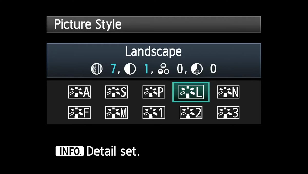 Canon user-defined picture style banks in the menu
Beyond the presets Canon ships, there are user-defined banks, typically labeled User Def. 1, 2, and 3. These are where things get genuinely useful. Navigate to one of these empty banks, press Info, and you can assign any of the base styles as a starting point, then layer your own parameter adjustments on top. RC’s example in the tutorial is a monochrome bank pushed toward high contrast, heavy sharpening, and an orange-blocking filter effect to deepen skies and give skin tones a more dramatic separation. Save that as User Def. 1, and it is waiting for you any time you need it, one button press away. For kid portraits in harsh midday sun, a setup like this can immediately show you which shots have the tonal structure to survive a dramatic black-and-white conversion later.
Canon user-defined picture style banks in the menu
Beyond the presets Canon ships, there are user-defined banks, typically labeled User Def. 1, 2, and 3. These are where things get genuinely useful. Navigate to one of these empty banks, press Info, and you can assign any of the base styles as a starting point, then layer your own parameter adjustments on top. RC’s example in the tutorial is a monochrome bank pushed toward high contrast, heavy sharpening, and an orange-blocking filter effect to deepen skies and give skin tones a more dramatic separation. Save that as User Def. 1, and it is waiting for you any time you need it, one button press away. For kid portraits in harsh midday sun, a setup like this can immediately show you which shots have the tonal structure to survive a dramatic black-and-white conversion later.
Step 4: Apply the Same Logic on Nikon Using Picture Control
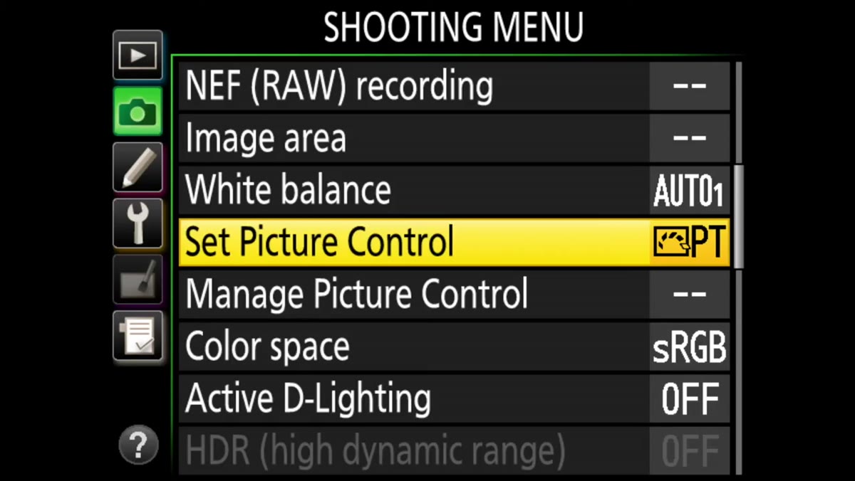 Nikon D810 menu showing Picture Control options
Nikon’s version of this system lives in the main menu under “Set Picture Control.” On the D810 RC demonstrates, you have Standard, Neutral, Vivid, Monochrome, Portrait, and Landscape options. The navigation is different but the principle is identical. Select Monochrome and press right on the multi-selector to enter the customization panel. From here you can adjust sharpening, clarity (which Nikon calls “mid-range sharpening” in some firmware versions), contrast, and the filter effect that controls which wavelengths of light are emphasized or suppressed in the monochrome conversion.
Nikon D810 menu showing Picture Control options
Nikon’s version of this system lives in the main menu under “Set Picture Control.” On the D810 RC demonstrates, you have Standard, Neutral, Vivid, Monochrome, Portrait, and Landscape options. The navigation is different but the principle is identical. Select Monochrome and press right on the multi-selector to enter the customization panel. From here you can adjust sharpening, clarity (which Nikon calls “mid-range sharpening” in some firmware versions), contrast, and the filter effect that controls which wavelengths of light are emphasized or suppressed in the monochrome conversion.
Step 5: Use the Toning Options to Split Your Monochrome Look
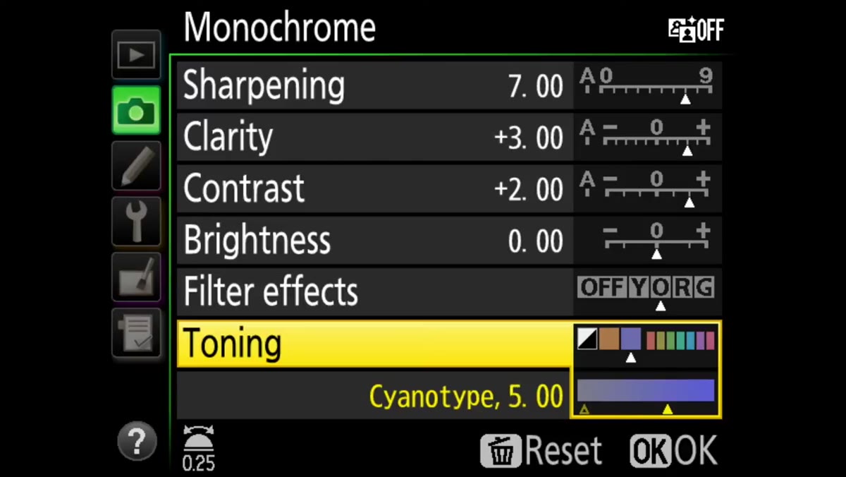 Nikon D810 toning sub-menu with split-tone controls
Inside Nikon’s monochrome Picture Control, there is a toning sub-menu that goes further than Canon’s equivalent. You can scroll through sepia, cyanotype, red, and several other base tones, and then dial in the saturation of that tone independently. RC points out that this effectively gives you an in-camera split-tone preview before the image ever hits your computer. For photographers who deliver a mix of black-and-white and toned files from a portrait session, pre-visualizing the tone right on the LCD can dramatically speed up the culling and editing process later because you are not guessing, you are confirming.
Nikon D810 toning sub-menu with split-tone controls
Inside Nikon’s monochrome Picture Control, there is a toning sub-menu that goes further than Canon’s equivalent. You can scroll through sepia, cyanotype, red, and several other base tones, and then dial in the saturation of that tone independently. RC points out that this effectively gives you an in-camera split-tone preview before the image ever hits your computer. For photographers who deliver a mix of black-and-white and toned files from a portrait session, pre-visualizing the tone right on the LCD can dramatically speed up the culling and editing process later because you are not guessing, you are confirming.
How I Would Take This Further in a Real Workflow
The technique RC outlines is smart on its own, but where I see the real leverage for post-production specialists is in using these in-camera looks as a communication tool with clients. When I have shot tethered for ad agency clients, showing them a vivid or high-contrast picture style on the laptop during the shoot gives them something to react to emotionally, even before retouching begins. It sets expectations accurately and often eliminates at least one round of revision.
I would also add: if you shoot RAW plus JPEG, you can use a punchy picture style for the JPEG and leave the RAW unaffected for full processing latitude later. The JPEG becomes your quick-delivery or client-approval file. The RAW becomes the production master. You are essentially making two creative decisions simultaneously at the point of capture, and that kind of efficiency compounds fast across a full shoot day.
One honest caveat: this is not a replacement for thoughtful RAW processing. The camera’s own processor is doing the picture style math with less data than you have available in something like Camera Raw. Treat these styles as a visual guide and a communication aid, not a final grade. The real color work still belongs in post.
The single most important idea here is this: your camera’s LCD is a creative tool, not just a review screen. Treating it that way, by intentionally configuring what it shows you, tightens the feedback loop between what you envision and what you capture. That is a workflow improvement you carry into every shoot from the moment you implement it.
Watch the full tutorial on YouTube to see RC demonstrate both the Canon and Nikon systems side by side with live camera footage.
Comments (1)
Just used this on a wedding shoot edit. Client was thrilled.
Leave a Comment