
I am, by profession, a person who automates things. I have a spreadsheet tracking every hour my Photoshop actions have saved me. I batch-process hundreds of product images before lunch. I do not, historically, sit down with an ink pad and a rubber stamp and press things onto paper slowly and deliberately. And yet here I am, genuinely converted, because Peter McKinnon made it look not just appealing but functional. In Watch the full tutorial on YouTube, McKinnon walks through his entire stamp-based journaling setup, from ink selection to custom stamp design to wax seals, and the underlying logic is the same one that drives every workflow system I’ve ever built: make the repeated action feel rewarding enough that you don’t skip it.
What hooked me wasn’t the aesthetics, though the aesthetics are genuinely impressive. It was the habit tracker stamp. McKinnon had a custom stamp made that fits precisely on a Post-it note, turning a 3x3 inch square into a ready-made daily tracker. That’s a workflow solution. The ink, the stamps, the visual consistency across journal entries, it all serves a real purpose: you come back to the pages, you review them, and because they look good, you actually want to. I’ve built enough batch systems to know that friction reduction is everything. Stamps reduce the friction between the blank page and a completed entry.
Here’s how the whole system breaks down, step by step.
Step 1: Start With the “Why” Before You Buy Anything
 Peter explaining why stamps make journaling entries worth revisiting
Before McKinnon touches a single stamp, he addresses the core question: what’s the actual point? His answer is that decorated journal entries are entries you’ll return to. When flipping through old pages looks rewarding rather than tedious, the habit sustains itself. This matters before you spend a dime, because it shapes which stamps you choose. You’re not decorating for decoration’s sake. You’re building visual anchors that make past entries scannable and future entries feel worth the effort.
Peter explaining why stamps make journaling entries worth revisiting
Before McKinnon touches a single stamp, he addresses the core question: what’s the actual point? His answer is that decorated journal entries are entries you’ll return to. When flipping through old pages looks rewarding rather than tedious, the habit sustains itself. This matters before you spend a dime, because it shapes which stamps you choose. You’re not decorating for decoration’s sake. You’re building visual anchors that make past entries scannable and future entries feel worth the effort.
Step 2: Build Your Core Stamp Collection Around a Theme
 Peter spreading out his full stamp collection on the desk
McKinnon’s collection leans heavily on postage stamp and passport stamp aesthetics, and there’s a reason for that coherence. When every stamp in your kit shares a visual language, your journal pages develop a consistent look without any deliberate effort on your part. He pulls from a maker called Adrian Barcenas at Casa Kierkeg, who produces a wide range of stamp designs in this style. The key move here is choosing a theme first, then sourcing stamps within it, rather than accumulating random stamps and wondering why nothing looks unified. Think of it like building a Photoshop action set: each tool should belong to the same pipeline.
Peter spreading out his full stamp collection on the desk
McKinnon’s collection leans heavily on postage stamp and passport stamp aesthetics, and there’s a reason for that coherence. When every stamp in your kit shares a visual language, your journal pages develop a consistent look without any deliberate effort on your part. He pulls from a maker called Adrian Barcenas at Casa Kierkeg, who produces a wide range of stamp designs in this style. The key move here is choosing a theme first, then sourcing stamps within it, rather than accumulating random stamps and wondering why nothing looks unified. Think of it like building a Photoshop action set: each tool should belong to the same pipeline.
Step 3: Choose Your Ink Intentionally, It Changes Everything
 Close-up of the Trodat ink pad and Shachi-iro vintage ink bottles side by side
This is where McKinnon goes deeper than most journaling tutorials bother to. He identifies two distinct ink categories. First, the reliable workhorse: a standard Trodat ink pad from Amazon, black, consistent, gets the job done on any paper stock. Second, the specialty option: Shachi-iro vintage inks from Japan, which produce colors with a depth and warmth that standard pads simply don’t match. He demonstrates a vintage red that lines up almost exactly with the Chevrolet logo color, and a blue that he describes as essentially Ford’s brand color. The practical takeaway is that your primary ink pad should be black and dependable, but keeping one or two specialty color pads for accent stamps dramatically lifts the visual quality of a spread without adding much complexity.
Close-up of the Trodat ink pad and Shachi-iro vintage ink bottles side by side
This is where McKinnon goes deeper than most journaling tutorials bother to. He identifies two distinct ink categories. First, the reliable workhorse: a standard Trodat ink pad from Amazon, black, consistent, gets the job done on any paper stock. Second, the specialty option: Shachi-iro vintage inks from Japan, which produce colors with a depth and warmth that standard pads simply don’t match. He demonstrates a vintage red that lines up almost exactly with the Chevrolet logo color, and a blue that he describes as essentially Ford’s brand color. The practical takeaway is that your primary ink pad should be black and dependable, but keeping one or two specialty color pads for accent stamps dramatically lifts the visual quality of a spread without adding much complexity.
Step 4: Stamp Correctly and Clean Regularly
 Peter pressing rubber stamp face-down onto the ink pad then onto paper
The actual stamping technique sounds obvious until you watch McKinnon do it and notice the deliberateness: rubber face down onto the ink pad, even pressure, then straight down onto the paper with no rocking or sliding. Any lateral movement blurs the impression. He’s also direct about maintenance: wash your stamps after use, especially if you’re switching between ink colors. Cross-contamination ruins both the stamp and the ink pad. A damp cloth or stamp cleaner after each session is all it takes, and it extends the life of the rubber indefinitely. Treat them like a lens you’re going to use for the next twenty years.
Peter pressing rubber stamp face-down onto the ink pad then onto paper
The actual stamping technique sounds obvious until you watch McKinnon do it and notice the deliberateness: rubber face down onto the ink pad, even pressure, then straight down onto the paper with no rocking or sliding. Any lateral movement blurs the impression. He’s also direct about maintenance: wash your stamps after use, especially if you’re switching between ink colors. Cross-contamination ruins both the stamp and the ink pad. A damp cloth or stamp cleaner after each session is all it takes, and it extends the life of the rubber indefinitely. Treat them like a lens you’re going to use for the next twenty years.
Step 5: Design and Order a Custom Stamp for Your Specific Habit System
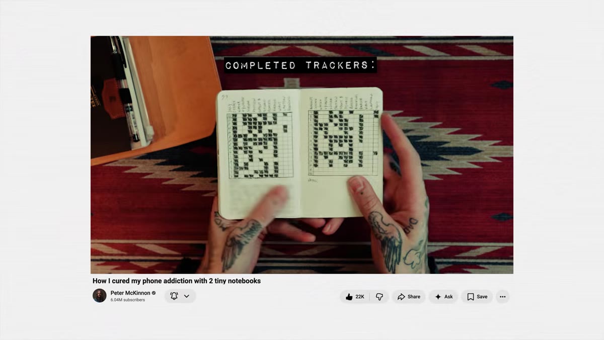 Custom habit tracker stamp impression on a Post-it note
This is the step most tutorials skip entirely, and it’s the most powerful one. McKinnon had a custom habit tracker stamp made and sized to fit a 3x3 inch Post-it note exactly. He provides the PNG file as a free download for anyone who wants the same design. But the broader skill here is learning that custom stamps are not expensive or complicated to order. He references several online rubber stamp makers (rubberstamps.net, rubberstamps4u.ca, thestampmaker.com) where you can upload any artwork and receive a mounted stamp within a week or two. If you have a recurring journaling structure, a weekly layout, a mood log, a project tracker, having it as a stamp means you set it up once and deploy it indefinitely. That is exactly the logic behind a Photoshop action, and it works just as well in the physical world.
Custom habit tracker stamp impression on a Post-it note
This is the step most tutorials skip entirely, and it’s the most powerful one. McKinnon had a custom habit tracker stamp made and sized to fit a 3x3 inch Post-it note exactly. He provides the PNG file as a free download for anyone who wants the same design. But the broader skill here is learning that custom stamps are not expensive or complicated to order. He references several online rubber stamp makers (rubberstamps.net, rubberstamps4u.ca, thestampmaker.com) where you can upload any artwork and receive a mounted stamp within a week or two. If you have a recurring journaling structure, a weekly layout, a mood log, a project tracker, having it as a stamp means you set it up once and deploy it indefinitely. That is exactly the logic behind a Photoshop action, and it works just as well in the physical world.
Step 6: Add Wax Seals as a Finishing Layer, Not a Gimmick
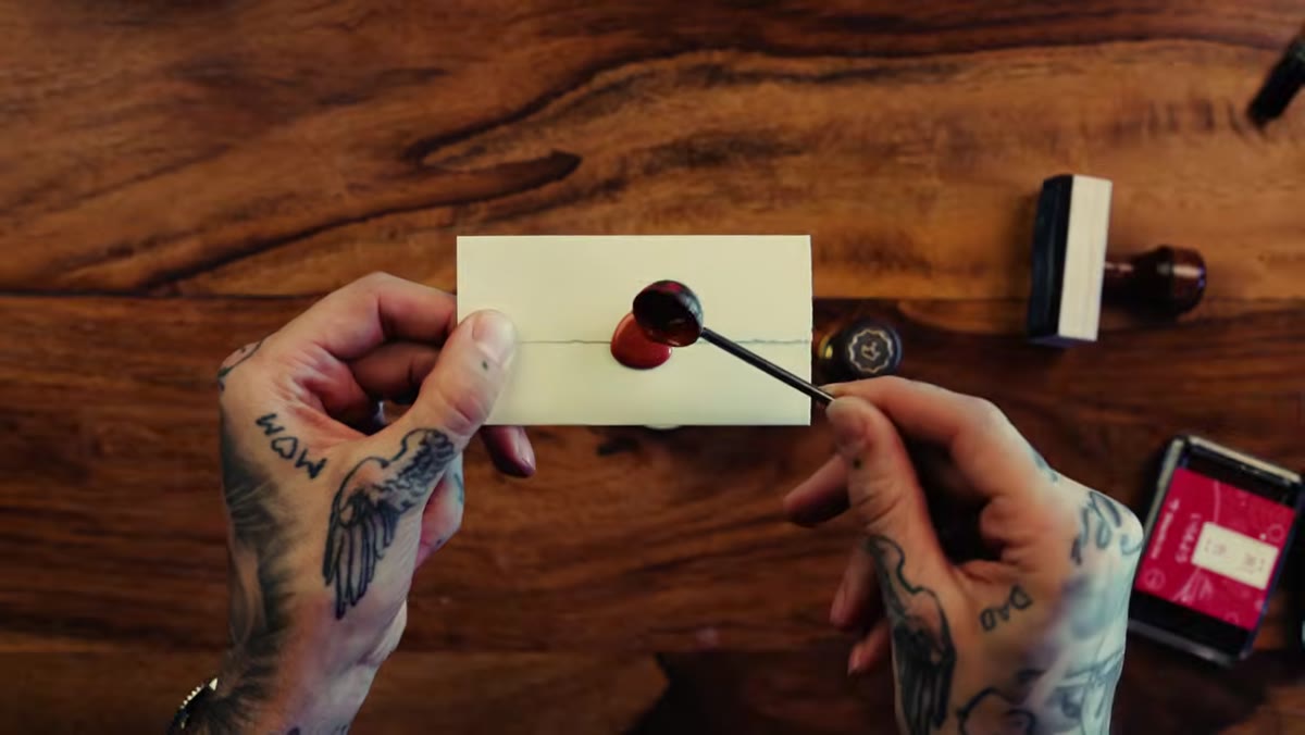 Wax seal being pressed onto journal page beside stamped entries
McKinnon uses wax seals selectively, not on every page, but at points that deserve emphasis. A completed week, a new chapter, a significant date. He sources his wax stamps from Stamptitude and uses a Craig Hill lighter for melting, which he credits as an essential tool rather than an optional one. The practical instruction here: use wax as punctuation. It signals that something on that page mattered. Overuse makes it meaningless; restraint makes it memorable.
Wax seal being pressed onto journal page beside stamped entries
McKinnon uses wax seals selectively, not on every page, but at points that deserve emphasis. A completed week, a new chapter, a significant date. He sources his wax stamps from Stamptitude and uses a Craig Hill lighter for melting, which he credits as an essential tool rather than an optional one. The practical instruction here: use wax as punctuation. It signals that something on that page mattered. Overuse makes it meaningless; restraint makes it memorable.
How I’d Extend This Into a Repeatable Studio Workflow
I work with visual systems all day, and what I see in McKinnon’s setup is a modular kit with a clear hierarchy. The custom habit tracker stamp is the core repeated element, the equivalent of a base action. The vintage ink pads are the creative variable layer. The wax seal is the flagging mechanism for high-priority entries. If I were building this from scratch, I’d add one step McKinnon doesn’t mention: photograph your completed journal spreads weekly with consistent lighting and file them as JPEGs. You get a searchable archive of your own handwriting, and the images become useful reference material if you ever want to recreate a layout or show a client what an analog system actually looks like in practice. It also gives you a before-and-after when your handwriting improves, which it will.
The single biggest thing I took from this tutorial is that analog tools deserve the same intentionality you’d bring to any digital workflow. Pick the right ink for the job, design your recurring template once, maintain your tools so they last. McKinnon demonstrates all of that in one sitting without making it feel like a lecture.
Watch the full tutorial on YouTube and grab his free habit tracker stamp PNG from the description while you’re there. It’s a 3x3 PNG that prints directly to Post-it note size, and it’s genuinely one of the more useful freebies I’ve seen attached to a tutorial in a while.
Comments
Leave a Comment