I’ve spent fifteen years in commercial photography studios watching editors burn hours on color work that should take minutes. The problem is rarely skill. It’s the absence of a reliable starting point. You can be an excellent retoucher and still waste forty-five minutes per image just trying to land on a baseline look that feels consistent with the last shoot. That inconsistency is what clients notice, even when they can’t articulate why a gallery feels “off.”
In this Mango Street tutorial, Watch the full tutorial on YouTube, the team walks through the Phil Chester Signature Collection presets across a real editing session. What caught my attention wasn’t the presets themselves, but the editing philosophy behind them. These aren’t “look at me” filters. They’re a repeatable foundation that respects skin tones and doesn’t force you to fight the preset to get back to natural. For anyone billing by the project rather than the hour, that distinction is worth a lot.
The tutorial moves fast, which is actually part of the point. Their editing process got faster after switching to this system, and watching the walkthrough you can see why. Here’s how the workflow breaks down, step by step.
Step 1: Start with the PCO1 Preset as Your Default Starting Point
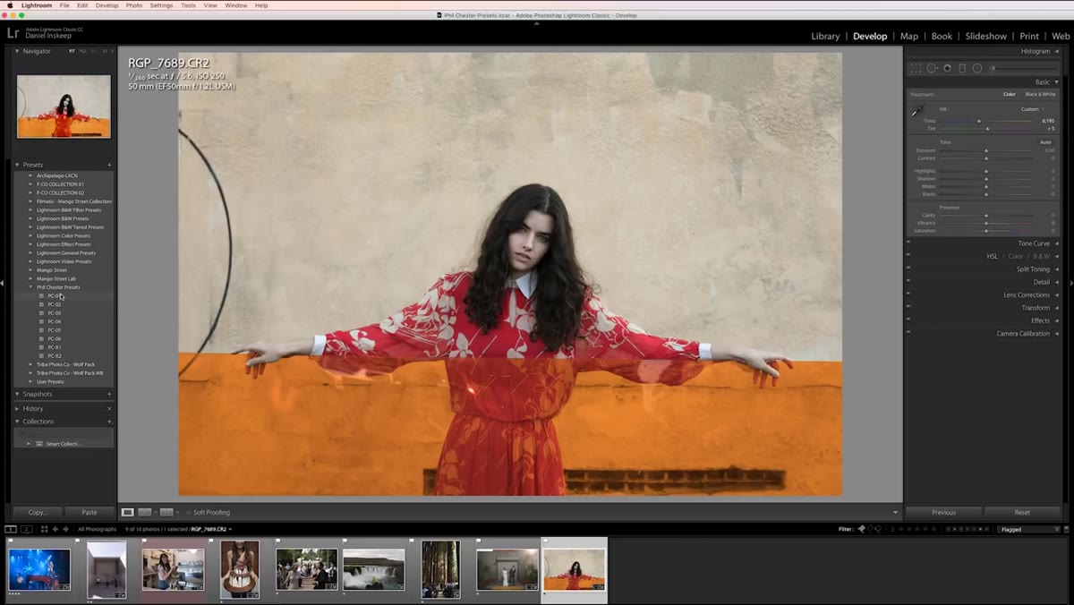 PCO1 preset applied to portrait photo in Lightroom
The PCO1 preset is the workhorse of the Phil Chester pack. Mango Street applies it first on a portrait session and uses it across multiple images in a row, specifically to demonstrate how it performs across varied lighting conditions. The preset doesn’t do anything aggressive to the image. It shifts the overall tone in a way that feels like a well-exposed photo rather than a stylized one.
PCO1 preset applied to portrait photo in Lightroom
The PCO1 preset is the workhorse of the Phil Chester pack. Mango Street applies it first on a portrait session and uses it across multiple images in a row, specifically to demonstrate how it performs across varied lighting conditions. The preset doesn’t do anything aggressive to the image. It shifts the overall tone in a way that feels like a well-exposed photo rather than a stylized one.
If you’re evaluating a preset pack for professional use, this is the test. Apply it to ten images from the same session without touching anything else. If you’re fighting it on more than half of them, it’s not a production-ready preset. PCO1 passes that test.
Step 2: Bring Down Highlights and Lift Shadows as Your Standard Two-Move Finish
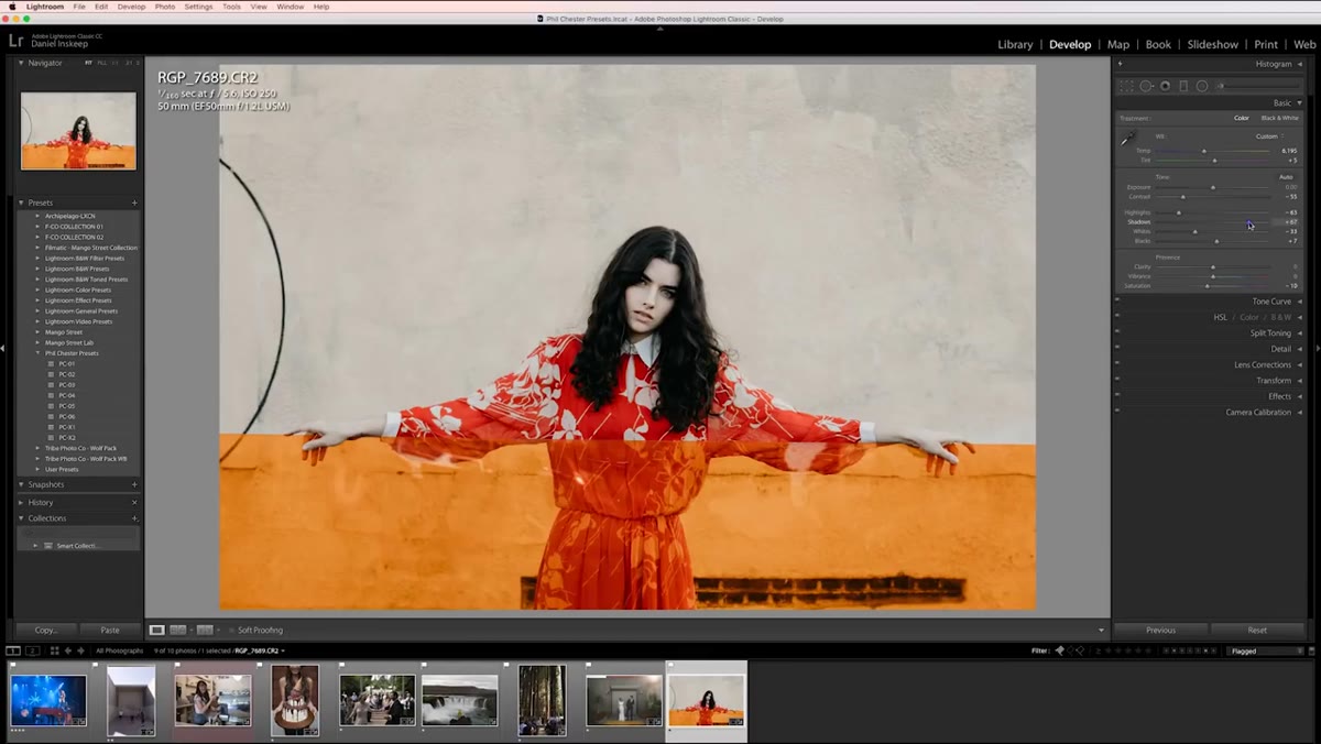 Highlights and shadows sliders adjusted in Lightroom panels
Once the preset is applied, the Mango Street workflow typically requires only two adjustments: pulling the highlights down and pushing the shadows up. That’s the entire edit on most images. The preset handles everything else. Highlights and shadows are the two sliders most likely to need correction across different exposure scenarios, which is exactly why making them the only manual step keeps the process efficient.
Highlights and shadows sliders adjusted in Lightroom panels
Once the preset is applied, the Mango Street workflow typically requires only two adjustments: pulling the highlights down and pushing the shadows up. That’s the entire edit on most images. The preset handles everything else. Highlights and shadows are the two sliders most likely to need correction across different exposure scenarios, which is exactly why making them the only manual step keeps the process efficient.
In Lightroom, both sliders sit in the Basic panel. Highlights move in the negative direction (drag left) to recover blown-out sky or specular highlights. Shadows move in the positive direction (drag right) to open up dark areas without introducing the grey, washed-out look that lifting Exposure would cause. Get comfortable doing these two moves quickly and you’ll fly through a gallery.
Step 3: Correct White Balance and Exposure Before the Preset Does Its Work
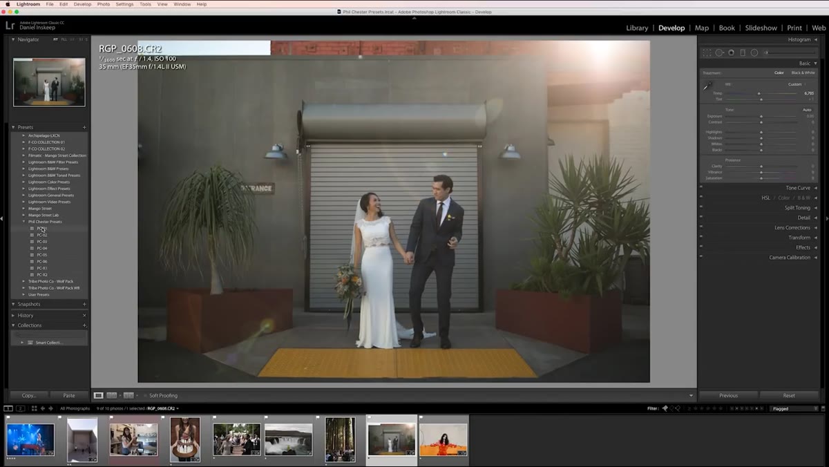 White balance and exposure controls visible in Lightroom Basic panel
Mango Street makes a point of flagging this, and it’s worth repeating loudly: presets assume a correctly exposed, properly white-balanced image. If either of those is off when you apply the preset, you’re not evaluating the preset. You’re evaluating the preset fighting your bad input. White balance first, exposure second, then apply. This order matters.
White balance and exposure controls visible in Lightroom Basic panel
Mango Street makes a point of flagging this, and it’s worth repeating loudly: presets assume a correctly exposed, properly white-balanced image. If either of those is off when you apply the preset, you’re not evaluating the preset. You’re evaluating the preset fighting your bad input. White balance first, exposure second, then apply. This order matters.
On the color side, Lightroom’s White Balance Selector (the eyedropper tool) is the fastest correction method if you have a neutral gray or white reference in the frame. If not, use the Temperature and Tint sliders manually and check your histogram. On exposure, aim to have your highlights just touching the right edge of the histogram without clipping before you apply anything.
Step 4: Save a Modified Preset Copy When You’re Repeating the Same Adjustments
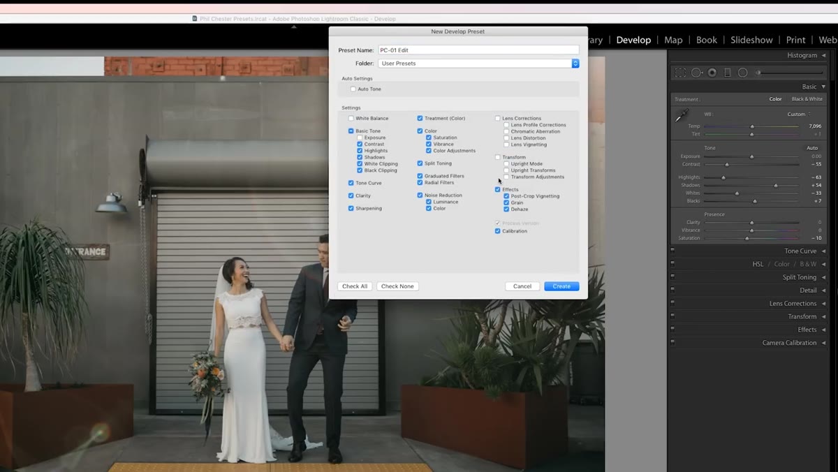 New preset dialog box open in Lightroom preset panel
If you notice you’re making the same highlight and shadow moves on every image from a particular shoot, Lightroom lets you save a new preset with those adjustments baked in. Right-click any preset in the Presets panel and choose “Create Preset with Current Settings.” Name it something specific, like “PCO1 - Indoor Window Light - Shadows +30 / Highlights -40.” That name will mean something to you six months later.
New preset dialog box open in Lightroom preset panel
If you notice you’re making the same highlight and shadow moves on every image from a particular shoot, Lightroom lets you save a new preset with those adjustments baked in. Right-click any preset in the Presets panel and choose “Create Preset with Current Settings.” Name it something specific, like “PCO1 - Indoor Window Light - Shadows +30 / Highlights -40.” That name will mean something to you six months later.
This is the kind of small system-building habit that compounds over time. I’ve tracked the hours my saved actions and presets have returned to me over the years, and the number is embarrassingly large. The two minutes it takes to save a modified preset is almost always worth it.
Step 5: Use PCO6 for Underexposed Frames, PCO2 for Warming Shadow Tones
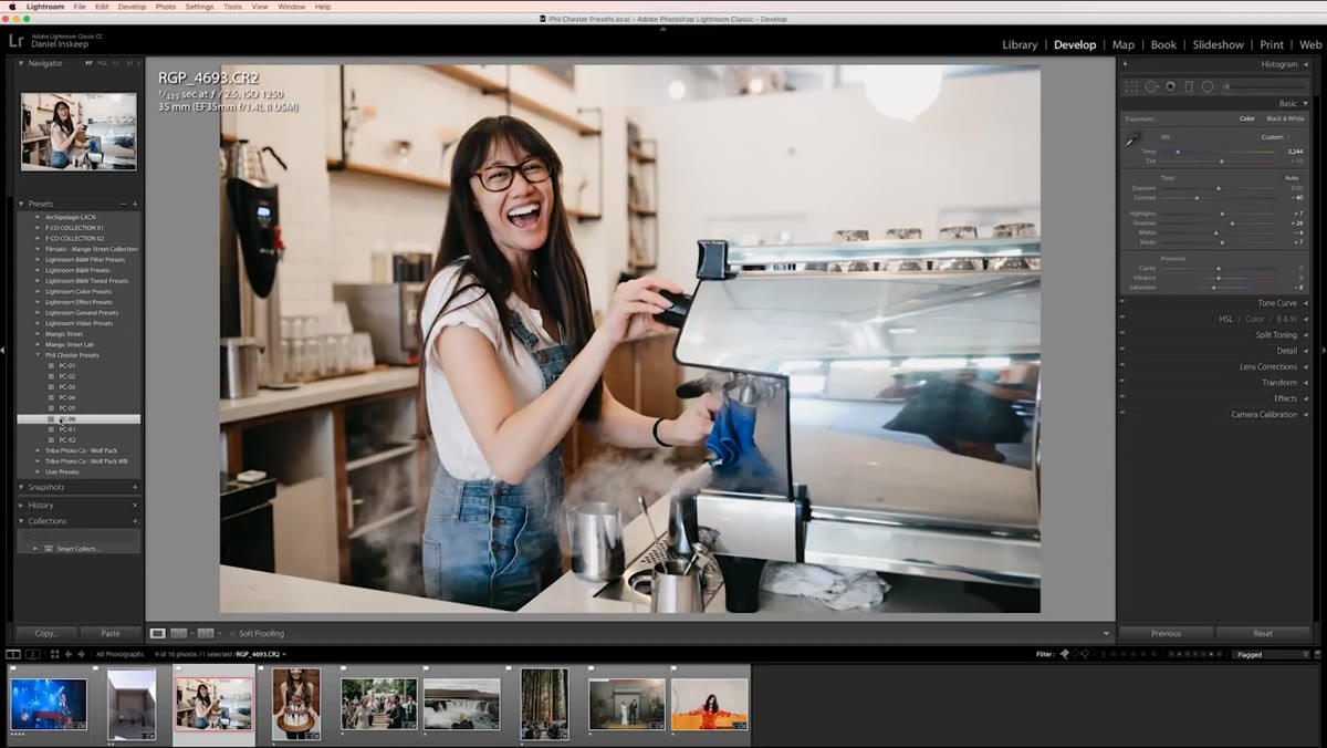 PCO6 preset applied with exposure adjustment in Lightroom
The pack includes specialized presets for situations where PCO1 isn’t the right tool. PCO6 is built for underexposed images. It has more saturation than PCO1, so after applying it, Mango Street brings the highlights down, lifts the shadows, and then nudges the overall Exposure down slightly to compensate for the added punch. The sequence matters: apply the preset, then adjust Exposure last.
PCO6 preset applied with exposure adjustment in Lightroom
The pack includes specialized presets for situations where PCO1 isn’t the right tool. PCO6 is built for underexposed images. It has more saturation than PCO1, so after applying it, Mango Street brings the highlights down, lifts the shadows, and then nudges the overall Exposure down slightly to compensate for the added punch. The sequence matters: apply the preset, then adjust Exposure last.
PCO2 is the go-to when you want warmth in the shadow areas. It pushes magenta and yellow tones into the darker parts of the image, which works well in golden-hour situations or scenes with warm ambient light. For a shot at handball courts in the tutorial, this preset adds that warmth without blowing out the overall color balance. Check your skin tones after applying any warming preset, especially in mixed light.
Step 6: Apply D-Haze to Counteract Stage Lighting Washout in the Black-and-White Presets
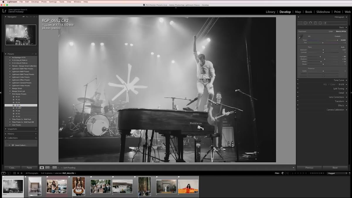 Dehaze slider adjusted on black-and-white preset in Lightroom
The pack includes two black-and-white presets. On a stage-lit image, Mango Street uses the B&W option and then adds a small amount of Dehaze to counteract the flat, washed-out effect that stage lighting creates on high-contrast scenes. The Dehaze slider in Lightroom lives in the Effects panel and adds micro-contrast and depth. Use it conservatively. A small positive value (10-20) is usually enough to bring back the structure that stage lights strip out.
Dehaze slider adjusted on black-and-white preset in Lightroom
The pack includes two black-and-white presets. On a stage-lit image, Mango Street uses the B&W option and then adds a small amount of Dehaze to counteract the flat, washed-out effect that stage lighting creates on high-contrast scenes. The Dehaze slider in Lightroom lives in the Effects panel and adds micro-contrast and depth. Use it conservatively. A small positive value (10-20) is usually enough to bring back the structure that stage lights strip out.
From My Bench: Skin Tones Are the Real Quality Test
I’ve bought a lot of preset packs, and the ones that fail in production almost always fail on skin. They look fantastic on landscapes or styled product shots and then turn every human subject into an orange statue or a grey ghost. The reason the Phil Chester presets work across diverse subjects is that they leave the hue channels that make up skin tones alone. The orange and red HSL channels aren’t being cranked for a trendy look. That restraint is the sign of presets built for professional use rather than Instagram impressions.
If you’re editing portraits of people with a wide range of skin tones, pull up the HSL panel after applying any new preset and look at the Orange and Red Hue sliders specifically. If they’ve moved dramatically from zero, that preset is going to fight you on human subjects. The Phil Chester presets don’t do that, which is why the Mango Street team can move through a full session without stopping to rescue skin tones image by image.
The single most important thing I took from this tutorial is the two-move finish: highlights down, shadows up, done. A preset that only needs two manual corrections per image is a preset you can actually use at scale. If you’re building or refining your own Lightroom workflow, use that as your benchmark.
Watch the full tutorial on YouTube to see the full editing session and how each preset performs across different lighting environments.
Comments
Leave a Comment