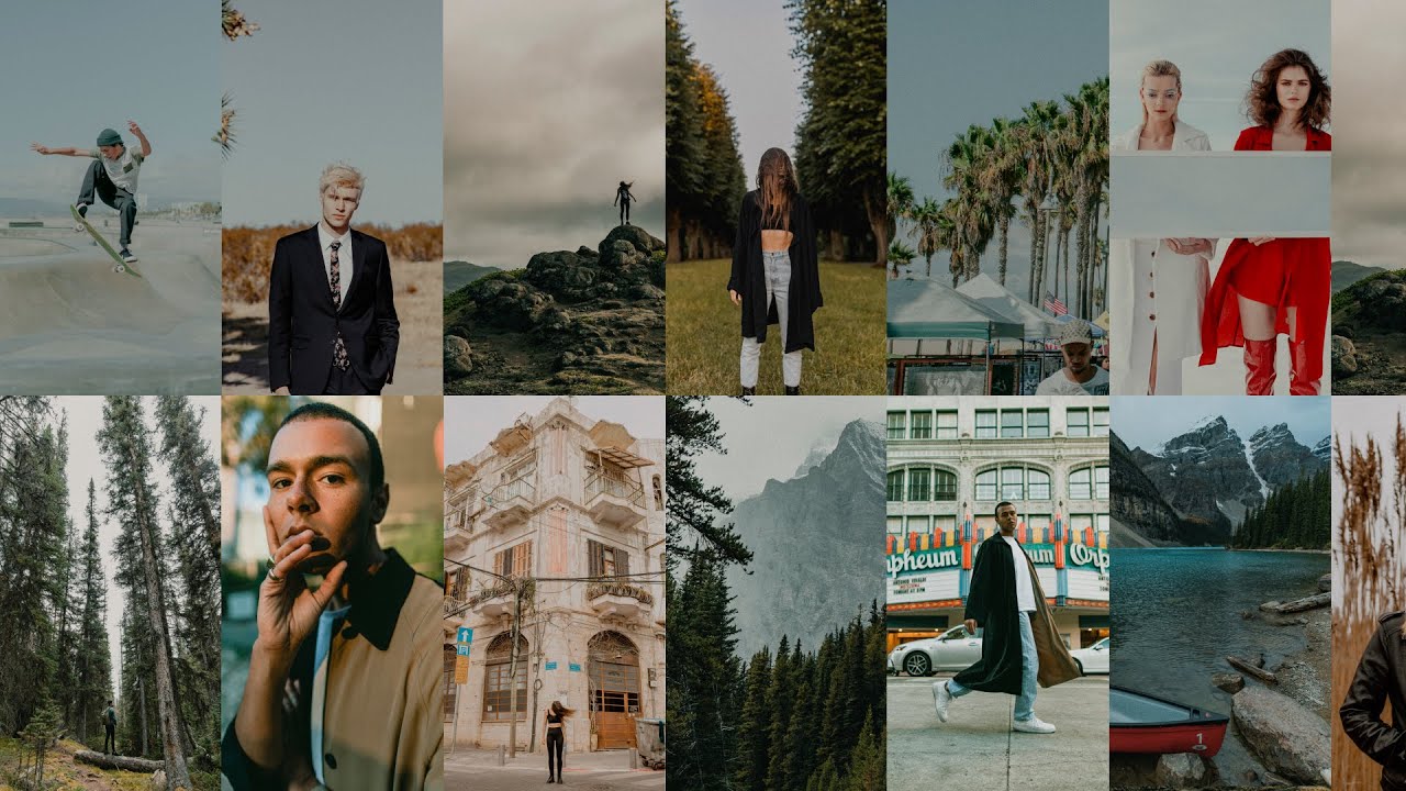
There’s a specific kind of editing frustration I know well: you’ve got a great shot from a field session, you slap on your go-to preset, and suddenly your subject looks like they’re standing inside a lime. The greens from the grass are bouncing all over their face, the preset that looks perfect in a studio context is fighting the environment, and you’re burning twenty minutes tweaking HSL sliders just to get back to neutral. That’s not editing. That’s damage control.
What I’ve learned after fifteen years in commercial studios is that presets fail when they’re built for a “general” photo rather than a specific lighting condition. A beach at noon and a forest at golden hour are completely different color problems. In Watch the full tutorial on YouTube, Rachel and Daniel from Mango Street walk through their 2020 Location Collection, sixteen presets organized by shooting environment rather than by aesthetic mood. It’s a small conceptual shift that makes a practical difference, and it’s worth understanding why each preset is built the way it is rather than just clicking through them blind.
The collection covers seven environments: beach, desert, downtown, fields, forest, golden hour, and winter. Each environment gets two to three preset variations, and none of them touch your white balance or exposure on import. That last detail matters more than people realize. A preset that moves your white balance is a preset that fights your RAW file. These are designed to layer on top of a correctly exposed, properly white-balanced image, which is the right way to build these tools.
Step 1: Set Your Exposure and White Balance Before Touching Presets
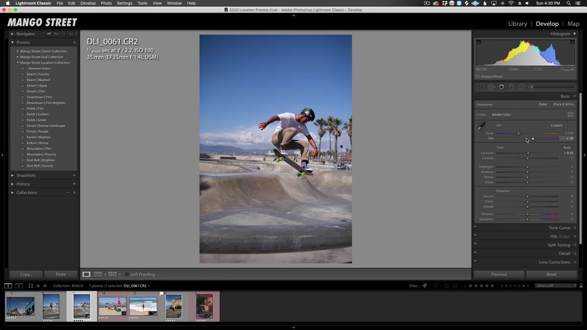 Lightroom interface showing white balance and exposure panel
Before you open the preset panel at all, get your exposure and white balance where you want them. Mango Street is explicit about this in the tutorial, and I’d underline it twice. These presets are tone and color treatments, not rescue tools. If your image is two stops underexposed or sitting at 3200K when it should be 5500K, the preset will look wrong and you’ll spend time diagnosing a problem that isn’t actually about the preset. Correct first, style second. It’s the same logic I use when building batch-processing actions for e-commerce clients: garbage in, garbage out, no matter how good the action is.
Lightroom interface showing white balance and exposure panel
Before you open the preset panel at all, get your exposure and white balance where you want them. Mango Street is explicit about this in the tutorial, and I’d underline it twice. These presets are tone and color treatments, not rescue tools. If your image is two stops underexposed or sitting at 3200K when it should be 5500K, the preset will look wrong and you’ll spend time diagnosing a problem that isn’t actually about the preset. Correct first, style second. It’s the same logic I use when building batch-processing actions for e-commerce clients: garbage in, garbage out, no matter how good the action is.
Step 2: Match the Beach Presets to Low-Contrast, High-Key Scenes
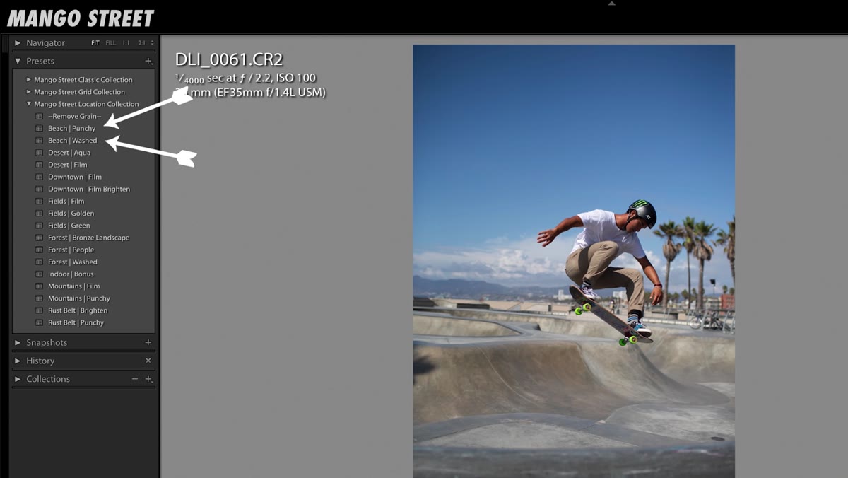 Beach preset applied to bright outdoor portrait photo
The beach presets are built around a lifted shadow structure and compressed highlights, which produces that low-contrast, dreamy quality associated with expired film photography. Mango Street cites photographer Jimmy Marble as a reference point, and that’s useful context. Marble’s work has a faded, sun-bleached quality where nothing is fully black. When you apply this preset to a genuinely bright, airy scene, it feels cohesive. When you apply it to a dark or contrasty image, it just looks flat. The preset also includes grain by default. If you want a cleaner result, there’s a companion “Remove Grain” preset you apply after the main look. Treat it like a modifier layer, not a separate preset.
Beach preset applied to bright outdoor portrait photo
The beach presets are built around a lifted shadow structure and compressed highlights, which produces that low-contrast, dreamy quality associated with expired film photography. Mango Street cites photographer Jimmy Marble as a reference point, and that’s useful context. Marble’s work has a faded, sun-bleached quality where nothing is fully black. When you apply this preset to a genuinely bright, airy scene, it feels cohesive. When you apply it to a dark or contrasty image, it just looks flat. The preset also includes grain by default. If you want a cleaner result, there’s a companion “Remove Grain” preset you apply after the main look. Treat it like a modifier layer, not a separate preset.
Step 3: Use the Desert Presets to Control Harsh Midday Light
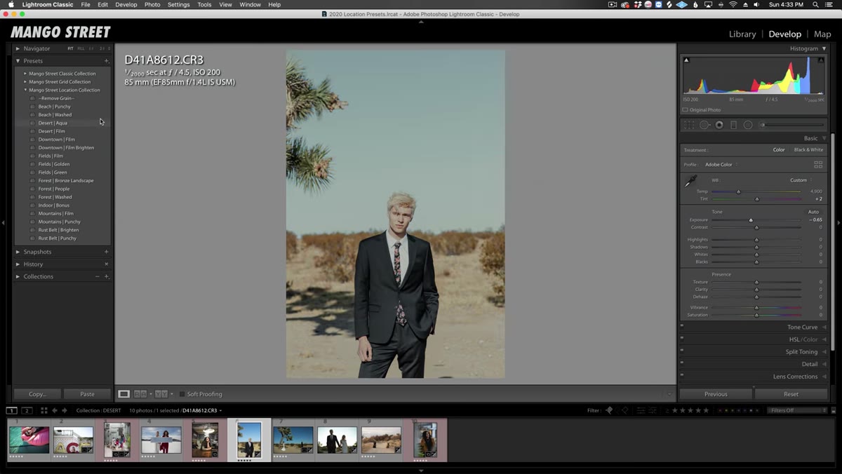 Desert Aqua preset applied to outdoor portrait in bright light
Desert shooting is a highlight problem. The sun is intense, the sky blows out fast, and skin can look washed and chalky if you push exposure at all. The desert presets address this by pulling highlights down and introducing a cooler, more restrained color palette. There are two variations: Desert Film, which reads cooler overall, and Desert Aqua, which emphasizes the sky tones. If you’re shooting someone against a lot of blue sky or near water in strong light, Desert Aqua will make that background feel intentional rather than accidental. Desert Film is better for subjects with more shadow contrast in their face, where you want the tonal structure to feel a little tighter.
Desert Aqua preset applied to outdoor portrait in bright light
Desert shooting is a highlight problem. The sun is intense, the sky blows out fast, and skin can look washed and chalky if you push exposure at all. The desert presets address this by pulling highlights down and introducing a cooler, more restrained color palette. There are two variations: Desert Film, which reads cooler overall, and Desert Aqua, which emphasizes the sky tones. If you’re shooting someone against a lot of blue sky or near water in strong light, Desert Aqua will make that background feel intentional rather than accidental. Desert Film is better for subjects with more shadow contrast in their face, where you want the tonal structure to feel a little tighter.
Step 4: Apply the Downtown Presets for Urban Grit Without Losing Skin Tones
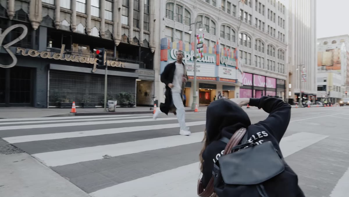 Downtown Film preset applied to street portrait photo
The downtown presets are doing something more technically interesting than the others. Urban environments, especially at dusk or under mixed artificial lighting, produce green and teal color casts in the shadows that are unflattering on skin. The downtown presets introduce a complementary warm-green shadow tone that leans into the urban palette without making faces look sickly. Mango Street demonstrates this on a photo taken mid-street with ambient city light behind the subject. The green in the shadows reads as cinematic rather than accidental because the skin tones are kept balanced. There’s also a “Downtown Film Brighten” variation for scenes where the ambient light is darker and the base exposure is sitting lower than ideal.
Downtown Film preset applied to street portrait photo
The downtown presets are doing something more technically interesting than the others. Urban environments, especially at dusk or under mixed artificial lighting, produce green and teal color casts in the shadows that are unflattering on skin. The downtown presets introduce a complementary warm-green shadow tone that leans into the urban palette without making faces look sickly. Mango Street demonstrates this on a photo taken mid-street with ambient city light behind the subject. The green in the shadows reads as cinematic rather than accidental because the skin tones are kept balanced. There’s also a “Downtown Film Brighten” variation for scenes where the ambient light is darker and the base exposure is sitting lower than ideal.
Step 5: Fix the Green-Bounce Problem with the Fields Presets
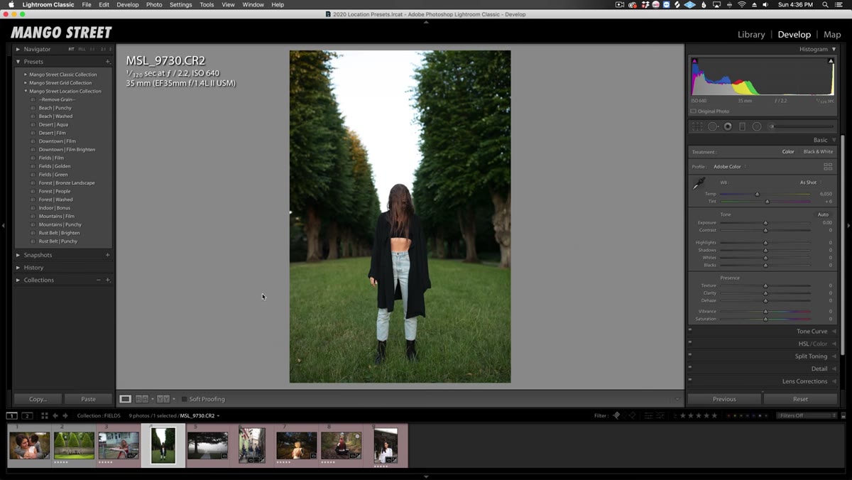 Fields Green preset applied to portrait in park setting
This is the one I wish I’d had years ago. Green environments, parks, fields, garden shoots, bounce green and yellow light back onto subjects and it reads terribly on skin in a way that’s time-consuming to fix manually in the HSL panel. The Fields Green preset is specifically built to desaturate and shift those environmental greens without completely flattening the lush quality of the background. It’s a narrow fix, but it’s the right fix. The collection also includes a golden hour park variant for late-afternoon sessions where the light is already warm and you want to lean into that amber quality rather than neutralize it.
Fields Green preset applied to portrait in park setting
This is the one I wish I’d had years ago. Green environments, parks, fields, garden shoots, bounce green and yellow light back onto subjects and it reads terribly on skin in a way that’s time-consuming to fix manually in the HSL panel. The Fields Green preset is specifically built to desaturate and shift those environmental greens without completely flattening the lush quality of the background. It’s a narrow fix, but it’s the right fix. The collection also includes a golden hour park variant for late-afternoon sessions where the light is already warm and you want to lean into that amber quality rather than neutralize it.
Step 6: Choose the Right Forest Preset for the Season and Light Quality
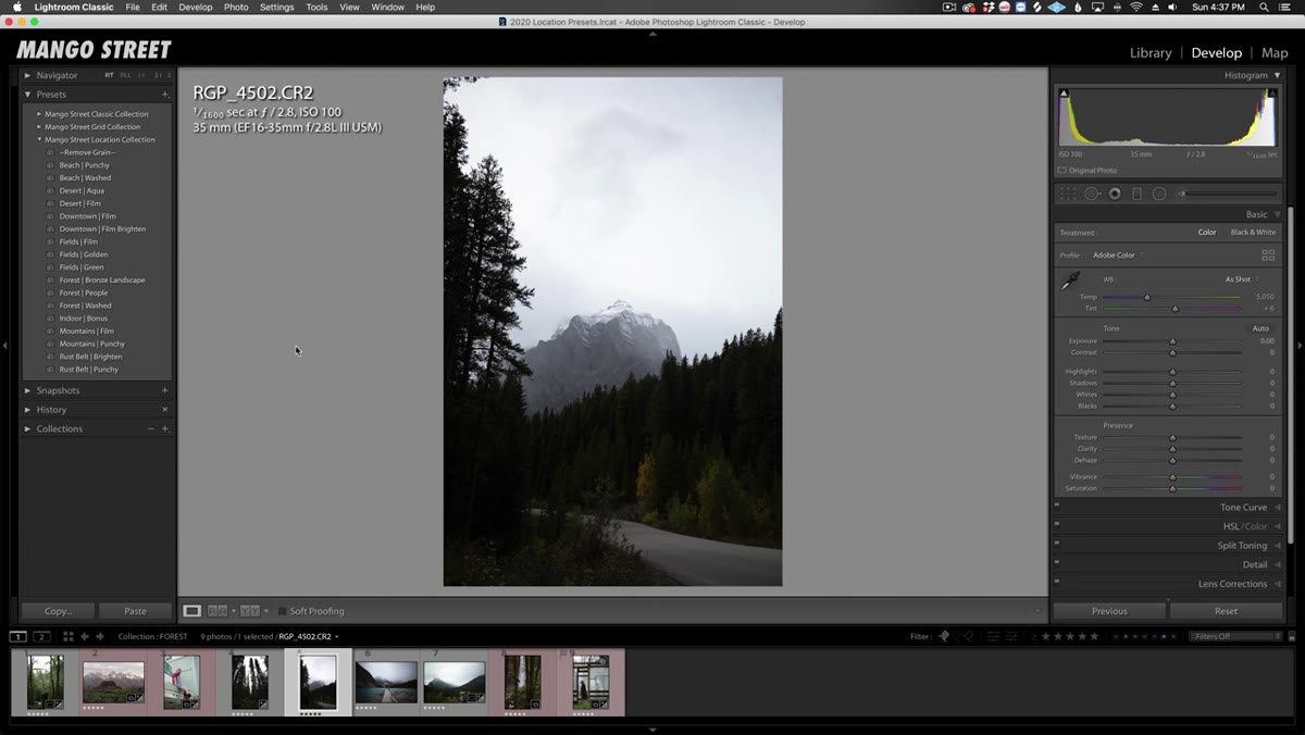 Forest Bronze Landscape preset applied to wooded road photo
The forest presets split into three distinct treatments. Forest Bronze is the most stylized of the group, pushing the warm fall tones aggressively toward amber and copper. Mango Street describes it as a one-click autumn preset, which is accurate. It’s not subtle, and it’s not meant to be. If you’re shooting in actual fall foliage, it amplifies what’s already there. If you’re shooting in summer green, it will look forced. Know your scene before you reach for this one.
Forest Bronze Landscape preset applied to wooded road photo
The forest presets split into three distinct treatments. Forest Bronze is the most stylized of the group, pushing the warm fall tones aggressively toward amber and copper. Mango Street describes it as a one-click autumn preset, which is accurate. It’s not subtle, and it’s not meant to be. If you’re shooting in actual fall foliage, it amplifies what’s already there. If you’re shooting in summer green, it will look forced. Know your scene before you reach for this one.
How I’d Extend This Workflow for High-Volume Sessions
The location-matching logic Mango Street uses here is something I’d take further if you’re editing batches of images from a single shoot location. Once you’ve identified which preset works for your environment and done the fine-tuning adjustments on a hero image, sync those settings across the full batch before you do any individual refinements. In Lightroom, that means selecting all similar images, hitting Sync Settings, and choosing to sync everything except white balance and exposure, which will be slightly different frame to frame. I’ve used this approach on editorial shoots with 300 to 400 selects and it cuts the per-image editing time significantly because you’re working with a calibrated baseline rather than starting from scratch on every frame.
The one thing this collection won’t solve is mixed-environment shoots, where you’ve got desert and urban elements in the same frame, or a beach location with heavy shade. For those, you’re still going back to manual panel work. Presets are a starting point, not a finish line, and Mango Street is honest about that throughout the tutorial.
The core insight here is worth keeping: build your presets around the light and environment, not just the aesthetic. When the preset is matched to the physical conditions of the scene, it works with your RAW data instead of against it, and that’s where you get results that hold up across a variety of camera systems and skin tones.
Watch the full tutorial on YouTube to see all sixteen presets demonstrated on real images across all seven environments.
Comments
Leave a Comment