
There’s a specific kind of frustration that comes from knowing exactly what you want a tool to do and feeling like it’s fighting you. I ran into this with Lightroom’s Adjustment Brush embarrassingly late in my career. I’d spent years in Photoshop building actions, dialing in brush opacity and flow to get precise, repeatable results on skin, product surfaces, backgrounds. Then I’d jump into Lightroom for a raw edit and the Adjustment Brush would just feel… blunt. I’d paint across a face trying to lift shadows, and the result looked like I’d stamped the correction on rather than blended it in.
The fix was sitting right there in the panel the whole time, and it took a KelbyOne tutorial from Pete Collins on Photoshop User TV, Watch the full tutorial on YouTube, to actually spell it out clearly. Pete comes from the same Photoshop-first background I do, so the way he frames the problem lands. The confusion isn’t about being a beginner. It’s about correctly understanding what Density actually controls versus what Flow does, and why Lightroom named it the way it did for a very specific reason.
What follows is a step-by-step breakdown of the technique Pete demonstrates, with enough detail that you can sit down in Lightroom right now and feel the difference immediately.
Step 1: Open the Adjustment Brush and Identify the Three Controls
 Lightroom Adjustment Brush panel showing Flow, Density, and Feather sliders
Open a portrait or any image with areas you want to selectively adjust. Activate the Adjustment Brush (K), and look at the bottom of the panel below the effect sliders. You’ll see three controls that govern how the brush itself behaves: Feather, Flow, and Density. Most people set Feather, occasionally touch Flow, and ignore Density entirely. That’s the gap this technique closes.
Lightroom Adjustment Brush panel showing Flow, Density, and Feather sliders
Open a portrait or any image with areas you want to selectively adjust. Activate the Adjustment Brush (K), and look at the bottom of the panel below the effect sliders. You’ll see three controls that govern how the brush itself behaves: Feather, Flow, and Density. Most people set Feather, occasionally touch Flow, and ignore Density entirely. That’s the gap this technique closes.
Before you paint anything, understand what you’re looking at. Feather controls the softness of the brush edge. Flow controls how quickly the effect builds up with each stroke. Density controls the maximum strength the brush can ever reach, regardless of how many times you paint over an area. These three interact in ways that aren’t obvious until you test them side by side.
Step 2: Set an Extreme Exposure Value to Make the Effect Visible
 Exposure slider pushed to maximum in Adjustment Brush panel
To actually see what Density and Flow do, you need an exaggerated effect. Drag the Exposure slider in the Adjustment Brush panel up to something dramatic, around plus 4 stops. You’re not going for a realistic edit here. You’re creating a visual test so the behavior of each slider becomes impossible to miss. Also, take Feather all the way down to zero. This gives you a hard-edged brush stroke with no blending at the boundary, which makes it easier to see the actual strength of the effect you’re applying.
Exposure slider pushed to maximum in Adjustment Brush panel
To actually see what Density and Flow do, you need an exaggerated effect. Drag the Exposure slider in the Adjustment Brush panel up to something dramatic, around plus 4 stops. You’re not going for a realistic edit here. You’re creating a visual test so the behavior of each slider becomes impossible to miss. Also, take Feather all the way down to zero. This gives you a hard-edged brush stroke with no blending at the boundary, which makes it easier to see the actual strength of the effect you’re applying.
Paint a stroke across a neutral area of the image. At 100% Density and 100% Flow, that’s your baseline. The area should be blown out, bright, obvious.
Step 3: Adjust Density and Watch How It Behaves Like Opacity
 Side-by-side strokes at 100, 60, 30, and 10 percent Density
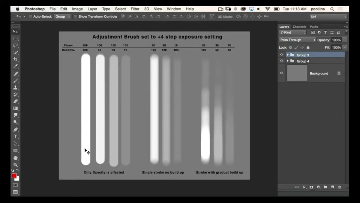
Create a new Adjustment Brush pin and drop Density to 60, keeping Flow at 100. Paint a new stroke next to the first. Then do it again at 30, and again at 10. What you’ll see is that as Density decreases, the effect gets progressively weaker, and no matter how many times you paint over the same area, it will never exceed that Density ceiling. This is the key insight: Density caps the effect. It behaves like opacity in Photoshop in the sense that it sets an upper limit.
Side-by-side strokes at 100, 60, 30, and 10 percent Density
Create a new Adjustment Brush pin and drop Density to 60, keeping Flow at 100. Paint a new stroke next to the first. Then do it again at 30, and again at 10. What you’ll see is that as Density decreases, the effect gets progressively weaker, and no matter how many times you paint over the same area, it will never exceed that Density ceiling. This is the key insight: Density caps the effect. It behaves like opacity in Photoshop in the sense that it sets an upper limit.
For exposure adjustments specifically, this means Density is a ceiling control. You’re saying, “No matter what, this correction can only be this strong.” That’s enormously useful for portrait work where you want to brighten eyes or lift shadows on skin without any risk of overcooking the correction.
Step 4: Switch to Flow and See Where the Difference Appears
 Flow reduced while Density remains at 100 percent, showing brush buildup behavior
Now reset Density to 100 and start dropping Flow instead. Paint a stroke and you’ll notice the effect feels softer initially, similar to what you saw with Density. But here’s where they diverge: paint over the same area multiple times. With Flow reduced, each pass adds more of the effect, building gradually up toward that 100% Density ceiling. Flow controls the rate of buildup per stroke, not the maximum strength.
Flow reduced while Density remains at 100 percent, showing brush buildup behavior
Now reset Density to 100 and start dropping Flow instead. Paint a stroke and you’ll notice the effect feels softer initially, similar to what you saw with Density. But here’s where they diverge: paint over the same area multiple times. With Flow reduced, each pass adds more of the effect, building gradually up toward that 100% Density ceiling. Flow controls the rate of buildup per stroke, not the maximum strength.
This is the Photoshop parallel Pete draws, and it’s accurate. In Photoshop, flow is how fast paint accumulates on the canvas with each pass. Lightroom’s Flow works the same way. Lower Flow means you have to work harder (more strokes) to reach full strength, which gives you finer control when you’re blending into an area gradually.
Step 5: Combine Low Density With Low Flow for Portrait Refinement
 Adjustment Brush settings panel with both Density and Flow set low for portrait work
The technique that Pete highlights, and the one I now use as a default starting point for faces, is running both Density and Flow lower than you think you need to. Something like Density at 60-70 and Flow at 30-40. This combination gives you a correction that builds slowly and can never exceed a moderate strength, which means you can paint across skin, eyes, or hair without worrying about one heavy-handed stroke ruining the image.
Adjustment Brush settings panel with both Density and Flow set low for portrait work
The technique that Pete highlights, and the one I now use as a default starting point for faces, is running both Density and Flow lower than you think you need to. Something like Density at 60-70 and Flow at 30-40. This combination gives you a correction that builds slowly and can never exceed a moderate strength, which means you can paint across skin, eyes, or hair without worrying about one heavy-handed stroke ruining the image.
The reason this matters for faces specifically is that facial corrections rarely benefit from full-strength, uniform application. You want variation. The edge of the forehead, the center of the cheek, the area under the eye all need slightly different intensities. Low Density and Flow naturally produce that variation based on how you move the brush, without requiring multiple separate pins for every sub-zone of the face.
How I’ve Extended This in Commercial Work
I run a lot of e-commerce retouching workflows, and this Density-as-ceiling concept translates directly to product shots too. When I’m using the Adjustment Brush to dodge background gradients or selectively sharpen product edges, I’ll set Density based on how correctable I want the maximum possible outcome to be, then let Flow handle the built-up precision. I’ve actually added a “Portrait Brush” and “Product Edge Brush” to my standard Lightroom preset list with these values baked in, so I’m not resetting from scratch on every job.
One practical note: the Density ceiling applies per pin. If you create a second new pin with Density at 100 and paint over the same area, you can exceed the first pin’s ceiling by combining two adjustments. That’s not a bug. It just means you need to be intentional about how many pins you’re stacking when you’re trying to keep corrections subtle.
The single most important thing to take away from Pete’s demonstration is that Density and Flow are not interchangeable, even though they can look similar at first glance. Density sets what’s possible. Flow controls how you get there. Using both deliberately gives you the kind of brush control in Lightroom that most people assume only exists in Photoshop.
Watch the full tutorial on YouTube to see Pete walk through the visual chart he built comparing these settings side by side. The before-and-after on the face example alone makes the difference click in a way that’s hard to get from description alone.
Comments
Leave a Comment