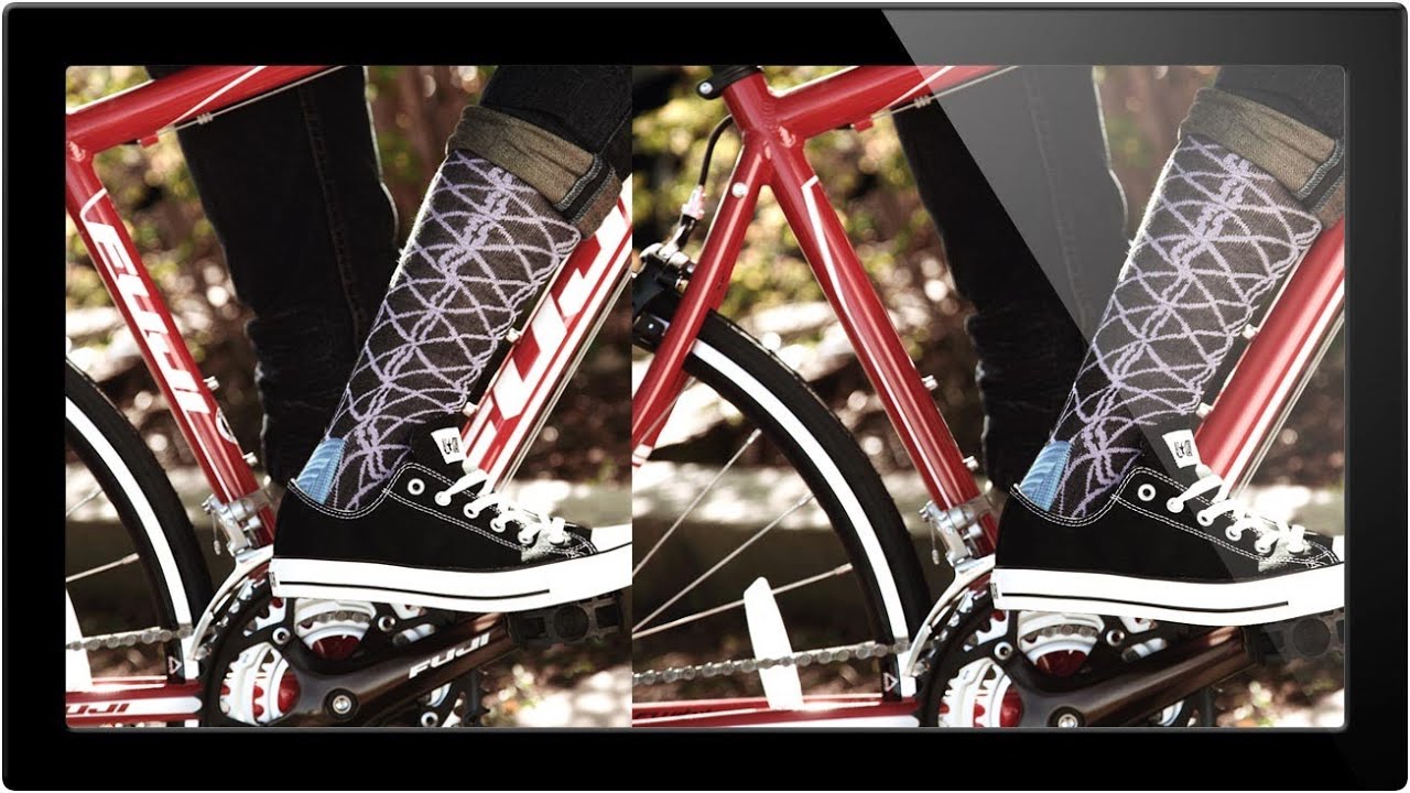
Product shot retouching is one of those jobs that sounds simple until you’re three hours deep, staring at a reflection of a brand logo that lives right on a highlight edge. I’ve been doing commercial post-production for fifteen years, and I can tell you: the work that looks the easiest is almost always the work that punishes you hardest when you rush it. Removing logos, watermarks, and visual distractions from product imagery is a daily reality in e-commerce and advertising retouching – and having a clear decision-making framework before you touch a single tool is what separates a clean two-hour job from an all-day nightmare.
In this Aaron Nace (PHLEARN) tutorial, Watch the full tutorial on YouTube, Aaron works through a real-world brief: stripping multiple Fuji logos from a bicycle for a product shot, live, with no prep. What makes this tutorial worth your time isn’t just the techniques – it’s watching someone triage a complex job in real time, ranking each area by difficulty before picking up a single tool. That triage instinct is something you either develop slowly through painful experience or borrow from someone who already has it.
What follows is a structured breakdown of his workflow, written so you can follow it at your own machine without necessarily watching every minute.
Step 1: Audit the Image and Rank Each Problem Area Before You Start
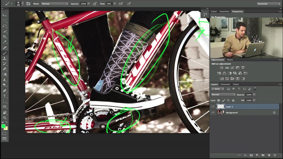
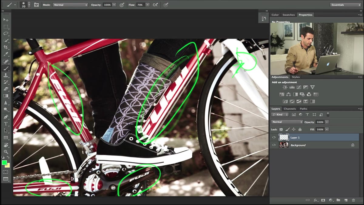 Aaron pointing out multiple logo locations on the bicycle
Before any tool touches the image, Aaron circles the frame and identifies every logo that needs to go. More importantly, he ranks them by difficulty – from a simple flat-white area all the way up to a logo sitting across complex shadow transitions. This isn’t fussiness. This is triage. You start with the easy wins to build momentum and to get a feel for the image’s tonal range before you’re committed to a difficult patch.
Aaron pointing out multiple logo locations on the bicycle
Before any tool touches the image, Aaron circles the frame and identifies every logo that needs to go. More importantly, he ranks them by difficulty – from a simple flat-white area all the way up to a logo sitting across complex shadow transitions. This isn’t fussiness. This is triage. You start with the easy wins to build momentum and to get a feel for the image’s tonal range before you’re committed to a difficult patch.
When I get a product brief with multiple distractions to remove, I do something similar on paper before opening Photoshop. Knowing which problems will take five minutes and which might take forty changes how you quote the job and how you sequence the work. Don’t skip this step.
Step 2: Handle Flat, Single-Color Areas with a Brush on a New Layer
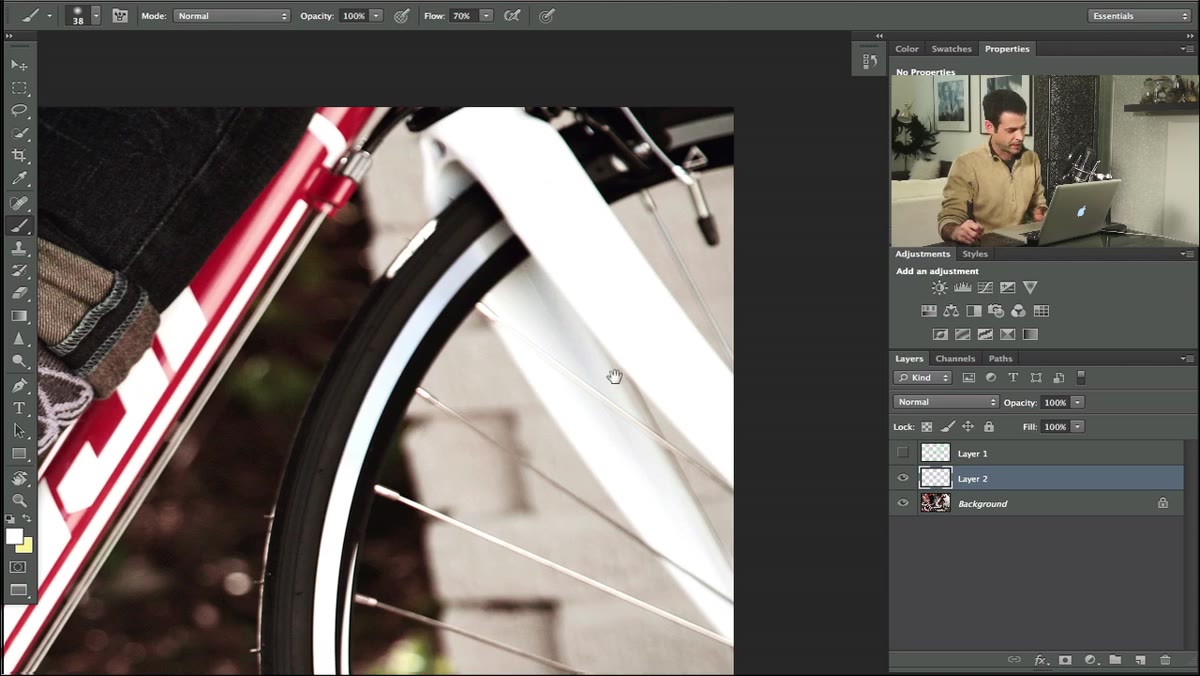 Painting white over a logo using a brush on a new layer
For the simplest logo – sitting cleanly on a flat white surface – Aaron’s approach is direct: create a new layer, sample the surrounding color with Alt/Option, and paint over the offending mark with a brush set to around 70% flow. That flow setting matters. Painting at 100% opacity often leaves a hard edge that reads as a patch under studio lighting. A slightly reduced flow lets you build coverage gradually and blend into the surrounding tone more naturally.
Painting white over a logo using a brush on a new layer
For the simplest logo – sitting cleanly on a flat white surface – Aaron’s approach is direct: create a new layer, sample the surrounding color with Alt/Option, and paint over the offending mark with a brush set to around 70% flow. That flow setting matters. Painting at 100% opacity often leaves a hard edge that reads as a patch under studio lighting. A slightly reduced flow lets you build coverage gradually and blend into the surrounding tone more naturally.
Working on a new layer rather than directly on the background is non-negotiable for this kind of work. It keeps your original pixel data intact and lets you lower the opacity of your painted layer independently if the match isn’t perfect on the first pass.
Step 3: Use the Polygonal Lasso to Contain Paint in Geometrically Defined Areas
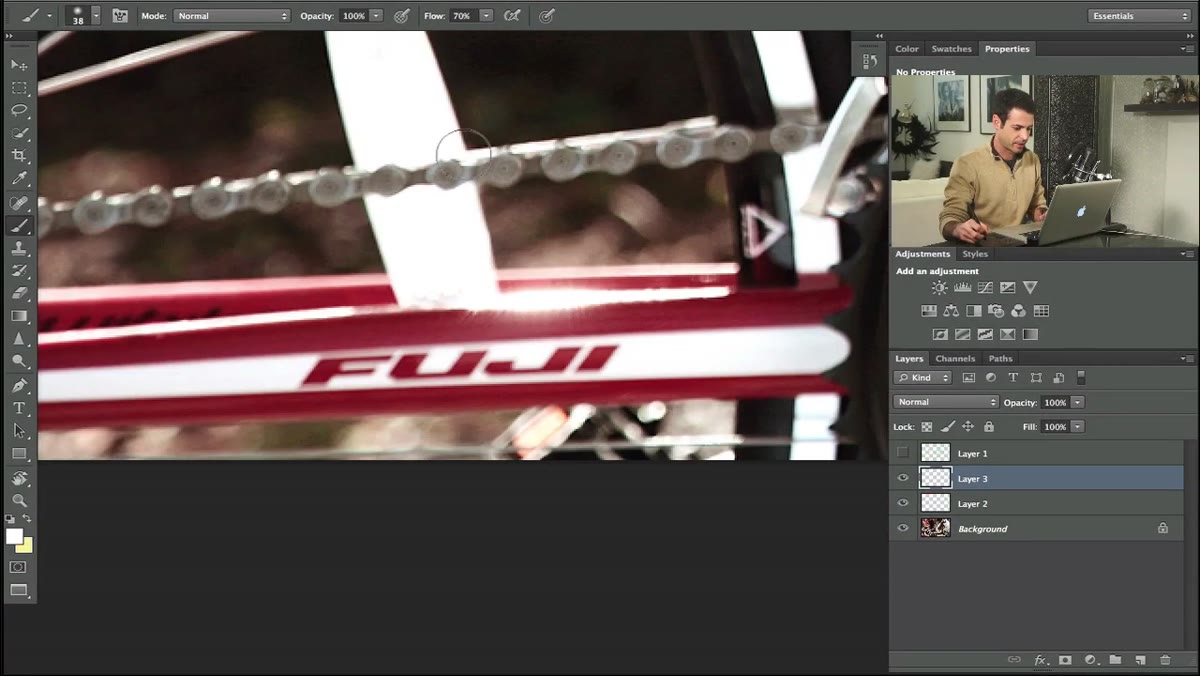 Drawing a polygonal lasso selection around a logo on the bike frame
For logos that sit inside a defined panel or bordered region – a frame tube, a component face – Aaron switches to the Polygonal Lasso tool (Shift+L to cycle through lasso variations) to draw a selection boundary around the area before painting. This confines your brush strokes to exactly where you need them and prevents color from bleeding into adjacent zones with different tonal values.
Drawing a polygonal lasso selection around a logo on the bike frame
For logos that sit inside a defined panel or bordered region – a frame tube, a component face – Aaron switches to the Polygonal Lasso tool (Shift+L to cycle through lasso variations) to draw a selection boundary around the area before painting. This confines your brush strokes to exactly where you need them and prevents color from bleeding into adjacent zones with different tonal values.
Once the selection is active, he samples the local color again and paints inside it. The selection acts as a stencil. This is a fast, underrated technique for product work where your distractions live inside geometric shapes – which they often do, because logos are almost always placed on flat panels by design.
Step 4: Use Command+H to Hide Selection Edges and Check Your Work Accurately
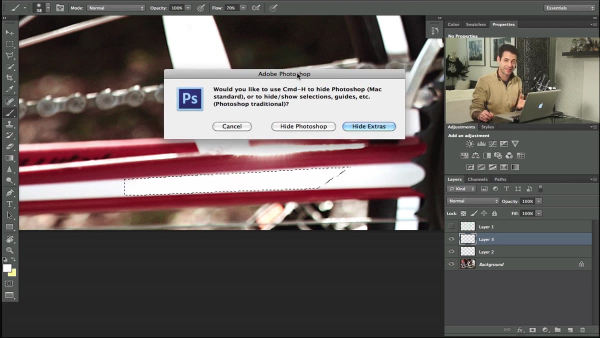 Hiding marching ants with Command+H to evaluate the painted area
Marching ants – the animated dashed border of an active selection – are visually noisy. When you’re trying to judge whether a painted patch is matching the surrounding tone, those moving edges make accurate evaluation almost impossible. Aaron hides the selection boundary with Command+H (Control+H on Windows) without actually deselecting, so he can see the result cleanly while still keeping the selection active for further painting.
Hiding marching ants with Command+H to evaluate the painted area
Marching ants – the animated dashed border of an active selection – are visually noisy. When you’re trying to judge whether a painted patch is matching the surrounding tone, those moving edges make accurate evaluation almost impossible. Aaron hides the selection boundary with Command+H (Control+H on Windows) without actually deselecting, so he can see the result cleanly while still keeping the selection active for further painting.
This is a small habit that makes a real difference. I’ve watched retouchers deselect entirely to check their work, then reselect and lose their placement. Keep the selection live, hide the edges, evaluate, and keep painting.
Step 5: Sample and Correct Local Color Variations Within the Same Region
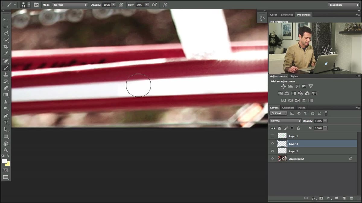 Resampling a slightly darker area within the same logo region
Even within a region that looks like a single flat color, there are often subtle gradations – areas that are a few percent darker or lighter due to lighting falloff or surface curvature. Aaron catches this by zooming in and noticing a slight tonal shift within an area he just painted. His fix is simple: re-sample from the slightly different zone and paint a second pass to correct the discrepancy.
Resampling a slightly darker area within the same logo region
Even within a region that looks like a single flat color, there are often subtle gradations – areas that are a few percent darker or lighter due to lighting falloff or surface curvature. Aaron catches this by zooming in and noticing a slight tonal shift within an area he just painted. His fix is simple: re-sample from the slightly different zone and paint a second pass to correct the discrepancy.
This is the kind of detail that separates a professional product retouch from something that looks patched. Flat surfaces in product photography almost never have truly uniform color. Learn to read those micro-gradients and your patches will disappear completely.
Step 6: For Complex Areas, Match Texture and Surface Geometry, Not Just Color
 Aaron identifying the hardest logo area near highlight and shadow transitions
The most demanding logos in this job are the ones that cross surface transitions – where a highlight rolls into a shadow, or where the logo text sits on a curved tube. Aaron flags these as the hardest stops on his difficulty ranking. The challenge isn’t just color matching: it’s maintaining the underlying surface information so the object still reads as three-dimensional after the logo is gone.
Aaron identifying the hardest logo area near highlight and shadow transitions
The most demanding logos in this job are the ones that cross surface transitions – where a highlight rolls into a shadow, or where the logo text sits on a curved tube. Aaron flags these as the hardest stops on his difficulty ranking. The challenge isn’t just color matching: it’s maintaining the underlying surface information so the object still reads as three-dimensional after the logo is gone.
For these areas, techniques like the Clone Stamp with a low opacity, or painting gradients that mimic the original light falloff, become necessary. The goal is always to reconstruct what the surface would look like if the logo had never been printed there – not to paper over it.
My Addition: Build a Reusable Action for the New-Layer-Sample-Paint Sequence
The steps Aaron runs through manually – new layer, sample color, set brush flow, paint, check – are a repeatable sequence. If you’re doing product retouching at any volume, that sequence is worth wrapping into a Photoshop action. I have one that creates a named layer, sets brush flow to 70%, and switches to the eyedropper automatically. It saves maybe forty-five seconds per logo. On a sixty-image product batch, that’s real time recovered.
The triage logic can’t be automated – that still lives in your head. But the mechanical setup around it absolutely can be, and should be.
The single most important idea in this tutorial isn’t any specific tool. It’s the habit of ranking your problems by difficulty before you start, and working from easiest to hardest. It gives you a reading of the image’s tonal character before you’re committed to the hard work, and it builds the kind of focused momentum that keeps complex jobs from going sideways.
Watch the full tutorial on YouTube to see Aaron work through the harder logo removals in real time – the live decision-making on the complex curved areas is worth watching even if you’re already comfortable with the basic tools.
Comments (2)
I've watched a dozen tutorials on this and yours is the clearest by far.
Well explained. I think my audience would really benefit from this — mind if I link to it?
Leave a Comment