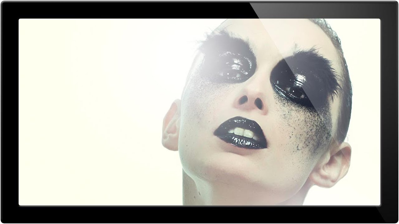
There’s a specific category of retouching request I get from ad agency clients that used to slow me down every single time: adding painterly, organic-looking elements to an otherwise clean photograph. Powder bursts, ink splashes, paint splatters. The kind of thing that looks effortless in the final comp but eats up an hour if you’re doing it by hand with a generic round brush. What I eventually figured out, and what this tutorial nails cleanly, is that the real solution lives inside Photoshop’s Brush Settings panel, a place most people open once, get confused by, and never return to.
In this Aaron Nace (PHLEARN) tutorial, the technique is demonstrated on a striking portrait with dramatic eye makeup and visible powder/pigment elements on the face. The goal is to extend and enhance those paint-like qualities using a custom brush built from scratch, rather than relying on stock splatter overlays or textures. It’s a smart, flexible approach, and once you understand the underlying logic, you can apply it to almost any compositing situation. Watch the full tutorial on YouTube if you want to follow along in real time, but everything you need to replicate this technique is laid out below.
Step 1: Assess the Image and Plan Your Paint Effect
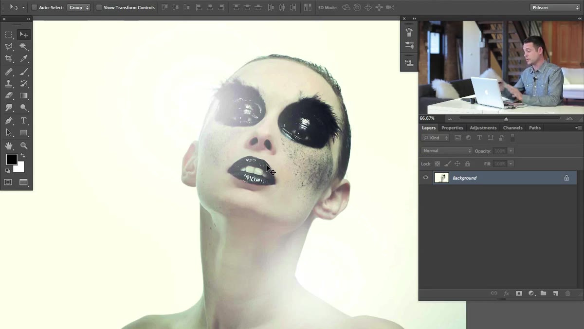 Portrait photo open in Photoshop before any editing
Before touching a single tool, Nace takes a moment to read the image and identify where the effect should live. In this case, the subject already has dark, dramatic eye makeup and a dusting of powder near the face. The idea is not to replace what’s there but to extend the logic of it, creating a gradient-like splatter that feels like it’s emerging from the darker areas and dissipating outward.
Portrait photo open in Photoshop before any editing
Before touching a single tool, Nace takes a moment to read the image and identify where the effect should live. In this case, the subject already has dark, dramatic eye makeup and a dusting of powder near the face. The idea is not to replace what’s there but to extend the logic of it, creating a gradient-like splatter that feels like it’s emerging from the darker areas and dissipating outward.
This planning step matters more than people give it credit for. When I’m adding textural elements to a product shot or portrait, I always ask whether the effect should look like it belongs to the original scene or like it was applied afterward. In this case, the answer is “belongs there,” which means sampling color directly from the image is essential.
Step 2: Create a New Layer and Sample Color from the Image
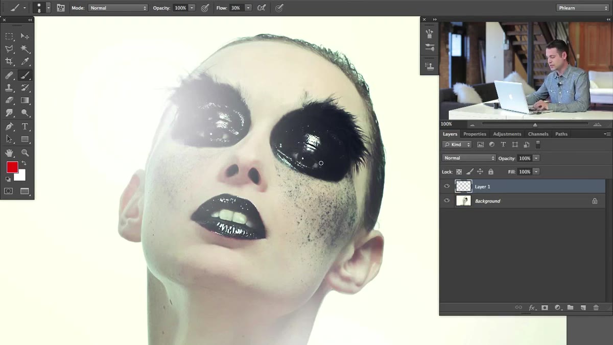 New layer created above subject, eyedropper sampling color
Add a new layer above your existing layers. This is non-negotiable for any effect work. You want the ability to adjust opacity, blend mode, or simply throw it away without touching the base image.
New layer created above subject, eyedropper sampling color
Add a new layer above your existing layers. This is non-negotiable for any effect work. You want the ability to adjust opacity, blend mode, or simply throw it away without touching the base image.
With the Brush tool active, hold Alt (Option on Mac) to temporarily switch to the Eyedropper and click directly on the color you want to paint with. Nace pulls a color from the existing powder/pigment tones already in the photo. This is what separates a believable effect from one that looks pasted on. Your sampled color should be a close match to whatever organic element you’re trying to extend.
Step 3: Open the Brush Settings Panel
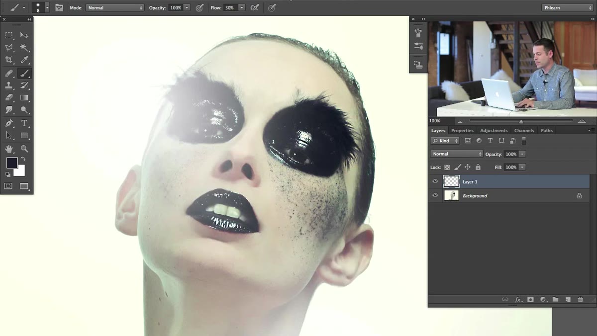 Window menu open, Brush option highlighted
Go to Window, then select Brush (or Brush Settings, depending on your version of Photoshop). This opens the full panel, which is different from the simplified brush picker that appears in the options bar. The full panel is where you control the behavior of the brush over time, not just its size and hardness.
Window menu open, Brush option highlighted
Go to Window, then select Brush (or Brush Settings, depending on your version of Photoshop). This opens the full panel, which is different from the simplified brush picker that appears in the options bar. The full panel is where you control the behavior of the brush over time, not just its size and hardness.
Most people stick to the options bar and miss out on the entire engine underneath. The Brush Settings panel is essentially a programmable tool, and understanding even two or three of its parameters changes how you work permanently.
Step 4: Set Brush Hardness as Your Starting Point
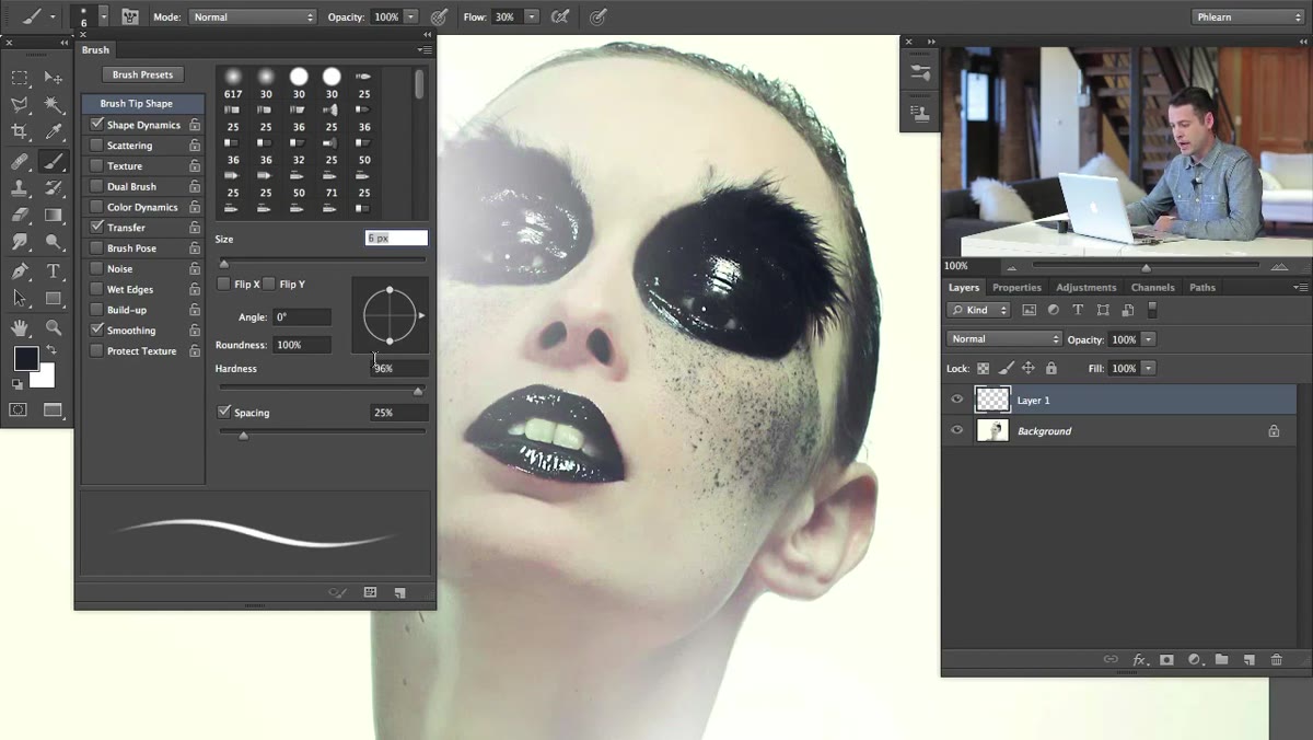 Brush hardness slider being adjusted upward in panel
Inside the Brush Settings panel, locate the Hardness slider and bring it up toward a harder edge. Nace starts here because a harder base brush will create more defined splatter marks, which read as more deliberate and paint-like than soft, feathered strokes.
Brush hardness slider being adjusted upward in panel
Inside the Brush Settings panel, locate the Hardness slider and bring it up toward a harder edge. Nace starts here because a harder base brush will create more defined splatter marks, which read as more deliberate and paint-like than soft, feathered strokes.
The specific hardness value depends on the look you’re after. A value around 70-85% gives you definition without being completely rigid. If your splatters look too clean or geometric at this stage, that’s fine. The next settings are what introduce the organic randomness that makes this convincing.
Step 5: Adjust Brush Tip Shape for Scatter and Spacing
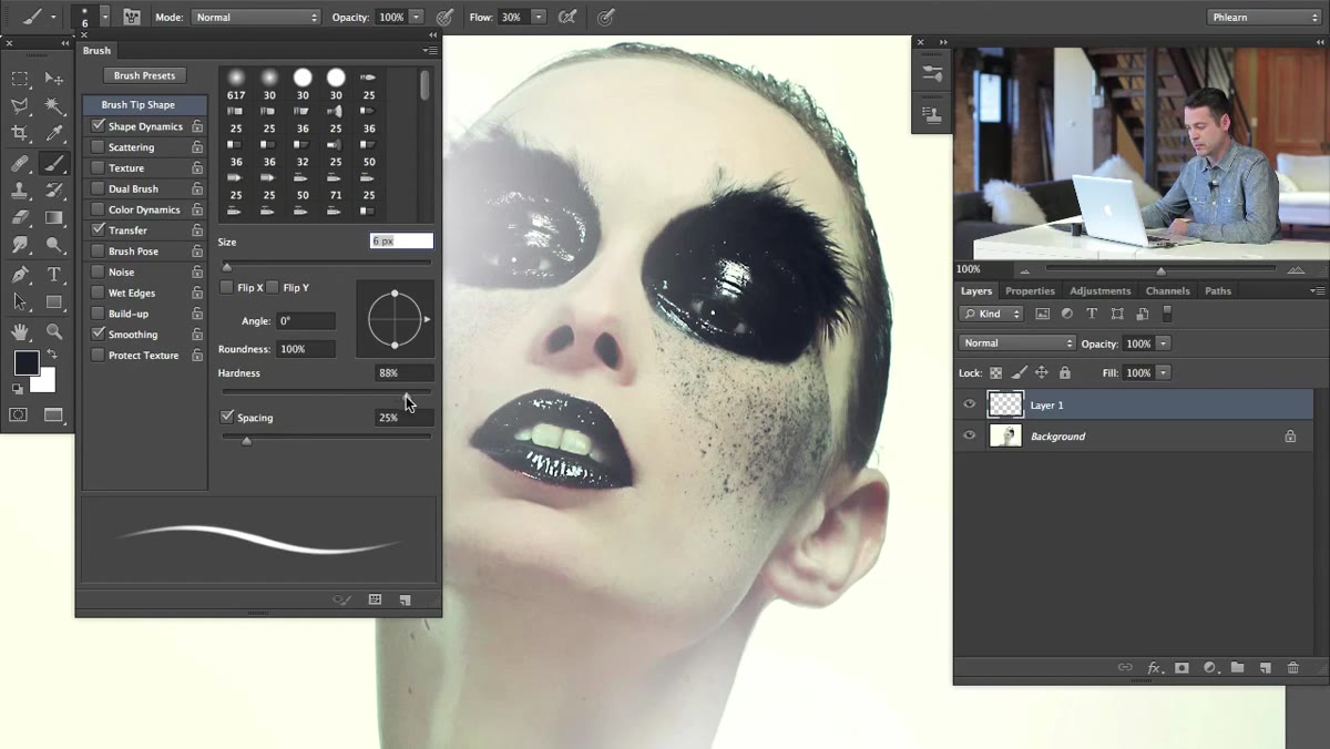 Brush tip shape options visible in Brush Settings panel
Still inside the Brush Settings panel, this is where you start breaking the brush away from its default circular, evenly-spaced behavior. Increase the Spacing value significantly. Default spacing is around 25%, but pushing it to 100% or beyond starts to separate individual brush marks so they read as individual paint droplets rather than a continuous stroke.
Brush tip shape options visible in Brush Settings panel
Still inside the Brush Settings panel, this is where you start breaking the brush away from its default circular, evenly-spaced behavior. Increase the Spacing value significantly. Default spacing is around 25%, but pushing it to 100% or beyond starts to separate individual brush marks so they read as individual paint droplets rather than a continuous stroke.
From here, check the Scattering option in the left-side list of the panel. Scattering randomizes the placement of each brush mark perpendicular to your stroke direction. A moderate scatter value creates a natural spread that mimics how paint or powder would actually disperse. The “Both Axes” checkbox widens this scatter in all directions, which usually gives a more convincing result for this kind of organic effect.
Step 6: Paint the Effect and Adjust Opacity by Layer
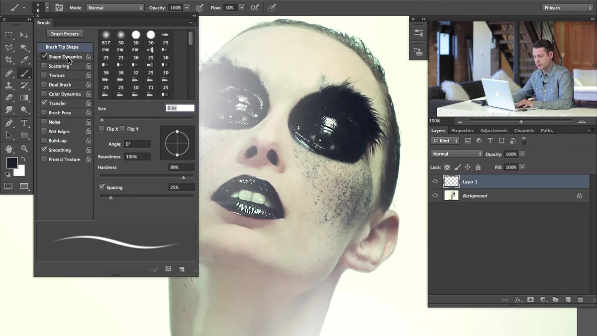 Custom brush being painted across the portrait in Photoshop
With your custom brush configured, paint your splatter strokes on the new layer. Follow the directional logic of the image. If existing powder in the photo appears to drift outward from the face, your strokes should echo that. Work in short passes rather than one long drag, and vary the pressure or brush size between passes if you’re on a tablet.
Custom brush being painted across the portrait in Photoshop
With your custom brush configured, paint your splatter strokes on the new layer. Follow the directional logic of the image. If existing powder in the photo appears to drift outward from the face, your strokes should echo that. Work in short passes rather than one long drag, and vary the pressure or brush size between passes if you’re on a tablet.
After painting, dial back the layer opacity. Somewhere between 60-80% often integrates the effect more convincingly than 100%, because it lets a hint of the underlying image show through the new marks, which is exactly what real powder or paint on skin would do.
From My Workflow: Where This Technique Pays Off Beyond Portraits
The splatter brush technique Nace demonstrates is genuinely versatile, but I’ve found its real value in product and editorial compositing, not just portraiture. I’ve used variations of this exact panel setup to add ink-splash elements to typography, to simulate dried paint texture on packaging mockups, and to create the kind of organic imperfection that stock textures never quite deliver because they weren’t built for the specific color palette of the image.
The key caveat: build your custom brushes and save them. Don’t reconfigure the panel every time you need a similar effect. Photoshop lets you save any brush configuration as a preset, and if you’re doing this kind of work regularly, having a small library of saved organic brushes is worth the ten minutes it takes to set them up properly. I have a small folder of texture brushes I’ve refined over several years, and they go into nearly every retouching job I take on.
The single most important insight from this tutorial is that the Brush Settings panel is not a set of optional tweaks. It’s the actual tool. The brush you see in the toolbar is just the entry point. Spending an hour learning what Scatter, Shape Dynamics, and Spacing actually do will change the quality of your painted effects more than any overlay pack or plugin ever will.
Watch the full tutorial on YouTube to see Aaron walk through the complete technique with the original image.
Comments
Leave a Comment