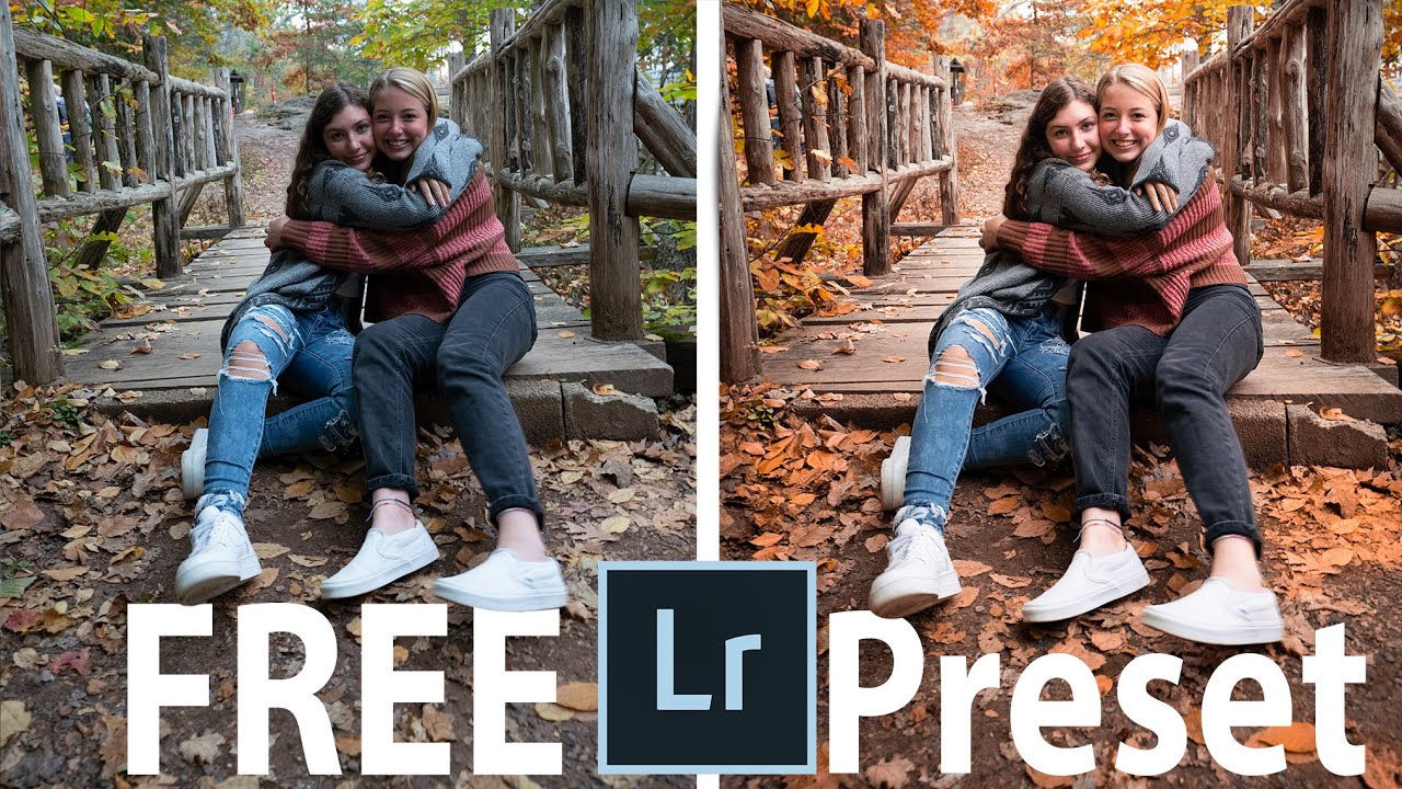
Most photographers I know treat presets as a binary thing: either the preset works or it doesn’t. They click through a dozen options, pick the one that looks closest, and call it done. That approach leaves a lot on the table. What actually separates a competent edit from a polished one is what happens after you apply the preset, and that’s the part most preset tutorials skip entirely.
In this Tony & Chelsea Northrup tutorial, Watch the full tutorial on YouTube, Chelsea walks through her “Make It Fall” preset using a real shoot from an outdoor session with her daughter and a friend. The images have good bones but the colors are flat and the subjects’ faces are sitting in shadow. The tutorial is nominally about a free preset giveaway, but what it actually demonstrates is a practical masking and exposure workflow that I’ve used variations of in commercial work for years. The specific steps she takes after applying the preset are worth breaking down carefully.
Step 1: Apply the Preset as a Starting Point, Not a Final Answer
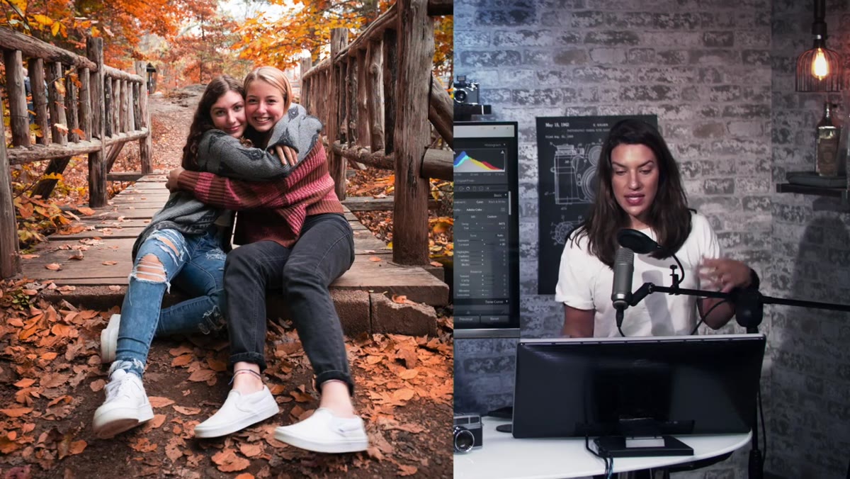 Lightroom preset applied to fall outdoor portrait
Click the preset in your Presets panel and immediately look at what it changed before you decide whether you like it. This sounds obvious, but it shifts your mindset. The preset is not your edit. It is a set of starting sliders. In Chelsea’s case, the “Make It Fall” preset pushes the yellow and orange tones up and adds overall warmth, which immediately makes the foliage read as more autumn. The skin tones, though, need attention. Don’t evaluate a preset by the thumbnail. Evaluate it by the problems it creates and the ones it solves.
Lightroom preset applied to fall outdoor portrait
Click the preset in your Presets panel and immediately look at what it changed before you decide whether you like it. This sounds obvious, but it shifts your mindset. The preset is not your edit. It is a set of starting sliders. In Chelsea’s case, the “Make It Fall” preset pushes the yellow and orange tones up and adds overall warmth, which immediately makes the foliage read as more autumn. The skin tones, though, need attention. Don’t evaluate a preset by the thumbnail. Evaluate it by the problems it creates and the ones it solves.
Step 2: Adjust the White Balance to Match Your Image’s Starting Temperature
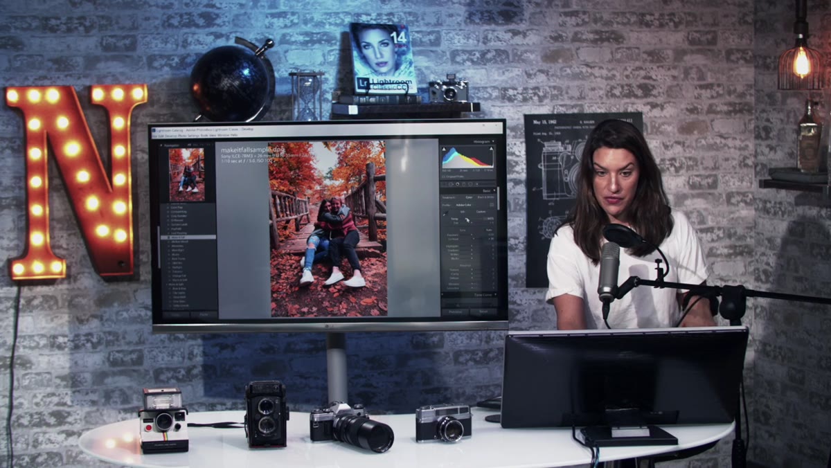 White balance slider adjustment in Basic panel
Presets are built on a specific white balance assumption. If your image was shot warmer or cooler than the base photo the preset creator used, the color grade will pull in an unexpected direction. Chelsea notes that if your photo already reads warm before the preset, the preset’s warming effect may overcook it. If it’s a cool image, you may need to drag the Temperature slider further right to compensate. This isn’t a flaw in the preset. It’s just physics. Pull the Temperature slider (measured in Kelvin) until the skin tones look natural to your eye, then decide if the overall mood still holds. Small adjustments, 200 to 400K at most, usually get you there.
White balance slider adjustment in Basic panel
Presets are built on a specific white balance assumption. If your image was shot warmer or cooler than the base photo the preset creator used, the color grade will pull in an unexpected direction. Chelsea notes that if your photo already reads warm before the preset, the preset’s warming effect may overcook it. If it’s a cool image, you may need to drag the Temperature slider further right to compensate. This isn’t a flaw in the preset. It’s just physics. Pull the Temperature slider (measured in Kelvin) until the skin tones look natural to your eye, then decide if the overall mood still holds. Small adjustments, 200 to 400K at most, usually get you there.
Step 3: Set Your Overall Exposure for the Subject’s Faces
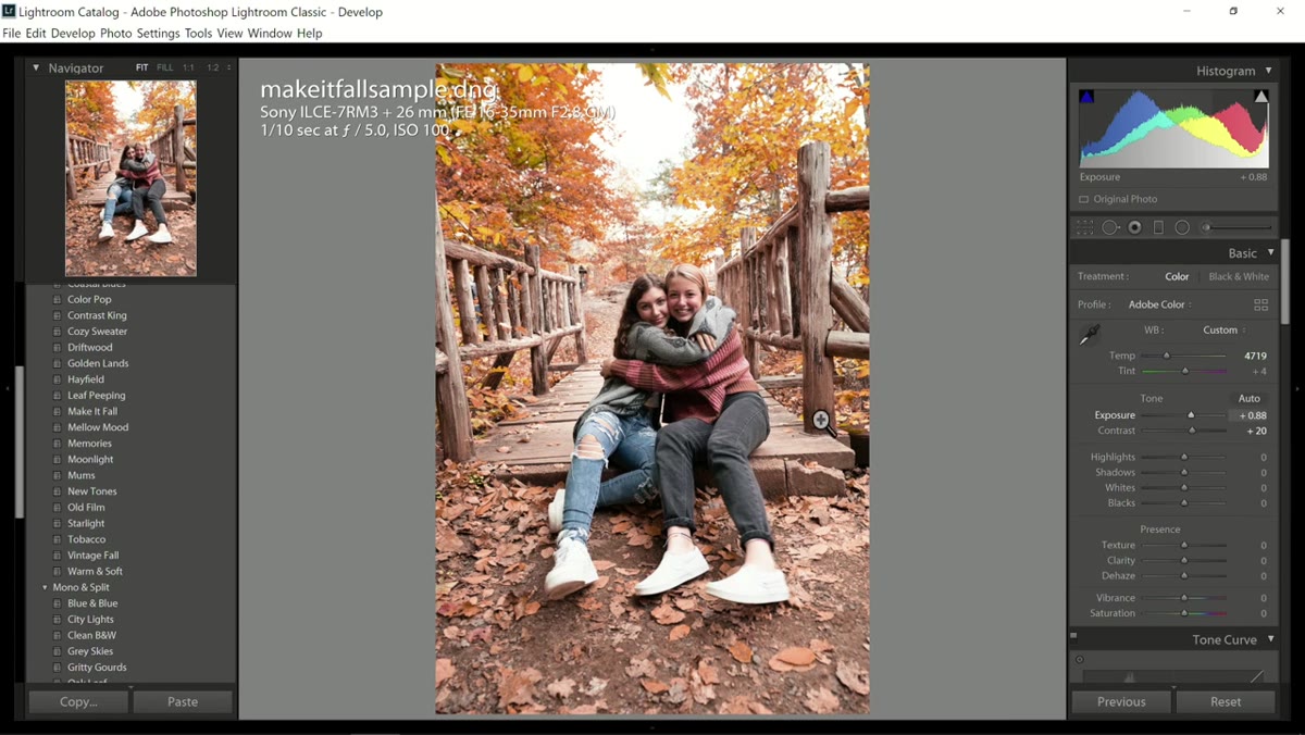 Exposure slider raised for subjects in shadow
Before you reach for any masking tools, raise the global exposure until your subjects’ faces are correctly exposed. Chelsea does this first, and it’s the right order of operations. If you start masking before you’ve established your base exposure, you end up chasing a moving target. Lift the Exposure slider in the Basic panel until the faces look natural, even if it blows out your background a little. You’ll pull that back in a later step.
Exposure slider raised for subjects in shadow
Before you reach for any masking tools, raise the global exposure until your subjects’ faces are correctly exposed. Chelsea does this first, and it’s the right order of operations. If you start masking before you’ve established your base exposure, you end up chasing a moving target. Lift the Exposure slider in the Basic panel until the faces look natural, even if it blows out your background a little. You’ll pull that back in a later step.
Step 4: Create a Radial Filter Around Your Subjects
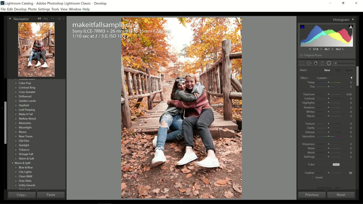 Radial filter drawn around subjects’ faces
Go to the Masking panel (the circle-with-dotted-border icon, or Shift+W) and select Radial Gradient. Draw an oval over your subjects’ faces and upper bodies. By default, Lightroom applies adjustments to the area outside the oval. Press the “Invert” toggle so the filter affects the inside instead. This is the container for your local exposure work. The radial filter on its own is a fairly blunt instrument, which is why the next step matters.
Radial filter drawn around subjects’ faces
Go to the Masking panel (the circle-with-dotted-border icon, or Shift+W) and select Radial Gradient. Draw an oval over your subjects’ faces and upper bodies. By default, Lightroom applies adjustments to the area outside the oval. Press the “Invert” toggle so the filter affects the inside instead. This is the container for your local exposure work. The radial filter on its own is a fairly blunt instrument, which is why the next step matters.
Step 5: Refine the Mask with a Brush Subtraction
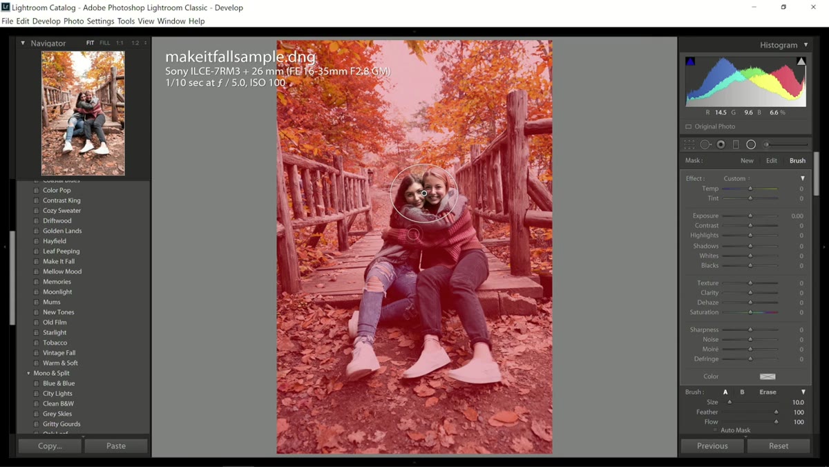 Brush tool with minus sign subtracting from mask
With the Radial Gradient mask selected, click “Subtract” and choose Brush. Chelsea uses the keyboard shortcut Alt (Option on Mac) to toggle the brush from additive to subtractive while painting. Press O to see the red mask overlay so you know exactly which pixels you’re affecting. Paint away any areas within your radial filter that you don’t want brightened, like the background foliage that’s already well-exposed or clothing that doesn’t need to come forward. Pressing O again hides the overlay so you can evaluate the result against the actual image.
Brush tool with minus sign subtracting from mask
With the Radial Gradient mask selected, click “Subtract” and choose Brush. Chelsea uses the keyboard shortcut Alt (Option on Mac) to toggle the brush from additive to subtractive while painting. Press O to see the red mask overlay so you know exactly which pixels you’re affecting. Paint away any areas within your radial filter that you don’t want brightened, like the background foliage that’s already well-exposed or clothing that doesn’t need to come forward. Pressing O again hides the overlay so you can evaluate the result against the actual image.
Step 6: Lower the External Exposure and Lift the Highlights in the Trees
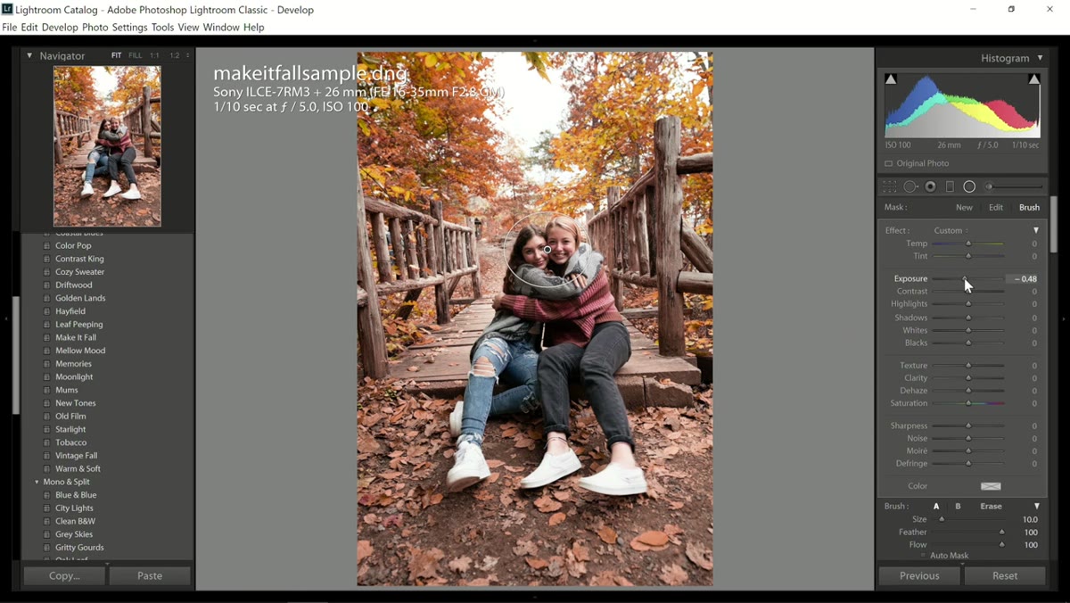 Exposure reduced outside the radial filter
Now invert your focus. Select the area outside your subject mask and drop the Exposure slider to push the background slightly darker relative to your subjects. This creates separation without looking like a vignette. Chelsea also raises the Highlights slider to bring up detail in the tree canopy, which gives the image depth without flattening the darker areas. The combination of a brighter subject and a slightly pulled-back background is what draws the eye naturally. It’s the same principle I use in product composites to keep the viewer’s attention on the item rather than the environment.
Exposure reduced outside the radial filter
Now invert your focus. Select the area outside your subject mask and drop the Exposure slider to push the background slightly darker relative to your subjects. This creates separation without looking like a vignette. Chelsea also raises the Highlights slider to bring up detail in the tree canopy, which gives the image depth without flattening the darker areas. The combination of a brighter subject and a slightly pulled-back background is what draws the eye naturally. It’s the same principle I use in product composites to keep the viewer’s attention on the item rather than the environment.
Step 7: Adjust Saturation to Taste and Crop for Output
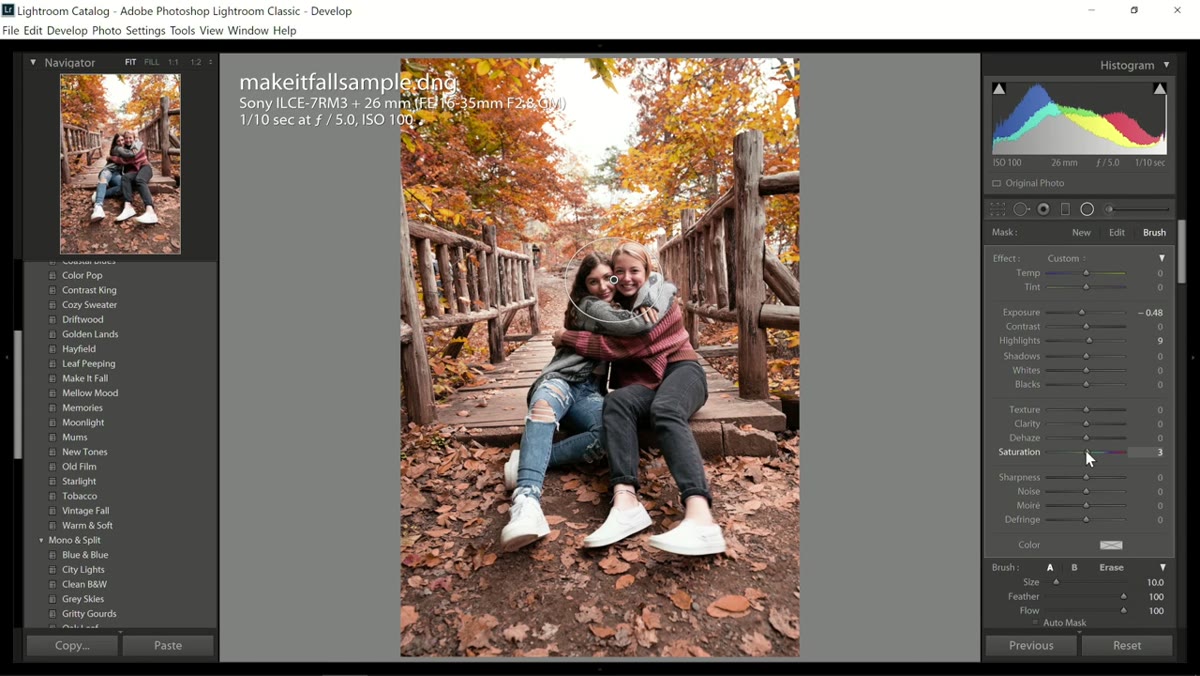 Saturation slider and crop tool applied
Saturation is a personal call and will depend on your output medium. Chelsea nudges hers up slightly to make the autumn colors pop, but she’s clear that this is a slider you should move based on where the image is headed, print, web, social. After color, she crops to an 8x10 ratio, which she prefers for online display. Use a straight edge in the frame, a horizon line, a fence, a building, anything with a known horizontal or vertical, to level the crop accurately. If the scene has no clean reference lines, use the grid overlay and approximate.
Saturation slider and crop tool applied
Saturation is a personal call and will depend on your output medium. Chelsea nudges hers up slightly to make the autumn colors pop, but she’s clear that this is a slider you should move based on where the image is headed, print, web, social. After color, she crops to an 8x10 ratio, which she prefers for online display. Use a straight edge in the frame, a horizon line, a fence, a building, anything with a known horizontal or vertical, to level the crop accurately. If the scene has no clean reference lines, use the grid overlay and approximate.
A Note on Presets in a Commercial Workflow
I don’t use many stylistic presets in my own commercial work since clients usually have brand standards that override any creative grade I might prefer. But the masking workflow Chelsea demonstrates here maps directly onto something I do constantly: separating the subject plane from the background with local adjustments rather than global ones. The radial filter with a brush subtraction is faster and more flexible than painting a mask from scratch, and it handles the irregular edges of people and foliage better than a simple graduated filter. If you’re processing high volumes of similar shots, this combination is worth building into a Lightroom preset of its own, one that applies the radial filter structure so you only need to resize and reposition it per image.
The single most useful idea in this tutorial is treating the preset as step one of a local adjustment workflow rather than the whole edit. Global sliders set the mood. Local masks do the actual work of making the image read correctly. Every strong edit I’ve seen, in commercial studios and in my own archive, earns most of its quality from that second phase.
If you’re working through autumn sessions right now and want to follow along with the original technique, Watch the full tutorial on YouTube and grab the free preset Chelsea includes. The coupon code she mentions (fall20) is worth checking for current availability if you want the full Autumn pack.
Comments (4)
Would love to see a follow-up going deeper into this topic.
Printing this out and pinning it next to my monitor. That good.
Simple but effective. Sometimes that's all you need.
I tried this on a client project yesterday and the results were way better than expected.
Leave a Comment