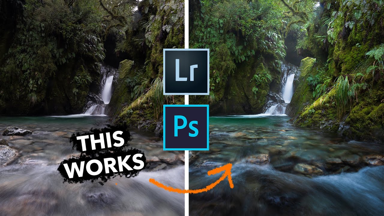
There’s a problem I keep seeing in raw files from photographers who are otherwise doing everything right. Great location, solid composition, proper exposure – and yet something feels off when the image hits the screen. The eye wanders. The sense of depth isn’t there. Nine times out of ten, the culprit isn’t the shot itself. It’s that the tonality is working against the composition rather than with it.
I stumbled across this William Patino tutorial while looking for a cleaner way to explain tonal direction to a few junior retouchers I’ve been working with lately. Watch the full tutorial on YouTube – Patino walks through a canyon waterfall shot where the foreground is blowing bright and the background falls into deep shadow, which is exactly the reverse of how we want the eye to travel. What he does to fix it is simple on the surface, but the reasoning behind each move is worth unpacking in detail.
The core idea comes from something painters have known for centuries: atmospheric perspective. Things far away have lower contrast, lighter shadows, and a compressed tonal range. Things close to us have stronger contrast and deeper blacks. When a raw file reverses that relationship, the image feels flat or disorienting even if viewers can’t articulate why. Once you start seeing this problem, you cannot stop seeing it.
Step 1: Set Your Base Profile and Make Basic Color Adjustments
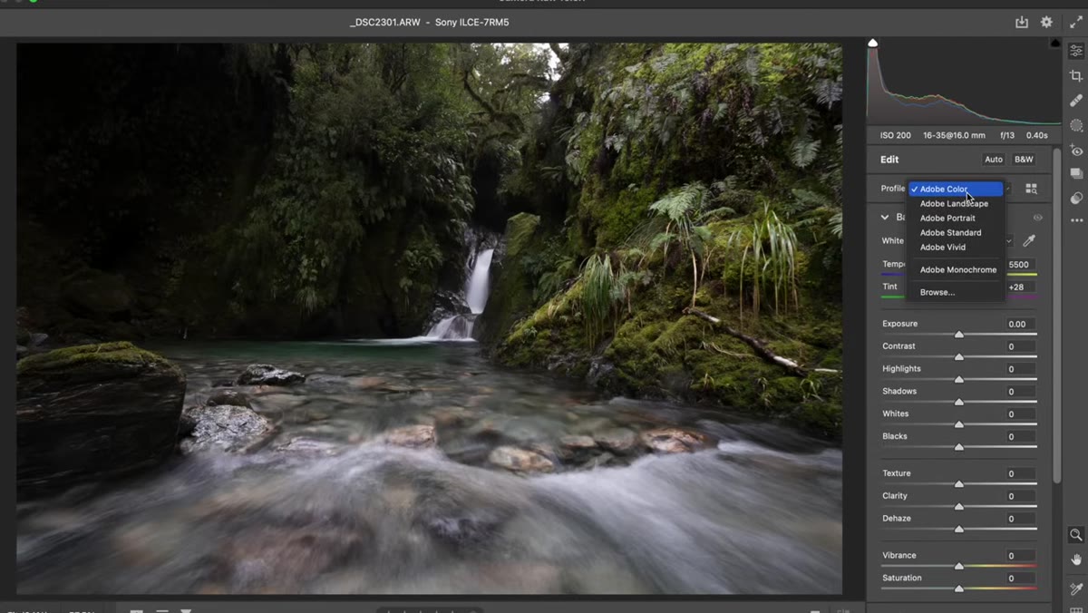 Landscape camera profile selected in ACR profile browser
Before touching any tonal adjustments, Patino makes a quick pass through the basic color settings. He switches the camera profile to Landscape, nudges the Vibrance up slightly, and pulls the Temperature and Tint cooler. This isn’t the focus of the tutorial, but it matters because you want your color baseline in place before you start painting in localized exposure changes. If you do it in the wrong order, your brush adjustments can fight your global corrections. Get the color foundation down first, then move on to the tonal work.
Landscape camera profile selected in ACR profile browser
Before touching any tonal adjustments, Patino makes a quick pass through the basic color settings. He switches the camera profile to Landscape, nudges the Vibrance up slightly, and pulls the Temperature and Tint cooler. This isn’t the focus of the tutorial, but it matters because you want your color baseline in place before you start painting in localized exposure changes. If you do it in the wrong order, your brush adjustments can fight your global corrections. Get the color foundation down first, then move on to the tonal work.
Step 2: Open the Adjustment Brush in ACR or Lightroom
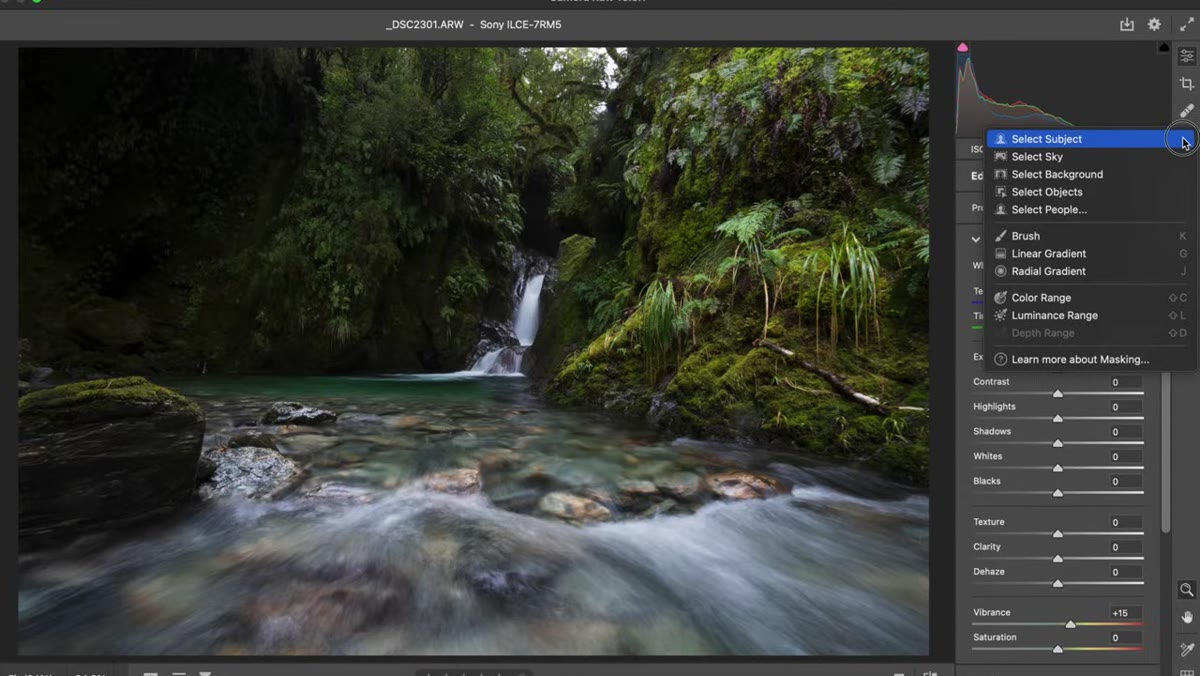 ACR masking panel open with adjustment brush selected
The primary tool here is the Adjustment Brush, found in the Masking section of Adobe Camera Raw. The keyboard shortcut is K. If you’re in Lightroom, the workflow is identical. This is not a gradient filter or a luminosity mask situation – Patino is hand-painting tonal corrections, which gives him precise control over exactly where the adjustments land. The brush approach lets you follow the organic shapes of a scene rather than forcing a geometric transition onto it.
ACR masking panel open with adjustment brush selected
The primary tool here is the Adjustment Brush, found in the Masking section of Adobe Camera Raw. The keyboard shortcut is K. If you’re in Lightroom, the workflow is identical. This is not a gradient filter or a luminosity mask situation – Patino is hand-painting tonal corrections, which gives him precise control over exactly where the adjustments land. The brush approach lets you follow the organic shapes of a scene rather than forcing a geometric transition onto it.
Step 3: Configure the Brush for Soft, Natural Transitions
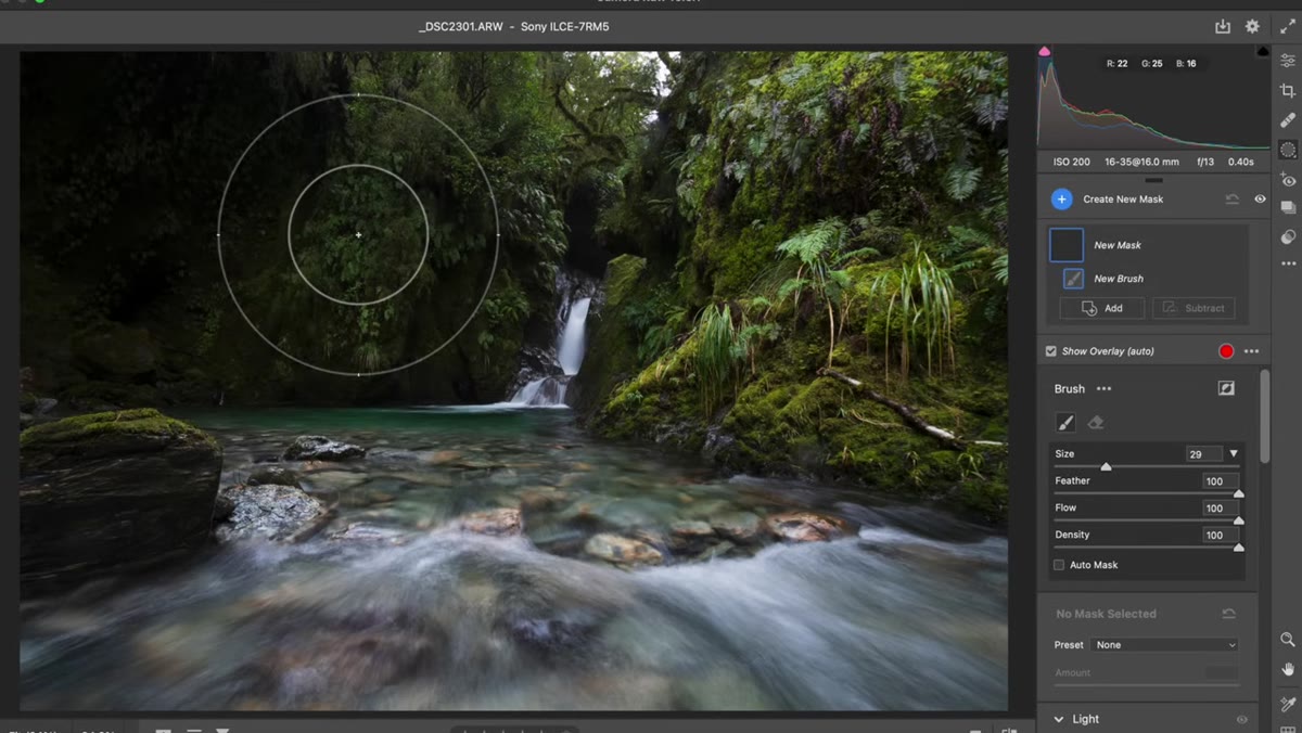 Adjustment brush settings showing high feather, flow and density at 100
Before painting a single stroke, configure the brush. Patino sets Feather high, which creates a soft falloff between the painted area and the unpainted area. With low feather, you get a hard edge that shows immediately in the final image and looks artificial. With high feather, the transition is gradual enough that the viewer never consciously notices the adjustment. He also sets Flow and Density to 100 so each stroke gives full application. The combination means you paint more deliberately, with fewer strokes, and the edges blend naturally into the rest of the image.
Adjustment brush settings showing high feather, flow and density at 100
Before painting a single stroke, configure the brush. Patino sets Feather high, which creates a soft falloff between the painted area and the unpainted area. With low feather, you get a hard edge that shows immediately in the final image and looks artificial. With high feather, the transition is gradual enough that the viewer never consciously notices the adjustment. He also sets Flow and Density to 100 so each stroke gives full application. The combination means you paint more deliberately, with fewer strokes, and the edges blend naturally into the rest of the image.
Step 4: Darken the Foreground with Exposure, Then Add Contrast
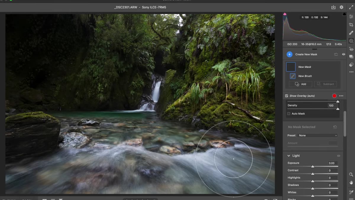 Adjustment brush being painted over foreground with exposure pulled down
With the brush configured, Patino paints over the foreground and brings Exposure down. This is straightforward, but here’s the nuance: pulling Exposure darkens every tone in that area uniformly, including the bright white water cascades that are actually a compositional asset. So he doesn’t lean too hard on Exposure alone. Instead, he layers in some positive Contrast on top. Adding Contrast to the foreground deepens the shadows further while actually lifting the highlights slightly – so the white water retains its brilliance even as the overall foreground reads darker. That distinction between Exposure and Contrast is easy to miss, and it’s the difference between muddy foreground water and foreground water that still looks alive.
Adjustment brush being painted over foreground with exposure pulled down
With the brush configured, Patino paints over the foreground and brings Exposure down. This is straightforward, but here’s the nuance: pulling Exposure darkens every tone in that area uniformly, including the bright white water cascades that are actually a compositional asset. So he doesn’t lean too hard on Exposure alone. Instead, he layers in some positive Contrast on top. Adding Contrast to the foreground deepens the shadows further while actually lifting the highlights slightly – so the white water retains its brilliance even as the overall foreground reads darker. That distinction between Exposure and Contrast is easy to miss, and it’s the difference between muddy foreground water and foreground water that still looks alive.
Step 5: Create a New Brush Layer and Brighten the Background
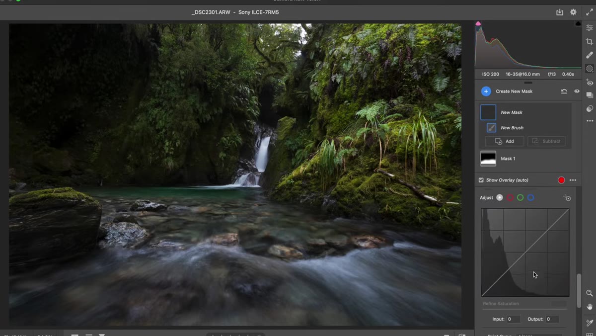 Second adjustment brush mask created for background area of canyon
Once the foreground correction is in place, Patino creates a separate brush adjustment and paints into the background – the deep canyon walls, the shadowed rock faces, the area behind the waterfall. Here the moves reverse completely. He brings Exposure up and reduces Contrast. Lower contrast in the background mimics atmospheric perspective: it compresses the tonal range, lifts the shadows, and makes the area read as being farther away from the viewer. The blacks in the canyon walls soften. The whole background shifts into a lighter, hazier tonal register. Combined with the darkened foreground, the image now has a tonal gradient that pulls the eye from the bottom of the frame toward the waterfall and into the distance.
Second adjustment brush mask created for background area of canyon
Once the foreground correction is in place, Patino creates a separate brush adjustment and paints into the background – the deep canyon walls, the shadowed rock faces, the area behind the waterfall. Here the moves reverse completely. He brings Exposure up and reduces Contrast. Lower contrast in the background mimics atmospheric perspective: it compresses the tonal range, lifts the shadows, and makes the area read as being farther away from the viewer. The blacks in the canyon walls soften. The whole background shifts into a lighter, hazier tonal register. Combined with the darkened foreground, the image now has a tonal gradient that pulls the eye from the bottom of the frame toward the waterfall and into the distance.
Step 6: Check the Overall Tonal Flow Before Finalizing
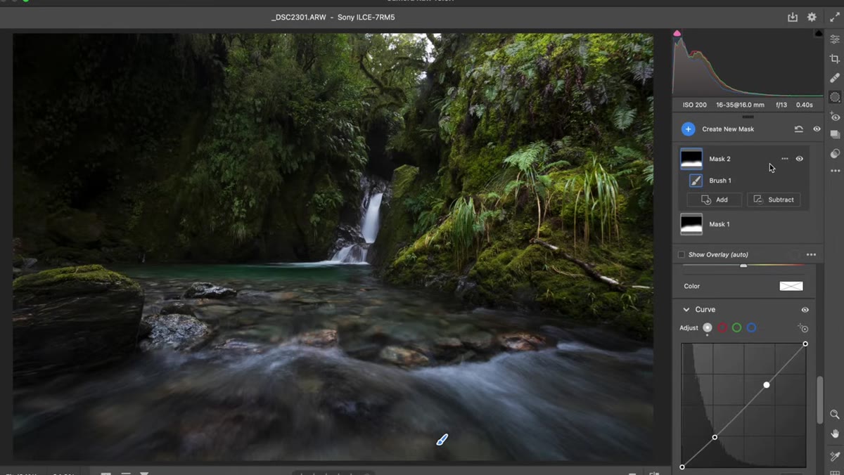 Before and after view showing tonal shift from foreground to background
Before calling it done, zoom out and look at the full image. Ask yourself where your eye goes first. In Patino’s file, after both brush adjustments are applied, the eye enters at the foreground, moves up along the water, and lands on the waterfall. That’s the intended journey. If something still feels off, revisit the feathering on your brush edges or check whether the transition between your two adjustment zones has a hard seam. The goal is for the tonal change to feel like something the light did, not something that was done in post.
Before and after view showing tonal shift from foreground to background
Before calling it done, zoom out and look at the full image. Ask yourself where your eye goes first. In Patino’s file, after both brush adjustments are applied, the eye enters at the foreground, moves up along the water, and lands on the waterfall. That’s the intended journey. If something still feels off, revisit the feathering on your brush edges or check whether the transition between your two adjustment zones has a hard seam. The goal is for the tonal change to feel like something the light did, not something that was done in post.
How I Apply This in Commercial Work
I mostly shoot product and ad work rather than landscapes, but the same principle shows up constantly. When a product is sitting in an environment – on a surface, against a background – the eye needs a path. If the background is competing tonally with the product, clients feel the image is “busy” without knowing why. I use the same two-brush approach: darken and add contrast around the hero subject, then lift and flatten contrast in the surrounding environment. It creates a spotlight effect that doesn’t look like a spotlight. The localized brush method Patino uses here is faster and more controllable than luminosity masking for this kind of broad directional correction, and it stacks cleanly with any other masking work you do later in the same file.
The single most important idea to take from this technique is that your tonal distribution is an editorial decision, not just a technical one. You are deciding where the eye goes. A raw file that came out of camera with “correct” exposure can still guide attention in exactly the wrong direction, and fixing it doesn’t require a complex compositing workflow. Two brush adjustments, a clear sense of where you want the eye to travel, and about three minutes of work.
Watch the full tutorial on YouTube to see Patino walk through the complete file from start to finish – he covers additional color work that I didn’t address here, and watching the before-and-after build in real time makes the depth effect much easier to internalize.
Comments
Leave a Comment