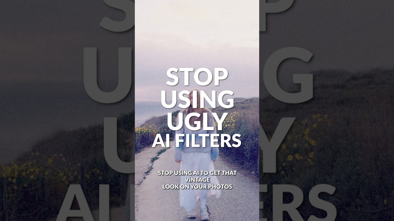
Client work has a way of exposing your shortcuts. A few months back, an ad agency sent me a batch of lifestyle shots that needed a cohesive vintage treatment, and every AI-driven “film look” filter I tested came back looking like someone had described film photography to a machine that had never seen a photograph. Overly warm, crushed in the wrong places, grain that tiled like bathroom tile. I scrapped all of it and went back to building the effect by hand.
That’s why Aaron Nace’s recent one-minute breakdown caught my attention. In this Aaron Nace (PHLEARN) tutorial, he walks through a fully manual vintage film process in Photoshop 2026 — highlight bloom, analog grain, and per-channel color grading using nothing but native tools. No plugins, no AI generation, no filters you can’t fully control. For anyone doing this at volume, each of these three components can be isolated into a reusable action. But before you automate anything, you need to understand what you’re actually building.
The technique has three distinct stages, and they build on each other. Get the bloom wrong and the grain looks disconnected. Get the grain wrong and the color grading has nothing to sit against. Here’s how each piece works.
Step 1: Isolate the Highlights Using Select Color Range
 Select Color Range dialog open on highlights
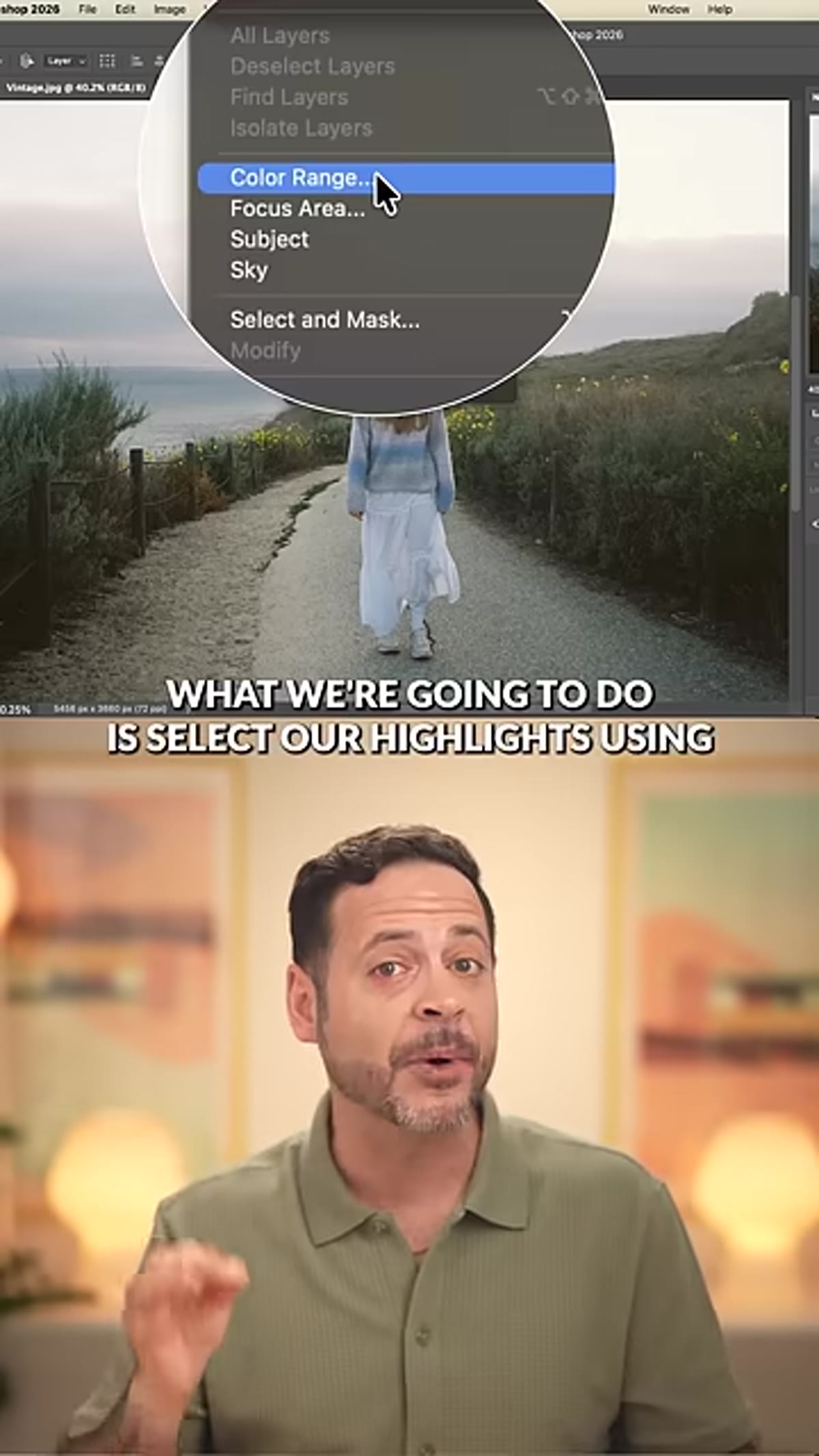
Open your image and go to Select > Color Range. Choose Highlights from the dropdown. Photoshop will generate a selection based on the luminosity of your image, isolating the brightest areas. The exact fuzziness setting will depend on your image, but start around 40-60 and watch how the selection preview responds. You want the highlights captured without pulling in too much of the midtones. Once you’re happy with the selection, hit OK.
Select Color Range dialog open on highlights
Open your image and go to Select > Color Range. Choose Highlights from the dropdown. Photoshop will generate a selection based on the luminosity of your image, isolating the brightest areas. The exact fuzziness setting will depend on your image, but start around 40-60 and watch how the selection preview responds. You want the highlights captured without pulling in too much of the midtones. Once you’re happy with the selection, hit OK.
This selection is the foundation for the bloom effect. The more precise it is, the more natural the final glow will look. If you’re working on images with a lot of blown-out areas, you may want to tighten the selection by reducing the fuzziness slightly.
Step 2: Duplicate the Highlights to a New Layer
 New layer created from highlight selection in Layers panel
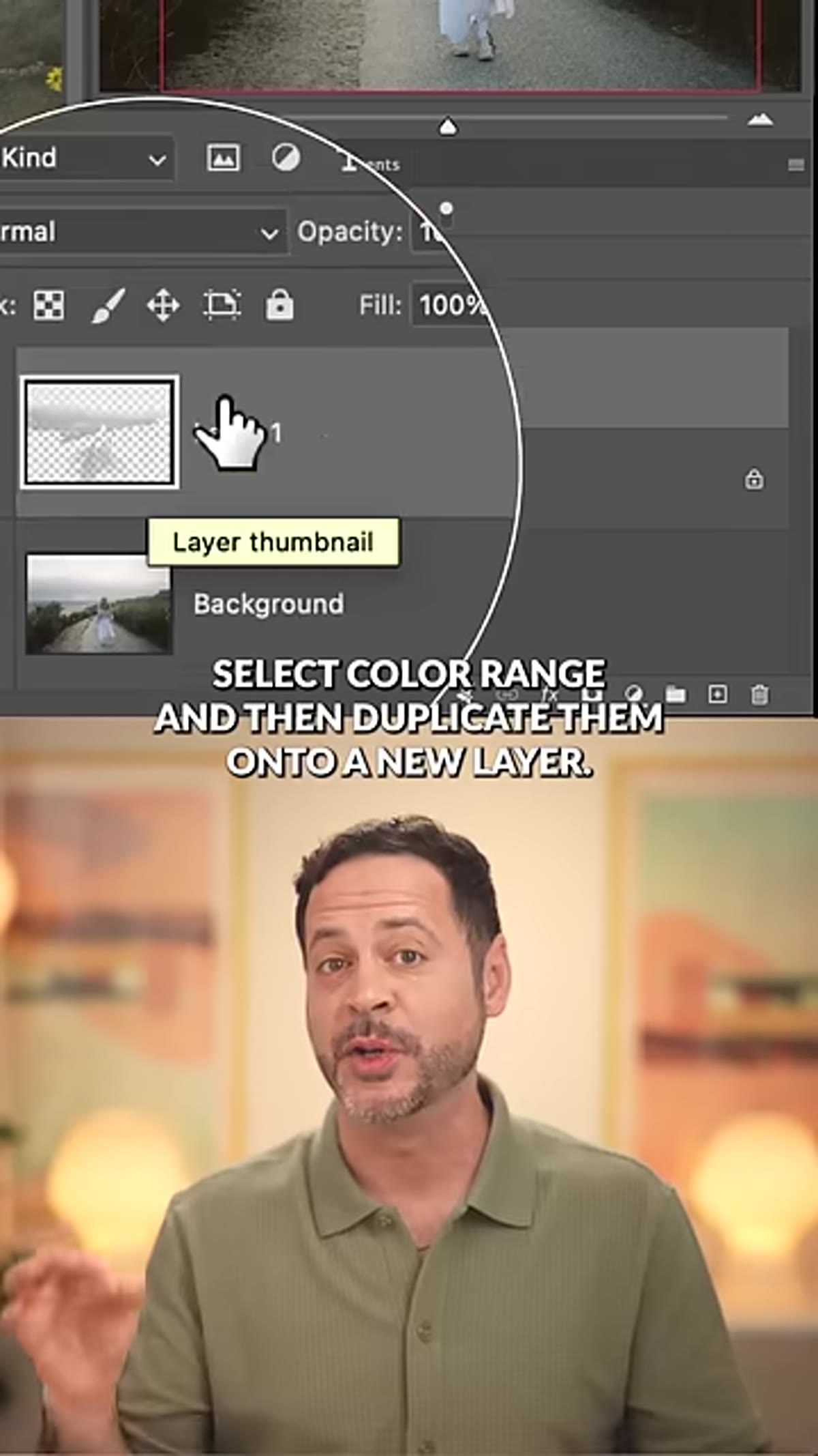
With your highlight selection active, use Ctrl+J (Cmd+J on Mac) to copy just those pixels onto a new layer. You’ll see a layer appear in your panel that contains only the bright regions of the image. Rename it something useful, “Highlight Bloom” works fine.
New layer created from highlight selection in Layers panel
With your highlight selection active, use Ctrl+J (Cmd+J on Mac) to copy just those pixels onto a new layer. You’ll see a layer appear in your panel that contains only the bright regions of the image. Rename it something useful, “Highlight Bloom” works fine.
This layer is what you’ll blur to create the glow. Keeping it separate from the base image is what makes this approach non-destructive and adjustable. If the bloom ends up too strong or too weak, you’re not digging through a merged file. You just tweak the layer’s opacity or blur radius and move on.
Step 3: Apply Gaussian Blur to Create the Bloom
 Gaussian Blur dialog applied to highlight layer
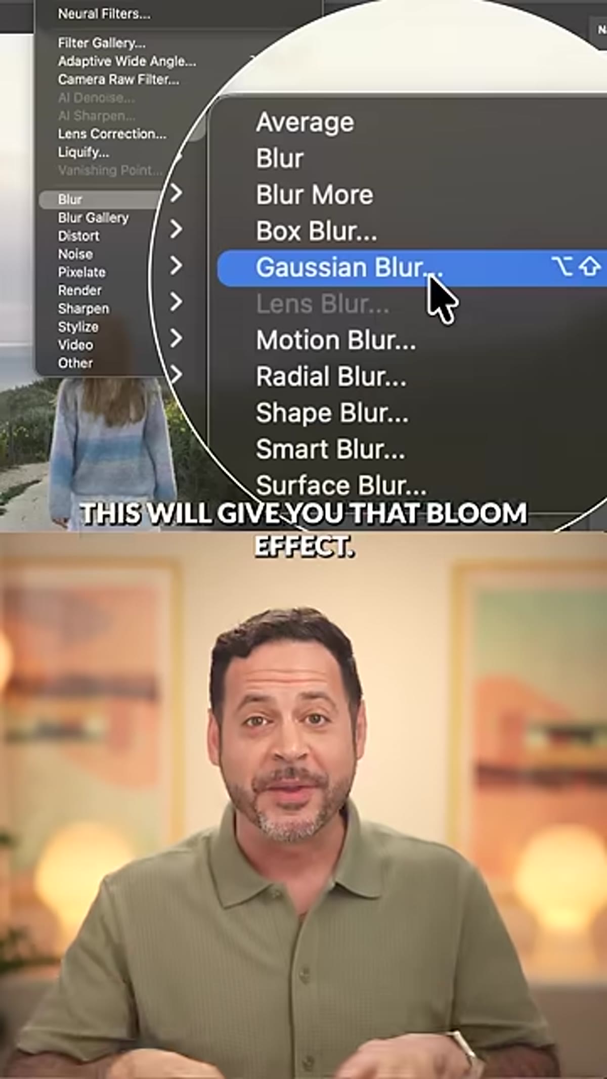
With the highlight layer selected, go to Filter > Blur > Gaussian Blur. The radius you choose controls how soft and diffused the bloom feels. For a subtle, realistic film look, start between 15-25 pixels on a full-resolution image. Higher values push it into a more dreamy, heavily processed look, which works for certain aesthetics but can read as heavy-handed on commercial work.
Gaussian Blur dialog applied to highlight layer
With the highlight layer selected, go to Filter > Blur > Gaussian Blur. The radius you choose controls how soft and diffused the bloom feels. For a subtle, realistic film look, start between 15-25 pixels on a full-resolution image. Higher values push it into a more dreamy, heavily processed look, which works for certain aesthetics but can read as heavy-handed on commercial work.
Set the layer blend mode to Screen or Lighten so the blur interacts with the image below rather than sitting on top of it flatly. Screen tends to give a brighter, more luminous result. Lighten is subtler. Your image will tell you which fits.
Step 4: Add a Grain Adjustment Layer
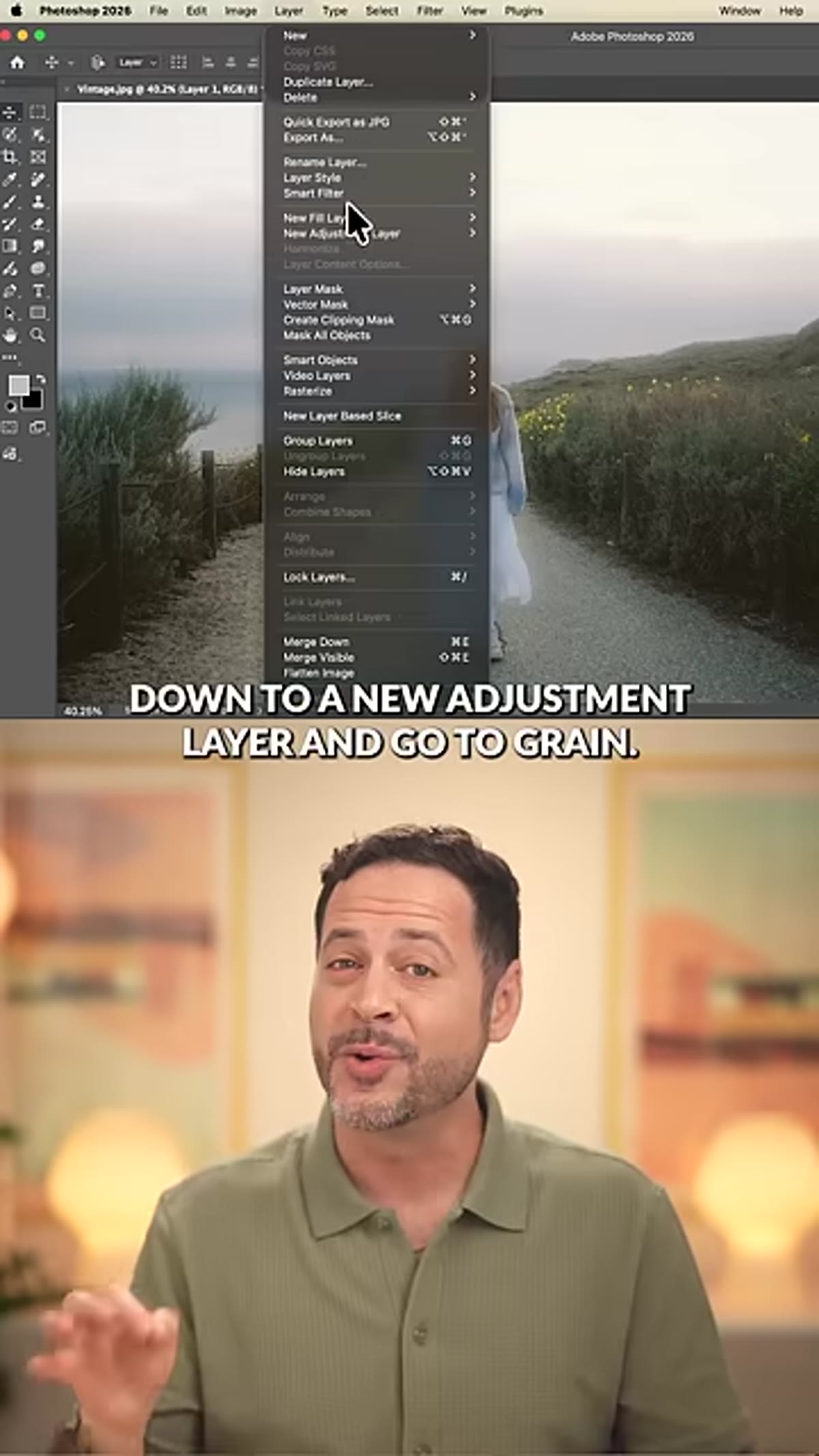 New Adjustment Layer menu showing Grain option
Go to Layer > New Adjustment Layer > Grain. This is the step that separates a polished manual technique from the old approach of adding noise directly to the image pixel layer. The Grain adjustment layer is fully non-destructive, which means you can revisit the intensity, contrast, and grain type at any point without degrading your file.
New Adjustment Layer menu showing Grain option
Go to Layer > New Adjustment Layer > Grain. This is the step that separates a polished manual technique from the old approach of adding noise directly to the image pixel layer. The Grain adjustment layer is fully non-destructive, which means you can revisit the intensity, contrast, and grain type at any point without degrading your file.
In the properties panel, you’ll find sliders for Intensity, Contrast, and a Grain Type dropdown. For a film texture that reads as analog rather than digital, keep Intensity in the 40-65 range and experiment with types like Regular, Soft, or Clumped. Soft grain at moderate intensity tends to sit most naturally across skin tones and fabric. Clumped reads more like pushed film stock.
Step 5: Build the Faded Film Look with a Levels Adjustment Layer
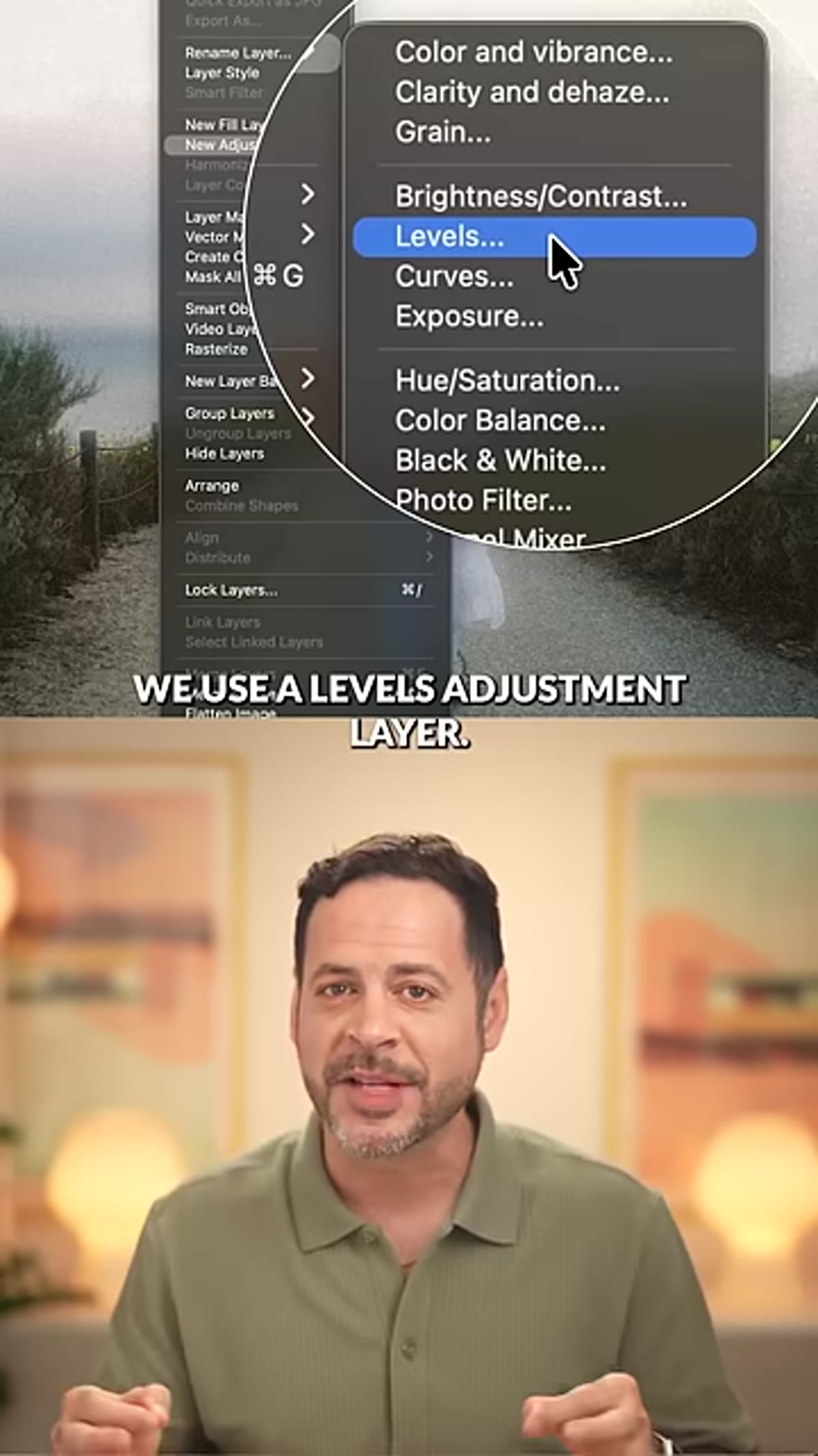 Levels adjustment layer with blacks slider lifted
Add a Levels adjustment layer above everything. The key move here is lifting the black point output slider, which is the left slider on the bottom output bar, not the input bar. Dragging it to the right fades the darkest shadows so they never fully reach pure black. This is one of the defining characteristics of film: it doesn’t have true black. A value somewhere between 20-40 is a good starting range, but trust your eyes over the numbers here.
Levels adjustment layer with blacks slider lifted
Add a Levels adjustment layer above everything. The key move here is lifting the black point output slider, which is the left slider on the bottom output bar, not the input bar. Dragging it to the right fades the darkest shadows so they never fully reach pure black. This is one of the defining characteristics of film: it doesn’t have true black. A value somewhere between 20-40 is a good starting range, but trust your eyes over the numbers here.
This single adjustment does a significant portion of the visual heavy lifting. Images that had the black point left at zero will look digital no matter what grain or bloom you add. Lift it, and the whole image starts to breathe differently.
Step 6: Color Grade Per Channel in Levels
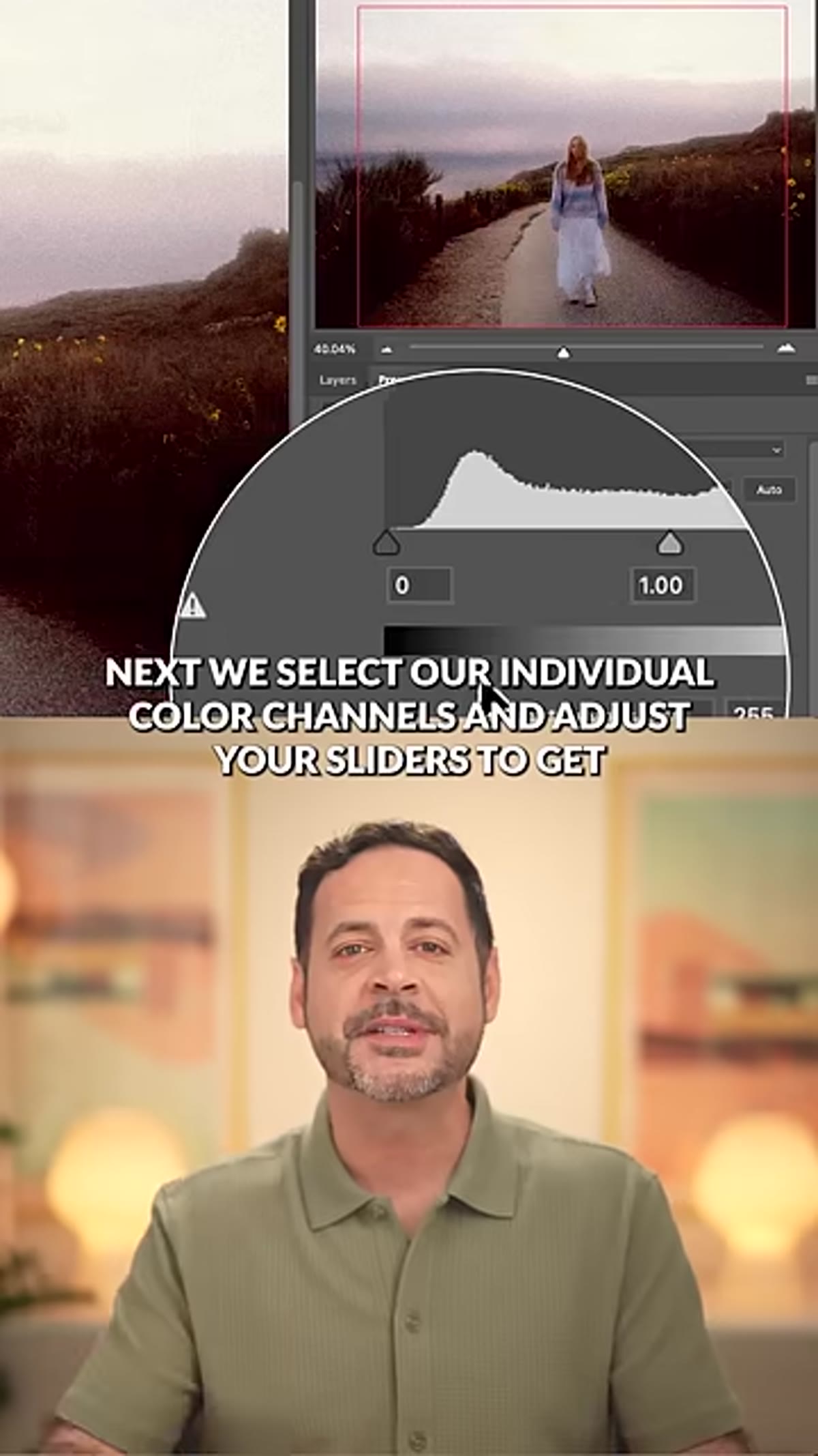 Levels panel with individual color channel selected
Still inside the same Levels adjustment layer, click the channel dropdown at the top of the Properties panel. It defaults to RGB. Switch to the Red, Green, and Blue channels individually.
Levels panel with individual color channel selected
Still inside the same Levels adjustment layer, click the channel dropdown at the top of the Properties panel. It defaults to RGB. Switch to the Red, Green, and Blue channels individually.
This is where the actual color character of the film look gets built. Moving the midpoint slider in the Red channel warmer adds that orange-amber quality in the midtones. Pulling the blue channel’s output down slightly (lifting the black point in blue) pushes the shadows toward a blue-green, which mimics the color shift you see in underexposed film shadows. Small moves matter here. A 10-15 point shift per channel is usually enough. The goal is color that feels like it came from a specific film stock, not like a color filter was thrown over the image.
A Note on Making This Repeatable
I’ll be honest: the first time I run a technique like this manually, I’m mostly building the action at the same time. Each of these six steps maps cleanly onto a Photoshop action, with the exception of the Color Range selection, which will vary per image and needs a manual trigger. Everything else, the Gaussian blur, the grain layer, the Levels layer with the lifted blacks, can be recorded and replayed in seconds.
For production work where I’m applying a consistent look across a set, I record the action with placeholder values, then adjust per image on the grain intensity and channel sliders. The structure is locked in. The fine-tuning stays manual. That’s the balance that actually holds up across a full shoot rather than just looking good on one hero image.
The bigger point here is that understanding the mechanics is what makes automation useful. If you hand this off to an action or a preset without knowing what each layer is doing, you won’t know what to tweak when the look isn’t landing. Build it manually first. Then make it fast.
The single most important thing in this technique is the lifted black point. It’s the move that most separates a convincing film look from a digital image with grain slapped on it. Get that right, and the rest of the effect has something real to build from.
Watch the full tutorial on YouTube to see Aaron walk through the complete process, including his specific settings for each step.
Comments (2)
Would love to see a follow-up going deeper into this topic.
Been doing this wrong for years apparently. Thanks for the wake-up call.
Leave a Comment