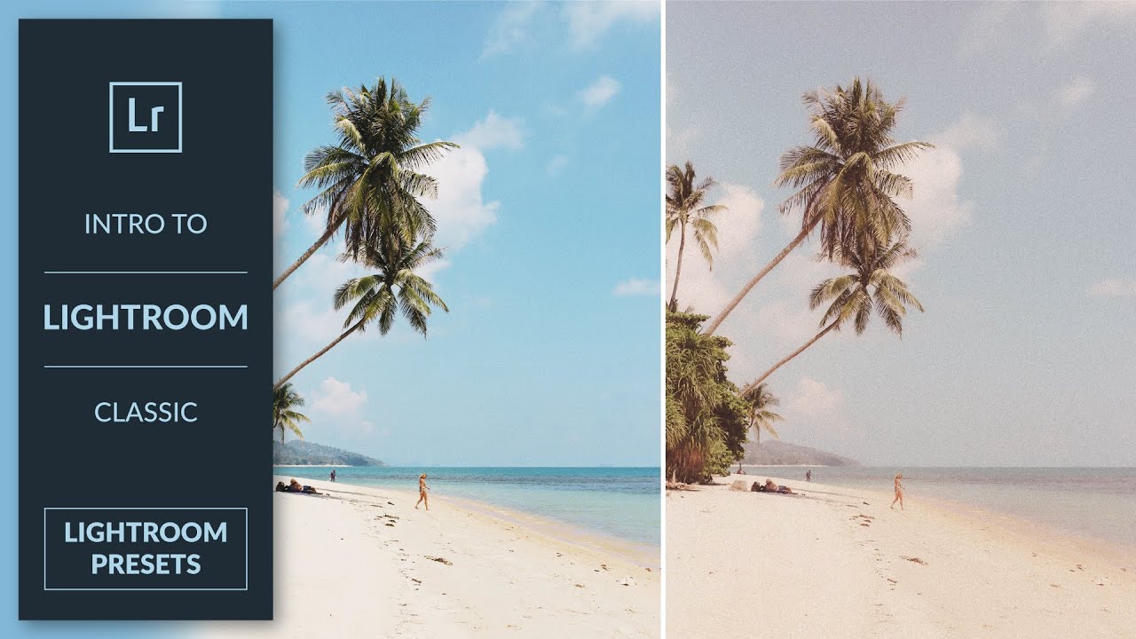
There is a particular kind of frustration that only photographers understand: you nail a look on one image, move on to the next session, and spend twenty minutes trying to remember exactly what you did. Contrast down how much? Which shadow color? I’ve been doing post-production work for fifteen years, and I can tell you that the answer to that problem isn’t a better memory. It’s a preset. In this Aaron Nace tutorial from PHLEARN, he walks through the entire process of building a vintage film preset inside Lightroom Classic - from dialing in the adjustments to saving and organizing the preset so it’s actually usable across sessions and projects. Watch the full tutorial on YouTube
What I appreciate about Aaron’s approach is that he doesn’t just show you the “save preset” button. He treats the whole process as a workflow decision - what to include, what to leave out, and how to name and group things so you can find them again. That philosophy maps directly onto how I think about Photoshop actions and batch systems. A preset you can’t locate in three seconds is a preset you won’t use. The walkthrough below follows the video’s actual order, with the specific settings and reasoning you’d need to replicate this yourself without pausing and rewinding.
Step 1: Set Up in the Develop Module
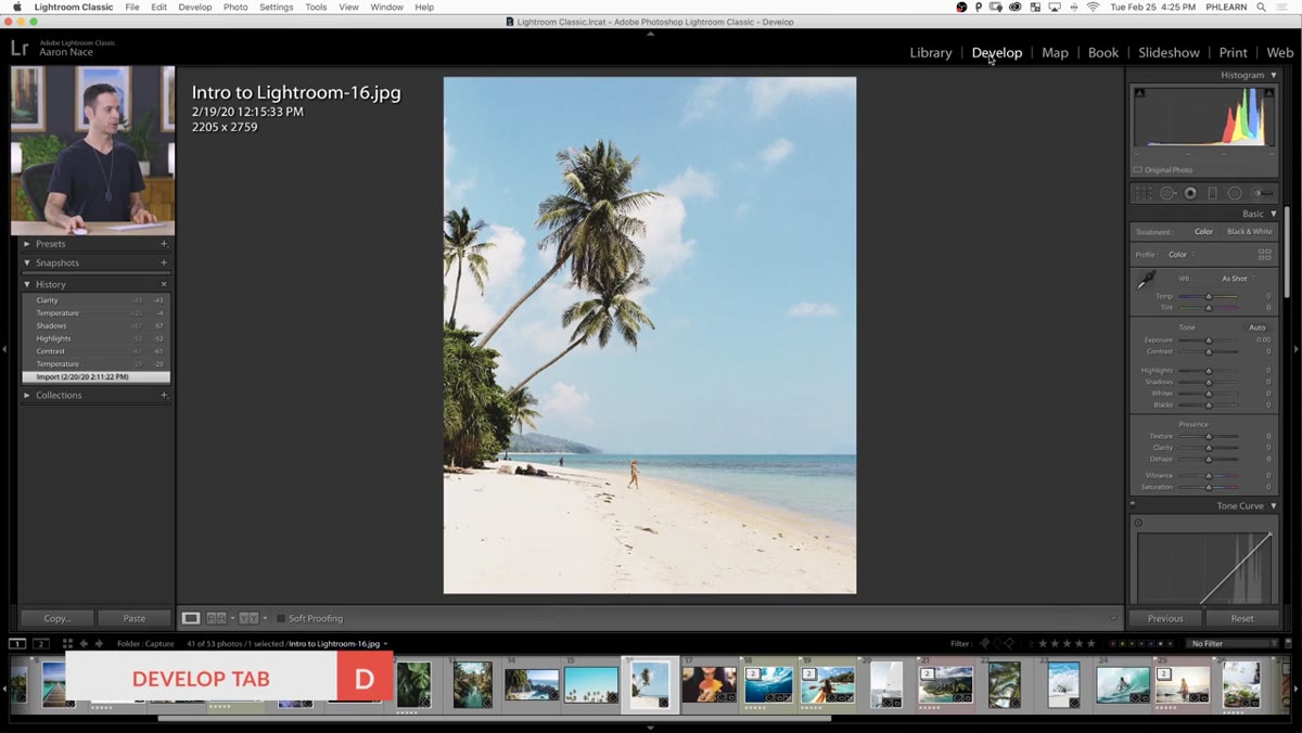 Lightroom Develop module open with sample image loaded
Before anything else, make sure you’re working in the Develop module, not the Library. This sounds obvious, but the preset creation option only lives in Develop. Aaron uses a portrait image from the PHLEARN sample pack for the demo - any image works, but picking something with a decent tonal range gives you a better sense of how the adjustments are reading as you build the look.
Lightroom Develop module open with sample image loaded
Before anything else, make sure you’re working in the Develop module, not the Library. This sounds obvious, but the preset creation option only lives in Develop. Aaron uses a portrait image from the PHLEARN sample pack for the demo - any image works, but picking something with a decent tonal range gives you a better sense of how the adjustments are reading as you build the look.
Step 2: Build the Base Tone - Contrast, Texture, and Clarity
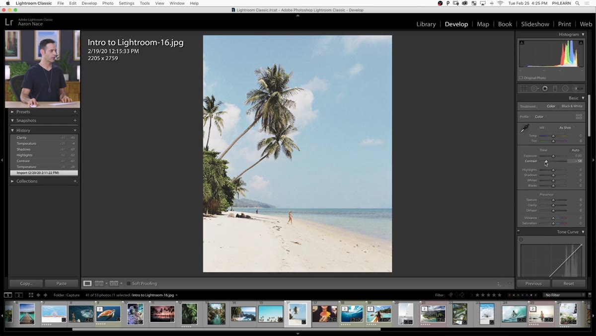 Basic panel with Contrast, Texture, and Clarity sliders being adjusted
The foundation of this vintage film look comes from pulling the energy out of the image slightly. Aaron lowers Contrast to flatten the tonal curve a bit, then brings Texture and Clarity down as well. Dropping Clarity in particular softens the midtone edge contrast - it’s a subtle effect but it’s what gives older film stocks that slightly diffused quality. Think of it as removing the “digital crispness” without actually blurring anything. You’re not destroying detail, just softening its presence.
Basic panel with Contrast, Texture, and Clarity sliders being adjusted
The foundation of this vintage film look comes from pulling the energy out of the image slightly. Aaron lowers Contrast to flatten the tonal curve a bit, then brings Texture and Clarity down as well. Dropping Clarity in particular softens the midtone edge contrast - it’s a subtle effect but it’s what gives older film stocks that slightly diffused quality. Think of it as removing the “digital crispness” without actually blurring anything. You’re not destroying detail, just softening its presence.
Step 3: Adjust Vibrance, Shadows, and Highlights
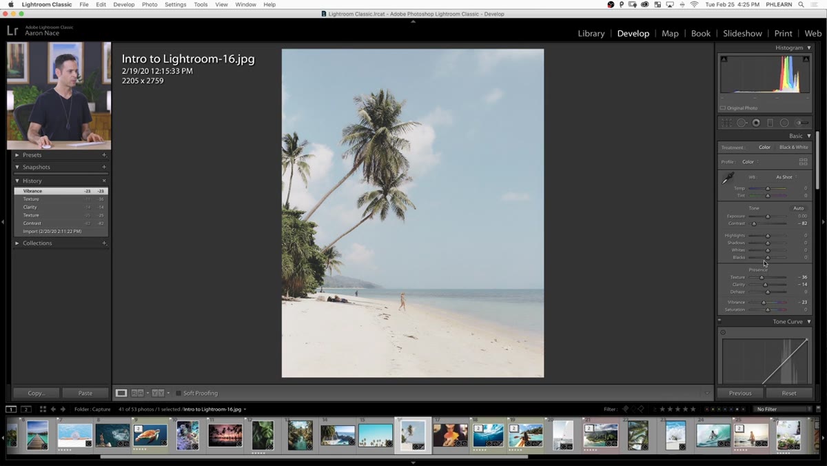 Vibrance, Shadows, and Highlights sliders in the Basic panel
After the contrast adjustments, Aaron pulls Vibrance down slightly to desaturate the image without killing skin tones the way Saturation would. Then he raises the Shadows value to lift the darkest areas - this is the single most recognizable characteristic of a film emulation look, that inability of film to hold true black. He also brings Highlights down a touch to compress the bright end. Together these two moves narrow the dynamic range intentionally, which is the opposite of what you’d normally do when editing a raw file for maximum tonal information.
Vibrance, Shadows, and Highlights sliders in the Basic panel
After the contrast adjustments, Aaron pulls Vibrance down slightly to desaturate the image without killing skin tones the way Saturation would. Then he raises the Shadows value to lift the darkest areas - this is the single most recognizable characteristic of a film emulation look, that inability of film to hold true black. He also brings Highlights down a touch to compress the bright end. Together these two moves narrow the dynamic range intentionally, which is the opposite of what you’d normally do when editing a raw file for maximum tonal information.
Step 4: Add Split Toning for Color Character
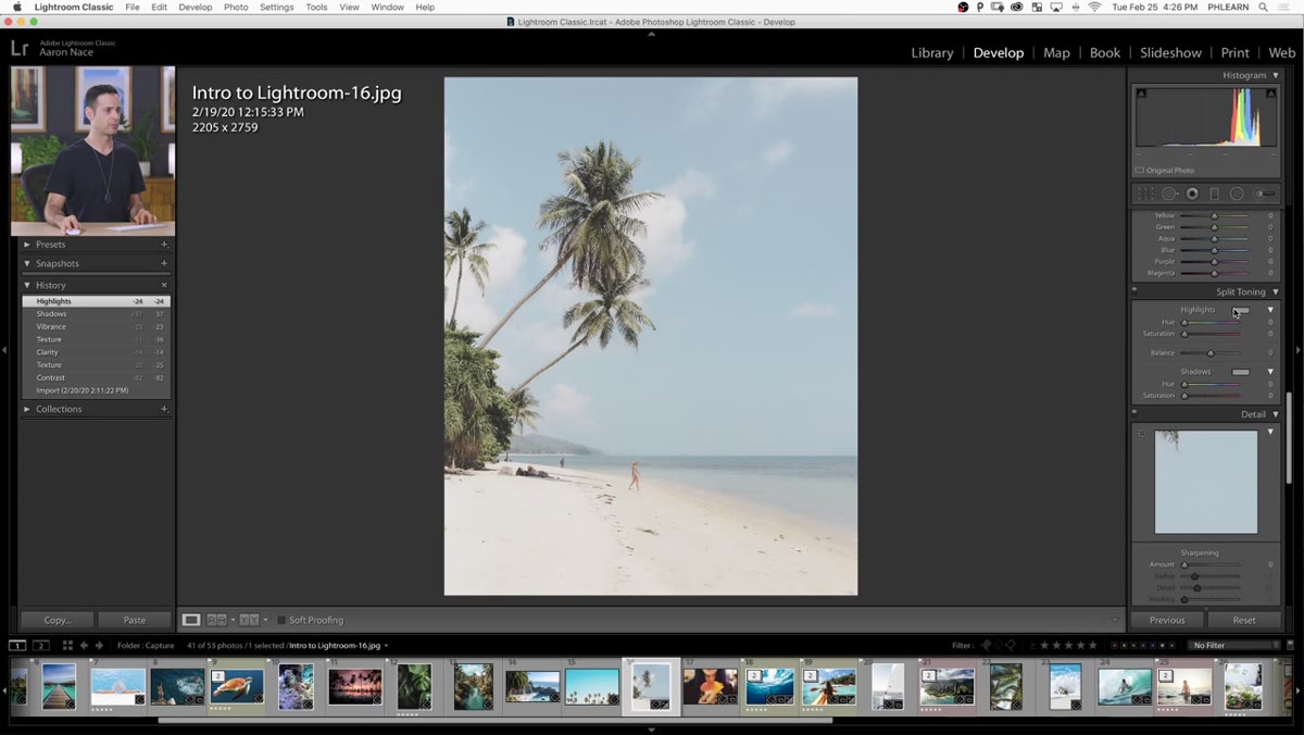 Split Toning panel with Highlight and Shadow hue/saturation controls
This is where the look gets its personality. In the Split Toning panel, Aaron adds a warm tone to the Highlights - think a gentle amber or gold hue with modest saturation, not a heavy orange push. Then he moves to the Shadows and adds a cooler red-shifted tone there. The contrast between a warm highlight and a slightly different shadow color is what makes a color grade feel intentional rather than accidental. Keep the saturation values conservative on both. You want the viewer to feel the color shift rather than immediately notice it.
Split Toning panel with Highlight and Shadow hue/saturation controls
This is where the look gets its personality. In the Split Toning panel, Aaron adds a warm tone to the Highlights - think a gentle amber or gold hue with modest saturation, not a heavy orange push. Then he moves to the Shadows and adds a cooler red-shifted tone there. The contrast between a warm highlight and a slightly different shadow color is what makes a color grade feel intentional rather than accidental. Keep the saturation values conservative on both. You want the viewer to feel the color shift rather than immediately notice it.
Step 5: Add Grain in the Effects Panel
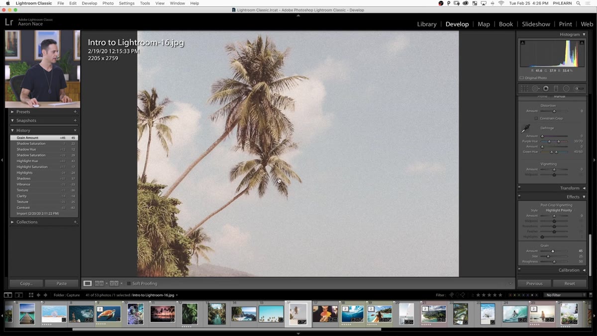 Effects panel with Grain Amount, Size, and Roughness sliders
Film grain is the final texture layer that ties everything together. Aaron scrolls down to the Effects panel and adds grain - zooming in on the image to actually see what the grain is doing at 1:1 or closer. The key here is to not overdo it. Grain that reads on screen often looks excessive in print, and grain that looks invisible at 100% view frequently disappears entirely on a phone screen. Aaron keeps this subtle, which is the right call for a preset intended to work across multiple images without requiring per-image tweaking.
Effects panel with Grain Amount, Size, and Roughness sliders
Film grain is the final texture layer that ties everything together. Aaron scrolls down to the Effects panel and adds grain - zooming in on the image to actually see what the grain is doing at 1:1 or closer. The key here is to not overdo it. Grain that reads on screen often looks excessive in print, and grain that looks invisible at 100% view frequently disappears entirely on a phone screen. Aaron keeps this subtle, which is the right call for a preset intended to work across multiple images without requiring per-image tweaking.
Step 6: Save the Preset with the Right Settings Checked
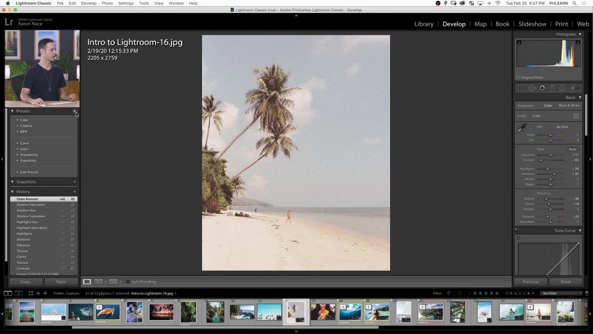 New Develop Preset dialog with Check None selected and specific settings enabled
Here’s where most people make a critical mistake. When you go to the Presets panel, click the plus icon, and choose Create Preset, Lightroom defaults to checking every possible setting. Aaron’s move is to immediately hit “Check None” and then manually select only the settings he actually changed. This matters enormously in practice. If you save a preset with Exposure checked, for example, every image you apply it to will get that exposure value applied - even if your base exposure was wildly different for that image. Only save the parameters you intentionally set. Name the preset clearly (he uses “Vintage Film”) and create a new group folder to keep your presets organized by source or project.
New Develop Preset dialog with Check None selected and specific settings enabled
Here’s where most people make a critical mistake. When you go to the Presets panel, click the plus icon, and choose Create Preset, Lightroom defaults to checking every possible setting. Aaron’s move is to immediately hit “Check None” and then manually select only the settings he actually changed. This matters enormously in practice. If you save a preset with Exposure checked, for example, every image you apply it to will get that exposure value applied - even if your base exposure was wildly different for that image. Only save the parameters you intentionally set. Name the preset clearly (he uses “Vintage Film”) and create a new group folder to keep your presets organized by source or project.
Step 7: Apply the Preset and Verify
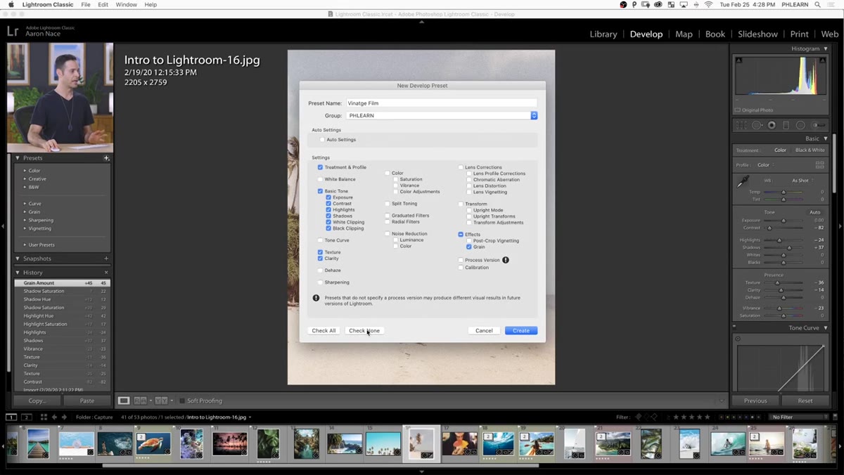 Preset applied to image showing before/after comparison in Develop module
Once saved, the preset appears in your Presets panel on the left side of the Develop module. Clicking it applies every saved setting instantly. Aaron checks the result against the original by stepping through the History panel - a simple before-and-after check that confirms the preset behaved as expected. At this point you can apply the same preset to other images in your catalog and use it as a starting point, adjusting per-image from there.
Preset applied to image showing before/after comparison in Develop module
Once saved, the preset appears in your Presets panel on the left side of the Develop module. Clicking it applies every saved setting instantly. Aaron checks the result against the original by stepping through the History panel - a simple before-and-after check that confirms the preset behaved as expected. At this point you can apply the same preset to other images in your catalog and use it as a starting point, adjusting per-image from there.
A Note on Preset Strategy From My Own Workflow
Where I’d push this further for production work: build a small family of related presets rather than one. A “Vintage Film - Soft,” a “Vintage Film - Punchy,” and a “Vintage Film - Desaturated” variant gives you three options to show a client in under sixty seconds. I do this with actions in Photoshop constantly - the base action plus two or three variation actions that tweak a single parameter. The overhead of building the variants is maybe ten minutes. The time it saves across a full client gallery is hard to overstate. Aaron doesn’t go into this in the tutorial but his approach of keeping preset groups organized by name is exactly the kind of habit that makes a preset library useful instead of just large.
The most important thing this tutorial demonstrates isn’t any single slider value. It’s the discipline of saving only what you changed. A sloppy preset that overwrites exposure or white balance on every image it touches is worse than no preset - it creates cleanup work instead of eliminating it. Get the settings right, check none, then check only what you touched. That habit alone will change how useful your preset library actually becomes.
Watch the full tutorial on YouTube - Aaron’s explanation of the Split Toning panel in particular is worth seeing in motion, since the hue wheel interaction is easier to follow visually than in text.
Comments (2)
Quality content like this is rare. Keep it up.
Great article! I actually covered something related on my site — the retouching angle is really complementary to this.
Leave a Comment