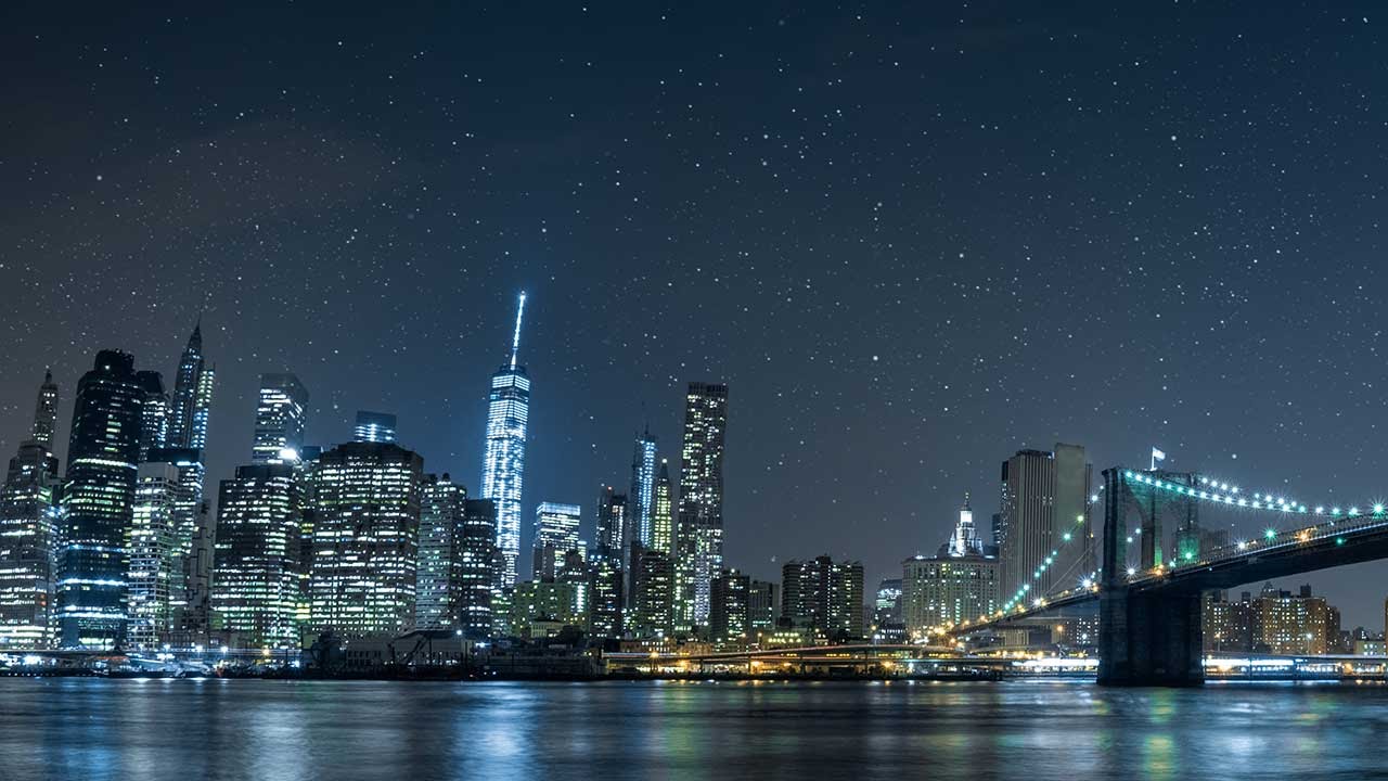
Client sends over a panoramic cityscape. Beautiful shot, golden hour fading into deep blue. The brief says “add stars.” If you’ve been doing this long enough, you already know what the wrong approach looks like: grab a tiny round brush, set it to white, and start clicking. Two hundred clicks later, you’ve got a sky that looks like someone flicked a paintbrush at the monitor. Every star is identical. Every star is boring. The whole thing reads as fake from ten feet away.
That’s the problem Aaron Nace solves cleanly in this PHLEARN tutorial. Watch the full tutorial on YouTube before or after reading this breakdown. His approach builds a custom brush from scratch, one that handles randomness, scale variation, and scatter automatically, so a single brush stroke produces a convincing field of stars rather than a pattern that screams “Photoshop.” After years of building batch systems and composite workflows for ad agencies, I can tell you: the difference between a brush that does one thing and a brush engineered to simulate randomness is the difference between amateur compositing and work clients actually approve on the first round.
Here’s the full walkthrough, with the settings you need to replicate it yourself.
Step 1: Create a New Document for Your Brush Shape
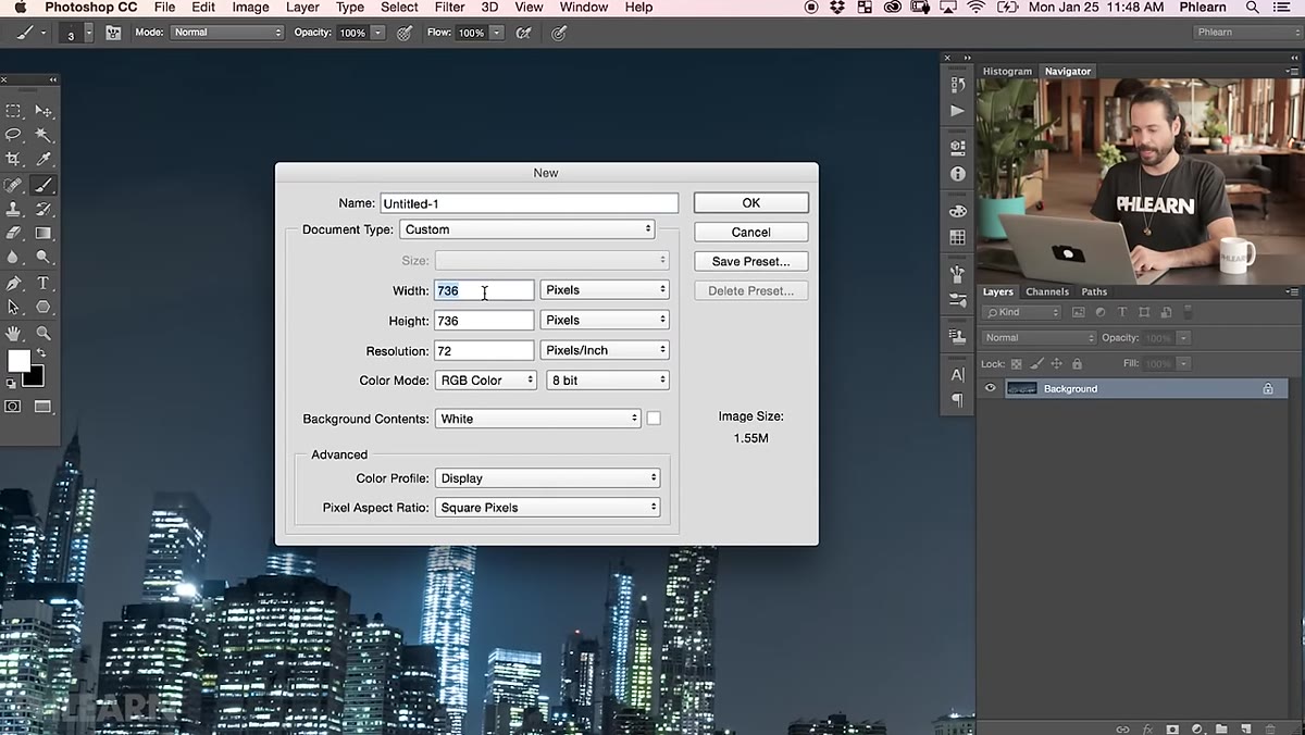 Blank 500x500 white canvas open in Photoshop
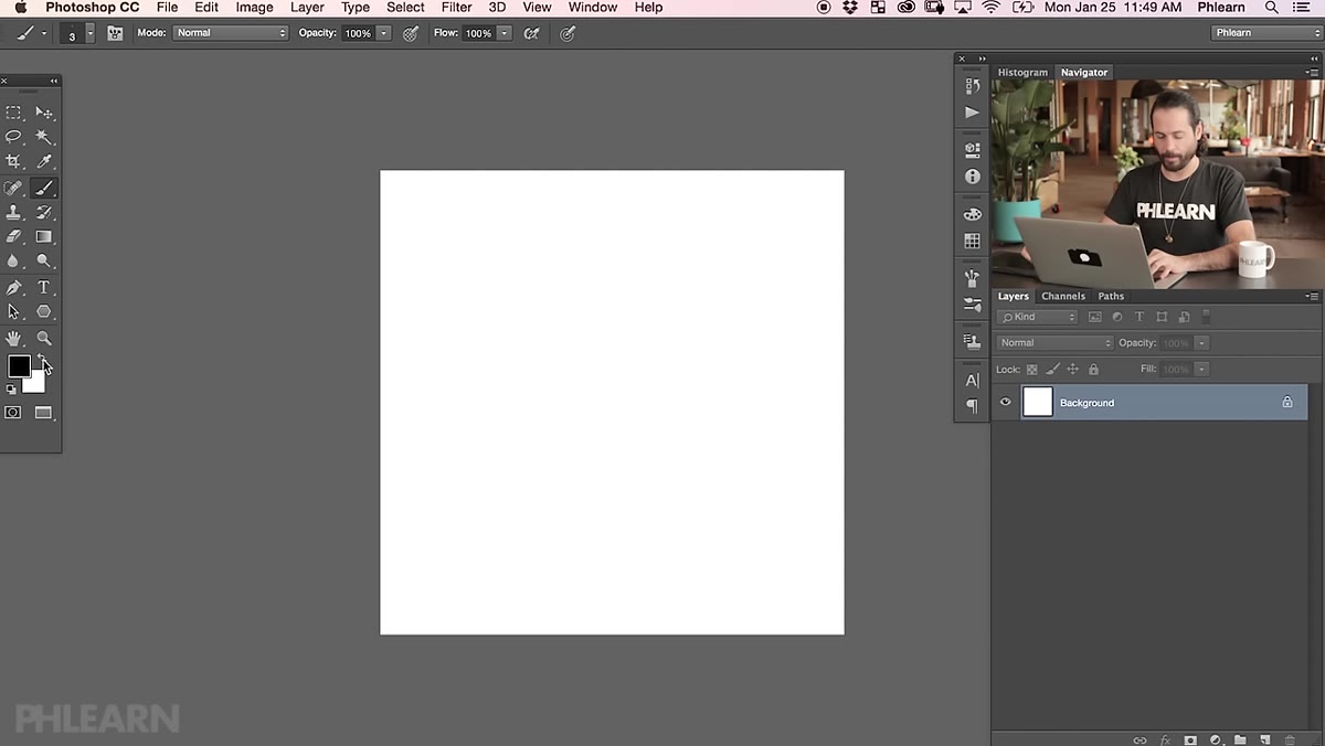
Hit Ctrl/Cmd+N and create a new document at 500x500 pixels. White background. This is your brush canvas, and the size matters. Bigger source documents give you more flexibility later because you can always scale a brush down without losing crispness. Going too small means your stars get mushy when you need them large.
Blank 500x500 white canvas open in Photoshop
Hit Ctrl/Cmd+N and create a new document at 500x500 pixels. White background. This is your brush canvas, and the size matters. Bigger source documents give you more flexibility later because you can always scale a brush down without losing crispness. Going too small means your stars get mushy when you need them large.
One rule to internalize: when building any custom brush in Photoshop, the background must be white and your painted shapes must be black. Photoshop reads darkness as the brush tip. White areas are transparent. Get that backwards and nothing works the way you expect.
Step 2: Paint Your Star Shapes with a Hard Round Brush
 Two black dots of different sizes painted on white canvas
Grab the Brush tool (B), set your foreground color to black, and right-click to bring up the brush options. Push hardness up to somewhere between 60 and 70 percent. Soft-edged stars look like blobs; too hard and they look like pixels. That 60-70 range hits the sweet spot of a small, defined point with just a hint of falloff.
Two black dots of different sizes painted on white canvas
Grab the Brush tool (B), set your foreground color to black, and right-click to bring up the brush options. Push hardness up to somewhere between 60 and 70 percent. Soft-edged stars look like blobs; too hard and they look like pixels. That 60-70 range hits the sweet spot of a small, defined point with just a hint of falloff.
Paint one dot in the lower-left area of your canvas for your larger star, then reduce the brush size and paint a smaller dot in the upper-right area, spacing them far apart. That spacing is doing real work. When Photoshop scatters the brush tip during a stroke, it references the shape of the brush source. Wide spacing between your two dots forces the scatter to feel genuinely random rather than clustered. One stroke, two differently sized stars, placed far apart on the canvas: that’s the whole engine.
Step 3: Define the Brush Preset
 Edit menu open with Define Brush Preset option highlighted
Go to Edit and choose Define Brush Preset. Name it something you’ll recognize, “Stars Custom” or similar. Your brush is now saved and accessible from the Brush panel. This is the step most tutorials rush past, but it’s worth pausing on: what you’ve just done is convert pixel information into a reusable tool. Any document, any future project, that brush is waiting in your panel.
Edit menu open with Define Brush Preset option highlighted
Go to Edit and choose Define Brush Preset. Name it something you’ll recognize, “Stars Custom” or similar. Your brush is now saved and accessible from the Brush panel. This is the step most tutorials rush past, but it’s worth pausing on: what you’ve just done is convert pixel information into a reusable tool. Any document, any future project, that brush is waiting in your panel.
Step 4: Configure Brush Settings for Scatter and Size Variation
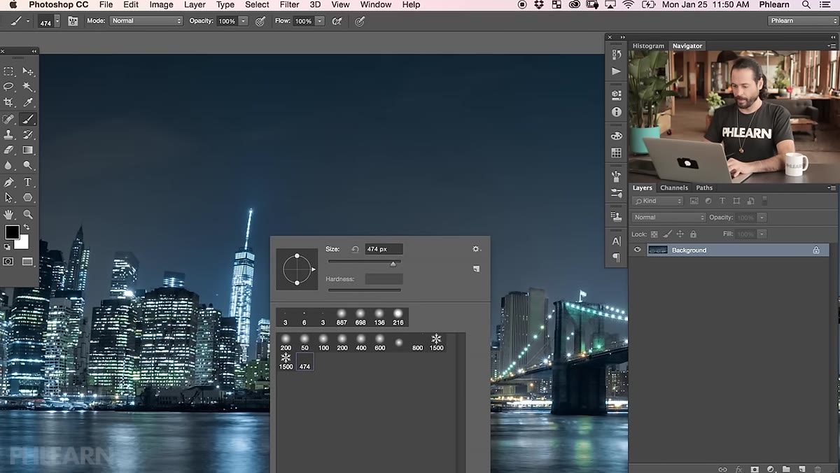 Brush Settings panel open showing Shape Dynamics and Scattering options
Open the Brush Settings panel (Window > Brush Settings). This is where the brush goes from a curiosity to a production-ready tool. Work through these settings in order.
Brush Settings panel open showing Shape Dynamics and Scattering options
Open the Brush Settings panel (Window > Brush Settings). This is where the brush goes from a curiosity to a production-ready tool. Work through these settings in order.
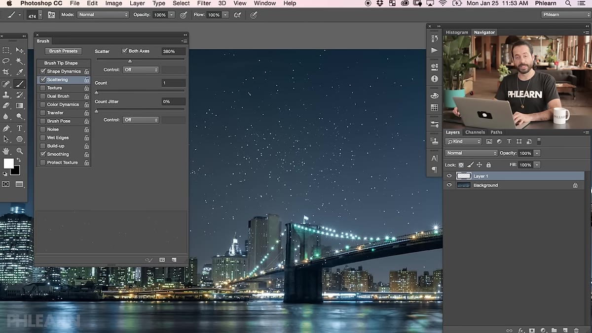
Under Shape Dynamics, crank Size Jitter up high, somewhere in the 70-100 percent range. This is what gives you stars at multiple scales in a single stroke, some large, most small, which mirrors how actual starfields look. Under Scattering, enable Scatter on both axes and push that value up significantly. The higher the scatter, the more spread your stars will be across the canvas. You also want Count set somewhere between 2 and 4, which multiplies how many brush tips get laid down per spacing interval. Spacing itself, back under Brush Tip Shape, should be pushed up as well. If spacing is too tight, your stars clump. Too loose and you’re clicking forever to fill a sky. Test around 150-200 percent to start.
Step 5: Paint Stars onto a Dedicated Layer
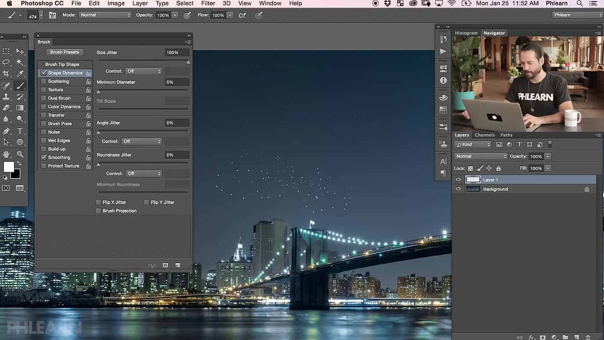 White stars painted across a dark sky on a separate layer
Back in your main image, create a new layer above your sky. Set your foreground color to white. Now paint across the sky area with long, loose strokes. The scatter settings you dialed in do the heavy lifting. What you’re after is a natural-looking density variation, denser in some zones, sparser in others, which is how real starfields behave.
White stars painted across a dark sky on a separate layer
Back in your main image, create a new layer above your sky. Set your foreground color to white. Now paint across the sky area with long, loose strokes. The scatter settings you dialed in do the heavy lifting. What you’re after is a natural-looking density variation, denser in some zones, sparser in others, which is how real starfields behave.
Keep this on its own layer. Non-destructive is non-negotiable on client work. I run every composite element on isolated layers with clear naming, because the moment a client asks you to “pull back the stars a little” at 11pm, you want a single opacity slider, not a hunting expedition through a merged file.
Step 6: Add a Glow and Subtle Motion Blur
 Layer styles panel open with Outer Glow settings applied to star layer
To push the realism, add a layer style to your stars layer. Double-click the layer to open Layer Styles and add an Outer Glow. Set the glow color to a very pale blue-white and bring opacity down so it’s suggestive rather than obvious. Overkill here is the enemy. Real stars have a soft corona from atmospheric diffraction, not a neon ring.
Layer styles panel open with Outer Glow settings applied to star layer
To push the realism, add a layer style to your stars layer. Double-click the layer to open Layer Styles and add an Outer Glow. Set the glow color to a very pale blue-white and bring opacity down so it’s suggestive rather than obvious. Overkill here is the enemy. Real stars have a soft corona from atmospheric diffraction, not a neon ring.
For an optional trailing effect that suggests long-exposure photography, apply a Motion Blur filter (Filter > Blur > Motion Blur) at a very low distance, 2-4 pixels, at a consistent angle. Duplicate the stars layer first so you preserve the clean version. This effect works especially well on panoramas where a long-exposure look makes compositional sense.
A Note on Blending This into Real Skies
Where I see this technique fail in client work is at the blending stage. A perfectly built star layer still reads as fake if it’s sitting at 100 percent opacity over a sky that has its own ambient light. I always clip a Curves adjustment layer to the stars layer and pull the darks slightly to let the sky’s natural luminosity bleed through. On city shots especially, the sky near the horizon is never truly black, so stars that appear right above the glow of the skyline need to feel softer, smaller, less dense than stars at the top of the frame. A layer mask with a gradient handles this in under a minute and makes the composite hold up at full resolution.
The custom brush Aaron built is also available as a download from PHLEARN if you’d rather skip the build and get straight to painting. Either way, once this brush is in your panel, the technique takes minutes, not hours.
The single most important thing this tutorial taught me: randomness in Photoshop doesn’t happen by accident, you design it into the tool before you ever touch the canvas. Watch the full tutorial on YouTube to see Aaron’s process in real time, including the brush settings panel walkthrough, which is worth seeing in motion.
Comments (1)
I've been looking for exactly this kind of tutorial. Perfect timing.
Leave a Comment